Table of Contents >> Show >> Hide
- What Is the 1970's IBM Standard Issue Wall Clock?
- Why IBM Made a Clock Worth Talking About
- What Makes the Clock So Recognizable?
- Why the 1970s Label Still Sticks
- How to Identify an Authentic Vintage IBM Wall Clock
- Why Designers and Collectors Still Love It
- Where a 1970's IBM Standard Issue Wall Clock Works Best Today
- Buying and Restoration Tips
- Final Thoughts
- Experiences Related to the 1970's IBM Standard Issue Wall Clock
- SEO Tags
Some objects do not beg for attention. They simply hang there, doing their job with the quiet confidence of a person who has never once said “circle back” in a meeting. The 1970’s IBM Standard Issue Wall Clock is that kind of object. It is practical, restrained, highly legible, and just stylish enough to make you pause and think, “Wait a minute, why does this old office clock look better than half the décor on Instagram?”
That reaction is part of the charm. The IBM wall clock is not flashy in the way a neon diner clock is flashy, nor does it have the fussy romance of a carved wooden mantel clock. It is industrial, disciplined, and deeply American in its design language. It belongs to the world of schools, labs, offices, warehouses, and factory floors. It was built for spaces where people had work to do, deadlines to meet, and very little interest in decorative nonsense. And yet, decades later, it has become exactly the sort of design object people hunt for, restore, and proudly hang in kitchens, studios, and home offices.
If you are curious about the 1970’s IBM Standard Issue Wall Clock, you are really asking about more than a timepiece. You are asking about IBM’s identity, twentieth-century industrial design, old-school durability, and the strange magic of objects that outlast the eras that produced them. That is what makes this clock interesting. It tells time, sure, but it also tells a story.
What Is the 1970’s IBM Standard Issue Wall Clock?
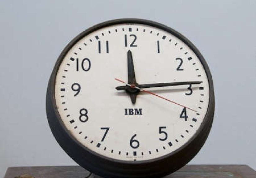
The phrase “1970’s IBM Standard Issue Wall Clock” usually refers to vintage IBM-branded industrial wall clocks that were used in workplaces and institutional settings. They are often round, metal-cased, easy to read from across a room, and built with the kind of no-fuss functionality that defined mid-century American work environments. In collector circles, the “1970s” label often sticks because many surviving examples are dated or sold as seventies pieces, even though the visual language of the best-known IBM clocks clearly reaches back to earlier decades.
That matters because the clock’s appeal is not tied to one narrow production year. Instead, it belongs to a longer IBM design tradition: clear numerals, disciplined geometry, practical materials, and a refusal to waste visual space. In plain English, it looks like the clock equivalent of a crisp white shirt. Not exciting at first glance, maybe, but somehow always the right choice.
Vintage examples are commonly described as electric clocks, and many have later been converted to battery power by restorers or sellers. That makes sense. An office clock from the IBM universe was never designed to be precious. It was designed to remain useful. If that meant rewiring it for modern life, well, the clock probably would not take it personally.
Why IBM Made a Clock Worth Talking About
IBM Did Not Start as “Just a Computer Company”
One reason the IBM wall clock feels so right is that timekeeping sits near the company’s roots. Before IBM became the giant associated with mainframes, PCs, and corporate computing, its lineage ran through time-recording technology. That background helps explain why a wall clock with the IBM name on it is not some weird branding accident. It is part of a broader history in which clocks, timing, accuracy, and organized work were woven into the company’s DNA.
In other words, IBM was not slapping its logo on random household décor because someone in marketing got bored. The company emerged from a culture that already understood time as both a mechanical problem and a business problem. When you know that, the wall clock stops seeming like a side note and starts feeling like a perfectly logical artifact.
IBM Turned Utility into a Design Language
By the mid-twentieth century, IBM had also become serious about design in a way that many corporations only talked about. The company invested in a unified design program and worked to create a consistent visual identity across products, graphics, buildings, and workspaces. That discipline shows up beautifully in the classic IBM clock. It is not ornate. It is not trying to be cute. It is trying to be right.
The result is a clock that feels modern even now. The face is usually uncluttered. The hands are bold enough to be read from a distance. The second hand often adds a subtle shot of red, like a tie on an otherwise sober suit. It is pure function, but function with posture.
What Makes the Clock So Recognizable?
Legibility First, Always
The defining feature of the IBM wall clock is legibility. You can read it from across a classroom, down a hallway, or from the far end of a conference room where someone is definitely pretending to listen. Large numerals, clean minute markers, and strong contrast make it instantly usable. This is not the kind of clock that asks you to admire its artistry before granting you the privilege of knowing it is 3:17.
That easy readability is one reason the design has aged so well. Good information design rarely goes out of style. The clock succeeds for the same reason a well-designed transit sign or a crisp spreadsheet succeeds: it gives you what you need, fast.
Industrial Materials That Mean Business
Most people picture these clocks with a metal case, a slightly domed glass lens, and a sturdy presence on the wall. The silhouette is simple, but it has weight. It does not look flimsy. It does not look disposable. It looks like it survived coffee breaks, reorganizations, management trends, and at least one employee who insisted on calling everyone “sport.”
That physical sturdiness is part of the emotional appeal. A lot of modern home goods are designed to look vintage while secretly being fragile little drama queens. The IBM clock comes from the opposite tradition. It was built to work first and charm you later.
A Face That Became Familiar Everywhere
The design became so widely recognized because clocks of this type appeared in schools, offices, churches, and other institutional settings for decades. Even people who have never owned an IBM clock often feel they know it already. It carries the visual memory of American public life. It is one of those designs that sneaks into your brain early and never really leaves.
Why the 1970s Label Still Sticks
Here is the honest version: the clock design most people associate with IBM did not suddenly appear in the 1970s. It had earlier roots and was already well established by the middle of the century. But surviving IBM-branded wall clocks from the 1970s do exist in the vintage market, and they are often described as standard issue office clocks. That is why the label survives.
In practical terms, the seventies represent the tail end of an era when the analog wall clock still ruled institutional space. Computers were growing in importance, but offices still depended on physical systems, synchronized routines, and visible timekeeping. A 1970’s IBM wall clock captures that overlap beautifully. It belongs to a future-facing company, yet it is unmistakably part of an older, analog world.
That tension is delicious for collectors. The clock feels both technological and stubbornly low-tech. It came from a company shaping the future, but it did so with a steel case, printed numerals, and a wall hook. There is something wonderfully unpretentious about that.
How to Identify an Authentic Vintage IBM Wall Clock
Look at the Dial and Branding
An authentic example will usually have IBM branding on the dial, and the face should feel balanced rather than decorative. The typography matters. The spacing matters. The whole point of the clock is visual discipline, so sloppy printing or awkward proportions can be a red flag.
Check the Case Construction
Original clocks tend to have a solid industrial build, often with metal housing and a substantial lens. If the case feels suspiciously lightweight or looks like it came from a modern bargain bin, proceed with caution. The real thing should have some presence. It should feel like it once reported to work on time every day.
Understand the Movement Situation
Many vintage IBM clocks were electric, and some were part of larger synchronized systems used in institutional settings. Others on the market today have been converted to quartz or battery operation. That is not automatically a bad thing. In fact, a careful conversion can make a clock far easier to live with. But if originality matters to you, ask direct questions about the movement, wiring, and any replaced parts.
Respect Honest Wear
Patina is not a defect. Minor scuffs, aged paint, or gentle discoloration can be part of the clock’s charm. These clocks were working objects, not museum princesses. A little wear often adds credibility and character. Damage is one thing; history is another.
Why Designers and Collectors Still Love It
The IBM wall clock appeals to people who love honest design. It does not rely on nostalgia alone, although nostalgia absolutely helps. It wins because it still solves the same problem well: telling time clearly, from a distance, in a way that feels calm and competent.
It also fits beautifully into modern interiors. Put one in a minimalist office and it looks intentional. Put one in a farmhouse kitchen and it looks grounded. Put one in a loft with exposed brick and suddenly you have “industrial chic” without trying too hard. It is the rare vintage object that can play well with many styles because its design is so fundamentally clean.
Collectors also love the clock because it sits at the intersection of several worlds: IBM history, industrial design, office Americana, institutional salvage, and vintage horology. You are not just buying a clock. You are buying a little slice of modern business history, which sounds much more glamorous than “I bought a used thing off the internet,” even if that is technically what happened.
Where a 1970’s IBM Standard Issue Wall Clock Works Best Today
One of the nicest things about this clock is that it still feels useful, not merely decorative. It works in home offices because its roots are professional. It works in kitchens because the face is easy to read while your hands are covered in flour and poor decisions. It works in studios and workshops because it was born in a culture that respected tools.
If you want the strongest visual impact, give it room to breathe. These clocks benefit from clean walls, modest surrounding décor, and enough distance to appreciate the proportions. They are not shy, but they also do not want to compete with twelve framed slogans and a fake succulent army.
Buying and Restoration Tips
If you are shopping for one, buy with both your heart and your common sense. Ask about dimensions, movement, condition of the glass, condition of the case, and whether the clock keeps accurate time. If it is electric, confirm how it is powered and whether it has been safely updated. If it has been converted to battery, find out whether the conversion was done cleanly or with the grace of a raccoon in a hardware store.
For restoration, less is often more. Preserve the original dial whenever possible. Avoid over-polishing the case into oblivion. Keep the clock readable and structurally sound, but do not scrub away the very qualities that make it feel authentic. The goal is not to make it look newborn. The goal is to make it look well kept.
Final Thoughts
The 1970’s IBM Standard Issue Wall Clock is compelling because it represents a very specific kind of beauty: the beauty of competence. It was made for real spaces, real schedules, and real work. It carries the visual authority of IBM’s design culture, the practical legacy of timekeeping technology, and the humble confidence of an object that never needed to shout.
That is why people still want it. Not because it is trendy, but because it feels earned. It reminds us of a time when even ordinary office equipment was expected to be durable, readable, and dignified. In a world full of disposable gadgets, that kind of seriousness feels oddly refreshing. The IBM wall clock may be old, but it is not outdated. It is simply proof that good design does not need a motivational speech.
Experiences Related to the 1970’s IBM Standard Issue Wall Clock
Part of the fascination with a 1970’s IBM Standard Issue Wall Clock is the experience it creates once it is actually on the wall. This is not a clock you glance at the way you glance at your phone. It changes the feel of a room. The moment you hang one up, the space seems a little more grounded, a little more disciplined, and a little less interested in nonsense. It is as if the room quietly got a promotion.
People who grew up in older schools or worked in institutional buildings often react to it before they even identify it. They see the round metal case, the bold numerals, the unmistakable face, and suddenly they are somewhere else. Maybe it is a classroom with waxed floors and squeaky chairs. Maybe it is a union office, a drafting room, or a lab with fluorescent lights humming overhead. The clock has that rare power to trigger not just memory, but atmosphere.
There is also a tactile pleasure in finding one. Spotting an authentic IBM wall clock in a salvage shop or vintage warehouse can feel like discovering a relic from an era when objects were expected to survive for decades. You notice the scuffs on the case, the slight aging on the dial, maybe a converted movement hiding behind the back plate, and none of it feels disappointing. It feels lived in. It feels proven. It feels like the object has stories and is too polite to brag about them.
Then there is the daily experience of living with it. Unlike a phone, the clock does not demand your fingerprints, your password, or your soul. It just hangs there and tells the truth. When you are writing, cooking, working, or halfheartedly pretending to organize your desk, the clock becomes part of the rhythm of the room. It invites a different awareness of time. Less frantic. Less digital. More physical. You do not swipe to check it. You simply look up.
That simple act matters more than it sounds. Looking up at a wall clock creates a pause. It makes time feel shared with the room instead of trapped inside your pocket. That is one reason these clocks work so well in home offices and kitchens. They make time visible in a communal, architectural way. It is not just your schedule anymore; it is part of the environment.
There is also a small thrill in the contrast. IBM is one of the great technology names in American history, yet this beloved artifact is resolutely analog. No app. No sync notification. No “smart” anything. Just a face, hands, and a job to do. In an age when even a toaster threatens to connect to Wi-Fi, that feels downright heroic.
And perhaps that is the deepest experience tied to the 1970’s IBM Standard Issue Wall Clock: reassurance. Reassurance that useful things can still be beautiful. Reassurance that design does not need gimmicks. Reassurance that an object made for everyday labor can outlast trends and still feel relevant. It hangs there, steady and unfussy, like a veteran employee who has seen seven reorganizations and still knows where everything is.
Once you live with one, you understand the obsession. It is not just a vintage clock. It is a mood, a memory, and a master class in quiet industrial design.