Table of Contents >> Show >> Hide
- Why Color of the Year picks actually matter (even if you roll your eyes)
- Every 2023 Color of the Year we know (with real-life ways to use them)
- Pantone: Viva Magenta (18-1750)
- Benjamin Moore: Raspberry Blush (2008-30)
- Sherwin-Williams: Redend Point (SW 9081)
- Behr: Blank Canvas (DC-003)
- PPG Paints: Vining Ivy
- Glidden: Vining Ivy
- Valspar: Rising Tide (4008-3A) + a whole palette of 2023 Colors of the Year
- Dunn-Edwards: Terra Rosa (DE5096)
- Krylon: Spanish Moss
- Dutch Boy: Rustic Greige (404-4DB)
- Minwax: Aged Barrel (wood stain)
- Better Homes & Gardens: Canyon Ridge
- HGTV Home by Sherwin-Williams: Darkroom (HGSW7083)
- How to pick the right 2023 Color of the Year for your home
- Real-life experiences and lessons from living with 2023’s Colors of the Year (extra notes)
- 1) The “sample is lying to me” phase is normal
- 2) Warm neutrals can feel “quiet” at firstthen you notice the peace
- 3) Dark colors don’t automatically make rooms smallerbad lighting does
- 4) The easiest way to “try a trend” is to paint something you can move
- 5) Wood stain trends sneak up on you (in a good way)
- Conclusion
Every year, paint brands, design magazines, and the color-oracle at Pantone pick a “Color of the Year” like we’re all voting on the next president of throw pillows.
And honestly? It’s a little bit marketing, a little bit mood forecasting, and a whole lot of “please let my living room feel like a hug.”
The fun part: 2023’s winners aren’t marching in one single direction. Instead, they form a surprisingly wearable groupbold reds and corals for confidence,
soft neutrals for calm, and nature-leaning greens and blue-greens for anyone who wants their home to feel like a deep breath.
If you’ve been searching “2023 color of the year” because you want ideas that look fresh but still livable, you’re in the right place.
Why Color of the Year picks actually matter (even if you roll your eyes)
You don’t have to repaint your entire house just because a committee fell in love with a specific shade. But these picks are useful because they:
- Spot trends early: Brands track what people buy, what designers specify, and what feels “right” culturally.
- Give you a shortcut: Instead of staring at 1,842 swatches, you start with a curated shortlist.
- Help you pair colors: Most “Color of the Year” announcements come with palettes and styling guidance that’s actually practical.
Think of them as a playlist. You’re not required to love every songbut you might discover your next favorite.
Every 2023 Color of the Year we know (with real-life ways to use them)
Pantone: Viva Magenta (18-1750)
Viva Magenta is bold, spirited, and unapologetically attention-grabbinglike the friend who shows up overdressed and somehow makes everyone else look better.
Use it when you want energy: a front door, an accent wall behind open shelving, dining chairs, or a statement rug. If painting a whole room feels like a lot,
try it in small, high-impact moments: a bookcase back panel, a powder room vanity, or even framed art mats that make neutrals look intentional.
Pairing tip: It pops against creamy whites, warm wood, and soft clay tones. Add brass or matte black hardware for a modern edge.
Benjamin Moore: Raspberry Blush (2008-30)
Raspberry Blush is a lively red-orange coral with a pink kicklike your walls drank an espresso and suddenly have plans.
It’s fantastic for spaces where you want warmth and personality: an entryway, a breakfast nook, or a music room (yes, that’s a thingeven if it’s just a corner with a speaker and confidence).
For a calmer approach, treat it like a “color accessory” and paint the inside of a cabinet, a bar cart, or a single ceiling medallion area.
Pairing tip: Try it with denim blues, inky navy, or a deep chocolate-brown to keep it sophisticated instead of candy-coated.
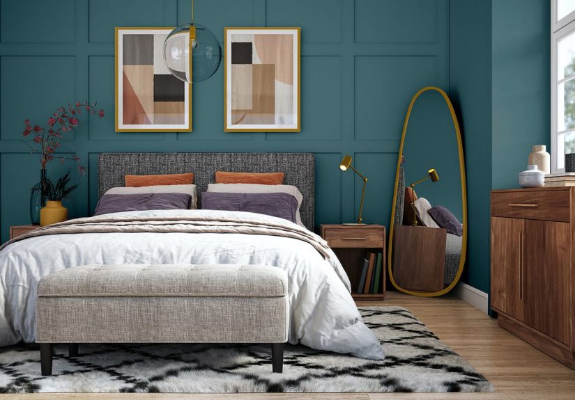
Sherwin-Williams: Redend Point (SW 9081)
Redend Point is the warm, blush-beige neutral that quietly makes everything else look expensive.
It works beautifully in open-concept spaces where you need one color to connect multiple zones without feeling bland.
If you’ve been stuck in cool gray land and want out (no judgment, we’ve all been there), this is a gentle on-ramp to warmer tones.
Pairing tip: Layer it with terracotta, creamy whites, and natural textures (linen, oak, rattan). It also loves muted greens.
Behr: Blank Canvas (DC-003)
Blank Canvas is a warm white that’s designed to feel welcomingnot sterile, not icy, not “my house is secretly a dentist office.”
It’s a strong choice if you want your home to feel brighter while still cozy, especially in bedrooms, living rooms, and hallways.
The best use case: as a “quiet hero” backdrop that lets art, wood tones, and textiles do the talking.
Pairing tip: Add contrast with charcoal accents, warm leathers, or soft sage greens to keep it from feeling flat.
PPG Paints: Vining Ivy
Vining Ivy is a robust blue-green that lands somewhere between “forest” and “jewel tone”the kind of color that looks classy in daylight and dramatic at night.
It’s great for offices, libraries, dining rooms, and kitchen islands. If you’re nervous, start with a built-in, lower cabinets, or a single wall behind the bed.
It’s also surprisingly good outside: shutters, trim, and doors that want to look timeless instead of trendy.
Pairing tip: Crisp whites and warm metals (brass/bronze) make it feel tailored. Creamy neutrals keep it relaxed.
Glidden: Vining Ivy
Glidden also crowned Vining Ivy as its 2023 Color of the Year, proving that sometimes the group project actually agrees.
The charm is its flexibility: it can read more blue in cool light and more green in warm light, so it adapts to your space.
Use it where you want depth without going fully black: accent walls, cabinetry, a hallway that needs personality, or a bathroom vanity that deserves better than builder beige.
Pairing tip: Try sandy neutrals, clay tones, and natural wood. Add a warm white ceiling to keep it airy.
Valspar: Rising Tide (4008-3A) + a whole palette of 2023 Colors of the Year
Valspar took a different approach and released multiple Colors of the Year12 shades meant to feel livable and nature-friendly.
If you want one headline shade, Rising Tide is a soft, uplifting light blue that behaves like a “fresh neutral” in many rooms.
It’s a smart pick for bedrooms, bathrooms, laundry rooms, and any space where you want calm without going cold.
Pairing tip: Pair with warm whites, pale woods, and gentle greens. For a sharper look, add navy or matte black accents.
Dunn-Edwards: Terra Rosa (DE5096)
Terra Rosa is a deep rosy pink with a terracotta influencewarm, confident, and surprisingly wearable.
It shines in spaces that benefit from warmth: dining rooms, reading corners, and bedrooms where you want cozy without going muddy.
If full walls feel intense, paint a fireplace surround, a built-in bench, or even just the inside of an arched niche for instant “designer did this” energy.
Pairing tip: Creamy neutrals, natural stone, and olive greens keep it grounded. Brass accents make it glow.
Krylon: Spanish Moss
Spanish Moss is a moody midnight green that brings “sophisticated comfort” to DIY projectsespecially if you’re updating furniture, planters, metal pieces, or outdoor accents.
It’s the kind of green that makes thrifted finds look intentional. Try it on a side table, picture frames, a headboard, or patio pieces that need a glow-up.
Bonus: deep greens hide scuffs better than light colors, which is great if your furniture lives a real life.
Pairing tip: Warm woods and tan leather look amazing next to it. Add cream textiles to keep it soft.
Dutch Boy: Rustic Greige (404-4DB)
Rustic Greige is the peacemaker of neutrals: part gray, part beige, and fully committed to making your home feel settled.
It’s ideal for living rooms, hallways, and open layouts where you want warmth but not yellow.
If you’re selling, renovating, or just trying to make mismatched furniture look like it belongs together, this shade does the unglamorous work beautifully.
Pairing tip: White trim + black hardware = crisp. Add warm woods and textured fabrics for a cozy, layered look.
Minwax: Aged Barrel (wood stain)
Not every “Color of the Year” is wall paint. Minwax’s Aged Barrel is a warm brown wood stain that leans into comfort and craft.
It’s perfect for dining tables, shelving, trim, and anything you want to feel grounded and timeless.
If your space feels a little too slick or trend-chasing, warmer wood tones instantly add soulespecially when paired with creamy whites and soft textiles.
Pairing tip: Pair stained wood with warm whites (not icy ones), and add black or bronze accents for contrast.
Better Homes & Gardens: Canyon Ridge
Canyon Ridge is a sunbaked terracotta-leaning shade that reads like a desert sunset you can paint on the wall.
It’s warm, friendly, and versatile enough to act like a near-neutral if your room gets good light.
It works especially well in entryways, living rooms, and bedrooms where you want a “glow” effect. It also makes a killer accent color for stenciling and DIY wall details.
Pairing tip: Try cobalt or navy for contrast, mossy greens for an earthy palette, or soft pinks/turquoise for a playful spin.
HGTV Home by Sherwin-Williams: Darkroom (HGSW7083)
Darkroom is a rich black with a purple undertonedramatic, romantic, and surprisingly flexible if you treat it like a “new neutral.”
It’s amazing for moody bedrooms, dining rooms, built-ins, and anywhere you want architectural details to look more expensive.
The trick is balance: pair it with lighter walls, reflective surfaces, and warm lighting so the room feels intentional, not cave-adjacent.
Pairing tip: Creamy whites, warm woods, and vintage-inspired metals (antique brass) keep it elegant and inviting.
How to pick the right 2023 Color of the Year for your home
- Start with the job: Calm (Rising Tide, Blank Canvas), cozy (Redend Point, Rustic Greige), bold (Viva Magenta, Raspberry Blush), grounded (Vining Ivy, Aged Barrel), dramatic (Darkroom).
- Test in your lighting: Morning light, afternoon glare, and nighttime lamps can make the same paint look like three different decisions.
- Use the “60/30/10” mindset: Big surfaces (60), supporting tones (30), accent moments (10). Bright colors often win in the 10% slot.
- Pick a texture partner: Colors look more “real” when paired with materialswood, stone, linen, leather, metal. Build a mini mood board before you paint.
Real-life experiences and lessons from living with 2023’s Colors of the Year (extra notes)
You can read about paint all day, but the real truth arrives the moment it’s on your wall and your lamp turns it into something… unexpected.
Here are the most common “lived experiences” people report when they actually use Color of the Year shadesplus how to make those moments work for you.
1) The “sample is lying to me” phase is normal
Most people start confident. Then they paint a tiny swatch and panic because it looks too bright, too dull, or somehow “different” than it did online.
This happens because color is relational: the floor, the couch, the trim, and the direction your windows face all change how the hue reads.
With energetic shades like Viva Magenta or Raspberry Blush, the shift can feel dramaticmorning light makes them playful; evening light makes them richer and moodier.
The best workaround is boring but effective: paint a larger sample on poster board and move it around for a full day.
You’ll learn quickly whether the color is your soulmate or just a fun fling.
2) Warm neutrals can feel “quiet” at firstthen you notice the peace
People who switch from cool gray to warmer neutrals (Redend Point, Rustic Greige, Blank Canvas) often say the room feels “different” but can’t explain why.
A week later, they’ll describe it as calmer, softer, or more welcoming. That’s the subtle power of warmth: it doesn’t shout, it settles.
The most satisfying results come from layeringthink textured rugs, linen curtains, wood tones, and a few black accents to add crispness.
Warm neutrals don’t want perfection; they want cozy complexity.
3) Dark colors don’t automatically make rooms smallerbad lighting does
Darkroom, Vining Ivy, and Spanish Moss can look incredible, but they demand decent lighting.
In real homes, the “wow” moment often happens after people add warmer bulbs, an extra table lamp, or a mirror to bounce light.
Another real-life trick: keep trim and ceilings lighter, or use the dark shade on built-ins and cabinetry instead of all four walls.
Many homeowners end up loving dark colors most in spaces that are naturally smaller anywaypowder rooms, offices, reading nooksbecause the intimacy feels intentional.
4) The easiest way to “try a trend” is to paint something you can move
If you love the idea of a bold 2023 color but fear commitment, paint a piece of furniture instead of a room.
Spanish Moss on a side table, Raspberry Blush inside a bookcase, or Viva Magenta on a picture frame collection gives you the trend without the teardown.
People often discover they like the color more than expectedthen later upgrade to a bigger application.
It’s like testing a new hairstyle with a hat first. Totally scientific.
5) Wood stain trends sneak up on you (in a good way)
Aged Barrel is the kind of “color” you don’t notice until it makes everything else feel warmer and more finished.
Many DIYers report that staining a shelf, table, or trim detail brings an immediate sense of depthespecially in homes heavy on white paint.
The experience is less “wow, look at that color” and more “wow, the room finally feels complete.”
If your home feels visually flat, a warm wood tone can be the missing ingredient.
Conclusion
The best part of the 2023 Color of the Year lineup is that it doesn’t force you into one personality.
Want bold self-expression? Viva Magenta and Raspberry Blush have your back. Want calm, cozy, and quietly stylish?
Redend Point, Blank Canvas, and Rustic Greige show up like dependable friends with snacks.
Want nature, depth, and a little drama? Vining Ivy, Spanish Moss, Terra Rosa, Canyon Ridge, and Darkroom are ready.
Pick the color that matches how you want to feel in your spacethen test it in your actual lighting, pair it with textures you love,
and remember: the goal isn’t to follow a trend. It’s to make your home feel like you.