Table of Contents >> Show >> Hide
- Table of Contents
- Why Design Quotes Work (and When They Don’t)
- How to Use These Design Quotes Like a Pro
- The 139 Design Quotes
- Category 1: Creative Mindset (1–20)
- Category 2: Process & Iteration (21–40)
- Category 3: Constraints, Simplicity & Focus (41–55)
- Category 4: Typography, Copy & Communication (56–70)
- Category 5: Color, Layout & Visual Composition (71–85)
- Category 6: UX, Human-Centered Design & Accessibility (86–105)
- Category 7: Collaboration & Leadership (106–117)
- Category 8: Craft, Career & Professional Growth (118–129)
- Category 9: Fun, Silliness & Surprise (130–139)
- The Design Principles Behind the Punchlines
- of Experiences Designers Recognize
- Conclusion
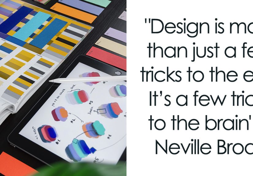
If creativity had a favorite outfit, it would be a black turtleneck with a pocket full of sticky notes and one suspiciously chewed pen.
Designers don’t just “make things pretty” (though we do enjoy a good glow-up). We translate messy human needs into clear experiences,
turn constraints into cleverness, and somehow convince a blank canvas to behave.
This article is both a pep talk and a practical tool: 139 design quotes (short, punchy, and studio-friendly) plus
real-world design principles you can actually use. Save your favorites for your next critique, sprint planning session, or “why is this button
still 9px off?” moment.
Why Design Quotes Work (and When They Don’t)
A good quote is a tiny compression algorithm for hard-won wisdom. In a sentence (sometimes half a sentence), it can remind a team to
return to the user, simplify the interface, or test assumptions before everyone falls in love with the wrong idea.
But quotes don’t replace craft. They’re not a substitute for research, accessibility checks, usability testing, or a clear design system.
Think of them as creative “north stars” helpful when you’re lost, annoying if you use them to avoid doing the work.
How to Use These Design Quotes Like a Pro
1) Use them as critique prompts
Before feedback gets personal (“I just don’t like it”), use a quote to steer the room toward outcomes:
clarity, hierarchy, flow, trust, accessibility, and task success.
2) Turn quotes into checklist items
If a quote survives contact with reality, promote it to a checklist. Example: “If it needs a tooltip, it needs a redesign” becomes
“Can a first-time user complete this step without explanation?”
3) Add them to sprint rituals
Pick one quote for the week. Let it guide how you write tickets, review work, or scope experiments. Designers love consistency almost as much as
they love “one more small tweak.”
4) Use them to defend the user (politely)
The right quote can help you say “no” without starting a tiny workplace civil war. Bonus points if you say it with a smile and bring data.
The 139 Design Quotes
These are intentionally short so they’re easy to remember, repeat, and apply. Some are serious, some are spicy, and all are meant to keep
creativity pointed in the right direction: toward real people and real outcomes.
Category 1: Creative Mindset (1–20)
- Creativity isn’t rare; it’s underused.
- Design is curiosity with deadlines.
- Your first idea is a warm-up lap.
- Make the obvious better before making the weird louder.
- Inspiration is everywhere; attention is the filter.
- Good taste is a skill, not a personality trait.
- Start with “Why?” and end with “Does it help?”
- Every constraint is a design partner in disguise.
- Ideas are cheap; clarity is expensive.
- Confidence grows faster when you ship.
- Design is optimism you can click.
- Perfection is a moving target; progress is measurable.
- Make room for play; it’s where the surprises live.
- Don’t wait for genius. Invite it with process.
- When stuck, zoom out. When lost, zoom in.
- Creativity loves questions more than answers.
- Choose curiosity over defensiveness.
- Make the work serve the story, not your ego.
- Design is empathy wearing comfortable shoes.
- If you can’t explain it simply, it isn’t simple yet.
Category 2: Process & Iteration (21–40)
- Prototype early, because opinions are loud and reality is louder.
- Iterate like you mean it: change something, test something, learn something.
- Sketch fast to think faster.
- Every version teaches you something if you listen.
- Don’t polish assumptions.
- Make it work. Make it clear. Make it delightful. In that order.
- Feedback is data, not destiny.
- Design reviews should judge outcomes, not aesthetics alone.
- When you can’t decide, design the experiment.
- “Good enough” is a milestone, not a lifestyle.
- Ship the smallest thing that proves the biggest risk.
- Measure twice, align once, nudge forever.
- Design is a verb. Documents are just receipts.
- Test with real people before you test your luck.
- If it’s important, write it down. If it’s critical, test it.
- Great design isn’t guessed; it’s verified.
- The best workflow is the one your team will actually follow.
- Iteration is how you pay respect to complexity.
- Make decisions reversible when possible, and deliberate when not.
- When in doubt, reduce scope not quality.
Category 3: Constraints, Simplicity & Focus (41–55)
- Simplicity is what’s left after you stop showing off.
- If everything is emphasized, nothing is.
- Remove before you add.
- Make the primary path obvious and the secondary path possible.
- Every extra step is a tax on attention.
- Less UI, more outcome.
- Clarity beats cleverness on weekdays.
- Design is the art of not doing ten things.
- Keep the promise your headline makes.
- When a feature is confusing, it’s not “advanced” it’s unfinished.
- Whitespace is not empty; it’s organized breathing room.
- If you can’t explain the benefit, you can’t justify the complexity.
- Consistency saves users from thinking too hard.
- Make the default choice the safest choice.
- Focus is a design decision, not a mood.
Category 4: Typography, Copy & Communication (56–70)
- Typography is the user interface of reading.
- Make the text earn its place.
- If users skim, your hierarchy must speak.
- Good copy is a designer’s secret superpower.
- Readable beats trendy. Every time.
- Headlines are promises; body text is delivery.
- Microcopy is macro trust.
- Label buttons like actions, not riddles.
- Write for humans, not internal departments.
- If the error message blames the user, you missed the bug.
- Let the tone match the moment: calm in crisis, playful in delight.
- Acronyms are speed bumps for newcomers.
- Great typography is felt more than noticed.
- Line length matters. Yes, still.
- When words fail, the UI fails too.
Category 5: Color, Layout & Visual Composition (71–85)
- Color is a tool, not a personality.
- Contrast is kindness.
- Hierarchy is what your layout believes is important.
- Alignment is the difference between “designed” and “accidental.”
- Grids don’t kill creativity; they keep it honest.
- Visual rhythm turns scanning into understanding.
- Use emphasis like seasoning: enough to taste, not enough to regret.
- Icons should clarify, not decorate.
- Shadow is a promise of depth don’t lie with it.
- Consistency is what makes novelty feel safe.
- Whitespace is the stage; content is the performer.
- Design the states: loading, empty, error, success.
- Motion should explain, not entertain itself.
- Beauty matters especially when it supports comprehension.
- If it looks clickable, it better be clickable.
Category 6: UX, Human-Centered Design & Accessibility (86–105)
- Design for humans first, then for screens.
- Accessibility is not a feature; it’s a baseline.
- Usability is empathy in measurable form.
- Users don’t read manuals; they read outcomes.
- If the user must remember, the design must change.
- Match the real world, not your org chart.
- Make errors easy to avoid and easier to recover from.
- Give feedback fast; silence feels broken.
- People blame themselves before they blame your interface.
- Reduce cognitive load like it’s a performance budget.
- Every form field should justify itself.
- Great UX is invisible until it isn’t there.
- Design the journey, not just the screen.
- Respect the user’s time like it’s your own.
- Don’t hide the important stuff behind “Learn more.”
- When everything is urgent, nothing is.
- Empathy is a method, not a slogan.
- Inclusive design is just good design with more people invited.
- Trust is earned in tiny moments.
- Test with the people who struggle most; everyone benefits.
Category 7: Collaboration & Leadership (106–117)
- Design is a team sport disguised as a solo portfolio.
- Strong opinions, loosely held.
- Assume good intent, demand good evidence.
- Meetings are expensive; bring a prototype.
- The best idea can come from the quietest person.
- Critique the work, not the worker.
- Make it safe to be wrong; that’s where learning lives.
- Alignment beats agreement; both beat confusion.
- Designers translate. Great designers negotiate.
- When stakeholders disagree, go back to the user goal.
- Clarity is contagious; so is chaos. Choose carefully.
- Leadership is making decisions visible and reversible when possible.
Category 8: Craft, Career & Professional Growth (118–129)
- Master the basics; that’s where the magic hides.
- Your portfolio is the trailer, not the movie.
- Design taste grows by comparison and critique.
- Study systems, not just screens.
- Document decisions so you don’t re-argue them.
- Be fluent in constraints: time, tech, and humans.
- Learn to write. Then learn to edit.
- Ask better questions; you’ll get better briefs.
- Depth beats breadth until the project demands both.
- Be the designer who makes other people better.
- Craft is care made visible.
- Growth is what happens after feedback stops stinging.
Category 9: Fun, Silliness & Surprise (130–139)
- Play is research in a party hat.
- Silliness is a shortcut to unexpected combinations.
- Make room for weird ideas; some of them are genius.
- If you’re not laughing a little, you’re not exploring enough.
- Delight is function with personality.
- Creative culture needs permission, not perfection.
- Try the ridiculous version first then dial it back.
- Design should feel human, not manufactured.
- Surprise is a spice: use it to enhance, not to confuse.
- The best designs feel inevitable after you discover them.
The Design Principles Behind the Punchlines
Empathy is not optional
Many respected design frameworks in the U.S. emphasize starting with real user needs and validating assumptions through research and testing.
When teams listen to users continuously, products improve continuously. If you only “listen” after launch, congratulations you’ve invented
panic-driven product management.
Usability is a set of learnable behaviors
Great interfaces tend to share predictable qualities: they use familiar language, provide clear feedback, reduce memory load, prevent errors,
and support recovery. These aren’t “nice-to-haves.” They are the difference between users feeling capable and users feeling cursed.
A practical way to apply usability is to run quick heuristic reviews during design and QA, not just at the end.
Accessibility is usability for the broadest audience
Accessibility is about building experiences people can perceive, operate, understand, and rely on as technology changes. In practice, that means
adequate contrast, readable typography, clear focus states, logical structure, and thoughtful interaction patterns. Treat accessibility as
a design constraint that raises quality not a compliance chore you do when you “have time.”
Typography and hierarchy do heavy lifting
In digital design, typography isn’t decoration; it’s structure. Strong hierarchy helps users skim, orient, and decide. When your type scale,
spacing, and labels are consistent, users feel like the product “makes sense,” even if they can’t explain why.
Good composition is a map for attention
Layout, spacing, alignment, and contrast work together to tell users what matters and what to do next. A clean grid isn’t about making designs
boring; it’s about making patterns predictable so the content can be interesting.
Creative confidence grows with action
Creativity is not limited to people who can draw well; it’s a way of understanding and reframing problems. Teams build creative confidence by
trying things out, prototyping, learning, and iterating. Translation: stop waiting to “feel ready.” Make a version, then make it better.
Classic iOS themes are a useful reminder
Even older design guidance can be a sharp lens. For example, the classic themes of deference, clarity, and depth (introduced with iOS 7-era design)
still read like a clean checklist: let content win, keep things legible and understandable, and use visual layers/motion to clarify rather than
distract.
of Experiences Designers Recognize
Designers often swap the same stories across industries because the tools change, but humans don’t. Here are a few common “you had to be there”
experiences that fit this topic like a perfectly kerned headline.
1) The “Can you make it pop?” moment. Someone asks for “more pop,” which is not a requirement so much as a cry for help.
Teams that handle this well turn vibes into specifics: pop for who, pop in what context, and pop to achieve what action?
Suddenly, “pop” becomes “increase hierarchy for the primary CTA, improve contrast, and reduce competing elements.” Same request, but now it’s design.
2) The debate that ends with a prototype. Two smart people disagree. One wants minimalism; the other wants “all the information.”
The best teams don’t arm-wrestle. They build two quick versions and test them with a handful of users. The room goes quiet when the evidence shows
that users didn’t need more content they needed better labeling and structure. The prototype becomes the diplomat that everyone trusts.
3) The “tiny change” that isn’t tiny. “Let’s just add one dropdown” sounds harmless until you realize it changes the flow,
adds a decision point, complicates validation, introduces an empty state, and creates accessibility work (keyboard navigation, focus order, ARIA,
contrast, and error messaging). Designers learn to respect complexity and to budget time for the boring states that keep products reliable.
4) The accessibility wake-up call. Someone tests with a keyboard-only user or a screen reader and suddenly the interface feels like
an escape room with missing clues. It’s humbling and it’s one of the fastest ways to improve design maturity. Teams often discover that accessibility
improvements (clearer labels, better structure, stronger contrast) also make the experience smoother for everyone.
5) The surprise power of copy. A product can look gorgeous and still fail because the words are wrong. Swap “Submit” for “Save changes,”
rewrite an error message to explain the fix, and add one reassuring sentence at the right moment and conversion jumps. Designers eventually stop
treating copy like a late-stage garnish and start treating it like interface design.
6) The day “fun” became a strategy. Many teams report that their best ideas arrived after permission to be a little ridiculous.
A playful sketch, a “what if we did the opposite?” exercise, or a deliberately exaggerated concept can unlock a better middle path.
Silliness, used with intent, becomes a tool for breaking linear thinking and for keeping creativity alive when deadlines get loud.
Conclusion
Design quotes are tiny tools: quick to read, easy to remember, and powerful when used as prompts for real decision-making.
The best ones don’t just sound cool they push you toward clarity, empathy, accessibility, and the courage to iterate.
Bookmark the quotes that feel uncomfortably true. Use them in your next critique. Turn a few into checklists.
Then do the most creative thing a designer can do: build, test, learn, and make it better.