Table of Contents >> Show >> Hide
- The Icon Behind the Color: Why Artek’s Stool 60 Still Wins
- Color Isn’t Just Paint: Finishes That Change the Whole Vibe
- The Best Artek Stool Colors for Real Homes
- How to Choose the Right Color (Without Overthinking Yourself Into a Nap)
- Styling Ideas: Making Colored Stools Look Like They Belong
- Special Editions and Collaborations: When Stool 60 Gets Dressed Up
- Care and Keeping It Cute: Maintenance Tips That Actually Matter
- Buying Advice: Authenticity, Value, and Avoiding Regret
- Conclusion
There are two kinds of people in the world: the ones who think a stool is “just a stool,” and the ones who’ve discovered the Artek Stool 60 and started treating it like a tiny, three-legged life upgrade. The second group also tends to have opinions about finishes the way wine people have opinions about “notes of blackberry.”
If you’re here, you’re probably already in Group Twoor you’re dangerously close. Because once you realize an Artek stool can be a seat, a side table, a plant pedestal, a bedside stand, and an emergency “we invited two more friends” dinner-party save, the next obvious question is: what color should it be?
Let’s talk about Artek stools in colorhow the hues behave in real rooms, which finishes are secretly doing the heavy lifting, and how to pick a shade that feels intentional (not “I panic-clicked ‘petrol’ at 1:00 a.m.”).
The Icon Behind the Color: Why Artek’s Stool 60 Still Wins
The Artek Stool 60 is the kind of design that makes other furniture look like it’s trying too hard. Designed by Finnish architect Alvar Aalto in 1933, it’s built around a deceptively clever idea: the L-leg, a bentwood leg that connects cleanly to the seat while staying strong enough for everyday use. That bend is not a decorative flourishit’s the whole plot.
The stool’s geometry also makes it stackable, and not in a sad “folding chairs in the garage” way. When you stack multiple Stool 60s, the legs line up into a twisting spiral that looks sculptural even when you’re just trying to clear floor space. You can stash extras in plain sight and pretend it’s “an installation.” (Technically true.)
What’s especially relevant for color lovers: the Stool 60 has never been trapped in a single “museum beige” identity. Yes, the clear-lacquered birch original is iconic. But Artek has leaned into color and surface options for decadeslacquers, stains, laminates, linoleum tops, and special editions that treat the stool like a tiny canvas you can sit on.
Color Isn’t Just Paint: Finishes That Change the Whole Vibe
Before you pick a color, it helps to know what kind of “color” you’re actually buying. With Artek stools, you’re typically choosing a combination of frame finish (the legs and seat edge) and seat surface (the top). That’s where the personality lives.
1) Clear lacquered birch: the “goes with everything” classic
Clear lacquered birch is the design-world equivalent of a great white T-shirt: simple, dependable, and somehow looks better with age. It’s warm without being yellow, light without being fragile-looking, and it plays nicely with Scandinavian, Japandi, mid-century modern, and even “I inherited this rug and now everything must match it” interiors.
2) Lacquer colors: crisp, modern, and unapologetically graphic
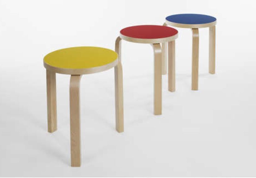
A lacquered stool reads as more graphic and intentionallike punctuation in a room. A black lacquer Stool 60 can anchor a corner. A white lacquer one can disappear into airy spaces (in a good way). Bright lacquersred, green, yellow, blue, orange, grey, even petrolcan act like functional décor, especially in minimalist rooms that need a controlled jolt of energy.
3) Stains: the “grown-up warm” option
Stained finishes (think walnut or honey tones) keep the wood character but deepen the mood. If clear birch is a sunny morning, honey stain is golden hour. These finishes often look especially good in rooms with warm metals, leather, earthy textiles, or vintage pieces that want a little richness.
4) Seat surfaces: laminate, HPL, linoleumAKA the practical flex
Many Stool 60 options include a different seat surfacelike white laminate or black linoleumpaired with a wood frame. This is the cheat code for families, home offices, and anyone who has ever set a sweating iced coffee on bare wood and regretted it immediately.
The result is subtle but important: you still get that bentwood warmth, but the top behaves more like a hard-working tabletop. It’s a small change that can dramatically alter how confidently you use the stool day-to-day.
The Best Artek Stool Colors for Real Homes
A color guide should be honest about one thing: there’s no “best” color in a vacuum. There’s only “best for your light, your floors, your chaos level, and your tolerance for visible wear.” With that said, here’s how the most popular color families tend to perform in American homes.
Natural birch: effortless, timeless, and weirdly calming
Natural birch works when you want the stool to feel like it’s always belonged. It’s excellent in small spaces because it keeps the room visually light. It also layers beautifully with other woodsespecially if your space isn’t perfectly matched (most real homes are not showroom-coordinated, despite what your algorithm suggests).
White: clean, bright, and secretly bold
A white Artek stool can look airy and minimal… until you realize it’s a bright object with edges and attitude. White is fantastic in kitchens, bathrooms, and studios where you want a crisp look. If your space already has a lot of white, this stool becomes texture and shape rather than “another thing.”
Black: the anchor that makes everything else look intentional
Black is the easiest way to make a room feel edited. A black stool next to a sofa can read like a deliberate side table. A black seat surface (like linoleum) is also a favorite for high-traffic use because it tends to hide daily life better than lighter tops.
Greys and petrols: modern color without the “look at me!”
Grey lacquer and petrol (that blue-green-teal family) are the “color for people who say they don’t like color.” They add depth without turning the stool into a mascot. These shades work especially well in offices, bedrooms, and living rooms with a muted palette.
Red, yellow, orange, blue, green: the happy troublemakers
Bright lacquer stools are what happens when functional furniture decides to be fun. They’re perfect for kids’ rooms, creative studios, and open-plan spaces that need a focal point. They also do something magical in neutral interiors: they give your room a heartbeat.
If you’re nervous, start with one bright stool and treat it like a movable accentbecause that’s literally what it is. If you’re not nervous, buy three in different colors and call it “a palette story.” (No one can argue with a palette story.)
How to Choose the Right Color (Without Overthinking Yourself Into a Nap)
Here’s a practical way to pick an Artek stool color that won’t feel random six months from now.
Step 1: Decide if the stool is background or spotlight
If the stool is meant to disappear into the room (extra seating, bedside perch, small-space hero), go with natural birch, white, or a quiet stain. If it’s meant to be a mood-lifter or design “moment,” pick a lacquer color that repeats something already in the roomart, a rug detail, a book spine color, even a plant pot.
Step 2: Match the undertone, not the exact shade
Warm room? Warm stool (honey, walnut, yellow, orange). Cool room? Cool stool (grey, blue, petrol, crisp white). The goal isn’t perfect matching; it’s avoiding a subtle clash that makes everything feel slightly “off.”
Step 3: Consider wear like a realist
If your home includes kids, pets, roommates, or your own habit of using furniture like it’s a multi-tool, choose a more forgiving top surface (laminate/linoleum) and a color that doesn’t spotlight every micro-scratch. If you love patina and want the stool to age with character, wood finishes are your friend.
Step 4: Think in sets (even if you’re buying one)
Stool 60s have a habit of multiplying. If you buy one now, imagine what a second one could be later. A classic move is: first stool in natural birch, second stool in a color that plays off it (black, white, petrol, or a bright lacquer if you’re feeling spicy).
Styling Ideas: Making Colored Stools Look Like They Belong
A colored stool is small, which means it’s easy to styleand also easy to make look accidental if you just plop it somewhere and hope for the best. Here are a few strategies that reliably work.
Use the “tray trick” when the stool is acting as a table
Put a tray on top. Instantly: side table. Also instantly: your drink has boundaries. A tray visually “finishes” the surface and makes a bright color feel purposeful rather than random.
Pair it with one repeat element
If your stool is red, repeat red oncemaybe in a throw pillow, a piece of art, or a book cover on a shelf. This is the interior-design version of rhyming: it doesn’t need to be constant; it just needs to happen.
Make a stack a feature, not storage shame
Two or three stools stacked in a corner can look sculptural. If the stools are different colors, the stack becomes an instant vertical accentlike functional modern art that can also rescue you when guests show up.
Let it do small-space double duty
In tight apartments, stools shine as bedside tables, plant stands, and “floating” extra seating. If you live in a space where every piece has to earn its keep, an Artek stool is basically overqualified.
Special Editions and Collaborations: When Stool 60 Gets Dressed Up
Part of the fun of Artek stools in color is that the brand treats the Stool 60 like a platformsometimes literal, sometimes cultural. Over the years, special editions have pushed the stool beyond standard lacquers and stains.
Color-forward reimaginations
Some collaborations play with color placement in a way that feels more like fashion than furniturethink legs in multiple hues, stained tops, and playful contrasts. These editions can be a great choice if you want a conversation piece that still works as everyday furniture.
Pattern and surface artistry
Other limited runs use the stool as a surface for pattern, marquetry, or graphic treatmentsproof that the Stool 60 can handle being the “art” in functional art. If you love the idea of color but don’t want a single flat hue, a patterned edition can give you complexity without clutter.
Material storytelling
Recent discussions around wood selection, sustainability, and “wilder” grain patterns have also influenced how the stool lookssometimes celebrating knots and natural variation rather than hiding them. It’s a reminder that color isn’t the only way to add character; sometimes the wood itself is the color story.
Care and Keeping It Cute: Maintenance Tips That Actually Matter
Artek stools are designed for real life, but “real life” is also where the Sharpie appears without warning. A little care goes a long wayespecially with colored finishes.
- Use felt pads on the feet if you’re moving the stool around often (and you will).
- Wipe spills quickly, especially on wood finishes, because moisture loves leaving souvenirs.
- Choose the right cleaner: a soft damp cloth is usually enough; skip anything abrasive that could dull lacquer.
- Embrace patina thoughtfully: minor wear on wood can add charm, while heavy gouges on bright lacquer might read more “battle damage.” If you want less visible wear, go darker or choose a tougher seat surface.
Buying Advice: Authenticity, Value, and Avoiding Regret
The Stool 60 is widely copied because the idea is brilliantand also because people enjoy paying less than the price of a small appliance. But the original earns its reputation through material quality, construction, and finish. If you’re investing in the genuine Artek stool, you’re buying something designed to survive decades of daily use and still look good doing it.
In the U.S., you’ll commonly see authentic Artek stools through established design retailers and museum shops, often with options like natural birch, colored lacquer, and practical seat surfaces (white laminate or black linoleum). Pricing typically lands in the “investment piece, but not a sofa” zonevarying by finish and edition.
One more tip: if you’re buying color, look at it in your room’s lighting if you can. A blue that looks calm in a showroom can look like “pool toy” under warm bulbs. Meanwhile, petrol can be sophisticated in daylight and deliciously moody at night. Color is a shapeshifter; plan accordingly.
Conclusion
Artek stoolsespecially the Stool 60are proof that great furniture doesn’t need a dramatic monologue. It just needs smart design, honest materials, and the kind of versatility that makes you wonder how you lived without it. Add color, and the stool becomes more than a utility piece: it becomes a flexible accent that can brighten a room, anchor a palette, or quietly blend in and do its job like a minimalist superhero.
Whether you go classic (clear birch), crisp (white or black), muted (grey or petrol), or joyful (red, yellow, orange, blue, green), the best color choice is the one that matches how you actually livehosting, working, rearranging, stacking, and occasionally using it as a plant throne. Because furniture should work hard, look great, and ideally make you smile at least once a day.
Color Experiences: What Life With Artek Stools Tends to Feel Like (500+ Words)
People don’t just buy Artek stoolsthey end up building a relationship with them. Not a dramatic, “we-renewed-our-vows” relationship, but more like the dependable friend who shows up every time you move and somehow fits into the new place better than the old one.
In real homes, the first surprise is usually how often the stool changes jobs. A single Stool 60 might start as a desk-side perch, then migrate into the living room as a side table, then get drafted into service as extra seating when friends come over. And because it stacks, it doesn’t have the usual “where do we store this?” problem. Two stools stacked become a tidy tower that can sit in a corner without looking like you’re hoarding spare furniture “just in case.” (Even though you are. And the case is: people like you.)
Color adds a second layer of everyday dramain a good way. Bright lacquer stools tend to become mood devices. A yellow stool in a kitchen can feel like a little daily shot of optimism, especially in winter or in apartments with limited natural light. A red stool in a neutral room often acts like punctuation: it makes the space feel edited and intentional, even when the rest of the room is basically “laundry chair meets book pile.” And blue or petrol finishes can shift with lighting so much that it feels like you own two stools for the price of onecalm and airy in daylight, deep and cozy at night.
The most practical “color experience” is how the top surface affects your confidence. Wood tops are beautiful, but they can make you behave like a museum guard in your own homehovering whenever someone sets down a cold drink. Seat surfaces like laminate or linoleum can change that immediately. Suddenly the stool is not just pretty; it’s usable. People tend to stop babying it, which is exactly the point of a hardworking piece of furniture.
Over time, wood finishes develop their own story. Clear birch can warm and mellowespecially if it’s exposed to sunlightwhile stained frames lean into a richer, more “collected” look. Minor scuffs on a natural stool often read as patina; minor scuffs on a high-gloss bright lacquer can read as “this stool has seen things.” Neither is wrong, but they feel different. If you want a stool that wears quietly, darker colors or tougher surfaces tend to be a safer bet. If you like the idea of objects aging with you, wood finishes can feel genuinely satisfying.
One of the most charming real-world uses is the “dinner party shuffle.” In apartments and smaller homes, stools are the secret weapon for hosting. They slide under tables, they tuck into corners, they show up when you need two extra seats, and they vanish again afterward. The fact that they can look good stackedeven hypnotic, with that spiral of legsmeans you don’t have to hide them. They become part of the room’s design language instead of an awkward storage problem.
The punchline is that color, in practice, isn’t about being trendy. It’s about making a tool feel personal. A Stool 60 is already one of the most functional pieces you can own. Choosing a color you love turns that function into something you actually enjoy seeing every daywhich is the sneaky definition of good interior design.