Table of Contents >> Show >> Hide
- Why “Not-White” Neutrals Are the Secret Weapon
- The 4 Designer-Approved Neutral Paint Colors (Not White)
- 1) Benjamin Moore Revere Pewter (HC-172): The Legendary Greige
- 2) Sherwin-Williams Agreeable Gray (SW 7029): The Crowd-Pleasing Warm Gray
- 3) Sherwin-Williams Accessible Beige (SW 7036): The “First Beige” That Doesn’t Feel Dated
- 4) Benjamin Moore Kendall Charcoal (HC-166): The “Dark Neutral” That Acts Like a Superpower
- How Designers Choose a Neutral Paint Color That Won’t Betray You at 4 P.M.
- Quick Pairing Cheat Sheet (Because You Have Better Things to Do)
- Common Neutral Paint Mistakes (and How to Avoid Them)
- Conclusion: The Best Neutral Is the One That Makes Everything Else Look Better
- Real-Life Paint Experiences: What Usually Happens After the Swatch Stage (Extra )
White walls are greatuntil you realize they’re also the interior-design equivalent of “I’ll decide later.”
If you want a home that feels finished (and not like you just moved in last weekend), a non-white neutral can do
the heavy lifting: it adds warmth, hides scuffs, flatters your furniture, and still plays nicely with every style
from modern farmhouse to “midcentury-ish but with better Wi-Fi.”
Designers keep coming back to a handful of neutral paint colors that look polished without shouting for attention.
Think of these shades as the best supporting actors of your home: they make your art pop, your wood tones look richer,
and your life choices feel more deliberate.
Below are four designer-loved neutrals that aren’t whiteplus how they behave in real rooms, what they pair with,
and how to avoid the classic “Why does this look green at night?” surprise.
Why “Not-White” Neutrals Are the Secret Weapon
A great neutral isn’t just “beige but make it classy.” Designers treat neutral paint colors as a foundation:
the backdrop that lets texture, lighting, and finishes shine. And here’s the twistneutrals aren’t limited to white,
gray, or beige. Many designers even treat the palest blushes or barely-there blues as neutrals when they behave quietly
in the space.
The payoff of choosing a deeper neutral (even slightly deeper) is big:
- More dimension: Warm neutrals can highlight trim, millwork, and architectural details instead of washing them out.
- More forgiving: They’re kinder to everyday lifefingerprints, pet bumps, and the occasional mysterious wall mark.
- More “done” feeling: Rooms look intentional, not like you’re waiting for a personality to arrive in the mail.
The 4 Designer-Approved Neutral Paint Colors (Not White)
These four shades show up again and again in designer roundups because they’re flexible, livable, and surprisingly adaptable
across different homes. Each one hits a slightly different “neutral mood,” so you can match it to your light, finishes,
and how bold (or cautious) you feel with a paint roller in your hands.
1) Benjamin Moore Revere Pewter (HC-172): The Legendary Greige
Revere Pewter is the Swiss Army knife of greige paint colorswarm enough to feel cozy, but balanced enough to work with
cooler finishes. Benjamin Moore describes it as a neutral that bridges warm and cool tones, which is exactly why designers love it:
it doesn’t force your room to pick a side.
Why designers like it
Revere Pewter has that “softly sophisticated” vibe. It reads calm in open-concept spaces, looks elegant next to natural wood,
and doesn’t turn into a gloomy gray when the sun goes down. It’s also frequently recommended as a “whole-home paint color”
because it creates continuity without feeling flat.
Best places to use it
- Open floor plans: Helps rooms flow without making everything feel identical.
- Living rooms + hallways: A reliable neutral wall color that works with changing décor over time.
- Bedrooms: Particularly good if you want warm and restful, not stark and hotel-white.
Lighting + undertone notes
Revere Pewter is famous for being “easy,” but it still reacts to light. In bright, warm daylight it can look creamier; in cooler light
it can lean more gray. If you have lots of greenery outside, you may notice a subtle earthy castnothing dramatic, but enough to matter
if you’re pairing it with very cool whites or icy grays.
Pairing ideas
- Crisp contrast: White trim + black hardware + Revere Pewter walls = timeless, tailored look.
- Color that pops: Designers often recommend energizing accents like turquoise, tangerine, or scarlet to wake up a large space.
- Natural warmth: Linen, camel leather, warm oak, and aged brass all feel at home here.
Pro tip: If you’re anxious about committing, start with a room that has predictable lighting (like a hallway),
then move into the big, dramatic spaces once you’re confident it behaves well in your home.
2) Sherwin-Williams Agreeable Gray (SW 7029): The Crowd-Pleasing Warm Gray
If paint colors had a “most likely to be invited to every party” award, Agreeable Gray would take it home. Sherwin-Williams calls it
their best-selling paint color and notes its subtle warmth (thanks to a beige undertone). That warmth is the difference between
“calm and modern” and “why does my living room feel like a rainy parking garage?”
Why designers like it
Designers recommend Agreeable Gray because it’s a chameleon: it can read more gray in one room and more beige in another,
depending on exposure and surrounding finishes. It’s especially popular when someone wants a neutral that works with both
warm wood floors and cooler stone or tile.
Best places to use it
- Kitchens: Designers frequently suggest it for a calm, clean backdrop that still feels warm.
- Family rooms: Great with textured rugs, layered neutrals, and casual upholstery.
- Office spaces: Neutral enough for focus, warm enough to keep it from feeling sterile.
Lighting + undertone notes
Agreeable Gray tends to look warmer in rooms with southern light and slightly cooler in north-facing rooms. If your space has strong
cool LEDs, it can lean a bit more grayso your bulb choice matters more than you think.
Pairing ideas
- Modern neutral palette: Pair with soft whites, pale woods, and matte black accents.
- Warm-meets-cool balance: Looks great with creamy stone countertops, brushed nickel, and warm oak.
- Color accents: Navy, muted greens, clay tones, and even dusty pinks can all work without fighting the walls.
Pro tip: If your home has a mix of warm and cool materials (common in remodels), Agreeable Gray is often the “peace treaty”
that prevents your floors from arguing with your countertops.
3) Sherwin-Williams Accessible Beige (SW 7036): The “First Beige” That Doesn’t Feel Dated
Beige has a reputation problem. It’s been blamed for everything from boring rentals to questionable 2007 décor choices.
Accessible Beige is here to rehabilitate the category. Sherwin-Williams notes it has gray undertones (which helps it avoid going full-on yellow),
and designers often call it a “starter beige” because it feels warm, grounded, and easy to live with.
Why designers like it
Designers like Accessible Beige when they want warmth without the “buttercream” effect. It’s also a favorite for homeowners who are beige-curious
but fear ending up with walls that look like a banana bread recipe.
Best places to use it
- Open-concept living areas: Creates a cozy, unified feel across connected rooms.
- Cabinetry + built-ins: Designers often use it beyond wallson trim, doors, or cabinets for a softer take on “neutral wood.”
- Homes with warm finishes: Especially flattering near honey oak, warm tile, and beige stone.
Lighting + undertone notes
Accessible Beige can shift depending on what surrounds itsomething designers emphasize often. In morning light it may look lighter and warmer;
in evening light it can deepen and feel more “snug.” If your room has a lot of green outside, you might catch a faint earthy pull, so test it
on multiple walls before you commit.
Pairing ideas
- Soft + tonal: Layer with creamy whites, sand linens, and warm woods for a relaxed, elevated look.
- Contrast: Add charcoal, deep olive, or espresso accents to keep the beige feeling modern.
- Metals: A natural match for aged brass, antique bronze, and champagne gold.
Pro tip: If you’re painting a room that gets little natural light, Accessible Beige can actually help it feel warmerjust avoid
very cool bulbs that make everything look slightly sad.
4) Benjamin Moore Kendall Charcoal (HC-166): The “Dark Neutral” That Acts Like a Superpower
Not all neutrals are light. In fact, designers increasingly treat charcoal as a modern neutralgrounding a room without the harshness of true black.
Benjamin Moore describes Kendall Charcoal as a dark neutral with rich, varied undertones that works with a wide spectrum of colors.
Translation: it’s dramatic, but it plays well with others.
Why designers like it
Kendall Charcoal adds instant architecture to bland spaces. It can make white trim look crisp, make wood tones look richer, and give a room a
“custom” feel without renovating anything. It’s also a favorite when designers want contrast but don’t want the room to feel like a chalkboard
swallowed the sunlight.
Best places to use it
- Accent walls: Behind a bed, around a fireplace, or in a dining room for a moodier vibe.
- Cabinets + built-ins: A high-impact choice for kitchens, libraries, and media walls.
- Powder rooms: Small spaces love dramaespecially with good lighting and a bold mirror.
Lighting + undertone notes
Dark paint colors can look radically different depending on the light. In bright daylight, Kendall Charcoal can feel crisp and modern; in low light,
it becomes deeper and more enveloping. The key is balance: pair it with reflective surfaces (mirrors, glossy tile, metallics) and lighter textiles
so the room feels intentionalnot like it’s waiting for daylight to return from vacation.
Pairing ideas
- Classic contrast: Kendall Charcoal + warm white trim + natural oak = timeless.
- Soft color companions: Misty blues, muted greens, and warm putties all look elevated next to charcoal.
- Unexpected warmth: Add camel leather, terracotta ceramics, or antique brass for richness.
Pro tip: If you’re nervous about a dark wall, start with a built-in or a vanity. It’s the design version of dipping a toe in the pool
before doing a cannonball.
How Designers Choose a Neutral Paint Color That Won’t Betray You at 4 P.M.
Choosing neutral paint colors is less about picking “a safe shade” and more about managing undertones and lighting like a responsible adult.
(Yes, paint requires maturity. No, I don’t make the rules.)
1) Learn the undertone game
Undertones are the secret ingredients. A neutral can quietly lean beige, green, violet, or blue depending on light and surroundings.
That’s why two “warm grays” can behave like completely different species once they’re on the wall.
2) Pay attention to LRV (Light Reflectance Value)
LRV is the percentage of light a color reflectshigher numbers are lighter and bounce more light, lower numbers are darker and absorb more.
It’s not everything, but it helps explain why one “neutral” brightens a room while another makes it moodier.
For example, Revere Pewter sits in a mid-range LRV zone that feels substantial but not heavy, while a charcoal like Kendall Charcoal is much lower and more dramatic.
3) Sample like you mean it
Designers constantly repeat this because it’s the only way to avoid regret: test your color on multiple walls. Morning light, afternoon light,
and evening lamplight can make the same neutral look like three different paint colors with three different attitudes.
If you want to skip the emotional rollercoaster, sample first.
4) Match the neutral to your “fixed” finishes
Floors, countertops, tile, and large upholstery pieces are the boss fight here. Your paint color needs to cooperate with them.
A warm greige can calm down orange-toned wood; a balanced beige can soften a room full of cool gray tile; a charcoal can make bland builder-grade
elements look upscale instantly.
Quick Pairing Cheat Sheet (Because You Have Better Things to Do)
- Revere Pewter (greige): white trim, black accents, warm wood, jewel-tone pops (turquoise, scarlet, tangerine).
- Agreeable Gray (warm gray): creamy whites, oak, light stone, navy, muted greens.
- Accessible Beige (modern beige): warm whites, antique brass, olive/charcoal accents, natural textures.
- Kendall Charcoal (charcoal): warm whites, oak, misty blues, muted greens, brass and bronze.
Common Neutral Paint Mistakes (and How to Avoid Them)
Mistake #1: Picking a neutral under store lighting
Store lighting is not your home. It’s a special fluorescent universe where every color looks like it’s auditioning for a sci-fi movie.
Bring samples home, view them on different walls, and check them at night with your actual bulbs.
Mistake #2: Ignoring the bulbs
Cool bulbs can make warm neutrals look dull or gray; very warm bulbs can make some beiges look more yellow than you intended.
If you’re repainting anyway, it’s worth choosing consistent bulb temperatures so your walls aren’t shape-shifting hourly.
Mistake #3: Forgetting sheen
Flat and matte finishes hide wall flaws but can scuff more easily; eggshell is a popular compromise for living spaces; satin is common for kitchens and baths.
Sheen affects how light bounces, which affects how the color readsespecially with deeper neutrals like charcoal.
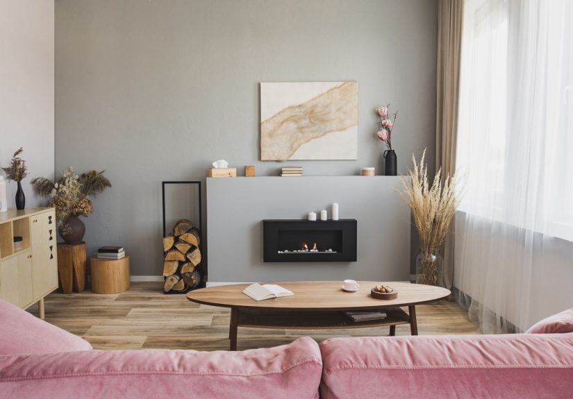
Conclusion: The Best Neutral Is the One That Makes Everything Else Look Better
White will always have a placebut if you want a home that feels layered, intentional, and easy to live in, a non-white neutral is often the smarter move.
Start with the mood you want (warm and cozy, calm and modern, grounded and dramatic), then choose a shade that behaves well in your lighting and plays nicely
with your finishes.
If you’re still torn, here’s the simplest strategy: sample two of these shades in your space, live with them for 48 hours, and pick the one that looks
good in both daylight and lamplight. The right neutral won’t demand attentionit’ll quietly make your home look like you hired help.
Real-Life Paint Experiences: What Usually Happens After the Swatch Stage (Extra )
The most honest part of choosing neutral paint colors happens after the excitement of the first swatch wears offright around the time you realize
you’ve been staring at a beige rectangle for three days like it’s going to reveal the meaning of life. In real homes, neutrals don’t fail because
they’re “boring.” They fail because they’re underestimated.
Here’s what tends to happen: a homeowner picks a warm gray because it looks modern online, then paints a north-facing room and wonders why it feels colder.
That’s not the paint being rudethat’s the light. North-facing spaces naturally skew cooler, so a neutral with a beige undertone (like many greiges)
often feels more comfortable there than a neutral that leans blue or icy gray. This is why designer favorites aren’t just pretty; they’re predictable.
A color like Revere Pewter is popular precisely because it can take a punch from cool light and still look livable.
Another common real-life moment: the “open concept surprise.” You paint one color across the kitchen, living room, and hallway, expecting a seamless flow.
Then you notice the same paint looks slightly different in each zone. That’s because every area has its own mix of natural light, shadows, and reflective
surfaces. Kitchens bounce light off cabinets and counters; living rooms bounce it off upholstery and rugs. A chameleon neutral like Agreeable Gray can
actually help hereit flexes without looking mismatched. The trick is consistency in lighting (bulbs) and a steady trim color so your eye reads the space
as one story, not a set of disconnected scenes.
Beige has its own storyline. People who “hate beige” often hate the wrong beigethe kind that turns yellow, peachy, or murky depending on the time of day.
A modern beige like Accessible Beige tends to win people over because it feels warmer than gray but not syrupy. In homes with warm woods, it can be the
missing link that makes everything feel cohesive instead of visually chaotic. And yes, many people end up liking beige more than they expectedlike someone
who reluctantly tries oat milk and then tells everyone about it.
Then there’s the deep-neutral experience: painting with charcoal. The first 10 minutes feel thrilling. The next hour can feel terrifying (“Did I just make
my dining room a cave?”). But once you add contrastlighter art, warm metal, textured textiles, good lampscharcoal becomes incredibly sophisticated.
A shade like Kendall Charcoal often reads as “designed,” not “dark,” when the room has intentional lighting and at least a few lighter elements to balance
the visual weight. It’s less about bravery and more about planning.
The most practical lesson people learn is also the least glamorous: samples save money and sanity. Paint changes with daylight, shadows, and nearby finishes.
Testing on multiple walls (and checking it at night) is what turns “I hope this works” into “Yep, that’s the one.” In other words: the best neutral
paint color isn’t just a colorit’s a relationship. Date it first. Then commit.