Table of Contents >> Show >> Hide
Because sometimes the problem is not the ad. It is the tragic little detail called “where on earth did you put it?”
Advertising people love to argue about copy, color palettes, brand voice, emotional resonance, and whether a call-to-action button should say Shop Now or Discover More. Meanwhile, the real villain is often standing right there in plain sight: placement. A perfectly decent ad can become a public joke the second a tree branch covers the price, a bus door chops up the headline, or a programmatic buy plants a cheerful family brand next to content that makes everyone deeply uncomfortable.
That is what makes advertising placement fails so weirdly wonderful. They are accidental comedy. They are media planning meeting notes turned into slapstick. They are proof that context is not a side dish in marketing. It is the plate.
And the industry has learned that lesson the expensive way. Major brands have pulled campaigns after their ads appeared beside extremist videos, hateful posts, or low-quality clickbait. At the same time, out-of-home advertising works best when the message fits the place, the mood, and the audience moment. In other words: when placement goes right, people notice the product. When placement goes wrong, people notice the disaster.
This article rounds up 50 of the funniest, cringiest, and most painfully believable ad placement fails that made people laugh instead of buy. Some are classic physical-world mistakes. Others are digital-era blunders born from automation, weak controls, and the eternal optimism of someone who thought a QR code on a speeding train was a solid plan.
Why Advertising Placement Matters More Than Brands Want to Admit
A bad placement does not just waste money. It changes meaning. The same ad can look polished, clever, and persuasive in one setting, then look ridiculous, tone-deaf, or unintentionally hilarious in another. A luxury watch ad on a sleek editorial page feels aspirational. The exact same ad beside a “How To Find Secret Clearance Deals” article suddenly feels like it wandered into the wrong party and will not stop talking about private school.
That is why ad placement fails hit so hard. Humans are context machines. We read the room even when the room is a sidewalk, a subway platform, a mobile feed, or a web page with fourteen blinking banners screaming about miracle collagen gummies. When an ad does not match its environment, the audience does not simply ignore it. They often reinterpret it. And that reinterpretation is where the laughter begins.
So yes, creative matters. Targeting matters. Brand safety matters. But placement is the moment all of those decisions either work together beautifully or trip over a curb in public.
50 Advertising Placement Fails That Made People Laugh Instead Of Buy
Physical Placement Fails: The Street-Level Comedy Tour
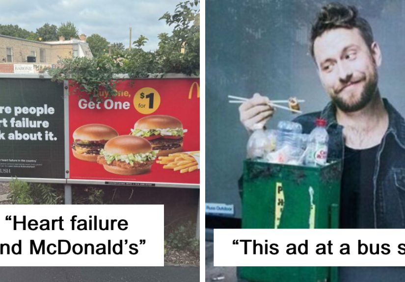
- The billboard hidden by a heroic tree. The media buy may have been premium, but the branches got top billing. Half the slogan disappears, and now the ad reads like a cryptic ransom note.
- The utility pole through the model’s forehead. Nobody intended modern-art horror, but the city infrastructure had other plans. Suddenly the campaign looks less “luxury skincare” and more “medical mystery.”
- The lamppost that edited the logo. One badly placed pole can turn a recognizable brand name into something immature, confusing, or accidentally dirty. Twelve-year-olds notice first. Adults follow quickly.
- The exit-ramp billboard nobody can actually process. Drivers get two seconds, the headline has fourteen words, and the CTA is microscopic. Congratulations: your ad is now a roadside crossword nobody asked for.
- The bus door that rewrites the sentence. Once the doors open, the copy splits in exactly the wrong place. Suddenly the message is less “healthy meal delivery” and more “we deliver regret.”
- The bench ad that makes the spokesperson sit on their own face. Great portrait, unfortunate furniture mechanics. Every passerby sees a celebrity being folded into a park bench like a coupon flyer.
- The escalator that ages the model in real time. Anti-aging cream on moving stairs sounds clever until the ride slices the face into segments. Now the before-and-after happens every three seconds.
- The stair-wrap ad that removes someone’s teeth. A smiling mouth stretched across steps becomes a dental nightmare when the risers break the image apart. Excellent awareness campaign for flossing, terrible campaign for everything else.
- The crosswalk stripes across a swimsuit ad. What was meant to look sleek and summery now looks like abstract censorship. It is less fashion and more “municipal zebra attack.”
- The subway pillar through the family photo. A happy household becomes four unrelated people hiding behind concrete. The emotional storytelling dies somewhere between Platform 2 and structural support.
- The moving walkway that outruns the punchline. Airport ads need timing. If the reveal lands after the traveler glides past, your clever joke is now for the janitor and one confused toddler.
- The digital billboard placed directly by a traffic light. Bright, urgent, flashing, and impossible to ignore is not always a compliment. Nobody loves a call-to-action that feels like a hazard.
- The mall banner hung in the stratosphere. Someone bought an expensive hanging placement, then designed it for people standing six inches away. The result is a giant airborne whisper.
Transit, Retail, and Venue Fails: Good Intentions, Terrible Surroundings
- The floor decal that points to the wrong store. Directional advertising is brilliant until the arrow sends shoppers straight to a competitor. That is not conversion. That is charity.
- The coffee ad placed outside a closed kiosk. Warm, inviting, full of promise, and physically impossible to act on. It is basically emotional damage with a foam heart on top.
- The appetite-suppressant poster outside the food court. On paper, that sounds like smart targeting. In real life, it looks like one brand picked a fight with tacos and lost immediately.
- The gym membership ad beside a donut stand. This one creates the world’s fastest consumer A/B test. People glance left, glance right, and choose frosting with shocking confidence.
- The funeral home ad beside a children’s birthday venue. Context is not just a branding issue. It is also an emotional one. Some pairings make the room go silent in a deeply unhelpful way.
- The allergy ad under blooming trees. The copy says relief is near. The environment says “counterargument.” Everyone sneezes, nobody trusts the poster.
- The sunscreen ad in an underground tunnel. Technically still advertising. Practically speaking, it feels like the sun has filed a restraining order against this campaign.
- The snow-boot ad during a heat wave. Static creative in a dynamic world is risky. On a sweltering sidewalk, winter footwear does not look aspirational. It looks like somebody forgot the season exists.
- The ice-cream campaign during a freezing rainstorm. Timing can make a product irresistible or absurd. This is one of those moments when “treat yourself” sounds less persuasive and more clinically reckless.
- The luxury watch ad on a beat-up bus shelter. Premium branding hates busted surroundings. Even the best product shot struggles when framed by rust, tape residue, and one deeply personal pigeon.
- The perfume ad in a station that smells like brakes and wet coats. Fragrance marketing depends on imagination. Nothing kills imagination faster than public transit in bad weather.
- The QR code placed where no human can scan it. Too high, too small, too fast, too reflective, or all four. The ad says “engage now,” while the environment says “bring a drone.”
- The billboard facing the wrong direction. It is visible, technically. Just not to the traffic that matters. This is what happens when geography and confidence shake hands without supervision.
- The storefront vinyl that blocks the actual merchandise. The promotion is huge. The products are invisible. Shoppers are left admiring the announcement of a sale they cannot browse.
- The parking-garage poster hidden in darkness. Nothing says “trust this financial services brand” like a message nobody can read without the flashlight feature and a mild fear response.
- The projection mapped onto the wrong surface. Fancy visual tech loses its magic when the wall is wrinkled, uneven, or full of windows. Suddenly the product demo looks haunted.
- The pop-up banner placed behind a speaker stack. Event sponsorship should boost visibility, not practice humility. If the audience only sees two letters and a microphone stand, you sponsored mystery.
- The stadium ribbon ad that slices the URL every few seconds. Fans are already distracted. If the web address appears in fragments between innings, you are basically advertising to forensic linguists.
Digital Placement Fails: When Automation Has a Sense of Humor
- The office perks ad next to a layoffs story. There is no faster way to make “We care about our people” sound accidental than placing it beside an article about 3,000 people losing jobs.
- The vacation ad beside air-disaster coverage. Travel marketing depends on emotional lift. Catastrophic adjacency gives it the exact opposite.
- The baby-products banner beside a horror trailer. One minute it is lullabies and soft blankets. The next minute it is demonic lighting and panic. Not every audience overlap is a strategy.
- The fast-food ad on a weight-loss article. Relevance is not the same as sabotage. Sometimes targeting works a little too hard and turns into open mockery.
- The investment ad beside a fraud indictment. “Trust us with your future” is a delicate message. It does not thrive next to headlines involving handcuffs and federal prosecutors.
- The jokey insurance ad beside disaster footage. Humor can be powerful, but not every neighboring piece of content is prepared to meet your quirky mascot with good faith.
- The toy brand pre-roll before mature gaming content. This is how family-friendly brands learn that “broad reach” is not a personality trait. It is a warning sign.
- The premium brand stranded on a clickbait swamp. If the page looks like it was built by ten pop-ups in a trench coat, even a luxury ad starts to feel suspicious.
- The ad that lands on a copycat domain. You paid for prestige and got spoofed by a low-grade imitation site with too many ads and not enough dignity.
- The brand beside misinformation. Nobody intends that adjacency, but consumers rarely care about the backstory. They just see your logo standing awkwardly next to nonsense.
- The retargeting ad that follows after the purchase. Timing matters online too. Showing me the same blender ad after I already bought the blender is less persuasion and more clinginess.
- The luxury retailer next to “coupon hacks” content. Sometimes the mismatch is subtle but devastating. Premium positioning and bargain-chasing energy do not make a graceful couple.
- The wellness brand beside questionable health claims. Even if the surrounding content is not banned, it can still be wildly wrong for the brand. Suitability is where this problem lives.
- The eco-friendly brand on an ad-stuffed low-quality page. Sustainability messaging loses some sparkle when it appears in an environment that looks built purely to harvest impressions and patience.
- The autoplay ad with sound on a memorial or obituary page. Nothing teaches respect for context faster than realizing your cheerful video campaign just barged into a quiet moment.
- The neutral consumer brand dropped into a hyper-polarized political feed. A plain old snack or shampoo ad can suddenly look like it is taking sides just by appearing in the wrong neighborhood.
- The clever ad beneath a toxic comment section. The page itself may be fine. The user-generated chaos below it is not. Context includes what people are doing around the ad, not just the article headline.
- The brand-safe blocklist that blocks everything useful. Not every fail is an unsafe placement. Sometimes the campaign becomes so overprotected that it eliminates quality inventory and sabotages its own performance.
- The ad on a “made for advertising” site no real person enjoys. It technically delivered impressions. It also technically delivered them into a digital hallway lined with sludge, auto-refreshes, and audience indifference.
Classic Design-and-Placement Collisions: The Unintentional Punchline Factory
- The half-covered price point. If the only visible number is the wrong one, shoppers do not see a deal. They see chaos with a dollar sign.
- The door seam through the product. Packaging matters until public infrastructure decides to perform cosmetic surgery on it every time somebody enters the bus.
- The mirrored surface that makes the ad unreadable at noon. Reflection looks futuristic in mockups. In reality, it turns copy into a staring contest with the sun.
- The tiny disclaimer that becomes the main attraction. When the legal text is more readable than the headline, the ad has accidentally become a compliance poster.
- The ad with a joke that only works in one orientation. Rotate it, crop it, wrap it around a pillar, and now the entire concept sounds like it was written during turbulence.
- The “scan me” instruction on a moving vehicle. Society has collectively agreed that some user journeys are simply too optimistic. Chasing a bus for a promo code is one of them.
- The window wrap that clashes with what is behind the glass. A healthy salad brand with a giant burger display inside creates the kind of mixed messaging usually reserved for reality TV.
- The ad placed where people only see it from ten feet below. Perspective is not a minor detail. If the design assumes eye level and the audience gets ceiling view, your beautiful visual becomes a geometry problem.
- The slogan completed by random street graffiti. Cities are collaborative in ways brands do not always appreciate. Sometimes the neighborhood finishes your sentence, and not kindly.
- The campaign that becomes a meme instead of a message. This is the final boss of advertising placement fails. The product disappears, the joke goes viral, and the public remembers everything except what you were selling.
Yes, that list technically wandered past 50 because ad placement failures are like potato chips and regrettable auto-refresh inventory: once you start counting them, they multiply. But the pattern is consistent. Whether the mistake happens on a sidewalk or inside a programmatic auction, the audience responds the same way. They notice the mismatch first, the brand second, and the buying message somewhere around never.
The Real Lesson Behind These Advertising Placement Fails
The funniest part about bad ad placement is that it often exposes a serious marketing truth. Consumers do not separate message from environment nearly as neatly as marketers do. They do not say, “Well, the brand probably did not mean for this luxury fragrance ad to appear next to a dumpster fire of content, so I will judge the creative independently.” No. They just absorb the whole moment at once and decide how it feels.
That is why placement strategy should be treated like creative strategy, not like a boring spreadsheet step that happens after the fun people leave the room. The best campaigns understand context, audience mood, physical constraints, screen behavior, and what the environment might accidentally say back. The worst campaigns assume the ad is strong enough to survive anything. It usually is not.
So before launching the next campaign, it helps to ask a few brutally practical questions. Can people actually see it? Can they read it at speed? Does the surrounding content support the brand or undercut it? Will the environment change the meaning? Could this accidentally become the Internet’s favorite screenshot for all the wrong reasons?
If the answer to that last question is “maybe,” congratulations. You are already doing more quality control than a shocking number of ad placements ever got.
Experiences People Actually Have With Ad Placement Fails
What makes this topic so sticky is that almost everybody has lived some version of it. You do not have to work in media buying to understand the experience of seeing an ad in the wrong place and instantly trusting it less. You are walking through a station, you glance up, and there is a polished poster for peace and relaxation directly above a trash can that is having a very difficult day. You are reading a serious news story, and halfway down the page a cheerful animated banner starts shouting about weekend getaways like it was raised by wolves. The mismatch is immediate. Your brain does not file it under “minor placement issue.” It files it under “what on earth is going on here?”
There is also a very particular kind of secondhand embarrassment attached to these moments. You feel it for the designer who probably made something good. You feel it for the brand manager who approved clean, handsome creative and never imagined a bus hinge would turn the tagline into nonsense. You even feel it for the media planner, at least briefly, before remembering they put a QR code where only migrating birds could use it. Bad placement has a way of making everyone look a little helpless in front of physics, algorithms, weather, architecture, and user behavior.
In the physical world, the experience is often comic because the mistake is visible all at once. A pole is through the face. A bench is under the slogan. A staircase has turned a smile into a crime scene. People laugh because the visual gag is instant. In digital spaces, the experience can be more subtle but just as damaging. The ad is technically visible, technically delivered, technically optimized, and still somehow wrong in a way that makes the brand seem careless. That kind of fail is less slapstick and more trust erosion with a loading icon.
Consumers rarely describe these moments in marketing language. They do not say, “This brand has a contextual alignment problem.” They say things like, “Why is this ad here?” or “That feels weird,” or the devastating classic, “This looks fake.” And that reaction matters because buying decisions are emotional long before they are rational. A placement that feels awkward, invasive, cheap, or wildly off-tone can flatten the ad before the offer even gets a chance.
There is another experience marketers know well: the screenshot spiral. One odd placement gets photographed, shared, reposted, memed, and group-chatted into legend. Suddenly a local execution problem becomes a reputation problem. Nobody shares examples of competent placement because competent placement is invisible by design. It feels natural. But a fail? A fail gets a social life. It travels. It grows jokes. It acquires captions from strangers. It becomes free distribution for the exact wrong message.
That is why the smartest brands obsess over context even when nobody will applaud them for it. When placement works, the audience barely notices the mechanics. The ad feels like it belongs. The message lands cleanly. The brand seems sharper, more thoughtful, more trustworthy. And honestly, that is the dream. Not viral mockery. Not accidental comedy. Just the quiet miracle of an ad showing up where it makes sense and doing the one thing it was hired to do: helping people want to buy.