Table of Contents >> Show >> Hide
- Why Minimalism Started Strong and Then Got Weird
- 1. All-White Rooms That Feel More Clinical Than Calm
- 2. Open Shelving Everywhere, Especially in Kitchens
- 3. Gray-on-Gray Palettes That Drained the Life Out of a Room
- 4. Bouclé Overload on Every Chair, Bench, and Sofa in Sight
- 5. Sculptural Furniture That Looks Amazing but Feels Terrible
- 6. Personality-Free Minimalism That Looks Like a Staged Showroom
- How to Make Minimalism Feel Better in 2026 and Beyond
- Real-Life Experiences: When Minimalist Trends Stop Feeling Peaceful
- Final Thoughts
- SEO Tags
Minimalism was supposed to make our homes feel calm, intentional, and beautifully edited. And when it is done well, it still can. The problem is that somewhere along the way, “less is more” got translated into “strip the soul out of the room and call it elevated.” That is how we ended up with homes that look immaculate in photos, but somehow feel like no one has ever laughed, cooked, read a book, or dropped a hoodie on a chair inside them.
Designers are not rejecting minimalism itself. They are rejecting the versions of it that feel sterile, impractical, and suspiciously like they were assembled by an algorithm that only knows three colors: white, beige, and a gray so cold it could chill soup. Today’s design conversation is less about abandoning simplicity and more about making simple spaces feel warm, personal, and livable.
So let’s talk about the minimalist decor trends that wore out their welcome. Some were too stark. Some were too trendy. Some looked amazing for exactly twelve minutes, right up until real life arrived with dust, fingerprints, houseguests, and a cereal box. Here are six minimalist trends designers are more than ready to leave behind, plus what actually works now.
Why Minimalism Started Strong and Then Got Weird
There is a reason minimalism became so popular in the first place. It promised visual peace in a noisy world. Clean lines, uncluttered surfaces, and restrained palettes can absolutely make a home feel more restful. Minimalist decor also helped many homeowners avoid the kind of overcrowded, buy-everything-at-once look that makes a room feel accidental instead of intentional.
But trends have a funny habit of taking good ideas and stretching them until they snap. Minimalism moved from thoughtful editing to aesthetic overcorrection. Suddenly every room had to be pale, sparse, and suspiciously free of evidence that an actual human lived there. The result was a wave of interiors that felt more staged than soulful. Designers are now pushing back, asking a smarter question: can a home be simple without being soulless? Spoiler: yes. It just takes better choices.
1. All-White Rooms That Feel More Clinical Than Calm
There was a time when all-white interiors felt crisp, aspirational, and endlessly pin-worthy. White walls, white sofas, white drapes, white kitchens, white bedding, white everything. The idea was simple: if the palette is clean, the room will feel serene. In reality, many of these spaces ended up feeling flat, chilly, and one missing lab coat away from looking medical.
The problem is not white itself. White can be beautiful. The problem is when white becomes the whole personality of the room. Without contrast, texture, warmth, or meaningful accents, an all-white space can feel unfinished rather than sophisticated. It often reads less like “peaceful retreat” and more like “luxury rental listing waiting for check-in.”
Designers now tend to prefer rooms that use white as a backdrop rather than the entire story. Warm woods, aged brass, natural stone, soft clay tones, antique pieces, and layered textiles help white interiors feel grounded. Even a simple off-white wall paired with a caramel leather chair or a walnut table can make the space feel infinitely more human.
What to do instead
Keep the light, airy feeling, but add warmth. Try creamy whites instead of stark ones, then layer in texture through linen, wood, plaster, woven shades, and art that does not look like it came in a three-pack labeled “Neutral Set A.”
2. Open Shelving Everywhere, Especially in Kitchens
Open shelving had a strong run because it looked breezy and editorial. In photos, a few stacked plates, a ceramic pitcher, and a strategically placed olive oil bottle can make a kitchen look charmingly effortless. In real life, open shelving often becomes a full-time commitment to dust management and visual discipline.
This trend especially struggles in busy households. Everyday dishes are not always display-worthy. Mugs multiply. Snack boxes appear. Grease exists. Dust does not ask permission. And unless you are blessed with identical tableware and the patience of a museum curator, open shelves can quickly turn a kitchen into an accidental still life called Chaos With Pasta.
Designers increasingly favor storage that hides the mess while still allowing for a little breathing room. That might mean mostly closed cabinetry with one small display shelf, a niche for pretty glassware, or a dedicated coffee station where open storage actually makes sense. The key is restraint. Minimalism should reduce stress, not force you to style your cereal bowls like they are auditioning for a catalog.
What to do instead
Use open shelving sparingly and strategically. One short section can work well for beautiful items you actually use. For everything else, let cabinets do their noble and underappreciated job.
3. Gray-on-Gray Palettes That Drained the Life Out of a Room
Gray was once the reigning monarch of modern minimalism. Gray walls, gray floors, gray sofas, gray cabinets, gray rugs, and if the room was feeling adventurous, perhaps a gray throw blanket. At first, it felt sleek and safe. Then it started to feel like the visual equivalent of a cloudy Tuesday that never ends.
Cool grays can make a room look polished, but when they dominate every surface, the space often feels cold and emotionally distant. Gray-heavy interiors also tend to flatten architectural details and mute the natural warmth that makes a home inviting. Many designers now see the gray wave as a classic case of trend fatigue: what once felt current now often feels generic and a little dated.
That does not mean neutral palettes are over. It means warmer neutrals are taking the lead. Think mushroom, taupe, putty, sand, camel, warm beige, tobacco, soft terracotta, and natural wood tones. These colors still feel understated, but they bring depth and comfort instead of the energy of a luxury parking garage.
What to do instead
If you already have gray flooring or furnishings, soften the look with warmer paint, richer wood tones, layered textiles, and lighting that creates an inviting glow. Gray is easier to live with when it is part of the cast, not the entire cast and crew.
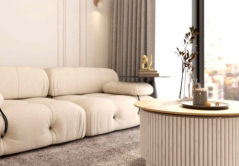
4. Bouclé Overload on Every Chair, Bench, and Sofa in Sight
Bouclé arrived with serious main-character energy. The nubby texture looked cozy, elevated, and modern all at once. Suddenly it was everywhere: accent chairs, beds, ottomans, stools, dining chairs, benches, and enough white bouclé sofas to make it seem like the whole country had agreed to furnish their living rooms with fancy sheep.
The issue is not that bouclé is ugly. It is that it became overused fast. When every minimalist room started featuring the same creamy, rounded bouclé piece, the material lost its charm and started feeling formulaic. On top of that, many designers now point out the practical downside: some bouclé fabrics can show wear, snag, trap dirt, and look tired faster than smoother, more durable upholstery.
Texture is still important in minimalist decor, but variety matters more than trend loyalty. Linen, wool blends, cotton velvet, mohair, leather, performance fabrics, and natural woven materials can all bring depth without making a room feel like it copied and pasted its furniture from the same social media board.
What to do instead
If you love bouclé, use it in moderation. One well-made accent piece can still look great. Just do not let it take over the room like a very stylish, slightly high-maintenance houseguest.
5. Sculptural Furniture That Looks Amazing but Feels Terrible
Minimalist interiors have long loved sculptural furniture. Curved sofas, low-profile chairs, pebble-shaped coffee tables, armless lounge pieces, and dramatic silhouettes all photograph beautifully. The trouble begins when the furniture behaves more like an art installation than something you can comfortably use for longer than twenty minutes.
Designers are increasingly skeptical of pieces that prioritize shape over function. A sofa can be sleek without forcing everyone to perch on it like nervous flamingos. A chair can be modern without requiring Olympic core strength to stand back up. And a coffee table can be organic and chic without having a surface too tiny to hold a remote, much less a drink.
This is one of the biggest shifts in current minimalism: comfort is back on the guest list. People want homes that look polished but still welcome daily life. That means deeper seats, better ergonomics, practical table surfaces, and materials that hold up to actual use. A room is not truly well designed if everyone secretly prefers sitting on the floor.
What to do instead
Choose furniture with clean lines and subtle curves, but test it for comfort and function. If a piece is beautiful and usable, that is timeless. If it is beautiful and impossible, it is just a future regret with upholstery.
6. Personality-Free Minimalism That Looks Like a Staged Showroom
This is the trend designers seem most eager to retire: minimalist spaces so edited that they erase the people who live there. A pale sofa, one oversized vase, a stack of unread neutral books, abstract art that says absolutely nothing, and no sign of hobbies, memories, humor, family, or life. The room may look expensive, but it often feels anonymous.
The biggest criticism of this style is that it mistakes emptiness for sophistication. Good design is not about removing every object with a backstory. It is about choosing what matters and letting it shine. A home should reveal something about its owner. Maybe that is vintage photography, inherited pottery, travel finds, great books, or a wildly specific lamp that makes no sense to anyone else but brings you joy every single day.
Designers today are leaning toward minimalism with character. That means fewer objects, yes, but better ones. It means editing with intention instead of decorating by subtraction alone. A room can be spare and still have warmth, history, and wit. In fact, that is usually what makes it memorable.
What to do instead
Keep the clutter low, but let the personality show. Mix old and new. Display books you actually read. Hang art you actually like. Add one surprising color or object that makes the room feel lived-in rather than merely approved.
How to Make Minimalism Feel Better in 2026 and Beyond
If designers are over these trends, what are they embracing instead? Not maximalist chaos for the sake of it. The better direction is thoughtful warmth. Minimalism still works when it includes comfort, texture, authenticity, and a sense of identity.
- Choose warm neutrals: creamy whites, mushroom, sand, camel, olive, and wood tones age better than icy grays.
- Prioritize real life: hidden storage, durable fabrics, and comfortable furniture beat photo-ready impracticality every time.
- Mix textures: linen, plaster, wood, stone, wool, leather, and metal create depth without clutter.
- Use display space carefully: a little styling goes a long way; too much starts looking theatrical.
- Add meaningful objects: the goal is edited, not erased.
- Invest in longevity: simple shapes with quality materials will outlast trendy silhouettes and one-note palettes.
In other words, the future of minimalist decor is not colder. It is smarter. It is less about proving you have taste and more about creating a home that feels good on a random Tuesday when the mail is on the counter and someone is reheating leftovers.
Real-Life Experiences: When Minimalist Trends Stop Feeling Peaceful
One of the most interesting things about these trends is that many people do not realize they dislike them until they actually live with them. On social media, an all-white living room reads as calm and luxurious. In a real home, it can become a low-level source of anxiety. People sit down carefully. They avoid red wine like it is a legal issue. They buy washable slipcovers, stain removers, and sometimes a whole new personality built around saying, “Please use a coaster.” That is not peace. That is upholstery-based stress management.
Open shelving follows a similar pattern. At first, it feels liberating. The kitchen looks bigger. Everything seems within reach. Then real life enters the chat. Suddenly there are mismatched mugs from three different eras, a protein powder container the size of a toddler, and a layer of grease-dust that appears out of nowhere like it pays rent. What looked charming in a styled photo can start to feel like a part-time job in everyday use.
Gray-heavy minimalism also tends to change emotionally once people spend time inside it. What felt crisp during the renovation phase can start feeling flat by the second winter. Homeowners often describe these rooms as “nice, but not cozy,” which is a polite way of saying the room looks expensive and somehow still makes you want to wear a sweater indoors. Warmth matters more than many trend cycles admit. People do not just want rooms that photograph well. They want rooms that restore them.
Bouclé and sculptural furniture create another very real kind of buyer’s remorse. People are drawn to soft, rounded shapes because they look inviting. But once the novelty wears off, practical questions show up fast. Does this chair support my back? Will this fabric survive kids, pets, jeans, or life in general? Can I set anything useful on this tiny artistic coffee table, or is it mainly here to be admired from a respectful distance? Many homeowners end up learning that “beautiful” and “easy to live with” are not automatically the same thing.
Perhaps the biggest experience people report, though, is emotional rather than practical: overly minimal spaces can feel strangely impersonal over time. A room without books, personal art, collected objects, or visible signs of life may look tidy, but it rarely feels memorable. Guests compliment it, then forget it. The homeowner keeps trying to understand why the room still feels unfinished, even though technically nothing is wrong with it. Usually, what is missing is not another expensive object. It is identity.
That is why so many designers are encouraging a softer, more lived-in version of minimalism now. The most satisfying homes are edited, but not empty. Clean, but not cold. Stylish, but not so precious that nobody can relax. The best rooms do not look like they were frozen at the perfect moment for a photo. They look like people live there happily, comfortably, and with enough confidence to own a weird lamp if they love it. Honestly, that sounds a lot more luxurious than another beige vase ever could.