Table of Contents >> Show >> Hide
- Why These Female Logo Transformations Took Off
- What Makes an Iconic Logo Easy to Reimagine
- The 9 Female Logo Transformations That Stole the Show
- What These Makeovers Say About Branding and Gender
- Not Every Iconic Logo Started in a Male World
- Why the Results Look Awesome Instead of Awkward
- Experiences Related to These Female Logo Makeovers
- Final Thoughts
There are few things on Earth more stubborn than a famous logo. Once a symbol works its way into the public brain, it practically rents a luxury apartment there. You do not simply “adjust” the Pringles guy, the Monopoly mascot, or the McDonald’s arches without people noticing. And yet that is exactly why this female-logo makeover project landed so well: it took some of the world’s most recognizable brand marks, gave them a feminine twist, and proved just how deeply gender can be baked into visual identity without most of us ever stopping to think about it.
The idea is clever on its face, but it is more than a one-joke design stunt. These redesigned logos work because they expose something branding often tries to hide in plain sight: the so-called “neutral” default in advertising has often been male. A mustache, a tux, a strong jawline, a schoolboy silhouette, a heroic pose on a moon, and suddenly we accept all of it as normal, classic, timeless. Switch those cues to female-coded ones, though, and the logo feels fresh, surprising, and weirdly revealing all at once.
That tension is what makes this topic so much fun to unpack. The makeovers are playful, yes, but they also say something meaningful about design, culture, and the quiet power of mascots. More importantly, they show that a logo can evolve without losing its identity. In fact, when the redesign is smart, the core symbol can become even more interesting.
Why These Female Logo Transformations Took Off
The appeal of these redesigned logos comes down to three things: instant recognition, visual surprise, and cultural timing. When an audience already knows a mascot by heart, even a tiny shift feels dramatic. That is why the female versions of Pringles, Monopoly, DreamWorks, Bic, and the rest got such a strong reaction. The original forms were already so familiar that a hairstyle change, wardrobe tweak, or silhouette adjustment was enough to make people do a double take.
And timing mattered. The redesigns were tied to a broader conversation about women’s visibility in creative industries, where representation has often lagged behind the culture those industries claim to reflect. That is part of what made the project resonate beyond design nerd circles. People were not just looking at altered logos; they were looking at a visual argument. The message was simple: if brand identity has been shaped through a heavily male lens for years, what would it look like if women were centered instead?
That question hits harder than it sounds. A logo is supposed to be shorthand for a brand’s personality, values, and promise. So when many of the world’s most memorable mascots default to male-coded imagery, it is fair to ask what kind of visual world consumers have been trained to accept as normal.
What Makes an Iconic Logo Easy to Reimagine
Not every logo can survive a makeover. Some would fall apart the second you touched them. The ones in this project held together because they already followed the golden rules of great logo design: they are simple, memorable, adaptable, and unmistakable even in altered form. The best logos do not depend on twenty tiny details and a prayer. They work as silhouettes. They work in black and white. They work on packaging, billboards, apps, and coffee cups. In other words, they have backbone.
That backbone is exactly what makes gendered reinterpretation possible. When a logo is iconic enough, you can swap hair, posture, accessories, or expression without losing the original identity. The brand stays recognizable, but the emotional signal changes. That is design catnip. It creates a new conversation while keeping the visual DNA intact.
Put simply, the makeover works because the logos were strong before the redesign began. You are not watching weak branding get rescued. You are watching strong branding prove how flexible it really is.
The 9 Female Logo Transformations That Stole the Show
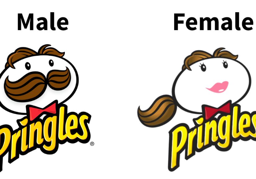
1. Miss Pringles
The Pringles mascot is one of the easiest characters in the world to recognize. The face, the hair, the bow tie, the glorious mustache that practically deserves its own SAG card—it is all unmistakable. Turning that familiar chip-can gentleman into a female version works because the redesign keeps the bold circular face and confident expression while shifting the styling. The result feels playful rather than forced. It says, “Yes, this is still Pringles. She just has a different vibe now, and honestly she owns the shelf.”
2. Miss Monopoly
The Monopoly mascot has always looked like old-money confidence in human form. Top hat, tuxedo energy, smug little smile—the man practically invented the phrase “I own railroads and opinions.” Reimagining that character as a woman is especially effective because it flips a symbol long associated with male power, capital, and boardroom swagger. The makeover does not ruin the joke of Monopoly; it sharpens it. Suddenly the character looks less like a relic and more like a reminder that money, ambition, and authority should never have been coded as masculine in the first place.
3. Miss Schwarzkopf
Schwarzkopf’s silhouette is sleek, elegant, and already beauty-adjacent, which makes the female reinterpretation feel almost inevitable. Of all the redesigns, this one has a kind of visual smoothness to it. It does not scream for attention. It glides. The makeover fits because haircare branding already operates in a world of beauty ideals, identity, and self-presentation. Giving the logo a feminine profile feels less like rebellion and more like a smart reveal of something that was always hovering just beneath the surface.
4. Miss DreamWorks
The DreamWorks logo is built on a dreamy, storybook image: a child perched on a moon with a fishing rod, suspended in a cinematic sky. Recasting that figure as a girl changes the tone in a subtle but meaningful way. The original logo always communicated imagination, wonder, and fantasy. The female version keeps all of that, but broadens who gets to inhabit the dream. It is a gentle redesign, yet it quietly expands the emotional invitation of the image. Same moon, same magic, wider point of view.
5. Miss Bic
Bic’s mascot is famously minimal: a schoolkid-like figure with a pen for a head, clean lines, and a no-nonsense posture. That simplicity is exactly why the makeover works. There is almost nothing there, which means every tiny design cue matters more. A change in silhouette or styling instantly shifts the read without making the logo collapse. It also says something interesting about education and office branding, areas that have long leaned on neutral-looking symbols that turn out to be not so neutral after all.
6. Miss BAFTA
BAFTA’s mask already carries drama, performance, and artistic prestige. A female version of that identity lands because acting itself is built on transformation. The redesign feels theatrical in the best sense. It does not look like a totally different symbol; it looks like the same symbol stepping into a new role. There is something fitting about a film-and-television institution getting a gender-flipped emblem, because screen culture has spent decades wrestling with who gets centered, who gets sidelined, and who is allowed to become iconic.
7. Miss Oscar
The Oscar statuette is one of the most formal symbols in entertainment. It is polished, upright, and almost absurdly solemn, like a tiny gold person who has never once spilled coffee on themselves. Reimagining it as female is powerful precisely because awards culture has so often treated male prestige as the default setting. A female Oscar does not need fireworks to make its point. The point is already there in the silhouette: when the symbol of cinematic excellence shifts, the culture around that symbol suddenly looks less fixed than it pretended to be.
8. McDonald’s
McDonald’s took a slightly different route because its logo is not a mascot face but an abstract icon: the Golden Arches. And yet that is what makes the gender tribute especially smart. By flipping the “M” into a “W,” the brand used its own simplicity to create a visual salute to women. It was a reminder that not every brand needs to redraw a person in order to make a cultural statement. Sometimes the strongest move is the smallest one. One turn, one letter, one headline, and everybody gets it.
9. MTV
MTV has always had an elastic identity. It was never a brand that behaved like a museum piece. It mutates, remixes, and experiments. So a female-leaning reinterpretation suits it naturally. The brand has long lived in pop culture’s messiest, loudest, most expressive corners, which makes a gender-forward variation feel less like a disruption and more like a continuation of the network’s shape-shifting DNA. In other words, if any logo can show up in a new look and still wink at the audience, it is MTV.
What These Makeovers Say About Branding and Gender
The bigger story here is not just that the logos look cool. It is that they expose how often masculinity has functioned as invisible default branding. When a mascot is male, audiences rarely pause to label it as male. It just reads as normal. When a mascot is female, though, the gender becomes visible immediately. That double standard tells us a lot about visual culture.
This is where the conversation moves from cute redesigns to actual analysis. Research into brand mascots has shown that male mascots significantly outnumber female ones, and female mascots are more likely to be portrayed through stereotypes. That matters because mascots are not decorative fluff. They help signal authority, humor, trust, expertise, friendliness, and status. If the dominant brand characters consumers see are male, and the female ones are narrower or more stereotyped, then branding is not just reflecting culture. It is reinforcing it.
The female logo transformations work so well because they break that pattern without becoming preachy. They do not lecture the viewer. They simply swap the visual defaults and let the audience feel the difference. That is often the smartest way to make a cultural point: let the image do the talking while the rest of us scramble to catch up.
Not Every Iconic Logo Started in a Male World
There is another twist here that makes the whole topic richer: some of the world’s most enduring logos were shaped by women in the first place. The Nike Swoosh, for example, was created by Carolyn Davidson, and it became one of the clearest examples of how a simple mark can grow into global mythology. Muriel Cooper’s MIT Press colophon is another landmark in logo history, proving that elegant, influential visual systems have long been built by women even when the broader design world failed to give them equal visibility.
And not every famous female-coded symbol is new, either. Starbucks has been anchored for decades by the Siren, a female figure whose look evolved over time while remaining central to the brand’s identity. That matters because it shows there was never anything inherently impossible about putting women at the center of iconic branding. It has always been possible. It just has not always been common.
That is why the logo makeover project feels so sharp. It is not claiming women do not belong in branding. It is pointing out that women have always belonged there, whether as designers, symbols, or decision-makers. The issue has never been capability. The issue has been visibility.
Why the Results Look Awesome Instead of Awkward
Let us be honest: campaigns with a social message can go sideways fast. The internet has a full warehouse of cringe to prove it. But these transformed logos avoid that trap because they do not over-design the idea. They respect the original shapes. They keep the jokes crisp. They do not try to reinvent each brand from scratch or turn every logo into a giant corporate TED Talk.
The best redesigns here succeed because they are light on their feet. They use restraint. That is a big reason the results look awesome rather than clumsy. Good design knows when to stop. It does not dump twenty symbols into one image and then hope empowerment happens by sheer force of decoration. These makeovers make a point with minimal visual fuss, and that economy is exactly what gives them style.
Also, they are just fun to look at. That should not be underrated. Serious ideas do not have to show up wearing a beige cardigan. Sometimes they arrive through smart visual play, raise one eyebrow, and leave the whole internet debating mascots at lunch.
Experiences Related to These Female Logo Makeovers
There is a very specific experience that happens when you see one of these transformed logos for the first time. Your brain recognizes the brand before it fully understands what changed. For a split second, it is like meeting someone you know well in a new haircut, new glasses, and a dramatically improved sense of self. You know them. You absolutely know them. But your mind still pauses, recalibrates, and says, “Wait a second… why does this feel new?” That tiny moment of recognition-plus-surprise is part of the thrill.
Another common experience is realizing how much brand imagery lives in muscle memory. Nobody wakes up planning to feel emotionally attached to a snack mascot or a game-piece tycoon. Yet the second those symbols change, people react like a neighbor repainted the house overnight. That is because logos are not just commercial graphics. They are visual habits. We grow up with them on shelves, screens, signs, packaging, commercials, and shopping bags. By the time we are adults, we do not merely recognize them; we carry them around in our heads like permanent wallpaper.
That is why the female versions feel so personal to so many viewers. The experience is not just about seeing “a new design.” It is about watching a familiar symbol reveal a bias you had never fully noticed. A lot of people see these makeovers and laugh first. Then they think. Then they laugh again, but differently. It is the laugh of recognition, the one that says, “Oh wow, of course that original mascot was male-coded. I just never stopped to name it.”
For women especially, there is often another layer to the experience. Seeing a familiar logo rewritten through a female lens can feel oddly validating. It is a small thing, but not a trivial one. When culture repeatedly presents male-coded imagery as universal, female-coded imagery can feel marked, niche, or secondary. So when a major symbol gets reimagined and still looks powerful, polished, and instantly legible, it quietly pushes back on that old hierarchy. It says women are not a special edition of the default. They are part of the main visual language too.
For designers, the experience is even more delicious. It becomes a kind of case study in semiotics, brand elasticity, and the psychology of perception. Which details are doing the heavy lifting? Is it the hair, the posture, the accessory, the negative space, the color, the facial expression? How little can you change before an audience notices? How much can you change before the mark breaks? These are the kinds of questions that make brand strategists lean forward in their chairs like they have just been handed coffee and gossip at the same time.
There is also the social media experience, which is its own species of theater. People share the logos because they are visually punchy, easy to understand in a second, and inviting to comment on. One person praises the creativity. Another says one redesign works better than another. Somebody inevitably declares one version “cuter,” which is both amusing and proof that brand mascots really do function like characters in the public imagination. Before long, a design project becomes a conversation about gender, nostalgia, identity, and whether the Monopoly mascot has always looked like he gives terrible dinner-party advice.
Maybe the most interesting experience of all, though, is the aftereffect. Once you have seen these transformed logos, it becomes harder to unsee the original assumptions behind branding. You start noticing how often authority is drawn one way, humor another, glamour another, and expertise another. The project follows you out of the post and into the real world. Suddenly a cereal box, shampoo bottle, or billboard feels less accidental than it did five minutes earlier.
And that is the mark of an effective creative idea. It does not just entertain you while you are looking at it. It rewires how you look afterward. These female logo makeovers may arrive with a wink, but the experience they create lingers because it changes the viewer, not just the image.
Final Thoughts
The brilliance of these transformed logos is that they manage to be stylish, funny, and pointed at the same time. They honor the strength of the original brand marks while revealing how much cultural baggage can hide inside something as simple as a mascot or silhouette. That is not easy to do. Plenty of visual campaigns make noise; far fewer make a point with this much elegance.
In the end, these female logo versions work because they do not ask us to abandon iconic branding. They ask us to look at it more closely. And once you do, the takeaway is hard to miss: the world of logos has never been as neutral as it liked to pretend. Sometimes all it takes is a brilliant redesign to show that the familiar can still surprise us—and that a smarter, more inclusive visual culture can look every bit as iconic.