Table of Contents >> Show >> Hide
- Before We Dive In: A Fast, Friendly Orange Pairing Cheat Sheet
- The Main Event: 30 Bright, Bold Colors That Go with Orange
- How to Make Orange Color Combinations Look “Designed” (Not Accidental)
- Orange Palette Ideas You Can Steal Today
- Conclusion
- Extra: Practical Experiences & Lessons (So You Don’t Learn Them the Hard Way)
- 1) “Too much orange” is usually a lighting problem (not a personality problem)
- 2) Undertones decide whether your palette feels chic or chaotic
- 3) The fastest way to make orange look expensive: give it a dark anchor
- 4) Small orange beats big orange in bedrooms (most of the time)
- 5) Don’t “match” orangeecho it
- 6) The “one loud print” rule saves outfits and rooms
- 7) When in doubt, add a metal
Orange is the extrovert of the color wheel. It shows up early, talks to everyone, and somehow convinces the whole room to have “just one more” accent pillow.
Whether you’re decorating a living room, planning a brand palette, or trying to wear orange without looking like a traffic cone with Wi-Fi, the secret is pairing it
with colors that either challenge it (high contrast) or harmonize it (same vibe, different volume).
This guide gives you 30 bright, bold colors that go with orangeplus real-world tips for making the combo look intentional, not accidental.
You’ll see what works for burnt orange, tangerine, persimmon, and neon-citrus shades, with examples for
interiors, outfits, and digital design.
Before We Dive In: A Fast, Friendly Orange Pairing Cheat Sheet
Orange plays well with others because it sits in a powerful spot on the color wheel. The best pairings usually fall into three “buckets”:
- Complementary contrast: Orange + blue (or blue-leaning shades) = instant energy and clarity. Great for modern interiors and bold branding.
- Analogous warmth: Orange + reds/pinks/yellows = a sunset palette (cozy, playful, and lively). Great for eclectic rooms and fashion.
- Triadic punch: Orange + green + purple families = vibrant balance. Great when you want “designed” rather than “decorated.”
One more pro rule: tone-match your saturation. If your orange is loud (think tangerine), pair it with equally confident colors (cobalt, emerald,
fuchsia). If your orange is earthy (burnt orange), it loves deeper, moody partners (navy, hunter green, charcoal).
The Main Event: 30 Bright, Bold Colors That Go with Orange
Below are 30 colors that match orangeeach with a quick “why it works” and a practical example. Use them as a pick-list, or mix and match into your
own orange color palette.
Bold Blues (Orange’s Favorite Rival)
1) Navy Blue
Navy turns orange from “fun” to “polished.” This pairing feels classic, coastal, and quietly expensive.
Try it: Navy walls + a burnt orange leather chair + bright white trim.
2) Cobalt Blue
Cobalt is high-voltage contrastperfect with bright orange accents. It’s crisp, sporty, and modern.
Try it: Cobalt throw pillows on a neutral sofa with a tangerine rug pattern.
3) Sapphire Blue
Sapphire is richer than cobalt and reads more jewel-toned. It makes orange look intentional and “designed,” not random.
Try it: Sapphire cabinetry with orange barstools (or vice versa) for a bold kitchen moment.
4) Electric Blue
Electric blue + orange is playful and attention-grabbinggreat for streetwear palettes, sports branding, and creative studios.
Try it: Electric blue sneakers with an orange hoodie; keep everything else neutral.
5) Aqua
Aqua gives orange a breezy, beachy vibe. It’s a lighter contrast that still feels bright.
Try it: Orange accent lamp on an aqua side table, balanced with natural wood.
6) Teal
Teal is the “grown-up fun” optioncool enough to calm orange, saturated enough to keep the energy.
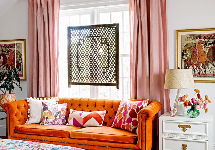
Try it: Teal velvet sofa + orange art + brass accents.
7) Turquoise
Turquoise leans tropical and youthful. Pair it with orange when you want a fresh, upbeat palette that feels sunny.
Try it: Turquoise shower curtain + orange towels + white tile.
8) Peacock Blue
Peacock blue sits between blue and green, so it bridges orange into earthier palettes.
Try it: Peacock blue feature wall with terracotta/orange ceramics on open shelving.
9) Periwinkle
Periwinkle is blue with a whisper of purplesoft, but still colorful. It makes orange feel friendlier and less intense.
Try it: Orange bedding accents with periwinkle walls for a playful guest room.
10) Indigo
Indigo is moodier than navy and pairs beautifully with burnt orange and copper tones.
Try it: Indigo denim + orange knit sweater + tan boots (simple, strong, repeatable).
Greens That Make Orange Look Rich (Not Random)
11) Emerald Green
Emerald and orange is jewel-tone magic. It’s bold, festive, and dramatic without being chaotic.
Try it: Emerald curtains with orange patterned pillows and warm wood furniture.
12) Jade Green
Jade is fresh and modernespecially with brighter oranges. It’s like a botanical garden that also knows how to dance.
Try it: Jade kitchen accessories with orange cookware and white countertops.
13) Forest Green
Forest green grounds orange, especially earthy oranges like rust or terracotta. It reads cozy and timeless.
Try it: Forest green rug + burnt orange accent chair + cream walls.
14) Hunter Green
Hunter green is deeper and slightly more formal than forest. It makes orange feel warm and “heritage.”
Try it: Hunter green blazer with an orange pocket square (holiday party, but tasteful).
15) Lime Green
Lime is fearless. With orange, it becomes high-energy and youthfulbest used in smaller doses.
Try it: Lime art prints in a room with orange accents and lots of white space.
16) Chartreuse
Chartreuse is a yellow-green that loves orange because they share warmth. Together they feel modern and trend-forward.
Try it: Chartreuse vase + orange flowers + charcoal tabletop.
17) Olive Green
Olive turns orange into an earthy, desert-inspired palette. It’s less “pop,” more “premium.”
Try it: Olive walls with terracotta/orange textiles and black accents.
18) Wasabi Green
Wasabi green brings punchy, contemporary contrastespecially fun with persimmon or vivid orange shades.
Try it: Wasabi statement chair + orange throw + neutral sofa (keep it curated).
19) Mint Green
Mint cools orange down while staying playful. Great for kitchens, kids’ spaces, and retro-inspired looks.
Try it: Mint cabinets + orange hardware or dishware for a cheerful twist.
20) Seafoam Green
Seafoam is breezy and soft, but still colorful. It pairs nicely with orange when you want “bright” without “shouty.”
Try it: Seafoam accent wall + orange framed prints + light wood.
Pinks & Reds: Sunset Energy (But Make It Stylish)
21) Hot Pink
Hot pink + orange is maximalist, joyful, and fearless. If you want a room to feel like a party (in a good way), start here.
Try it: Orange sofa with hot pink art and lots of white walls to keep it breathable.
22) Fuchsia
Fuchsia is a cooler, deeper pink that creates bold contrast without looking juvenile.
Try it: Fuchsia clutch with an orange dress; add gold jewelry to tie it together.
23) Magenta
Magenta adds drama. With orange, it feels editorialgreat for statement rooms, creative brands, and bold prints.
Try it: Magenta throw + burnt orange pillow + charcoal sofa.
24) Bubblegum Pink
Bubblegum pink is playful and bright, perfect with tangerine or sherbet oranges.
Try it: Bubblegum accent chair + orange side table + crisp white walls.
25) Raspberry
Raspberry sits between pink and red. It pairs beautifully with orange in floral palettes and bold textiles.
Try it: Raspberry patterned rug with orange accents and warm wood.
26) Cherry Red
Red and orange are neighbors on the wheelso the combo feels naturally warm and energetic. The key is controlling proportions.
Try it: Mostly orange with small cherry red details (or the other way around) plus neutral grounding.
27) Crimson
Crimson is deeper and moodier than cherry red. It makes orange feel luxe and fall-ready.
Try it: Burnt orange walls with crimson textiles and warm metals.
28) Coral
Coral is orange’s friendly cousin. Together they create a layered, tonal lookwarm, flattering, and easy to live with.
Try it: Orange accessories with coral upholstery and sandy neutrals.
Purples & Power Neutrals (Because Orange Needs a Supporting Cast)
29) Violet
Violet + orange is bold, artistic, and high-impact. It’s a classic “creative” combo that looks amazing in graphic design and statement interiors.
Try it: Violet accent wall with orange art, balanced by white or charcoal.
30) Metallic Gold
Gold warms orange up and makes it glow. It’s the easiest way to make orange look elevatedlike it’s wearing a blazer.
Try it: Orange pillows + gold frames + deep blue backdrop for a polished, layered palette.
How to Make Orange Color Combinations Look “Designed” (Not Accidental)
1) Match the orange to the mood
- Burnt orange / rust / terracotta: loves navy, hunter green, charcoal, gold, and natural textures (leather, wood, linen).
- Tangerine / bright orange: loves cobalt, turquoise, hot pink, chartreuse, and crisp white.
- Persimmon / reddish orange: loves teal, jade, deep blue, and warm neutrals for balance.
2) Use the “60–30–10” trick
If you’ve ever walked into a room and thought, “This is… a lot,” it probably needed clearer proportions. A classic design move:
60% dominant (often a neutral), 30% secondary (your main partner color), 10% accent (orange or a punchy pop).
Orange works beautifully as the 10%pillows, art, vases, lamps, trim, sneakers, lipstick, you name it.
3) Give orange a “resting place”
Orange looks best when it has something calm nearby: bright white, charcoal, natural wood, or even a big field of navy. That breathing room prevents the palette
from feeling like a clearance aisle exploded (no offense to clearance aislesthey raised us).
4) Let materials do some of the work
Orange in velvet feels richer. Orange in leather feels classic. Orange in high-gloss paint feels modern and loud.
If your orange feels too intense, swapping the finish can calm it down without changing the color.
Orange Palette Ideas You Can Steal Today
For interiors
- Classic contrast: Navy + bright white + orange + gold.
- Modern tropical: Turquoise + orange + chartreuse + white.
- Earthy luxe: Olive + burnt orange + charcoal + brass.
- Creative studio: Violet + orange + teal + white.
For outfits
- Easy win: Orange top + dark denim (indigo) + white sneakers.
- Statement look: Orange dress + fuchsia bag + gold jewelry.
- Fall-ready: Burnt orange sweater + olive pants + black boots.
For branding and web design
- High contrast CTA: Orange buttons on deep navy backgrounds with lots of white space.
- Playful youth brand: Orange + electric blue + bubblegum pink (use black text for clarity).
- Premium warmth: Burnt orange + hunter green + gold accents + off-white backgrounds.
Conclusion
The best colors that go with orange aren’t just “pretty together”they support a mood. Blue-based shades give orange crisp contrast, greens make it
feel lush and grounded, pinks and reds create sunset energy, and gold turns it instantly upscale. Pick your orange, pick your vibe, and let proportion do the heavy lifting.
Orange will do the restbecause orange always does.
Extra: Practical Experiences & Lessons (So You Don’t Learn Them the Hard Way)
Color pairing advice is cute in theory… right up until your living room looks like a karaoke bar at noon. So here are real-world, experience-based lessons that show up
again and again when people try bold orange color combinations in homes, outfits, and design projects.
1) “Too much orange” is usually a lighting problem (not a personality problem)
A bright orange that feels fun in daylight can turn aggressive under warm bulbs at night. The fix isn’t always repaintingsometimes it’s swapping bulbs to a more neutral
temperature, adding layered lighting (floor lamp + table lamp + overhead), or increasing soft textures that absorb glare. If orange starts yelling at 8 p.m., lighting is the
megaphone. Take the megaphone away.
2) Undertones decide whether your palette feels chic or chaotic
Orange can lean yellow (tangerine), red (persimmon), or brown (burnt orange). The partner color should “agree” with that undertone. Tangerine loves crisp blues and bright
whites. Persimmon loves teals and richer blues. Burnt orange loves hunter green, charcoal, and warm metals. When the undertones fight, the room feels offeven if you can’t
explain why. When undertones match, everything looks like it came from the same stylist.
3) The fastest way to make orange look expensive: give it a dark anchor
Designers repeatedly rely on the same trick: pair orange with a deep, stable base (navy, indigo, hunter green, charcoal). The dark color “frames” orange so it reads like a
deliberate accent, not an accident. This works in fashion too: orange plus dark denim or black looks sharper than orange plus medium gray or washed-out neutrals.
4) Small orange beats big orange in bedrooms (most of the time)
Orange is energizing. That’s wonderful for kitchens, entryways, studios, playrooms, and anywhere you want movement and conversation. But in bedrooms, large areas of vivid
orange can feel like your walls are encouraging you to start a group chat at midnight. If you love orange in a bedroom, use it as an accent: art, a throw blanket, a bench,
lamp shades, or a patterned rug. You get the warmth without the caffeine.
5) Don’t “match” orangeecho it
Beginners often try to match orange perfectly across multiple items (same orange pillow, same orange vase, same orange art). That’s how you end up with a room that looks
like it’s wearing a uniform. A more natural, designer-friendly approach is to echo orange in different shades: burnt orange + terracotta + coral, or
tangerine + peach + a tiny pop of neon orange. The palette becomes layered, not loud.
6) The “one loud print” rule saves outfits and rooms
If you’re using orange with another bold color (like hot pink or chartreuse), pick one element to carry the dramausually a patterned rug, a statement jacket, or a single
piece of art. Then keep the surrounding pieces calmer (white, charcoal, navy, wood). This keeps the combo vibrant while still livable. Translation: let one item be the
main character. Everybody else is supporting cast.
7) When in doubt, add a metal
Orange looks incredible next to warm metalsespecially gold and brass. If a palette feels unfinished, metallic accents often “seal” it: frames, hardware, lighting, mirror
trims, or jewelry. Metals act like punctuation. Orange is the sentence; gold is the period that makes it feel complete.
Bottom line: orange is bold, but it’s not difficult. Choose a strong partner color (or two), keep your proportions clear, and give orange some breathing room.
Do that, and orange goes from “Whoa” to “Wow.”