Table of Contents >> Show >> Hide
There are two kinds of people on the internet: the ones who scroll for “inspo,” and the ones who scroll for
“proof that someone out there owns a home that doesn’t look like a tangled phone-charger drawer.”
If you’re in the first group, welcome. If you’re in the second group… also welcome. You’re among friends.
Accounts like Home And Decor on X (formerly Twitter) are basically visual comfort food:
dreamy exteriors, clever layouts, and rooms that feel like a deep breath. But the best part isn’t just the pretty
picturesit’s the repeatable logic behind them. “Done right” usually isn’t about having a mansion or a celebrity
budget. It’s about choices that make a space feel easier to live in, easier to love, and harder to mess up.
(Yes, I’m looking at you, one-lonely-ceiling-light-in-the-middle-of-the-room.)
What “Home Design Done Right” Actually Means (Even When It Looks Effortless)
1) The room has a joband the layout supports it
The best rooms feel intuitive: you walk in and instantly understand where to sit, where to drop your keys,
and where the snacks should live. That’s not magicit’s a layout that respects movement, sightlines, and the
way real humans function (including the ones carrying groceries while negotiating a dog leash).
2) Lighting is layered, not lonely
“Done right” homes almost never rely on a single overhead light. They mix ambient light (overall glow),
task light (where you actually do things), and accent light (for mood, texture, and focus). The difference is huge:
layered lighting makes rooms feel warmer, more expensive, and more flatteringespecially at night, when your home
should not feel like a waiting room.
3) Storage is built into the design, not treated like an apology
Great design hides the unglamorous stuff without making life annoying. Think entry benches with shoe space,
mudroom hooks that can actually handle backpacks, and built-ins that turn “where do we put this?” into “already handled.”
Bonus: when clutter has a home, your brain stops running background “tidy up” software 24/7.
4) Materials and texture do the heavy lifting
Some spaces look incredible even with a simple color palette because texture is doing the work:
warm wood, stone, linen, woven accents, plaster walls, ribbed glass, a nubby rug. Texture adds depth without needing
neon paint or a thousand decorative objects (unless you love thatthen go forth and maximalize responsibly).
5) Scale is right, so nothing feels awkward
“Done right” rooms get proportions right: rugs that actually fit the seating area, curtains that hang with purpose,
and light fixtures that don’t look like they were borrowed from a dollhouseor a stadium. When scale is right,
a room feels calm, cohesive, and surprisingly high-end.
40 “Done Right” Home Design Wins You’ll Spot on Feeds Like This
Below are the kinds of standout spaces accounts like this love to shareeach one with a quick “why it works”
so you can steal the idea, not just admire it.
-
A small cabin with huge windows facing trees.
Why it works: the view becomes the artwork, and natural light makes the footprint feel bigger. -
A minimalist kitchen warmed up with wood and soft lighting.
Why it works: clean lines + warm materials keeps “minimal” from feeling clinical. -
A built-in banquette breakfast nook.
Why it works: it saves space, adds storage, and turns breakfast into an event instead of a drive-by. -
An entryway with a slim console, mirror, and a “drop zone.”
Why it works: it prevents the classic “keys vanish into another dimension” phenomenon. -
A mudroom bench with hooks, cubbies, and baskets.
Why it works: every item gets a parking spot, so the hallway stops looking like a gear explosion. -
A living room that uses a big rug to anchor everything.
Why it works: the room reads as one intentional zone, not floating furniture playing musical chairs. -
A gallery wall with consistent spacing (not chaos spacing).
Why it works: it feels curated, even if the art was collected one thrift store victory at a time. -
A reading nook tucked under the stairs.
Why it works: dead space becomes a destinationcozy, efficient, and a little storybook. -
Layered lighting: floor lamp + table lamp + subtle accent light.
Why it works: depth, warmth, and flexibilitybright for cleaning, soft for existing peacefully. -
A statement pendant over a kitchen island.
Why it works: it defines the “heart of the home” and adds personality without cluttering counters. -
Under-cabinet lighting that actually illuminates the work surface.
Why it works: safer chopping, better visibility, and your backsplash gets its moment. -
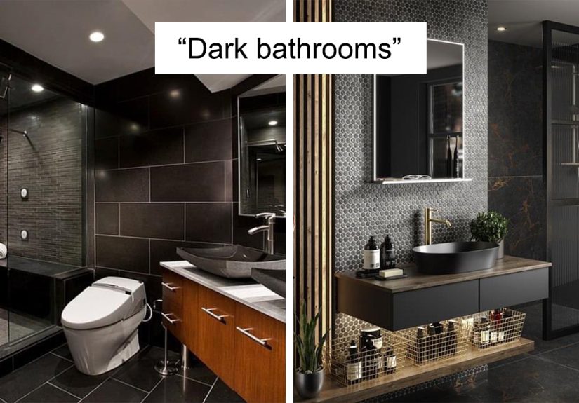
A bathroom vanity lit from the sides (or well-placed sconces).
Why it works: more flattering, fewer shadowsno one needs “campfire face” while brushing teeth. -
A cozy living room with layered textiles (rug + throw + mixed pillows).
Why it works: texture reads as comfort, not clutter, when the palette stays cohesive. -
Neutral walls with subtle patterned textiles.
Why it works: you get depth without visual noisepattern that behaves like a “new neutral.” -
A bold powder room that commits to a look.
Why it works: small rooms can handle drama; they’re basically jewelry boxes for design. -
Open shelving styled with restraint (and repeat materials).
Why it works: repetition creates order; chaos happens when every object auditions for lead actor. -
A pantry that uses baskets and labels (the grown-up kind).
Why it works: you see what you have, waste less food, and stop buying your third paprika. -
A small living room with furniture pulled slightly off the walls.
Why it works: it improves flow and often makes the space feel less cramped, not more. -
Mirrors placed to bounce light (not just to check outfits).
Why it works: they amplify daylight and make tight spaces feel more open. -
A fireplace wall with built-ins that balance storage and display.
Why it works: it frames a focal point and hides the messy stuff behind doors. -
A calm bedroom with bedside sconces and uncluttered nightstands.
Why it works: more surface space, better reading light, and fewer “where’s my charger?” panics. -
Ceiling-height curtains hung correctly.
Why it works: it visually lifts the ceiling and makes windows feel grander. -
A home office placed near natural light, with task lighting backup.
Why it works: better focus, less eye strain, and your video calls look nicer (shh, it matters). -
A built-in window seat with storage underneath.
Why it works: it adds seating, tucks away blankets, and makes the room feel custom. -
Natural materials: wood, stone, linen, woven accents.
Why it works: texture and warmth age welltrend-proof comfort. -
A simple color palette with one “hero” material (like walnut or marble).
Why it works: restraint lets quality shinelike good jeans and a great jacket. -
Kitchen seating that’s comfortable enough to linger.
Why it works: “usable” beats “Instagram-only” every day of the week. -
Hidden charging stations (drawers or concealed outlets).
Why it works: fewer cords on display, fewer accidental phone yeets. -
A laundry room with a folding counter and wall storage.
Why it works: chores become less chaotic when the space supports the process. -
A kid-friendly space with modular storage.
Why it works: bins and cubes make cleanup doabletiny hands can actually participate. -
A dining space defined by a chandelier and a rug.
Why it works: it creates a “room within a room,” even in open-concept layouts. -
A tiny bathroom that uses vertical storage.
Why it works: when floor space is limited, walls become your best employee. -
Accent lighting that highlights art or architectural details.
Why it works: it adds depth and makes the home feel intentionally designed. -
A cozy corner chair with a side table and a lamp.
Why it works: it’s a “yes, you can sit here” signalinstant hospitality. -
A staircase or hallway styled with purposeful simplicity.
Why it works: transitional spaces feel calm when they’re not overloaded with stuff. -
A porch with seating and soft outdoor lighting.
Why it works: curb appeal improves, and you actually use the outdoors more. -
A living room that mixes old and new pieces.
Why it works: it feels collected, not catalog-orderedcharacter beats perfection. -
A “small but mighty” space that prioritizes comfort over square footage.
Why it works: thoughtful design can feel more luxurious than unused extra rooms. -
A kitchen that balances closed storage with a little open display.
Why it works: practical for daily life, but still lets the room breathe visually. -
A bedroom that uses calm lighting (warm, dimmable) at night.
Why it works: it supports winding down, and the vibe says “rest,” not “interrogation.”
How to Steal These Ideas Without Copying the Whole House
The trick isn’t recreating a photo perfectlyit’s translating the principle behind it. If a space looks “done right,”
it’s usually because it nails function (how you live), light (how it feels), and flow
(how you move through it). Start with the most impactful upgrades first:
- Fix lighting before buying more decor: add a lamp, add a dimmer, add a warm bulb. Instant upgrade.
- Create one “landing zone”: entry hooks + a tray + a small bench can change daily life fast.
- Choose one anchor: a rug, a piece of art, or a hero materialthen build around it.
- Give clutter a job: baskets, drawers, and cabinets are not boringthey’re the reason pretty rooms stay pretty.
Extra: Real-Life Experiences That Make “Done Right” Design Click (About )
If you’ve ever saved a gorgeous room photo and then looked around your own space like, “Okay… but how?”
you’re having the most normal design experience on Earth. The internet shows the finish line. Real life is the part
where you trip over shoes and wonder why your living room feels weird even though you bought the exact throw pillow
you saw online. Here’s the secret most people learn the hard way: the pillow isn’t the point.
A common “aha” moment happens when someone swaps one overhead bulb for two lamps and suddenly the room feels
ten times cozier. Nothing else changed. Same couch, same walls, same stack of mail that swears it’s “temporary.”
But layered lighting changes how your brain reads the space. It softens edges, highlights texture, and makes the
room feel intentional. People often describe it as the room looking “finished,” even though the only new decor is…
electricity.
Another real-life pattern: small changes in the entryway can save your sanity. When a home doesn’t have
a drop zone, everything becomes the drop zonechairs, countertops, the floor, that one corner that turns into a museum
exhibit titled “Stuff We Meant to Put Away.” Adding hooks, a narrow console, or a bench with shoe storage can feel like
you upgraded your whole house, because you upgraded the part that greets you every single day.
And then there’s the experience of “copying” a beautiful photo but missing the vibe. That usually happens when the
underlying structure is different: maybe the inspiration room has a bigger rug, taller curtains, or fewer tiny items
scattered everywhere. Many people discover that editing is the real design flex. Pulling back the clutter, choosing
fewer (better) pieces, and repeating materialswood tones, metal finishes, a consistent palettecan make a space feel
calmer without buying anything new. It’s not as thrilling as ordering a new chair, but it’s wildly effective.
Finally, one of the most satisfying experiences is learning that “done right” isn’t one style. You can love a moody
library vibe, a bright Scandinavian kitchen, or a warm modern farmhouse entryway. What matters is the foundation:
practical layout, good lighting, smart storage, and materials that feel good to live with. Once you start noticing
those patterns in the homes you love online, you’ll be able to build your own “done right” moments on purposeone
room (and one light source) at a time.
Conclusion
The best thing about scrolling design inspiration isn’t envyit’s pattern recognition. When you know what makes a
space feel great (light, flow, storage, texture, scale), you can spot the “why” behind the wow. And that’s the part
you can bring home, no mansion required.