Table of Contents >> Show >> Hide
- Why Neutrals Make the Best Living Room Base
- What “Citrus Accents” Actually Means
- Step 1: Choose the Right Neutral Backdrop
- Step 2: Use a Simple Color Formula So It Looks Intentional
- Step 3: Put Citrus Where It Works Hardest
- Step 4: Make Neutrals Interesting With Texture (So Citrus Looks “Designer,” Not “Random”)
- Step 5: Choose the Right Citrus Shade for Your Style
- Step 6: Consider One “Bigger” Citrus Commitment (Optional, But Fun)
- Step 7: Build a “Citrus Map” So the Room Feels Balanced
- Common Mistakes (And How to Fix Them Fast)
- A Quick “Do This First” Plan (If You Want Results This Weekend)
- Conclusion
- of Real-Life Experience: What It’s Like to Actually Live With This Look
A neutral living room is the design equivalent of a white T-shirt: it goes with everything, it never looks like it’s trying too hard,
and somehow it still feels polished even when you’re holding a coffee mug like it’s emotional support.
The only catch? Neutrals can drift into “nice hotel lobby” territory if you don’t give them a pulse.
That’s where citrus accents come in. Lemon, lime, tangerine, grapefruitthese are the colors that wake up a calm space without turning it
into a highlighter aisle. Done well, a neutral living room with citrus accents feels fresh, cozy, and intentional:
the kind of room that says, “Yes, I own throw pillows… but I also own a personality.”
Why Neutrals Make the Best Living Room Base
Neutrals (think cream, ivory, beige, greige, warm gray, taupe, soft white) work because they’re forgiving. They play nicely with
wood tones, metal finishes, and most furniture stylesfrom modern to traditional to “I inherited this sofa and now it’s my whole aesthetic.”
A neutral foundation also makes your room easier to update. Swap pillows and a throw? New vibe. Change art? New mood.
Add one citrus-colored vase and suddenly the room looks styled, not staged.
The secret sauce: depth, not sameness
The best neutral rooms aren’t one flat beige. They’re layered: warm and cool notes balanced, multiple textures stacked,
and a few darker anchors (like walnut, black metal, or deep bronze) to keep the room from floating away.
Neutral doesn’t mean “no contrast.” It means “calm background with a plan.”
What “Citrus Accents” Actually Means
Citrus accents are small-to-medium hits of color that feel sunny and energetic without overwhelming the room.
You can go bright (lemon yellow) or moody (burnt orange, amber, marigold). You can do one citrus tone or a small “fruit bowl”
mixas long as your neutrals keep the peace.
Pick your citrus personality
- Lemon: Crisp, cheerful, best in small doses (pillows, art, a ceramic bowl).
- Lime: Fresh and modern, especially good with warm whites and light woods.
- Tangerine: Friendly warmth; reads playful without being juvenile when paired with natural textures.
- Grapefruit/coral: Softer citrus; flattering and easy to blend with creams and blushy neutrals.
- Burnt orange/rust: Citrus’s grounded cousin; perfect for cozy, earthy neutral rooms.
Step 1: Choose the Right Neutral Backdrop
Before you buy anything citrus-colored, lock in your neutral “temperature.”
Warm neutrals (cream, ivory, beige, warm greige) tend to make citrus feel inviting and natural.
Cooler neutrals (cool gray, stark white) can make citrus look sharper and more graphic.
Neither is wrongbut mixing temperatures randomly is how rooms end up looking “off” with no clear reason.
Paint and lighting: the great plot twist
Paint changes under different light. Morning sun, warm bulbs, north-facing windowsyour “perfect neutral” can shift fast.
Test samples on multiple walls and check them throughout the day.
This matters even more when you’re adding citrus accents, because your accent color will react to the undertones in your neutrals.
If you want an easy win: choose a warm off-white or light greige, then repeat that warmth in textiles (linen, wool, boucle)
and natural materials (wood, rattan, jute). Once your foundation looks rich, citrus accents will feel like garnishnot a rescue mission.
Step 2: Use a Simple Color Formula So It Looks Intentional
Designers often lean on the 60-30-10 guideline to keep color balanced:
60% dominant (your neutrals), 30% secondary (more neutrals or warm woods),
and 10% accent (your citrus). That “10%” can be pillows, art, a throw, a vase, and one small statement piece.
How to keep citrus from taking over
- Repeat it 3 times. One citrus object looks accidental. Three feels styled.
- Vary the scale. One medium piece + two smaller pieces usually looks better than three identical items.
- Use a “bridge” shade. If your citrus is bold, add a softer cousin (mustard, camel, peach) to smooth transitions.
Step 3: Put Citrus Where It Works Hardest
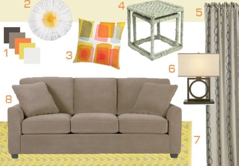
Citrus accents are most effective when they show up where your eyes naturally land: the sofa zone, the coffee table, and the wall space.
Here are the easiest places to add color without committing to a full renovation (or a dramatic “why did I do this” moment).
Textiles: the low-risk, high-reward move
- Throw pillows: Mix one solid citrus pillow with one patterned pillow that includes a hint of citrus.
- Throws: A lemon-yellow knit throw over a cream sofa looks cozy, not loudespecially with natural textures nearby.
- Rugs: If your room is very neutral, choose a rug that has a tiny citrus detail in the pattern for subtle cohesion.
- Curtains: Keep curtains neutral, then add citrus through trim, tiebacks, or nearby decor so the windows don’t dominate.
Art: instant mood, no floor space required
If you’re worried about citrus feeling too “pop,” let art do the talking.
One large piece with tangerine, saffron, or citrus green can anchor the scheme.
Then echo that color with a small object or two (a vase, a bowl, a candle).
Decor objects: the “fruit garnish” approach
- Ceramics: A matte white room loves a glossy citrus vase or bowl.
- Books: Stack a couple of bright spines on a coffee table like a casual flex.
- Florals/greens: Yellow blooms or a citrus-toned planter can add color while still feeling organic.
- Pillows + one hero object: Think: two citrus pillows and one sculptural amber glass lamp.
Step 4: Make Neutrals Interesting With Texture (So Citrus Looks “Designer,” Not “Random”)
The fastest way to elevate a neutral living room is to layer textures. This gives citrus accents something luxurious to pop against.
Picture lemon against boucle, tangerine against linen, rust against leatherchef’s kiss, no actual chef required.
Texture checklist for a cozy neutral living room
- Soft: Boucle chair, velvet pillow, chunky knit throw.
- Natural: Wood coffee table, jute rug layer, woven basket.
- Structured: Linen drapes, tailored sofa upholstery, clean-lined side tables.
- Reflective: Brass or gold accents (especially flattering near orange/yellow tones), glass, or a mirror.
- Grounding: One deeper elementwalnut, espresso wood, matte black, or charcoalto keep the palette from washing out.
Step 5: Choose the Right Citrus Shade for Your Style
“Citrus” isn’t one colorit’s a family. The shade you choose should match your room’s vibe and your tolerance for boldness.
(Be honest. If you flinch at neon Post-it notes, maybe don’t start with electric lime.)
If you like calm and airy
- Stick to soft lemon, buttery yellow, pale coral, and warm whites.
- Pair with light oak, creamy upholstery, and minimal patterns.
- Add citrus through pillows, a throw, and artkeep walls neutral.
If you like cozy and grounded
- Go with burnt orange, rust, amber, marigold.
- Pair with camel tones, textured rugs, and darker wood.
- Use one statement piece: a rust accent chair or a warm orange lamp shade.
If you like modern and graphic
- Try lime or a sharper tangerine against crisp whites and clean lines.
- Add black accents (frames, lighting, hardware) for definition.
- Choose bold shapes over lots of patterns: one geometric pillow, one sleek vase.
Step 6: Consider One “Bigger” Citrus Commitment (Optional, But Fun)
If you want more than accessories, choose one larger citrus move and keep everything else restrained.
This is how you get personality without chaos.
Three bigger moves that still feel safe-ish
-
An accent chair: A burnt orange chair in a neutral room reads curated, not cartoonish.
Bonus points if the chair fabric has texture (velvet, boucle, woven). -
A small painted area: Instead of a whole wall, try painting a niche, built-in, or the back of a bookshelf
in a muted citrus tone. -
An accent wallonly if your neutrals are settled: A warm orange accent can work beautifully,
but choose a shade with depth (think paprika or papaya rather than traffic cone).
Step 7: Build a “Citrus Map” So the Room Feels Balanced
Here’s a simple styling trick: imagine your living room as a grid. If all your citrus color is clumped on the sofa,
the room feels lopsided. Spread it out.
A balanced citrus map example
- Sofa zone: 2 pillows (one solid citrus, one patterned), plus a neutral throw.
- Wall zone: 1 art piece with citrus tones (or a frame with a citrus mat).
- Table zone: 1 citrus object (bowl, vase, candle) paired with natural elements (wood tray, stone coaster).
That’s it. You don’t need 19 orange items. You need three well-placed moments that talk to each other.
Let the neutrals do the heavy lifting; let citrus do the flirting.
Common Mistakes (And How to Fix Them Fast)
Mistake: The citrus is too bright for the room
Fix it by swapping neon for muted. Look for “burnt,” “amber,” “marigold,” “ochre,” “papaya,” or “coral” versions.
Or keep the bright shade but shrink itone small vase instead of four pillows.
Mistake: The neutrals feel flat
Add texture before adding more color: a nubby pillow, a woven basket, a layered rug, or a warm metal finish.
Citrus looks better when it has a rich backdrop.
Mistake: The room feels “matchy”
If your pillows, vase, and art are the exact same orange, your living room starts looking like a brand package.
Mix shades and materials: tangerine pillow + amber glass + rust pattern. Same family, different personalities.
Mistake: The lighting makes citrus look weird
Warm bulbs generally flatter citrus and warm neutrals. If your citrus looks dingy or greenish,
test different bulb temperatures and check how the color reads at night.
A Quick “Do This First” Plan (If You Want Results This Weekend)
- Choose your neutral base: warm white/greige + natural wood is the easiest combo.
- Pick one citrus shade: lemon, tangerine, coral, rust, or limejust one to start.
- Add three citrus moments: pillows, art, and one tabletop object.
- Layer textures: at least two of theselinen, boucle, knit, jute, leather, wood grain.
- Add one grounding element: black frame, walnut piece, or bronze/brass detail.
- Edit clutter: neutrals look “expensive” when surfaces can breathe.
- Reassess after 48 hours: if it feels loud, reduce scale; if it feels timid, add one more citrus detail.
Conclusion
A neutral living room with citrus accents is a smart, flexible formula: calm base, sunny details, and enough texture to make it feel lived-in
(not like a catalog that politely asks you not to sit down). Start with neutrals that have depth, pick a citrus shade that matches your style,
and repeat it in a few well-chosen places. If you ever get bored, congratulationsyou’ve built a room that can evolve without a full reset.
That’s not just good design. That’s emotional stability in sofa form.
of Real-Life Experience: What It’s Like to Actually Live With This Look
A neutral living room with citrus accents looks amazing in photos, but the real test is Tuesday nightwhen someone’s eating snacks,
the dog is doing interpretive dance on the rug, and you’re trying to relax without staring at a chaotic rainbow.
The good news: this style holds up really well in real life, mostly because neutrals are forgiving and citrus is easy to “tune.”
One of the first things you notice is how calm the room feels even when life isn’t calm. A cream sofa and warm greige walls
don’t visually “shout,” so your brain gets a break. The citrus accents become little mood boosterslike the room is quietly handing you a glass
of lemonade and saying, “You’ve got this.” And if you choose slightly muted citrus (think marigold or amber instead of neon lemon),
the color reads cheerful without turning the space into a sports drink ad.
Practically speaking, the best citrus accents are the ones you can move. Pillows and throws are the MVPs because you can change
them with the seasons, your mood, or your laundry schedule. In summer, lemon and lime feel fresh. In fall, burnt orange feels cozy.
If you’re someone who gets bored easily, this is the sweet spot: you get a “new room” feeling without buying a new couch (or explaining that
purchase to anyone who shares your bank account).
Another real-life lesson: texture does more work than you think. When you live in the room, you notice the tactile stuff:
the nubby pillow you always grab, the knit throw that becomes your TV blanket, the woven basket that magically collects everything
(remotes, chargers, the mystery toy that appears on every surface). Texture makes neutrals feel warm instead of bland, and it also keeps the
citrus accents from feeling like random “stuff.” Even one textured elementlike a jute rug layer or a boucle chaircan make the whole setup
feel designed on purpose.
If you have kids, roommates, or pets, you’ll appreciate that neutrals don’t demand perfection. Just pick performance-friendly fabrics and
avoid pure white if it stresses you out. Citrus accents are surprisingly kid-proof toobright colors hide minor stains better than pale pastels.
And when the room gets messy, neutrals help it look “softly lived-in” instead of “everything is happening at once.”
The biggest experience-based tip? Keep citrus on a “volume knob.” If you’re feeling overstimulated, remove one citrus item and
the room instantly quiets down. If you’re craving energy, add one more citrus piecelike a bowl on the coffee table or a small artwork swap.
That adjustability is what makes this design so livable. It’s not a one-note look; it’s a flexible system. And on a Tuesday night,
flexibility is basically luxury.