Table of Contents >> Show >> Hide
- Why People Love Awful Home Photos So Much
- 35 Types of Awful Homes That Keep Showing Up Online
- 1. The Bathroom With Too Much Confidence
- 2. The Carpeted Kitchen
- 3. The Toilet With No Boundaries
- 4. The Staircase Built for Villains
- 5. The “Open Concept” Gone Too Far
- 6. The Wallpaper Attack
- 7. The Kitchen Island That Blocks Everything
- 8. The All-Theme House
- 9. The Faux Luxury Disaster
- 10. The Tiny Rug Syndrome
- 11. The TV Mounted in the Stratosphere
- 12. The House of Many Floors
- 13. The Mirror Maze
- 14. The Basement Time Capsule
- 15. The Outdoor Décor Explosion
- 16. The Windowless Bedroom
- 17. The Paint Color Meltdown
- 18. The DIY Built-In That Should Have Stayed a Sketch
- 19. The Closet That Became a Bathroom
- 20. The House With Mystery Doors
- 21. The Lighting Crime Scene
- 22. The Overstuffed Room
- 23. The “Everything Matches” Showroom
- 24. The Tile Everywhere House
- 25. The Bathroom Carpet Sequel
- 26. The Garage Conversion With No Plan
- 27. The Fireplace That Dominates the Room
- 28. The Kitchen With No Counter Space
- 29. The Dangerous Extension Cord Lifestyle
- 30. The Moisture Problem Nobody Fixed
- 31. The “Luxury Bathroom” With Zero Storage
- 32. The Curb Appeal Collapse
- 33. The Room With Art Hung Too High
- 34. The Too-Trendy Remodel
- 35. The House That Forgot Humans Live There
- What Awful Homes Teach Us About Good Design
- How to Avoid Becoming the Next Viral Home-Shaming Post
- The Difference Between “Ugly” and “Interesting”
- Why Home-Shaming Posts Are Secretly Educational
- Extra Experiences and Real-Life Reflections on Awful Homes
- Conclusion
Every home has a personality. Some whisper, “Come in, take your shoes off, and stay awhile.” Others scream, “The bathtub is in the kitchen, the carpet is on the ceiling, and yes, that is a medieval chandelier in the laundry room.” Welcome to the wildly entertaining world of home shaming, where interior design crimes are not punished by lawbut they are absolutely roasted by the internet.
The Facebook group “That’s It, I’m Home Shaming” became popular because it celebrates one of the internet’s favorite hobbies: staring at questionable houses and asking, “Who approved this?” The group, described publicly as a place for sharing ugly interior and exterior home choices, has inspired viral roundups of bizarre real estate photos, chaotic DIY projects, cursed décor, and architectural decisions that make you want to call a contractor, a therapist, and possibly a priest.
But behind the jokes, awful homes can teach surprisingly useful lessons. A badly staged living room, a terrifying bathroom remodel, or a carpeted kitchen may look funny online, but these design disasters also reveal what homeowners, renters, sellers, and renovators should avoid. From poor lighting and awkward layouts to unsafe stairs and moisture problems, many “awful homes” are more than uglythey are uncomfortable, impractical, expensive, or even hazardous.
Why People Love Awful Home Photos So Much
Home-shaming content works because it combines humor, curiosity, and relief. We laugh at a leopard-print bathroom not only because it is visually loud enough to scare shampoo bottles, but also because it makes our own messy closet feel normal. Even if our homes are imperfect, most of us can proudly say, “At least my toilet is not on a carpeted platform under a disco ball.”
The appeal is also psychological. Homes are personal spaces. They reflect taste, budget, history, habits, and sometimes a bold refusal to measure anything before installing it. When we see an unusual house online, we are not just looking at walls and furniture. We are reading a story. Sometimes that story is charming. Sometimes it is “someone tiled the entire bedroom and then chose violence with the curtains.”
35 Types of Awful Homes That Keep Showing Up Online
The most memorable home-shaming posts usually fall into a few wonderfully terrible categories. Below are 35 common types of awful homes that make people stop scrolling, zoom in, and question every decision that led to this moment.
1. The Bathroom With Too Much Confidence
Some bathrooms are spa-like. Others look like a plumbing showroom fell into a nightclub. Think mirrored walls, black toilets, neon lighting, and tubs placed in locations that make privacy seem like a myth invented by shy people.
2. The Carpeted Kitchen
Few phrases chill the soul like “wall-to-wall kitchen carpet.” Kitchens are splash zones for oil, sauce, coffee, crumbs, and mysterious sticky patches. Carpet in a kitchen is not cozy; it is a long-term science experiment.
3. The Toilet With No Boundaries
A toilet in the corner of a bedroom. A toilet facing a glass door. A toilet beside a washer. Some homes treat bathroom privacy as an optional luxury, like heated towel racks or emotional stability.
4. The Staircase Built for Villains
Stairs without railings, stairs with weird angles, stairs that end in walls, stairs so steep they appear to have been designed by a mountain goatthese are internet gold and real-life danger zones.
5. The “Open Concept” Gone Too Far
Open concept can make a home feel bright and connected. But when the bedroom, bathroom, kitchen, and living room all become one mysterious arena, the result feels less like modern design and more like a furniture warehouse with plumbing.
6. The Wallpaper Attack
Wallpaper can add charm, pattern, and personality. It can also turn a hallway into a haunted dollhouse. The worst examples usually involve clashing florals, tiny repeating shapes, or a print so aggressive it seems to be moving.
7. The Kitchen Island That Blocks Everything
A kitchen island should improve flow. Some, however, appear to have been installed as a test of human flexibility. If opening the oven requires a yoga pose, the layout needs help.
8. The All-Theme House
A nautical powder room? Cute. A fully nautical house with portholes, rope railings, anchor mirrors, and a guest bedroom called “the brig”? That is not a design concept. That is a commitment hearing.
9. The Faux Luxury Disaster
Gold spray paint, plastic columns, shiny marble-look vinyl, and chandeliers too large for the ceiling height can create what might be called “budget palace energy.” It aims for Versailles and lands somewhere near clearance aisle prom décor.
10. The Tiny Rug Syndrome
A rug should anchor a room. A tiny rug floating under a coffee table looks like a napkin that got promoted too quickly. Designers often recommend choosing rugs large enough to connect furniture visually.
11. The TV Mounted in the Stratosphere
When a TV is mounted too high, watching a movie becomes a neck workout. Above-fireplace placement can work in some rooms, but if viewers need binoculars and a chiropractor, it is not ideal.
12. The House of Many Floors
Tile in one corner, laminate in the hallway, carpet in the dining area, mystery vinyl by the stairstoo many flooring transitions can make a home feel chopped into unrelated zones.
13. The Mirror Maze
Mirrors can brighten a room. But too many mirrors can make a hallway feel like a budget magic show. Bonus horror points if the mirrors face each other and create an infinite tunnel of regret.
14. The Basement Time Capsule
Some basements are cozy. Others still belong to 1978: wood paneling, orange carpet, drop ceilings, and a bar that has seen things. Vintage can be stylish, but neglected vintage often becomes accidental archaeology.
15. The Outdoor Décor Explosion
One garden gnome is whimsical. Forty-seven gnomes, a tire planter, plastic flamingos, broken fountains, and a statue of a raccoon playing saxophone may be a neighborhood petition waiting to happen.
16. The Windowless Bedroom
A bedroom without proper natural light can feel gloomy and uncomfortable. In many areas, legal bedroom requirements also involve egress, ventilation, and safety standards, so this is not just a style issue.
17. The Paint Color Meltdown
Bold color can be fantastic. The trouble starts when every room has a different high-intensity shade and the hallway becomes a rainbow tunnel with no emotional exit.
18. The DIY Built-In That Should Have Stayed a Sketch
Built-ins can add storage and charm. But poorly measured shelves, crooked cabinets, and uneven trim can make a room look like it was assembled during an earthquake.
19. The Closet That Became a Bathroom
Converting unused space can be smart, but some micro-bathrooms are so tight you can brush your teeth, shower, and answer emails without moving your feet. Efficient? Yes. Comfortable? Absolutely not.
20. The House With Mystery Doors
Doors that open into walls, tiny doors with no clear purpose, doors on ceilings, doors leading to a two-inch ledgethese features create suspense, but not the good kind.
21. The Lighting Crime Scene
Poor lighting can ruin even a decent room. One harsh ceiling bulb can make a living room feel like an interrogation chamber. Good homes layer ambient, task, and accent lighting so rooms feel functional and flattering.
22. The Overstuffed Room
Too much furniture makes a room feel smaller and harder to use. If guests must sidestep between recliners like they are navigating a furniture obstacle course, it is time to edit.
23. The “Everything Matches” Showroom
Matching sets can be easy, but too much coordination makes a room feel flat. A home looks more natural when it mixes materials, textures, and collected pieces instead of looking like page 12 of a catalog.
24. The Tile Everywhere House
Tile is durable, but when every surface is tiledfloors, walls, counters, stairs, maybe your dreamsthe home can feel cold and echoey. Balance matters.
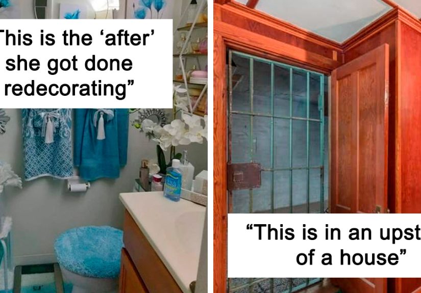
25. The Bathroom Carpet Sequel
If kitchen carpet is bad, bathroom carpet is its unhinged cousin. Moisture and soft flooring are not friends. Bathrooms need materials that handle water, cleaning, and humidity without becoming a mold invitation.
26. The Garage Conversion With No Plan
Garage conversions can add useful living space, but unfinished walls, visible tracks, odd temperature control, and awkward flooring often reveal when the project stopped halfway between “extra room” and “storage unit with a sofa.”
27. The Fireplace That Dominates the Room
A fireplace can be a beautiful focal point. But when it is oversized, oddly placed, or covered in clashing stone, it can bully every other design choice into silence.
28. The Kitchen With No Counter Space
A kitchen can have fancy appliances and still fail if there is nowhere to chop an onion. Function matters more than flashy finishes.
29. The Dangerous Extension Cord Lifestyle
Extension cords are meant for temporary use, not as permanent home wiring. A room powered by tangled cords under rugs is not quirky. It is a fire hazard wearing a lampshade.
30. The Moisture Problem Nobody Fixed
Water stains, warped floors, musty smells, and visible mold are not “character.” Moisture problems should be handled quickly because they can affect indoor air quality, structural materials, and long-term repair costs.
31. The “Luxury Bathroom” With Zero Storage
A freestanding tub looks amazing in photos, but if there is nowhere to put towels, toilet paper, or a toothbrush, the room is more showroom than home.
32. The Curb Appeal Collapse
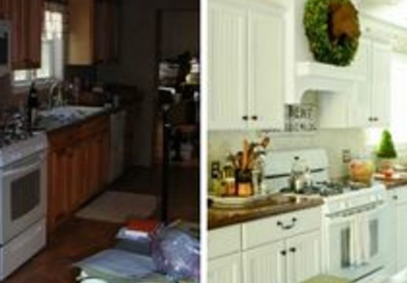
Overgrown landscaping, peeling paint, broken steps, and strange yard ornaments can make a home feel neglected before anyone enters. First impressions matter, especially when selling.
33. The Room With Art Hung Too High
Art should relate to the furniture and eye level. When framed prints hover near the ceiling, they look like they are trying to escape.
34. The Too-Trendy Remodel
Trends can be fun, but designing every surface around one viral look can make a home age fast. Today’s “must-have” can become tomorrow’s “please explain this wall of gray barnwood.”
35. The House That Forgot Humans Live There
The most awful homes are not always the ugliest. Sometimes they are simply impractical: no storage, no comfortable seating, bad traffic flow, poor lighting, and rooms arranged for photos rather than real life.
What Awful Homes Teach Us About Good Design
The best lesson from home-shaming posts is simple: design should serve people first. A room can be colorful, strange, vintage, dramatic, or deeply personal and still work beautifully. The problem begins when a home ignores function, safety, scale, lighting, and maintenance.
A good home does not need to be expensive. It needs to be livable. That means clear walkways, enough lighting, safe stairs, practical flooring, appropriate storage, and rooms that support daily routines. A modest kitchen with smart layout choices is better than a flashy kitchen where the refrigerator door hits the island. A small bathroom with ventilation and easy-to-clean surfaces is better than a dramatic bathroom with carpet and a chandelier that fears humidity.
How to Avoid Becoming the Next Viral Home-Shaming Post
Prioritize Function Before Drama
Before choosing a bold finish, ask how the room will actually be used. Can people move around comfortably? Is there storage? Is the lighting adequate? Can surfaces be cleaned? Design drama is fun, but daily life always gets the final vote.
Respect Scale and Proportion
Furniture that is too large makes rooms feel cramped, while furniture that is too small can look awkward and disconnected. Measure first. Buy second. Apologize to your future self never.
Use Bold Choices Strategically
A wild wallpaper in a powder room can be delightful. The same wallpaper in every hallway, bedroom, closet, and ceiling corner may feel like living inside a haunted gift bag. Use statement pieces where they can shine without taking hostages.
Do Not Ignore Maintenance
Some design fails are really maintenance fails. Peeling paint, mold, loose railings, broken steps, and outdated wiring are not just unattractive. They can affect safety, comfort, and resale value.
Think About Resale Without Losing Personality
Not every home needs to be beige to sell. In fact, warmth, charm, and distinctive details can make a property memorable. But highly permanent personal choiceslike themed tile murals, unusual built-ins, or extreme color schemesmay narrow the buyer pool later.
The Difference Between “Ugly” and “Interesting”
One important point: not every unusual home deserves mockery. Some homes are weird in the best way. They show creativity, history, culture, or fearless personality. A maximalist living room full of color and collected art can be beautiful. A retro kitchen can be charming. A hand-painted mural can be meaningful. The line between “awful” and “amazing” often comes down to intention, execution, and functionality.
The internet loves a roast, but good design is not about making every home look the same. The goal is not to erase personality. The goal is to avoid choices that make a home unsafe, uncomfortable, impossible to clean, visually chaotic, or expensive to fix.
Why Home-Shaming Posts Are Secretly Educational
Home-shaming groups are funny, but they also train the eye. After seeing enough design fails, readers start noticing patterns: bad lighting, poor furniture scale, too many materials, unsafe stairs, moisture damage, strange bathroom placements, and layouts that fight human movement. The jokes are the hook, but the lessons stick.
For homeowners, these posts can prevent expensive mistakes. For renters, they can sharpen red-flag radar during apartment tours. For buyers, they can make inspection details feel less boring. And for anyone planning a renovation, they are a reminder that “unique” is not always the same as “good.”
Extra Experiences and Real-Life Reflections on Awful Homes
Anyone who has toured enough houses knows that online home-shaming is not exaggerated by much. Real life has plenty of design choices that make you pause at the doorway and silently negotiate with your facial muscles. One of the most common experiences is walking into a home where every room belongs to a different decade. The living room says 1994, the kitchen says 1972, the bathroom says “luxury hotel in a dream sequence,” and the basement says nobody has asked questions down there since the Reagan administration.
Another familiar experience is the rental showing where the listing photos looked bright and spacious, but the actual home feels like a puzzle box. The bedroom door hits the closet door. The closet door hits the bed. The bathroom sink is so tiny that washing your face becomes a splash-based weather event. You stand there nodding politely while your brain files a formal complaint.
Bad DIY also has its own special energy. Many homeowners start projects with good intentions: save money, customize the space, learn a skill, maybe become the kind of person who owns three different sanders. But without planning, small projects can snowball. Peel-and-stick tile starts lifting. Floating shelves sag. Paint lines wobble. A “quick weekend update” becomes a six-month reminder that YouTube confidence is not the same as professional experience.
Then there are homes with emotional décor themes. These are not necessarily bad, but they can become overwhelming. A coastal theme can be relaxing, but when every lamp, pillow, soap dish, and drawer pull is shaped like a seashell, the room starts demanding that guests speak in pirate accents. A farmhouse kitchen can be warm, but too many signs saying “Gather,” “Blessed,” and “Eat” can make the walls sound bossy.
The most memorable awful homes are often the ones that mix beauty with one baffling decision. A gorgeous old house with original woodwork may also have a bathroom completely covered in pink carpet. A modern kitchen may have excellent cabinets but no place for a trash can. A charming cottage may have stairs so narrow they seem designed for ghosts traveling single file. These homes are funny because they are close to being good, and that makes the strange parts even louder.
Still, there is a compassionate side to the topic. Many awful homes are the result of limited budgets, inherited tastes, rushed repairs, or decades of different owners making unrelated choices. Not every strange room is a failure; sometimes it is a timeline. A house carries evidence of who lived there, what they could afford, what they loved, and what they thought would look amazing after one trip to a home improvement store.
That is why the best way to enjoy home-shaming content is with humor, not cruelty. Laugh at the carpeted bathroom, learn from the overloaded outlet, admire the courage of the purple kitchen, and then look around your own home with kinder eyes. Maybe your furniture layout needs work. Maybe your hallway light is too harsh. Maybe your rug is, in fact, the size of a postage stamp. The internet has spoken, but the fix may be simple.
In the end, awful homes remind us that design is personal, practical, and sometimes spectacularly weird. A home does not need to impress strangers online. It should support the people who live there. But if someone installs a toilet in the dining room, the group chat deserves to know.
Conclusion
The most awful homes shared on “That’s It, I’m Home Shaming” are funny because they are extreme, unexpected, and often painfully relatable. They show us what happens when taste runs faster than planning, when DIY gets too brave, and when function is sacrificed for a look that maybe should have stayed on a mood board.
But these homes also offer real design wisdom. Good interiors do not need to be perfect, expensive, or trend-proof. They need to be safe, comfortable, practical, and true to the people living in them. A little personality is wonderful. A leopard-print bathroom with carpet, no ventilation, and a chandelier over the tub? That may be a Facebook post waiting to happen.
Note: This article is an original, web-ready synthesis based on publicly available information about the home-shaming trend and general U.S. home design, renovation, real estate, and safety guidance. It does not copy captions, posts, images, or private group content.