Table of Contents >> Show >> Hide
- 1. Rich, Dark Colors Replace All-White Everything
- 2. Velvet Everything (In Jewel Tones, Please)
- 3. Natural Textures and Back-to-Nature Vibes
- 4. Blush Pink Becomes the New Neutral
- 5. Mixed Metals, Especially Brass and Bronze
- 6. Geometric Patterns and Statement Wallpaper
- 7. Hygge-Inspired Cozy Layering
- 8. Global and Artisanal Accents
- 9. Dark, Moody Interiors with a Sense of Drama
- 10. Pattern Play and Colorful Rugs
- Bringing It All Together
- Real-Life Experiences with Fall 2017 Design Trends
If summer is all about sand in your shoes and bright beach towels, fall 2017 is where your home slips into something a little more sophisticated. Think moodier colors, softer textures, and the kind of cozy, layered look that makes you want to cancel plans and stay in with a mug of something pumpkin-flavored. Designers across the U.S. in 2017 leaned hard into warmth, texture, and drama, trading in stark minimalism for spaces that actually feel like they give good hugs.
From velvet sofas to millennial pink accents and mixed metals, the biggest fall 2017 design trends had one thing in common: personality. Instead of “don’t touch” rooms, people wanted spaces that looked elevated but lived-in, chic but still comfy. Let’s walk through the 10 standout design trends that defined fall 2017and how they transformed homes into stylish, welcoming retreats.
1. Rich, Dark Colors Replace All-White Everything
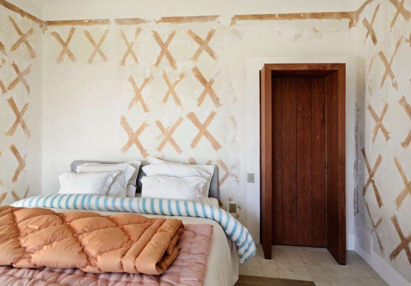
For years, white and gray ruled Pinterest like an icy minimalist monarchy. By fall 2017, though, designers started rebelling. Deep greens, navy, charcoal, espresso brown, and even black walls gained traction as the new “neutrals.” These rich hues made rooms feel dramatic and cocoon-like, especially when balanced with warm wood tones and soft lighting.
Instead of sterile white kitchens, moody cabinetry showed up in saturated forest greens and inky blues. Living rooms traded pale sofas for deeper tones that could actually stand up to everyday life (and the occasional coffee spill). The idea wasn’t to make rooms feel dark and gloomyit was to give them depth, character, and that cozy “wrapped in a sweater” vibe.
How to try it: If painting all your walls navy feels like a commitment on par with marriage, start small. Try an accent wall behind your bed, or repaint interior doors in a deep charcoal or black for instant sophistication.
2. Velvet Everything (In Jewel Tones, Please)
Velvet made a serious comeback in fall 2017, and not in a “grandma’s fussy parlor” way. Think modern silhouettes wrapped in plush fabrics: emerald green sofas, sapphire blue armchairs, and ruby-toned pillows. Velvet’s soft sheen and tactile quality added instant luxury, especially when paired with metallic accents and rich woods.
This trend leaned into the idea that a room should be seen and felt. Velvet helps bounce light gently, making darker rooms feel glam instead of cave-like. It also blends beautifully with fall’s deeper color palettes, creating that “boutique hotel but make it home” feeling.
How to try it: Swap in velvet throw pillows or a small ottoman if you’re velvet-curious. If you’re ready to commit, a jewel-toned velvet headboard or accent chair becomes a stunning focal point.
3. Natural Textures and Back-to-Nature Vibes
Fall 2017 was big on bringing the outdoors inwithout requiring you to camp. Designers layered natural textures like wood, stone, jute, rattan, wicker, and linen to create spaces that felt grounded and effortless. Woven baskets replaced plastic storage, rattan chairs popped up in living rooms, and raw wood tables took center stage.
The look was less “cabin in the woods” and more modern organic. Natural textures softened bold colors and provided visual interest without screaming for attention. They also played well with plants, which continued their rise as must-have decor rather than just background props.
How to try it: Add a woven basket for blankets, a jute rug, or a rattan side chair. Even a wooden tray on a coffee table can add that organic touch and break up a glossy surface.
4. Blush Pink Becomes the New Neutral
Blushalso known as millennial pinkrefused to leave the spotlight in 2017. For fall, it evolved into a soft, warm neutral used to balance dark colors and metals. Instead of screaming “cotton candy,” blush showed up in sophisticated ways: velvet pillows, ceramic vases, art prints, and even upholstered dining chairs.
Used with charcoal, navy, or deep green, blush added a subtle hit of warmth that kept rooms from feeling too heavy. It also blended well with brass and gold, making spaces feel modern and slightly romantic without going full fairy tale.
How to try it: Incorporate blush with small accessories first: a throw blanket, a piece of artwork, or glassware. If you love it, a blush accent chair or rug can shift the entire mood of a room.
5. Mixed Metals, Especially Brass and Bronze
Gone were the days of obsessively matching every metal in a room. Fall 2017 embraced mixed metalsespecially warm tones like brass, bronze, and gold. The goal was to create a layered, collected look rather than a showroom-perfect set.
Brushed brass hardware warmed up kitchens, bronze light fixtures replaced stark chrome, and gold-framed mirrors added a hint of glamour in entryways and bathrooms. Cool metals like stainless steel and nickel didn’t disappear; they were simply joined by warmer finishes that made rooms feel more inviting.
How to try it: Choose one dominant metal and one accent metal. For example, keep your existing chrome faucet, but add brass cabinet pulls and a gold-framed mirror. Let them mingleno need to over-polish the mix.
6. Geometric Patterns and Statement Wallpaper
Geometric patterns had already been popular in textiles, but by fall 2017 they started popping up on a bigger scaleespecially in furniture and wallpaper. From bold chevron and hexagon tiles to geometric inlay side tables and statement walls, the trend added energy and structure to rooms.
Wallpaper also made a huge comeback, particularly in small spaces like powder rooms, hallways, and entryways. Designers used geometric or graphic patterns to create “wow” moments in otherwise overlooked areas. The result: spaces that felt curated and intentional instead of forgotten.
How to try it: If full wallpaper feels risky, use peel-and-stick options or start with a single wall. Or, bring in geometry with patterned throw pillows, rugs, or even art prints.
7. Hygge-Inspired Cozy Layering
Hyggethe Danish concept of cozy comfortwas a major buzzword leading into 2017, and fall decor happily borrowed the idea. This translated into layered throws, piles of pillows, floor cushions, plush area rugs, and plenty of candlelight. The goal wasn’t perfection; it was comfort you could actually sink into.
Chunky knit blankets draped over sofas, sheepskin or faux fur throws over chairs, and lots of soft lighting made living spaces feel like retreats. Floor pillows and poufs turned living rooms into casual, lounge-ready zones perfect for movie nights or game nights.
How to try it: Start with lightingswap harsh overhead lights for table lamps, string lights, or candles. Then add one or two textural layers, like a thick throw and a cushy rug.
8. Global and Artisanal Accents
Another key fall 2017 trend was the move toward global, artisanal piecesitems that looked handmade, unique, and full of history. Think Moroccan-style rugs, handwoven textiles, carved wood accessories, and art that nods to far-flung places. The look felt curated rather than mass-produced.
Designers mixed Parisian Art Deco touches with global prints, layered different cultural influences, and leaned into pieces that looked like they had a story. This helped homes feel personal and worldly, even if your passport hadn’t seen a stamp in a while.
How to try it: Look for handmade pottery, woven wall hangings, or globally inspired pillows. Vintage shops, local markets, and small makers are great sources for unique pieces that bring this trend to life.
9. Dark, Moody Interiors with a Sense of Drama
Fall 2017 fully embraced drama. Deep, moody color paletteslike charcoal, aubergine, and forest greenpaired with rich textures and layered lighting created spaces that felt cinematic. Instead of trying to make every room as bright and airy as possible, designers leaned into the moodiness and made it intentional.
Dark walls were balanced out with metallic accents, mirrors, and warm lighting. Art with bold, saturated colors popped against inky backgrounds, and cozy textiles kept things from feeling too severe. The end result was luxurious, intimate, and perfect for shorter fall days.
How to try it: Try painting a dining room, bedroom, or small den in a deep shade and pairing it with warm white lamps, brass accents, and lighter linens. Let the room feel moodyit’s part of the charm.
10. Pattern Play and Colorful Rugs
Pattern took center stage in fall 2017, especially through rugs, throw pillows, and layered textiles. Designers mixed florals, stripes, geometrics, and global-inspired prints, relying on a cohesive color palette to keep everything from feeling chaotic.
Colorful area rugs, in particular, became a hero piece. They grounded rooms, added personality, and made neutral furniture feel intentional rather than boring. Many homeowners used rugs to experiment with bolder patterns without committing to a permanent change.
How to try it: Pick a patterned rug that includes a few of your existing room colors. Then echo one or two of those colors in pillows or art to tie everything together.
Bringing It All Together
When you zoom out, the fall 2017 design story is pretty clear: warmth, comfort, and character took over. Instead of sterile, over-edited spaces, people leaned into rooms that felt lived-in but polished, dramatic but welcoming. Rich colors, plush textures, natural materials, and global influences all worked together to create homes built for real lifeand real relaxation.
You don’t need to adopt every trend to enjoy the spirit of fall 2017. Pick one or two that fit your lifestyle and layer them into what you already own. In the end, the best trend is the one that makes you smile when you walk through the door (bonus points if it also makes you want a second cup of hot cider).
Real-Life Experiences with Fall 2017 Design Trends
So what does it actually feel like to live with these fall 2017 trendsnot on a perfectly styled photo shoot, but in a real home where people leave mugs on tables and kids forget where the hamper is? The short answer: surprisingly practical, as long as you lean into balance.
Take dark walls, for example. Many homeowners who tried deep navy or charcoal in 2017 discovered that those colors could actually make a room feel calmer, not smaller. In bedrooms, dark walls felt like nighttime all day, which made winding down easier. The key was pairing those walls with lighter bedding, warm lamps, and touches of metallics so the space felt intentional, not cave-like.
Velvet was another trend that sounded scary at firstespecially for people with pets and kidsbut ended up being more forgiving than expected. Performance velvet fabrics held up well to everyday wear, and darker jewel tones did an excellent job of hiding minor stains. People often discovered that a velvet chair or sofa became the most coveted seat in the house because it was just so comfortable.
Natural textures and woven pieces also proved their worth in real life. A jute rug might not be the softest thing under bare feet, but layered with a smaller, plush rug on top, it created a durable base that could handle heavy traffic. Wicker baskets became the unsung heroes of busy householdscollecting toys, blankets, mail, and all the stuff that magically appears on living room floors.
The blush trend surprised a lot of skeptics too. Homeowners who worried it would feel “too sweet” found that when blush was mixed with gray, black, or deep green, it read as warm and subtle rather than overly feminine. A single blush throw or accent chair could shift a room from cold and stark to cozy and welcoming, especially in fall light.
Mixed metals ended up being one of the easiest trends to live with over time. Instead of stressing about whether the faucet matched the hardware, people started treating metals like jewelrylayered, interesting, and flexible. A room with brass lighting, black hardware, and a chrome side table didn’t look mismatched; it looked considered and dynamic.
Of course, not every experiment was an instant success. Some people went overboard with patterns, only to realize their living room felt like a visual shout. The lesson learned? Patterns work best when tied together by color. Keep a consistent palette, and even bold prints will play nicely together.
Ultimately, living with fall 2017 trends was about embracing a home that felt like a sanctuary rather than a showroom. The moody colors made evenings feel cozy. The soft textiles invited you to curl up with a book. The natural textures and global accents made spaces feel personal rather than cookie-cutter. And the best part? Most of these choices aged gracefully, becoming less “trendy” and more “timeless with personality” as the years went by.
If you’re revisiting these trends now, think of them as a toolkit rather than a rulebook. Maybe you borrow the velvet and the mixed metals, but skip the blush. Maybe you go all-in on dark walls in one room and keep the rest light and bright. What fall 2017 really proved is that design is at its best when it’s comfortable, expressive, and just a little bit dramatickind of like fall itself.