Table of Contents >> Show >> Hide
- Before You Paint: The 5-Minute Plan That Saves 5 Hours
- The Main Event: 21 Wall Painting Ideas for Any Space
- Idea 1: The “Deeper Shade” Accent Wall
- Idea 2: Color-Drenching (Walls + Trim = Instant Mood)
- Idea 3: The Painted Arch (But Make It Useful)
- Idea 4: Reverse Arch / Halo Outline
- Idea 5: Oversized Color Block (The “Nook Highlighter”)
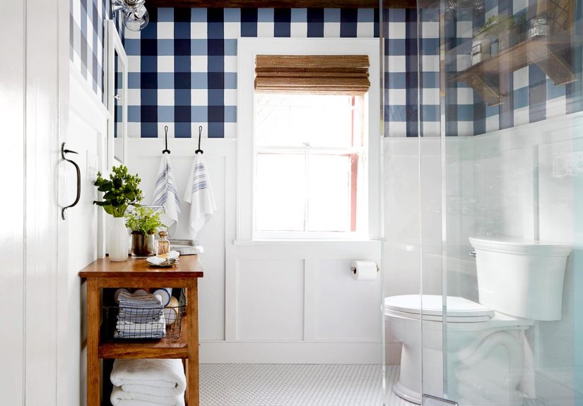
- Idea 6: Half-Painted Wall (Faux Wainscoting Without the Woodworking)
- Idea 7: Two-Tone Walls with a Higher Break (Hello, Taller Room)
- Idea 8: Tone-on-Tone Two-Tone (Subtle, Sophisticated, Sneaky)
- Idea 9: Checkerboard Wall (Graphic, Playful, Shockingly Versatile)
- Idea 10: Wide Horizontal Stripes (A Room “Stretcher”)
- Idea 11: Vertical Stripes (Instant Height + Drama)
- Idea 12: Diagonal Stripes (For People Who Are Slightly Brave)
- Idea 13: Chevron or Zigzag (Big Pattern, Big Payoff)
- Idea 14: Painted “Paneling” Frames (Classic Architecture, DIY Edition)
- Idea 15: The Painted Headboard (Bedroom Upgrade in an Afternoon)
- Idea 16: Scallops, Waves, or “Soft Geometry”
- Idea 17: Ombre Gradient Wall (Dreamy, Calm, and a Little Magical)
- Idea 18: Color Wash / Rag Roll (Texture Without Remodeling)
- Idea 19: Limewash-Look Walls (Old-World, Modern Color)
- Idea 20: Hand-Painted Mural (Abstract Lines Count, I Promise)
- Idea 21: Paint the “Fifth Wall” (Ceiling Color = Secret Weapon)
- Pro Techniques for Cleaner Lines and Fewer Regrets
- Common Mistakes (So You Don’t Become a Paint Cautionary Tale)
- Extra: Real-World Wall Painting Experiences (500+ Words of “I Learned This the Hard Way”)
- Conclusion
Blank walls are basically your home’s way of saying, “Hey… you gonna do something with me, or are we just going to
keep pretending that beige is a personality?” The good news: you don’t need a full renovation (or a reality TV crew)
to make a room feel designed. A few smart paint moves can add depth, drama, coziness, or “yes, I absolutely meant to
do that” sophisticationoften in a weekend.
Below are 21 wall painting ideas that work in apartments, houses, rentals (with the right approach),
and awkward little corners that currently exist only to collect dust and judgement. You’ll get practical tips,
where each idea shines, and real-world examplesbecause “paint something cool” is not a plan. It’s a wish.
Before You Paint: The 5-Minute Plan That Saves 5 Hours
1) Pick the right finish (aka: the shine level matters)
Wall paint isn’t one-size-fits-all. Flat/matte hides imperfections but scuffs easier; eggshell is a popular
“middle ground”; satin handles moisture and traffic better (think kitchens, baths, busy hallways). Trim and doors
usually go glossier than walls for durability and wipeability.
2) Prep like you mean it
The difference between “designer crisp” and “why does it look fuzzy?” is usually prep: clean the wall, patch holes,
sand lightly, dust again. If you’re going from light to dark (or covering stains), primer is your best friend.
Tinted primer can cut down on coats when using deep colors.
3) Test paint like it’s a new haircut
Paint swatches lie under store lighting. Sample on the wall in a few spots and check it morning, afternoon, and
night. If you’re color-blocking, test the combo togethertwo pretty colors can still argue in the same room.
4) Use the right tools
A quality angled brush for cutting in, a roller with the right nap for your wall texture, painter’s tape (the good
kind), and a small roller for tight shapes can make DIY patterns dramatically easier.
The Main Event: 21 Wall Painting Ideas for Any Space
Idea 1: The “Deeper Shade” Accent Wall
The easiest high-impact move: paint one wall a shade or two darker than the others. It adds depth without feeling
like a circus moved in. Try it behind a sofa, a bed, or the dining table. Example: soft lavender walls with a deeper
eggplant feature wall for a rich, layered look.
Idea 2: Color-Drenching (Walls + Trim = Instant Mood)
Paint the walls and trim the same color (sometimes even the ceiling) to create a cozy, immersive vibe. Great for
bedrooms, offices, and small living rooms where you want intentional “envelope” energy. Deep green, inky navy, or
warm clay can look wildly expensive even when your budget says otherwise.
Idea 3: The Painted Arch (But Make It Useful)
Painted arches are popular for a reason: they add architecture where none exists. Place one behind a bedside table
to mimic a headboard, behind a desk to “zone” a work area, or in a kid’s room as a whimsical focal point. Keep edges
crisp for modern, or soften them slightly for a hand-painted mural feel.
Idea 4: Reverse Arch / Halo Outline
Instead of filling the arch, paint the wall a solid color and leave an arch “outline” in the original wall color (or
a lighter tone). It’s subtle but cleverlike the wall is wearing eyeliner. This works beautifully in rentals where
you want a smaller paint footprint (and less repainting later).
Idea 5: Oversized Color Block (The “Nook Highlighter”)
Paint a large rectangle or organic block behind a reading chair, a console table, or a bar cart to create a
“destination” zone. This is especially helpful in open-concept spaces where the room needs visual structure. Try
warm white walls with a terracotta block behind a benchinstant boutique hotel lobby energy.
Idea 6: Half-Painted Wall (Faux Wainscoting Without the Woodworking)
Paint the bottom half of the wall a contrasting color to mimic wainscoting. This brings structure to dining rooms,
hallways, and kids’ roomsand it’s forgiving if your walls aren’t perfect. Pair a deep bottom color with a lighter
upper wall for an airy, classic look.
Idea 7: Two-Tone Walls with a Higher Break (Hello, Taller Room)
Raise the color break to just below the ceiling (often around picture-molding height) to make the room feel taller
and more tailored. A designer trick: carry the upper color onto the ceiling for a more expansive, wraparound effect.
It’s dramatic without being loudlike wearing a statement coat in a neutral outfit.
Idea 8: Tone-on-Tone Two-Tone (Subtle, Sophisticated, Sneaky)
Use two shades from the same color familylike pale blue up top and a slightly deeper blue below. This adds depth
while staying calm. For extra texture, you can even vary the sheen (matte above, slightly glossier below) so the
light catches each section differently.
Idea 9: Checkerboard Wall (Graphic, Playful, Shockingly Versatile)
A painted checkerboard wall can be retro, modern, or farmhouse depending on your colors. Classic black-and-white is
bold; try cream and greige for a softer look, or sage and off-white for a calmer kitchen nook. Pro tip: start with
the lighter color over the whole wall, tape your grid, then fill alternating squares.
Idea 10: Wide Horizontal Stripes (A Room “Stretcher”)
Horizontal stripes can make a room feel widergreat for narrow spaces like hallways or small bedrooms. Keep it
modern by choosing two colors with low contrast (like warm white and sand), or go bold with navy and crisp white.
Measure carefully; the stripes will absolutely expose your math skills.
Idea 11: Vertical Stripes (Instant Height + Drama)
Want a ceiling that feels higher? Vertical stripes pull the eye up. Use thin pinstripes for a tailored,
grown-up look, or broader stripes for a playful statement. They’re excellent in entryways where you want a strong
first impression without adding furniture.
Idea 12: Diagonal Stripes (For People Who Are Slightly Brave)
Diagonal stripes add energy and movement, especially in creative spaces like home offices, playrooms, or studios.
Keep the palette simple (two colors) so the pattern doesn’t overwhelm the room. Bonus: diagonals are a great way to
“disguise” slightly off-square wallsbecause everything looks intentional when it’s already angled.
Idea 13: Chevron or Zigzag (Big Pattern, Big Payoff)
Chevron looks complex but is doable with tape and patience. It’s excellent for a single feature wallbehind a bed or
a dining banquette. Use tonal colors (like taupe + cream) for sophisticated wallpaper vibes, or go high-contrast for
a bolder statement. The key is prep: measuring and taping takes time, but it’s the difference between crisp and
chaotic.
Idea 14: Painted “Paneling” Frames (Classic Architecture, DIY Edition)
Paint rectangular frames on the wall to mimic panel molding. It’s a budget-friendly way to add classic structure,
especially in dining rooms, stairways, and entry halls. Use the same wall color in two sheens (matte background,
eggshell frames) for a subtle, high-end look that doesn’t scream “I did this with tape.”
Idea 15: The Painted Headboard (Bedroom Upgrade in an Afternoon)
No headboard? Paint one. A rounded rectangle, an arch, or a wide block behind the bed adds instant polish and helps
anchor the room. Try a muted olive behind white bedding for calm, or a dusty blush behind warm wood for softness.
This is also renter-friendly if you keep it to a single wall and repaint later.
Idea 16: Scallops, Waves, or “Soft Geometry”
If hard edges aren’t your vibe, soft shapesscallops, waves, rounded blobsadd personality without feeling harsh.
Great for nurseries, bathrooms, and creative studios. Pair with a restrained palette (two or three colors max) so it
feels intentional, not like a paint store exploded.
Idea 17: Ombre Gradient Wall (Dreamy, Calm, and a Little Magical)
Ombre walls blend shades from dark to light (or one hue into another) for a soft, atmospheric effect. They’re
stunning in bedrooms and nurseries. The trick: work in sections while the paint is still wet so you can blend
seamlessly. Choose adjacent shades from the same family for the cleanest transition.
Idea 18: Color Wash / Rag Roll (Texture Without Remodeling)
Want “depth” but not a full faux finish saga? Try a color wash: a thinned glaze-like layer over a base coat, applied
with a rag or brush for soft movement. It’s especially pretty in dining rooms and powder rooms, where texture reads
luxe under warm lighting.
Idea 19: Limewash-Look Walls (Old-World, Modern Color)
Limewash-style finishes create a chalky, dimensional look that shifts in the light. The vibe is “Tuscan villa” even
if your reality is “second-floor condo.” Use it as a feature wall in a living room or bedroom, and keep decor simple
so the wall texture gets to be the star.
Idea 20: Hand-Painted Mural (Abstract Lines Count, I Promise)
Murals don’t have to be hyper-realistic landscapes. Abstract line art, chunky curves, simple shapes, or a few bold
strokes can look gallery-level and be DIY-friendly. Sketch lightly in pencil, then trace with a small roller or
brush to keep line width consistent. This works great behind a bed, in a stairwell, or on an outdoor wall.
Idea 21: Paint the “Fifth Wall” (Ceiling Color = Secret Weapon)
Painting the ceiling adds drama and changes the whole room’s mood. Try a soft color overhead in a bedroom for a cozy
cocoon, or match the ceiling to the top color of a two-tone wall for a seamless, expansive look. In bold colors,
flatter finishes help reduce glare and keep the ceiling from feeling too shiny.
Pro Techniques for Cleaner Lines and Fewer Regrets
Use painter’s tape like a professional, not like a hopeful person
Press tape firmly so paint doesn’t seep underneath. For extra crisp lines, “seal” the tape edge with the base wall
color first; once dry, paint your stripe color. When you peel the tape, do it slowly at an angle.
Cut in first (and don’t rush it)
Cutting inpainting a 2–3 inch band around edges and cornerskeeps your roller work neat and prevents weird halos
near trim and ceilings. It’s boring, but it’s the kind of boring that makes your work look expensive.
Remember the classic formula: primer + two coats
In many situations, primer plus two finish coats delivers the most even color and durability, especially with bold
hues, stained walls, patchy repairs, or big color changes.
Common Mistakes (So You Don’t Become a Paint Cautionary Tale)
- Skipping prep: Dirt, grease, and dust turn paint into a peeling hobby.
- Overcomplicating the palette: Two to three colors usually looks best for patterns.
- Ignoring light: North-facing rooms often read cooler; warm lighting can shift undertones.
- Rushing dry times: Tape removal, second coats, and touch-ups go smoother when paint cures properly.
- Choosing the wrong finish: Super-flat paint in a busy hallway will show scuffs fast.
Extra: Real-World Wall Painting Experiences (500+ Words of “I Learned This the Hard Way”)
Let’s talk about the part people don’t put on Pinterest: the messy, real-life experience of turning “I saw a cool
wall painting idea” into “my house is covered in painter’s tape and I’m questioning every decision I’ve ever made.”
The truth is, the best painted walls usually come from small, practical choicesnot just bold inspiration.
One lesson that shows up fast: your wall will expose your shortcuts. If you’re painting stripes,
chevrons, or a checkerboard, you’ll feel very confident for about 12 minutesright up until you realize one corner
of the room is not square. That’s normal. Most rooms aren’t perfectly square, which is why pattern walls succeed
when you pick a consistent reference point (like the ceiling line) and accept that the baseboard may not be your
friend. When you stop trying to “correct” every wobble and instead design around one reliable line, the room looks
intentional and crisp.
Another experience-based tip: paint is not one color. It’s a relationship between pigment, light,
and finish. A soft greige can look warm and cozy at noon, then turn green-ish at night under LEDs. That’s why sample
boards and wall swatches are worth the tiny inconvenience. If you’re doing color blocking, test the colors together.
A terracotta that looks amazing alone can suddenly look like spaghetti sauce next to the wrong white. (Not that
spaghetti sauce is always bad. Kitchens exist.)
If you’re torn between a big dramatic idea and something safer, here’s a trick: go bold in shape, calm in
color. A painted arch in a muted tone feels fresh without overpowering the room. Or do the opposite: keep
the design simple (one large block) and make the color the star. This keeps the project manageable and makes touch
ups easier. Speaking of touch upssave your paint. Label it. Date it. Your future self will thank you when a chair
leg scuffs the wall during a “quick furniture move” that was definitely not quick.
The best surprise for many people is how much a wall paint idea can solve a layout problem. Painted
zones can create order in open-concept spaces: a block of color behind a desk makes a “work area” feel separate from
the living room, even when it’s literally the same room. Half-painted walls can protect the lower portion from
fingerprints and chaos (especially if you share your home with kids, pets, or adults who mysteriously touch walls as
they walk). A darker accent behind a bed can make inexpensive furniture look more substantial because the contrast
creates a focal point.
Lastly: the biggest emotional truth of DIY wall painting is thisthe middle always looks worse than the end.
While taping, it’s ugly. First coat, it’s streaky. Second coat, it’s better but still questionable. Then you peel
the tape, clean the edges, put the room back together, and suddenly it looks like you knew what you were doing all
along. That moment is the reward. The wall is no longer blank; it’s contributing. It’s finally doing its job.
Conclusion
Whether you want a subtle two-tone wall, a bold checkerboard statement, or a mural that makes guests ask, “Wait, did
you hire someone?” (and you casually say, “No.”), the right paint idea can transform any space fast. Start with one
wall, choose an approach that fits your patience level, and remember: prep is the secret ingredient nobody wants to
talk aboutbecause it’s not glamorous, but it works.