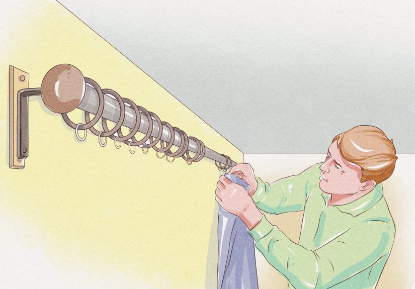
Table of Contents >> Show >> Hide
- Why Vanderhurd Patterns Play Nicely Together
- Start with the “Hero” and Let Everything Else Audition
- The Three Rules That Make Pattern Mixing Feel Effortless
- How Vanderhurd Rugs Help You Mix Patterns Without Overthinking
- Wallpaper That Doesn’t Just “Decorate” the RoomIt Defines It
- Textiles: The Easiest Way to Build a Pattern “Ecosystem”
- Room-by-Room Examples That Feel Real (Not Showroom Perfect)
- Common Mistakes (and the Fast Fixes)
- Keeping It Livable: Pets, Kids, Guests, and Real Life
- Experiences: What It’s Like to Live with a Mix of Patterns (and Love It)
- Conclusion
Pattern mixing is supposed to feel like a well-curated playlist: a little vintage, a little new, one track that’s oddly bold,
and somehow it all works together. Done right, your home feels layered, lively, and personal. Done wrong, it looks like your sofa
lost a fight with a kaleidoscope. The good news: there’s a sweet spot between “museum white box” and “my eyes are buffering.”
If you love interiors that feel collected rather than decorated, Vanderhurd is an easy brand to fall for. Their world is built on
craft, texture, and colorrugs with real substance, textiles with personality, and wallpaper that can hold its own without screaming
for attention. The result is a mix that feels expressive, not chaotic. The secret isn’t finding patterns that match; it’s finding
patterns that belong in the same story.
Why Vanderhurd Patterns Play Nicely Together
Vanderhurd’s look tends to hit that rare balance: bold enough to be interesting, structured enough to be usable. A lot of their
rugs and flatweaves read as “graphic” rather than “busy,” which makes them fantastic anchors in a room that includes wallpaper,
upholstery, and layered accessories. Their dhurries and flatweaves can deliver pattern without the visual heaviness of a dense,
ornate rugperfect when you want to stack prints without feeling like you live inside a magic eye poster.
Another advantage is material-driven character. Linen, hemp, wool, silkthese fibers don’t just carry pattern; they add a tactile
softness that keeps the room human. Texture is a cheat code in pattern mixing: it gives the eye somewhere to rest, even when the
motifs are energetic.
Start with the “Hero” and Let Everything Else Audition
The fastest way to mix patterns without panic is to pick one hero element and build outward. Your hero can be:
a statement rug, a wallpapered dining room, a favorite textile you refuse to stop loving, or even an antique piece you’d rescue
first in a fictional house fire.
Hero option 1: A Vanderhurd rug as the foundation
Rugs are excellent heroes because they sit under everything like a stage floor. If the rug’s palette is strong, the rest of the
room can borrow colors from itpillows, art, lamp shades, even the binding on drapery. A graphic dhurrie can make a room feel
pulled together before you’ve made a single commitment on the walls.
Hero option 2: Wallpaper as the “mood setter”
Wallpaper is basically instant atmosphere. It can be romantic, tailored, playful, moody, sunlit, or “I read design books for fun.”
If wallpaper is your hero, treat it like the lead singer: everything else should harmonize, not compete for the microphone.
Hero option 3: Textiles as a low-risk gateway
If you’re pattern-curious but commitment-shy, start with textiles: cushions, throws, a bench cushion, a Roman shade. You get the
effect of a layered mix with the flexibility to swap pieces seasonally (or emotionallyno judgment).
The Three Rules That Make Pattern Mixing Feel Effortless
1) Keep a tight, repeatable color story
You don’t need every pattern to share every color. You do want a few colors that recur like a chorus. Pick three to five core
colors and repeat them across the room in different doses. If your rug has ochre, indigo, and soft green, you can echo those tones
in a stripe on a pillow, a wallpaper background, or even a small ceramic vase. Repetition turns “random” into “intentional.”
A helpful way to think about balance is the classic proportion approach: a dominant color that sets the base, a secondary color that
supports it, and a smaller accent color that pops. This isn’t about strict math; it’s about making sure your room doesn’t feel like
all accents and no breathing room.
2) Mix scale like you’re building a sandwich (stay with me)
If every pattern is the same scale, they’ll compete. If you mix scale, they collaborate. Aim for:
one large-scale motif (wallpaper, big floral, bold geometric),
one medium-scale pattern (stripe, check, repeating medallion),
and one small-scale print (a tight dot, tiny floral, subtle texture).
The sandwich part: the big pattern is the bread, the medium pattern is the filling, and the tiny pattern is the seasoning.
If everything is seasoning, you’ll need a glass of water and a lie-down.
3) Use texture and “quiet” surfaces as the off switch
Pattern mixing isn’t just about pattern. It’s about contrast. Solid walls, natural wood, plaster, leather, bouclé, linen drapery,
and matte paint act like punctuation. They keep the room from feeling visually noisy. Many designers aim for a healthy mix of pattern
and solid/texture so the eye can restespecially if wallpaper is in the room.
How Vanderhurd Rugs Help You Mix Patterns Without Overthinking
Vanderhurd rugs tend to be both graphic and groundedideal for rooms with multiple prints. Their dhurries and flatweaves can offer
linear stripes, stacked geometrics, or optical rhythms that feel modern but still warm. That matters, because a rug that’s too ornate
can make everything else feel like “too much,” even if your other patterns are relatively calm.
Dhurries: crisp geometry, lighter visual weight
If you’re layering patternssay, a printed sofa, wallpaper, and patterned shadesdhurries are your best friend. They often read as
clean and architectural. They’re also practical: flat weaves can be easier to live with in high-traffic spaces, and their structure
makes furniture placement feel tidy.
Flatweaves: texture-forward pattern
Flatweaves add depth through yarn and weave as much as through motif. That’s huge when you’re trying to create a room that feels
rich without feeling busy. A textured weave can “count” as pattern in a subtle way, meaning you can go bolder on the walls or
upholstery while keeping the floor visually supportive.
Choosing the rug first: a practical checklist
- Identify two “must-have” colors you want to repeat elsewhere (for cohesion).
- Decide the room’s pattern temperature: calm (stripes, tight geometrics) or expressive (bolder motifs).
- Pick your contrast: if the rug is high-contrast, keep wallpaper softer; if the rug is subtle, let wallpaper sing.
- Leave at least one large surface quiet (walls, drapery, or major upholstery) so the rug can do its job.
Wallpaper That Doesn’t Just “Decorate” the RoomIt Defines It
Wallpaper is where pattern mixing becomes a lifestyle choice (the good kind). It’s also where people panic because it feels permanent.
Here’s the trick: treat wallpaper as atmosphere, not an all-or-nothing identity. In other words, you’re not marrying the wallpaper.
You’re just inviting it to move in and split the utilities.
Where Vanderhurd wallpaper works especially well
- Powder rooms: small scale, big impactlike a great accessory.
- Dining rooms: pattern adds intimacy and makes everyday meals feel like you tried (even if dinner is cereal).
- Bedrooms: one wallpapered wall behind the bed can act like a headboard’s cooler cousin.
- Hallways: transitional spaces can handle drama because you don’t live there all day.
How to layer wallpaper with rugs and textiles
If your wallpaper is a bold geometric, pair it with a rug that feels structured (a stripe, a stacked motif, a subtle optical rhythm).
If your wallpaper is floral or more organic, you can ground it with a graphic rug and sprinkle in a small-scale print on cushions.
The goal is contrast without conflictlike siblings who argue, but still show up for each other.
Textiles: The Easiest Way to Build a Pattern “Ecosystem”
Textiles are where a room gets its personality. They’re also the most forgiving place to experiment. Vanderhurd’s fabrics and cushions
often bring pattern with a handcrafted feelblock printing, embroidery, and layered color effects that don’t look digitally perfect.
That slight irregularity is a gift: it makes mixed patterns feel lived-in instead of staged.
The “sprinkle strategy” for textiles
Think of your textiles in three categories:
anchors (sofa upholstery, large curtains),
connectors (armchair fabric, bedspread, large pillows),
and sprinkles (small pillows, throws, lampshades).
Put your boldest textile patterns in connector or sprinkle territory unless you’re fully committed to maximalism.
Mixing embroidery with prints
Embroidery behaves differently than print. It catches light, adds relief, and reads as more “crafted.” If you’re mixing multiple
prints, embroidered pieces can function as a textured neutralstill interesting, but less visually noisy than another busy motif.
An embroidered cushion on a printed sofa can calm the whole scene.
Room-by-Room Examples That Feel Real (Not Showroom Perfect)
Living room: graphic rug + playful textiles
Start with a Vanderhurd dhurrie that includes two or three colors you can reuse. Add a solid sofa (linen or a textured weave), then
bring in pillows with mixed motifs: one geometric, one stripe, one small-scale pattern. If you want wallpaper, consider using it on
a single wall or in the adjacent entry so the living room still breathes.
A great combo is an “optical” geometric textile in a controlled palette paired with a rug that echoes the geometry but shifts the
scale. The repetition makes the mix feel deliberatelike you planned it, not like you impulse-bought five pillows at midnight.
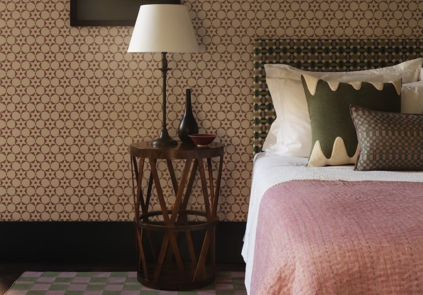
Bedroom: wallpaper as the headliner, rug as the calm base
If your bedroom wallpaper has a bold motif, keep the bedding pattern smaller and softerthink thin stripes, tiny prints, or textured
solids. A flatweave rug with subtle pattern can add depth without visual caffeine. Then add one accent textile (like a patterned bench
cushion or a throw) that repeats a wallpaper color in a different pattern family.
Dining room: pattern drenchinggrown-up edition
Pattern drenching is the trend version of what classic decorators have done forever: layering pattern across walls, upholstery, and
floors so the room feels immersive. The key is to keep the palette disciplined and the scales varied. A wallpapered dining room can
pair beautifully with a structured rug and upholstered chair seats in a smaller-scale print. Add a solid curtain or shade fabric to
keep the room from becoming visually loud.
Home office: small space, big personality
Offices are great for pattern because you can create a “world” in one room. Try wallpaper behind your desk, a dhurrie rug underfoot,
and a patterned cushion on your chair. Keep storage pieces and the desk itself simple. The room will feel energetic without reducing
your brain to a screensaver.
Common Mistakes (and the Fast Fixes)
-
Mistake: Everything is bold.
Fix: Add one large, quiet elementsolid drapery, a neutral sofa, or a textured wall paint. -
Mistake: Patterns all the same scale.
Fix: Swap one element to a smaller-scale print or a broader, calmer stripe. -
Mistake: Too many unrelated colors.
Fix: Choose 3–5 core colors and repeat them intentionally across the room. -
Mistake: The room feels “busy” even with a good palette.
Fix: Increase texture and reduce contrasttone-on-tone patterns can still feel rich without shouting.
Keeping It Livable: Pets, Kids, Guests, and Real Life
The fear with patterned rooms is that they’ll feel like a magazine spreadbeautiful, untouchable, and somehow allergic to snacks.
In reality, patterns can be more forgiving than solids. Rugs with variation hide the everyday signs of living. Layered textiles let you
rotate pieces (hello, washable cushion covers). And wallpaper can make scuffs less obvious than a flat, solid paintespecially in
high-traffic hallways.
The livability trick is to decide where you want the room to be resilient. If your living room is the family landing pad, anchor it
with a durable rug structure and keep the most delicate textiles for low-traffic zones. If your powder room is where you want drama,
go big on wallpaper there and keep the rest of the house calmer.
Experiences: What It’s Like to Live with a Mix of Patterns (and Love It)
Here’s what tends to happen when people actually commit to a layered mix of patternsespecially when Vanderhurd rugs, wallpaper, and
textiles are part of the story. First, the room starts doing emotional heavy lifting. Guests walk in and immediately have something to
talk about (“Is that wallpaper… optical?”). You stop apologizing for your space and start enjoying it. Pattern has a funny way of
making a home feel finishedeven when the “finished” version still includes a phone charger living permanently on the side table.
Second, you begin to notice that pattern mixing is less about bravery and more about editing. The most common lived experience is this:
you add the hero piecesay, a graphic dhurrieand everything feels exciting but a little loud. Then you pull one thing back (maybe the
curtains become a textured solid), and suddenly the whole room clicks. People expect the solution to “too much pattern” to be “remove
pattern,” but it’s often “add calm.” A simple linen, a matte paint, a wood tonethose are your pressure valves.
Third, you learn the joy of repetition. Once you’re living with pattern, you start repeating small details like you’re composing music.
A color from the rug shows up again in a lampshade trim. A wallpaper tone reappears in a cushion stripe. A stitched detail echoes the
geometry of the floor pattern. This repetition doesn’t feel restrictive; it feels soothing. It’s what keeps your space from becoming
a random collection of pretty things and turns it into a room with a point of view.
Fourth, your relationship with “seasonal decorating” gets easier. Patterned rooms already have movement, so you don’t need a dramatic
overhaul to make them feel fresh. Swapping two cushion covers can be enough. In cooler months, people often lean into deeper, denser
textilesan embroidered cushion, a heavier throw, richer tones pulled from the rug. In warmer months, the same palette can feel airy
just by shifting to lighter-weight fabrics and a few brighter accents. The base stays coherent because the rug and wallpaper keep the
story intact.
Fifth, you become surprisingly relaxed about imperfections. This is the under-discussed benefit of handcrafted-feeling pattern:
it doesn’t demand sterile perfection. A room with layered textiles and a woven rug can absorb the realities of lifecrumbs, creases,
paw prints, the occasional mystery markwithout looking “ruined.” It still looks intentional. In fact, a little wear can make the room
feel more authentic, like it’s being used instead of preserved.
Finally, you discover that pattern mixing isn’t a one-time decisionit’s a skill you keep refining. Many people start with the safe
version: patterned rug, mostly solid everything else. Then they add wallpaper in a small space. Then they get bold with upholstery.
Over time, you start to trust your eye. You know when to add another print and when to stop. And when you do go a little too far,
you’ll also know the easiest fix: remove one competing item, repeat one color elsewhere, and let texture do the quiet work.
Conclusion
Living with a mix of patterns doesn’t require a design degreejust a plan. Start with a hero (rug, wallpaper, or textile), keep a
repeatable palette, vary scale, and build in calm through texture and solids. Vanderhurd pieces make this easier because they’re
designed with structure: graphic motifs, craft-driven texture, and color that’s meant to be layered. The result can be expressive,
livable, and deeply personallike your home finally learned how to tell your story without yelling.