Table of Contents >> Show >> Hide
- The Look, in One Sentence
- Why Terracotta Works So Well in a Dining Room
- Start Here: Your Terracotta Color Strategy
- The Furniture Formula: Warm Wood + Mixed Seating
- Lighting: Your Dining Room Should Not Rely on One Overhead Bulb
- Textiles: The Difference Between “Pretty” and “Lived-In”
- Accessories That Make Terracotta Look Expensive
- The East London Twist: Vintage Bones, Modern Confidence
- Steal-This-Look Shopping Checklist
- Common Mistakes (and Easy Fixes)
- Extra: Real-Life “Experience” Notes (About )
- Final Thoughts
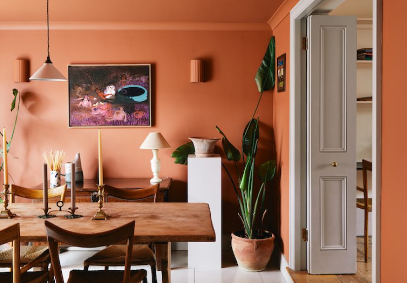
If your dining room has been feeling a little… emotionally beige, it’s time for a gentle intervention. Picture an East London dining space in a classic
Victorian terrace: tall sash windows, honest wood floors, and walls dipped in terracottathe kind of warm, clay-rich color that makes even a Tuesday night
leftover situation feel like a reservation.
This is a “steal the look” guide, not a museum tour. We’re borrowing the vibe: sun-baked walls, layered lighting, wood that looks better with age, and
styling that whispers effortless while quietly admitting it has a plan. You’ll get color picks, layout advice, lighting rules that actually make
sense, and a shopping checklist you can use whether your budget is “thrift store treasure hunt” or “I deserve a chair that hugs me.”
The Look, in One Sentence
Terracotta walls + warm wood + black accents + brass glow + tactile textilesa dining room that feels like candlelight even when the
candles are still in the drawer.
Why Terracotta Works So Well in a Dining Room
1) It flatters people, food, and furniture
Terracotta sits in that sweet spot between orange and red-brown, which means it plays nicely with skin tones, wood grain, and anything served on a plate.
It’s basically a built-in filterwithout the weird “why does my face look like a wax statue” side effect.
2) It’s cozy without being gloomy
Dark dining rooms can feel dramatic, but they can also feel like you’re eating inside a tuxedo. Terracotta brings depth while keeping warmth front and
center. The result is intimate, not cave-likeespecially if you balance it with lighter trim, reflective accents, and layered lighting.
3) It makes “color drenching” feel approachable
Fully saturated rooms (walls, trim, even ceilings) are having a moment because they make spaces feel intentional and immersive. Terracotta is a great
gateway color: bold enough to feel designed, earthy enough to feel livable.
Start Here: Your Terracotta Color Strategy
Pick the undertone you want (this is where most people go wrong)
“Terracotta” isn’t one colorit’s a family. Some versions lean pumpkin, some lean rust, some lean pink-clay, and some go deep and pottery-rich.
Choose your lane based on your light and your furniture:
- For north-facing or cooler light: choose a warmer, redder terracotta so the room doesn’t read flat.
- For bright rooms: you can go deeper and moodier; sunlight will keep it from looking heavy.
- If your floors are orange-toned wood: pick a terracotta that leans slightly red-brown (not yellow-orange) to avoid “everything matches, and now nothing matches.”
Concrete paint examples (so you’re not guessing)
Here are a few real-world options designers and homeowners reach for when they want that fired-clay effect:
- Sherwin-Williams Rookwood Terra Cotta (SW 2803): deep, historic, pottery-richexcellent for a moody East London feel.
- Sherwin-Williams Pennywise (SW 6349): bolder and sunniergreat if you want warmth that’s noticeable from the hallway.
- Benjamin Moore Baked Terra Cotta (1202): grounding orange-brownespecially good with pale oak and creamy whites.
Finish matters: choose the one that forgives real life
A dining room should handle chair scuffs, fingerprints, and that one friend who gestures enthusiastically while holding red wine.
In most homes, matte or eggshell reads rich and soft while still being wipeable.
Super-flat can look dreamy, but it’s less forgiving when you need to clean.
Trim + ceiling: the quiet support team
To keep terracotta from feeling overwhelming, pair it with a warm off-white on trim and ceiling. “Warm” is the key wordcool whites can make terracotta
look oddly pink or muddy. If you want an East London twist, consider painting the trim almost the same shade as the wall for a gentle,
modern “envelope” effect.
The Furniture Formula: Warm Wood + Mixed Seating
The table: make it look like it’s hosted stories
This look loves woodoak, walnut, even a pine table that’s been sanded and sealed. In an East London-inspired room, a rectangular table often fits the
architecture (narrow rooms, fireplaces, bay windows), but a round pedestal table can be a lifesaver if you’re tight on circulation space.
Pro tip: if your room is small, a pedestal base buys you knee space and makes chairs easier to slide in and out (your shins will write thank-you notes).
Chairs: don’t match everythingcurate it
Terracotta likes texture. A simple way to “steal” the designer look is to mix chair materials while keeping a consistent silhouette or palette:
- Option A (classic): all wood chairs in a slightly darker tone than the table for contrast.
- Option B (cozy): two upholstered end chairs (velvet, bouclé, or leather) + four lighter side chairs.
- Option C (East London eclectic): vintage bentwood chairs + one modern statement chair that looks like it belongs in a gallery.
A sideboard is the secret weapon
If you want the room to feel “styled” instead of “table in a box,” add a sideboard or console. It anchors art, provides storage for linens, and gives you
a landing zone for candles, ceramics, and the occasional dramatic baguette.
Lighting: Your Dining Room Should Not Rely on One Overhead Bulb
Choose a statement fixture that fits the table
Dining room lighting looks best when it relates to the table’s shapelinear fixtures over rectangular tables, round or clustered pendants over round tables.
Scale matters: too small looks apologetic, too big looks like the ceiling is wearing shoulder pads.
Layer the light (so the room works at 8 a.m. and 8 p.m.)
A “big light” can be beautiful, but it shouldn’t do all the emotional labor. Add at least one of these:
- Two wall sconces (especially if you have a chimney breast or fireplace wall)
- A table lamp on the sideboard (yes, lamps in dining rooms are chic)
- Candles for the “everyone looks 12% more relaxed” effect
Bulbs: pick warmth, not interrogation-room white
Terracotta thrives under warm light. Aim for a soft, warm glow so the walls read clay-rich instead of orange. If you can, put the main fixture on a dimmer.
It’s the cheapest luxury upgrade you can make.
Textiles: The Difference Between “Pretty” and “Lived-In”
The rug (yes, even in a dining room)
A rug under the table makes the space feel finished and helps terracotta feel layered instead of loud. Practical matters:
choose a low pile or flatweave so chairs slide easily. In this look, go for one of these directions:
- Muted vintage pattern: brings in soft blues, creams, and faded reds to balance the walls.
- Natural fiber: jute or sisal adds texture and keeps the palette grounded.
- Graphic neutral: black-and-cream stripes if you love contrast and a slightly modern edge.
Window treatments: soften the clay
Linen curtains in warm white, sand, or oatmeal are an easy win. They filter light, add movement, and keep the room from feeling too “painted.”
If you want a more tailored look, add a simple woven shade underneath.
Accessories That Make Terracotta Look Expensive
Ceramics (because “baked earth” is the theme)
Terracotta literally refers to fired clayoften unglazed, durable, and naturally earthy. That’s why ceramics feel so right here: unglazed pots, matte vases,
hand-thrown bowls, or a chunky platter that looks like it came from a tiny shop you “just happened to find.”
Greenery: your best complementary color
If terracotta is the warm base, green is the balancing act. Olive, sage, and deep leafy tones keep the room from tipping into too much “sunset.”
A large plant in a corner (or a branchy arrangement on the sideboard) adds height and life.
Art: one big piece beats five tiny apologies
Above the sideboard, go larger than you thinkespecially with tall ceilings. Terracotta walls look incredible behind:
- bold black line drawings
- abstracts with cream, rust, and muted green
- textural art (woven panels, plaster-like canvases)
Styling rule that always works: odd numbers
When you’re arranging objects (candles, vases, bowls), group them in threes, mixing height and texture. It reads balanced but relaxedlike you meant to do it,
even if you did it in 90 seconds before someone rang the doorbell.
The East London Twist: Vintage Bones, Modern Confidence
What makes the “East London terracotta dining room” feel distinct is the mix: old architectural details with contemporary color confidence.
If your home has any original featurespicture rails, fireplaces, ceiling roseslet them be part of the story.
How to fake the look in a newer home
- Add a simple ceiling medallion before installing your pendant.
- Use panel molding on one wall and paint it the same terracotta for subtle texture.
- Bring in a vintage piece (mirror, sideboard, or art) so the room doesn’t feel “all new, all at once.”
Steal-This-Look Shopping Checklist
No links, just a clean list you can search anywhere:
- Terracotta wall paint (pottery-leaning, not pumpkin-leaning)
- Warm off-white trim paint
- Oak or walnut dining table (rectangular or round pedestal)
- Mixed chairs (wood + two upholstered end chairs)
- Statement pendant (linen, rattan, opal glass, or aged brass)
- Dimmer switch + warm bulbs
- Flatweave rug (vintage pattern or natural fiber)
- Linen curtains (warm white/oatmeal)
- Unglazed ceramics + a large serving platter
- One oversized artwork or mirror
- Two taper candleholders (brass or black)
- A leafy plant (olive-like silhouette or something tall and architectural)
Common Mistakes (and Easy Fixes)
Mistake: The walls look too orange
Fix: shift the supporting palette cooler and deeper: add black accents, a rug with muted blues or creams, and wood tones that lean neutral
rather than honey.
Mistake: The room feels dark and heavy
Fix: brighten with warm-white trim, increase reflective surfaces (mirror, glass, brass), and layer lightingespecially a lamp on the sideboard.
Mistake: Everything is “matchy-matchy”
Fix: introduce one surprise material: a marble tray, a woven pendant, a glossy ceramic, or a modern chair in a contrasting fabric.
Terracotta loves contrastgive it something to play against.
Extra: Real-Life “Experience” Notes (About )
Here’s the part nobody tells you when you fall in love with a terracotta dining room photo online: living with this look is less about perfection and more
about mood. The walls do a lot of work for yousometimes so much work that you’ll catch yourself thinking, “Did I really just plate takeout like it’s a
tasting menu?” Yes. Yes, you did. Terracotta makes ordinary meals feel intentional because the room itself feels warm, gathered, and slightly dramatic in
the best way.
In the morning, terracotta reads softermore like baked clay than bold orangeespecially with daylight filtering through linen curtains. It’s an unexpectedly
calming backdrop for coffee, homework, emails, or that quiet five-minute stare into the middle distance before your day starts. If your dining room doubles
as a work zone (very real), the color helps the space feel less like a spare office and more like a lived-in room that happens to host a laptop sometimes.
A sideboard lamp is the hero here: it keeps the room from feeling “on display” and gives you that gentle glow that makes early hours feel less harsh.
By late afternoon, terracotta absolutely shines. It warms up as natural light shifts, and that’s when you’ll understand why people get hooked on earthy
tones. The room starts to feel like it’s holding the day for youcozy, a little cinematic, and ready for dinner even if dinner is eggs and toast. If you
add greenery (even just one plant), you’ll notice how alive the contrast feels. Terracotta + green is one of those pairings that looks styled without
trying. It’s like they were introduced at a party and immediately became best friends.
Hosting is where the look earns its keep. With terracotta walls, you can keep the table setting simple and still feel like you “decorated.”
A flatweave rug makes the whole scene feel grounded; candlelight makes the walls glow; and mixed chairs make it look collected rather than purchased as a
set. If you want a styling trick that works every time, use the “odd-number” approach: three items on the table (say, a low bowl, two candlesticks, and a
small vase of branches). Keep it low so people can actually see each otherbecause the best dining rooms are designed for conversation, not obstacle courses.
The practical side: scuffs happen. Chair backs kiss walls. Hands touch paint. If you choose an eggshell finish, most of this is manageable, and the room
stays looking soft rather than shiny. Also, terracotta is surprisingly forgiving with everyday clutter. A stack of mail on a wood sideboard looks less like
chaos and more like “a life in progress.” Not all colors are that kind. Terracotta is.
After a few weeks, the biggest “experience” shift is this: you stop thinking of the dining room as a formal zone and start using it more. The warmth makes
the space inviting, so you lingertalk longer, light a candle for no reason, add music, pour something sparkling even if it’s just seltzer. And honestly?
That’s the real steal: not the paint color, but the way the room makes everyday life feel a little more like an occasion.
Final Thoughts
A terracotta dining room doesn’t need to be complicated. Pick the right undertone, balance it with warm whites and wood, layer lighting like you mean it,
and let texture do the heavy lifting. The East London vibe comes from confidence: old-meets-new, practical-meets-beautiful, and a room that’s ready for
real lifenot just photos.