Table of Contents >> Show >> Hide
- Who (and What) Is X + L?
- Why Amsterdam Is the Perfect Backdrop for X + L
- The X+L Design DNA: Austerity Meets Color (and They Don’t Fight)
- How to Do an Architect-Style Visit to Amsterdam (Using X+L as Your Compass)
- Lessons You Can Borrow from X+L (Without Moving to Amsterdam)
- Conclusion: Seeing Amsterdam the X+L Way
Amsterdam is the rare city that can make an architect feel both wildly inspired and mildly judged by a bicycle.
One minute you’re staring at a gabled canal house that looks like it was designed by a poet with a ruler; the next,
you’re watching a local casually steer one-handed through a narrow lane while texting and balancing a baguette.
In that perfect chaos lives the appeal of X + L (often written as x+l)an Amsterdam-based interior design duo
admired for kitchens that are somehow both strict and playful. If you’ve ever wondered how Dutch interiors pull off calm minimalism
without turning into a blank waiting room, an “architect visit” through the X+L lens is an excellent way to find out.
Who (and What) Is X + L?
X + L is the design studio of Xander Vervoort and Leon van Boxtel, known for an approach that reads like a love letter
to restraintuntil a bold color shows up and steals your attention in the nicest possible way. They’ve been associated with an “organic modern” sensibility:
clean forms, tactile materials, and a human touch that keeps the space from feeling overly precious.
They’re also notable for treating interiors as more than a shopping list of furniture. Think of their work as
architecture at the scale of daily life: the kitchen drawer you open 40 times a day, the light that hits a wall at 4 p.m.,
the way a countertop edge feels under your hand.
Over time, the studio’s universe expanded beyond rooms into objectslimited-run pieces and handmade goods produced with artisans.
The message is consistent: perfection is overrated; character is not. In other words, if a surface has tiny irregularities, it’s not a defect
it’s proof a human existed.
Why Amsterdam Is the Perfect Backdrop for X + L
Amsterdam’s built environment is a masterclass in doing a lot with a little. Space is finite. Light is precious. Storage is a competitive sport.
And the historic city centershaped by canals, narrow plots, and tall, compact housesnudges designers toward solutions that are disciplined, clever,
and unusually sensitive to proportion.
1) A city designed around water (and stubbornness)
The famous canal belt isn’t just pretty; it’s urban planning with a long memory. The ring of canals and streets created an orderly framework for growth,
and the narrow parcels encouraged vertical livingtall façades, tight footprints, and interiors that reward smart layout choices.
2) Brick, craftsmanship, and the joy of texture
Amsterdam’s architectural personality is deeply tied to brick, masonry detail, and façades with strong rhythms of openings.
That tactile tradition shows up indoors, too: matte finishes, honest materials, and surfaces that look better when you live with them,
not only when you photograph them.
3) Dutch design: practical, conceptual, and quietly funny
The Netherlands has a reputation for design that’s pragmatic yet experimentalwhere function matters, but so does the idea behind the function.
That mindset maps neatly onto X+L: a pared-back foundation with one or two “interesting decisions” that keep the space awake.
The X+L Design DNA: Austerity Meets Color (and They Don’t Fight)
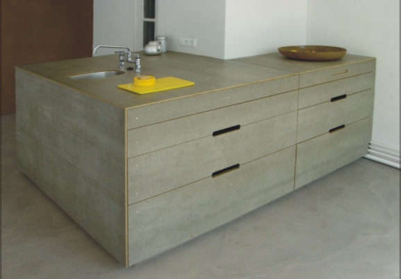
Remodelista once summed up the X+L effect in a way that sticks: their kitchens feel “unmistakably Dutch” thanks to a mix of austerity and color.
That pairing is the key. Austerity gives the room clarity. Color gives it personality. Put them together, and you get a space that feels composednever cold.
Color as structure, not decoration
In many interiors, color is the final steplike sprinkles on a cupcake. In an X+L-inspired approach, color can act more like a structural move:
defining a volume, highlighting a plane, or giving a simple cabinet run a sense of intention. The trick is to keep the geometry calm,
then let one color do the talking.
“Organic modern” without the blandness
Organic modern is often misunderstood as “beige + rounded furniture.” A more useful definition is:
modern simplicity softened by natural materials and imperfect craft.
Think timber grain you can actually see, plaster-like walls that catch light, textiles with weave and depth,
and lighting that feels warm instead of surgical.
Imperfect details that make the room feel lived-in
When designers say they “embrace the imperfect,” it can sound like a motivational poster. In practice, it means choosing materials and objects that age well:
patina-friendly metals, textiles that don’t panic at the sight of a coffee mug, and handmade pieces whose variations feel intentional.
How to Do an Architect-Style Visit to Amsterdam (Using X+L as Your Compass)
You don’t need access to a private studio to learn from a designer. You need a plan, good shoes (or a sturdy bike),
and the willingness to stare at door handles like you’re being paid for it. Here’s a one-day itinerary that blends
historic urbanism, material culture, and modern design energy.
Morning: The Canal Ring (proportion, rhythm, restraint)
-
Start with a slow walk along a canal where the façades form a repeating pattern of narrow widths, tall openings, and subtle differences.
Notice how variation lives inside a strict frameworkan idea you can reuse in kitchens and interiors. - Peek into passages and courtyards when you can. Amsterdam’s best spatial lessons often hide behind modest doors.
- Sketch one façade bay (even a messy sketch). The goal is to train your eye to see alignment, repetition, and scale.
Midday: Amsterdam School energy (texture, craft, drama)
To understand why Dutch “austerity” doesn’t have to mean “boring,” spend time with Amsterdam School architecture.
It’s expressive, brick-heavy, and deeply craftedproof that discipline and drama can co-exist. Bring that lesson back to interiors:
a quiet kitchen can still have one heroic gesture (a color block, a sculptural pendant, a tactile backsplash).
Afternoon: Waterfront modernism (new Amsterdam, new materials)
Cross to the city’s newer edgesdocklands, redeveloped industrial areas, and the waterfrontwhere contemporary buildings show how Amsterdam keeps evolving.
A modern visit complements the historic core: you’ll see how today’s designers handle glass, steel, and large public spaces without losing the city’s human scale.
- EYE Film Institute: a cinematic building that makes you think about movement, reflection, and the choreography of approach.
- NEMO Science Museum: a playful massing and a reminder that public architecture can be bold without being obnoxious.
Late afternoon: Design shops and showrooms (conceptual + practical)
Amsterdam’s design scene is famous for mixing concept and craft. Even if you buy nothing, treat showrooms like small exhibitions:
materials, joinery, color stories, and lighting strategies are all there to be studied. If you’re hunting for X+L-adjacent inspiration,
look for pieces that are simple in form but rich in texture.
Evening: The kitchen as a cultural document
End the day by noticing how people actually live: how cafés use light, how small apartments manage storage, how locals treat the street as an extension
of the home. Your best interior ideas will come from these real-life observationsbecause design is ultimately a plan for human behavior.
Lessons You Can Borrow from X+L (Without Moving to Amsterdam)
Let’s be honest: most of us can’t redesign a kitchen on a whim. But you can borrow the logic behind X+L’s aesthetic and apply it at any scale.
1) Build a “quiet grid,” then pick one loud note
Keep cabinet lines simple and aligned. Minimize visual breaks. Then add one deliberate accent: a saturated cabinet color, a strong stone,
or a single sculptural light. The grid makes the accent feel intentional instead of random.
2) Choose materials that get better with time
Patina is not a failure mode; it’s a feature. Think oiled wood, honest textiles, and metals that mellow instead of peeling.
If you’re afraid of a material aging, it might not be the right material for a hardworking kitchen.
3) Treat lighting like architecture
Don’t rely on one ceiling fixture to do everything. Layer task light, ambient light, and a warm focal glow.
Good lighting makes minimal interiors feel welcomingand makes bold color look sophisticated instead of harsh.
4) Edit harder than you decorate
The most “Dutch” interior trick might be editing: fewer objects, better chosen. Keep what you use. Display what has meaning.
Let empty space do some of the work. (Empty space is the intern of interior design: underpaid, overachieving.)
Conclusion: Seeing Amsterdam the X+L Way
An architect visit to Amsterdam isn’t just about landmark buildingsit’s about learning how a city’s constraints shape its interiors.
X+L’s kitchens resonate because they feel like Amsterdam itself: disciplined, practical, and quietly daring.
If you take one idea home, let it be this: simplicity gets powerful when it’s paired with one brave decision.
Field Notes: of X+L-Flavored Amsterdam Experience
I started the day the way Amsterdam seems to prefer: moving. Not rushingjust moving with purpose, like the city is politely allergic to loitering.
The air had that canal-side crispness, and every brick façade looked freshly arranged, as if someone had straightened the city overnight.
I took the slow route along the water on purpose, letting the canal houses do their repeating pattern trick: narrow, tall, narrow, tallthen a slight variation
that made the whole block feel alive. It hit me that this is the same game great kitchens play: repetition for calm, variation for delight.
By mid-morning, my notes were full of unglamorous observations: window alignments, stair angles, door widths, and the odd miracle of a building that looks
elegant while clearly containing three centuries of awkward renovations. I grabbed coffee and watched bikes slide past like a continuous design critique.
Nobody seemed to be performing “style.” Everything felt used, functional, and somehow still beautifulan everyday aesthetic that doesn’t beg for applause.
Later, I chased texture. Amsterdam School brickwork has a kind of muscular warmthexpressive without being chaotic. It’s the opposite of sterile minimalism,
and it made me rethink the word “austerity.” Austerity doesn’t have to mean thin or fragile. It can mean deliberate: fewer moves, stronger moves.
That idea felt very X+L. A room can be calm and still have depth if the materials carry the interest.
In the afternoon I headed toward the waterfront, where the city shifts from historic precision to modern experimentation. The EYE Film Institute reads like
a piece of frozen motionsharp planes, reflective surfaces, and a sense that the building is aware you’re approaching. Nearby, NEMO has that joyful boldness
that makes you forgive it for being dramatic. Standing there, I realized Amsterdam doesn’t ask you to pick a side between “old” and “new.”
It just expects you to pay attention to how each era solves problems.
By evening, I was thinking about kitchens againnot as rooms, but as systems. The best spaces I saw all shared a quiet confidence:
clear lines, smart storage, and one surprising moment (a color, a lamp, a rough-hewn object) that kept the room human. That’s the X+L lesson in a sentence.
Make the base calm. Make one choice brave. And let the rest of the space do what Amsterdam does best: work hard, look effortless, and never apologize for being practical.