Table of Contents >> Show >> Hide
- Before You Pick a Pattern: 5 Quick Remodeler Rules
- 10 Subway Tile Patterns to Choose
- 1) Classic Running Bond (Brick Pattern)
- 2) One-Third Offset Running Bond (Modern Brick)
- 3) Horizontal Stacked Bond (Grid / Stack Bond)
- 4) Vertical Stacked Bond (Vertical Stack / “Skyscraper” Look)
- 5) Vertical Running Bond (Brick Pattern, But Up)
- 6) Herringbone (Classic Zigzag, Big Payoff)
- 7) Chevron (Sharp, Tailored, and Intentionally Fancy)
- 8) Basketweave (Woven Look, Great Texture)
- 9) Diagonal Running Bond (The “Instant Energy” Layout)
- 10) Stepped Offset (Stair-Step / Progressive Shift)
- How to Choose the Right Subway Tile Layout for Your Room
- Grout, Trim, and Finishing Details That Make the Pattern Pop
- Conclusion
- Extra Remodeler Experiences: Lessons Learned the Hard Way (So You Don’t Have To)
- SEO Tags
Subway tile is the little black dress of remodeling: it goes with everything, it’s rarely “wrong,” and it somehow
survives every trend cycle like it’s got a secret bunker stocked with timelessness. But here’s the twist (pun fully
intended): the pattern you choose changes the whole personality of the room. Same tile. Totally different vibe.
Want your kitchen backsplash to feel classic and calm? There’s a layout for that. Want your shower to feel taller,
bolder, or “I definitely paid a designer, don’t ask questions”? Yepthere’s a layout for that too. In this
remodeler-friendly guide (with a nod to Bob Vila’s practical, no-nonsense spirit), we’ll break down 10 subway tile
patterns you can actually live withplus the real-world tips that keep your walls from looking like a wavy mirror
at a carnival.
We’ll cover what each subway tile pattern looks like, where it works best (kitchen backsplash, bathroom walls,
shower surround, even floors), how hard it is to install, and the small choiceslike grout color and offsetthat
make a huge difference. Ready to pick a pattern you’ll still love after the novelty wears off? Let’s tile responsibly.
Before You Pick a Pattern: 5 Quick Remodeler Rules
1) Tile “shape” includes the grout lines
Subway tile layout isn’t just tileit’s the grid you create with grout joints. Contrast grout makes patterns pop.
Matching grout softens the lines and makes the surface feel calmer (and slightly more forgiving of crumbs).
2) The bigger the tile, the fussier the offset
Many rectangular tiles have a slight bow. If you install them in a perfect 50% brick pattern (classic running bond),
the high spot of one tile can line up with the low spot of the next, making “lippage” (uneven edges) more likely.
That’s why a one-third offset is often recommended for longer tiles.
3) Choose a “hero area”
You don’t need a fancy pattern everywhere. A simple field pattern plus a feature section (behind a range, in a
shower niche, over a vanity) can look more intentionaland costs less in labor and tile cuts.
4) Dry layout isn’t optionalit’s your sanity plan
Use painter’s tape or a few rows of tiles on a counter to test the look. Small changes in starting point can decide
whether you end up with nice, balanced cuts… or a sad sliver of tile that will haunt your dreams.
5) Order extra tile (and don’t mix dye lots)
Pros typically plan for extra material because cuts, breaks, and “oops” happen. Buying later can mean a slightly
different shade or finish, especially with handmade-look tiles.
10 Subway Tile Patterns to Choose
1) Classic Running Bond (Brick Pattern)
This is the subway tile pattern most people picture: each row is offset so the joints don’t line up,
like a brick wall. It’s traditional, balanced, and works with everything from farmhouse to modern.
- Best for: Kitchen backsplash subway tile, bathroom walls, shower surrounds
- Style effect: Timeless, comfortable, visually “quiet” even with bold grout
- Pro tip: If you’re using the classic 3×6 size, the traditional 50% offset is usually fine.
2) One-Third Offset Running Bond (Modern Brick)
Think of this as the classic running bond’s more practical cousin. Instead of offsetting by half the tile length,
you offset by about one-third. It reads nearly the same from across the room, but it can reduce the chance of uneven
edges with longer subway tiles (like 4×12, 3×12, 4×16, and beyond).
- Best for: Larger-format subway tiles, long shower walls, big kitchen backsplashes
- Style effect: Classic with a slightly more modern rhythm
- Pro tip: If your tile has noticeable bowing, widen grout joints a bit and keep the surface flat with leveling clips.
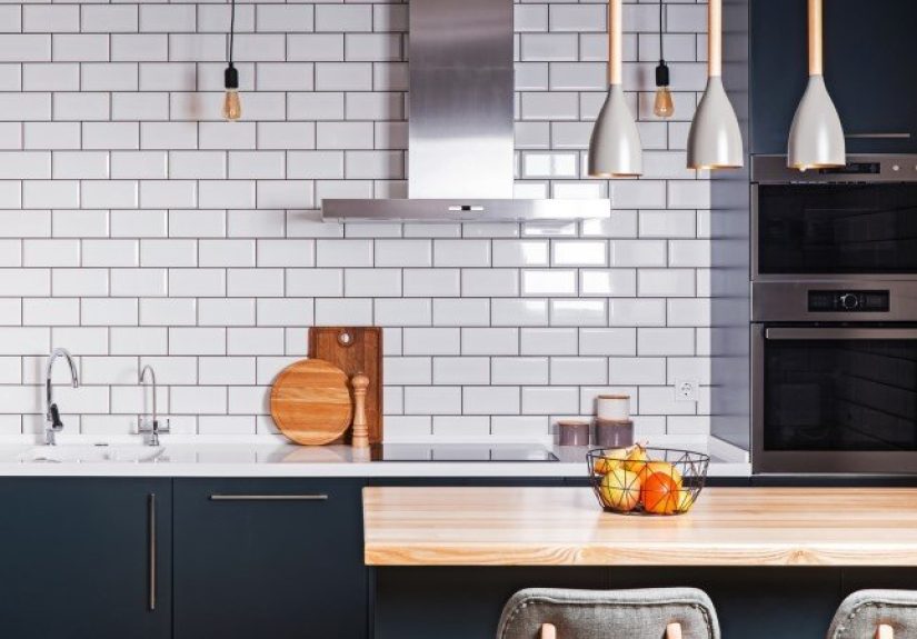
3) Horizontal Stacked Bond (Grid / Stack Bond)
Tiles line up in neat columns and rows. No offset. No “brick” movement. Just a crisp grid that feels modern,
minimalist, and surprisingly versatileespecially when paired with interesting tile finishes like glossy, matte,
or handmade-look edges.
- Best for: Contemporary kitchens, modern bathrooms, feature walls
- Style effect: Clean, orderly, graphic
- Pro tip: This pattern shows crooked walls and sloppy spacing fastuse a laser level and consistent spacers.
4) Vertical Stacked Bond (Vertical Stack / “Skyscraper” Look)
Same grid concept, but turned vertically. This layout can visually stretch walls upwardhelpful in small bathrooms,
tight shower stalls, or any room that needs a little “taller, please” energy. It’s also a sleek way to update classic
white subway tile without switching materials.
- Best for: Shower surrounds, powder rooms, narrow spaces
- Style effect: Taller walls, more modern and tailored
- Pro tip: Pair with a simple grout color if you want height without “barcode chic.”
5) Vertical Running Bond (Brick Pattern, But Up)
Vertical running bond is the best of both worlds: the familiar staggered look of brick pattern, but rotated so the
movement goes upward. It can make a backsplash feel taller and gives a subtle “designer chose this on purpose” feel
without going full geometry class.
- Best for: Kitchen backsplashes behind open shelves, shower walls, vanity walls
- Style effect: Adds height and motion while staying classic
- Pro tip: Keep your layout centered around the most visible area (like behind the faucet or range).
6) Herringbone (Classic Zigzag, Big Payoff)
Herringbone uses rectangular tiles in a V-shaped zigzag. It’s dramatic, traditional, and modern at the same time
basically the tile version of a blazer you can wear to anything. White herringbone subway tile is a popular move,
but the pattern also looks incredible in soft color or handmade textures.
- Best for: Statement backsplashes, shower accent walls, behind a range
- Style effect: Dynamic, high-end, eye-catching
- Pro tip: Start from a true centerline and use a ledger board; tiny alignment errors multiply fast.
7) Chevron (Sharp, Tailored, and Intentionally Fancy)
Chevron looks similar to herringbone, but the ends meet in a clean point-to-point V. It’s crisp and symmetrical,
and it reads more “architectural” than herringbone. The catch: chevron is easiest with chevron-shaped tiles
(or perfectly mitered cuts), so it can raise the complexity.
- Best for: Feature walls, niche backdrops, focal-point backsplashes
- Style effect: Bold, modern, clean geometry
- Pro tip: If you want chevron with less pain, choose a prefab chevron mosaic sheet.
8) Basketweave (Woven Look, Great Texture)
Basketweave alternates “bundles” of horizontal and vertical subway tiles to mimic a woven texture. It’s classic and
cozy, but also surprisingly fresh when done in a single color with a tight grout line. If you want pattern without
loud contrast, basketweave is a smart middle ground.
- Best for: Bathroom floors (with proper slip-rated tile), shower floors, backsplash feature panels
- Style effect: Textured, traditional, visually rich
- Pro tip: Scale mattersbasketweave reads best when the repeat isn’t too tiny for the space.
9) Diagonal Running Bond (The “Instant Energy” Layout)
Take a running bond pattern and rotate it 45 degrees. Suddenly, your wall has motion. This diagonal subway tile layout
adds visual energy, can disguise slightly out-of-square walls, and feels playful without being chaotic.
- Best for: Small kitchens needing a boost, accent walls, quirky powder rooms
- Style effect: Lively, visually expanding, a bit retro
- Pro tip: Plan the edges carefullydiagonal cuts can create lots of triangles, and triangles love to look messy.
10) Stepped Offset (Stair-Step / Progressive Shift)
This pattern starts like running bondbut each row shifts gradually, creating a “stair-step” movement across the wall.
It’s subtle enough to stay livable, but interesting enough to make standard subway tile look custom. If you like modern
design with a sense of rhythm, this one’s a sleeper hit.
- Best for: Accent walls, shower surrounds, modern backsplashes
- Style effect: Playful, contemporary, quietly artistic
- Pro tip: Mock it up first. The shift size (small vs. big) changes the entire personality of the wall.
How to Choose the Right Subway Tile Layout for Your Room
For a kitchen backsplash
If your counters, cabinets, and hardware are already doing a lot, keep the subway tile pattern simple (classic running
bond or stacked bond) and let grout color add interest. If your kitchen is more minimal, a focal patternlike herringbone
behind the rangecreates a natural centerpiece without changing materials across the whole wall.
For a bathroom shower surround
Vertical patterns (vertical stacked or vertical running bond) are great for making showers feel taller. Herringbone
works beautifully as a feature wall, especially behind a freestanding tub or in a main shower bay. In wet areas,
remember that more cuts and joints can mean more timeand more places to keep cleanso choose complexity where you’ll
appreciate it most.
For floors
Subway tile can work on floors, but pick the right surface (think slip resistance) and the right scale. Basketweave
is a classic for bathrooms. If you’re using rectangular tiles on a floor, pay extra attention to flatness and offset
choices to avoid toe-stubbing lippage.
For small spaces
Small powder rooms can handle bolder patterns because you see the whole space at oncelike a tiny jewelry box. Vertical
stacked bond can also help small rooms feel taller. If you’re going bold with grout contrast, consider limiting it to one
wall so the room feels intentional, not busy.
Grout, Trim, and Finishing Details That Make the Pattern Pop
Grout color: quiet, contrast, or full-on personality
White grout with white subway tile gives a soft, seamless lookgreat for modern minimal spaces. Light gray grout adds
gentle definition (and is a little more forgiving over time). Dark grout creates a bold, graphic grid that makes the
layout unmistakable. Color grout can be playful and modern, but test it first: grout looks different dry vs. wet, and
lighting can change everything.
Grout joint width: tiny changes, big impact
A tighter joint can look sleek and modern, while a slightly wider joint emphasizes pattern and gives more visual texture.
Follow tile manufacturer recommendations and use consistent spacers. Uneven joints are the fastest way to make expensive
tile look like a weekend science fair project.
Edges and transitions: don’t let the last inch ruin the first 99%
Decide how you’ll finish exposed edges: bullnose pieces, metal profiles, stone trim, or wrapping the tile to a corner.
This is especially important for backsplashes that stop at open walls, shower entries, or half-height wainscoting.
Clean edges are what separate “nice tile” from “wow, that looks professionally done.”
Conclusion
Subway tile is popular for a reason: it’s adaptable, budget-friendly in many forms, and capable of looking either classic
or cutting-edge depending on your layout. If you want timeless, pick a running bond (and consider a one-third offset for
longer tiles). If you want modern, stacked bond is a clean win. If you want a statement, herringbone, chevron, and basketweave
give you the dramawithout forcing you to abandon subway tile’s simple charm.
The best subway tile pattern isn’t the “trendiest.” It’s the one that fits your room’s scale, your tolerance for grout lines,
and the kind of daily life your space actually sees (coffee splatters count as a lifestyle). Choose the layout with intention,
test it before you commit, and your walls will thank youquietly, because walls are polite like that.
Extra Remodeler Experiences: Lessons Learned the Hard Way (So You Don’t Have To)
Remodelers hear the same sentence all the time: “It’s just subway tilehow hard can it be?” And yes, subway tile is friendly.
It’s the golden retriever of wall finishes. But even golden retrievers will knock over your drink if you don’t train them.
One of the most common real-world scenarios goes like this: a homeowner falls in love with a photo of a crisp, high-contrast
backsplashwhite subway tile with charcoal grout in a perfect brick pattern. They order a longer tile (say 4×12) because it
feels more “elevated.” Then installation day arrives, and suddenly the wall looks uneven under under-cabinet lighting. That’s
when everyone learns the word lippage and starts staring at the tile like it personally betrayed them. The fix is
rarely dramaticit’s often as simple as choosing a one-third offset, using proper leveling, and not forcing a narrow grout joint
on a tile that wants a little breathing room.
Another classic: the “tiny sliver of doom.” It usually appears at the top row under cabinets or at the far end of a backsplash.
It happens when the layout starts at one end without centering the pattern in the most visible zone. The tiles look fineuntil
you notice that last cut is a skinny strip that screams “I did math… badly.” A dry layout (even a quick tape mockup) prevents this
almost every time. The goal isn’t perfection; it’s balance. Two medium cuts look intentional. One full tile plus one sad sliver
looks like a mistake.
Then there’s the herringbone ambition moment. Herringbone is gorgeous. It also multiplies your opportunities to be off by a hair.
And a “hair” becomes “why is that line drifting?” by the time you reach the third row. Pros often tackle herringbone by snapping
clear centerlines, using a ledger board, and treating the first few rows like they’re laying the foundation for a skyscraper.
Because they are. A wobbly base row makes the rest of the wall look like it’s slowly sliding into the sea.
Grout is another real-life plot twist. People pick tile carefully and then treat grout like an afterthoughtuntil it dries and
suddenly the wall looks more “graph paper” than “dream kitchen.” The experience lesson: grout color is a design choice, not a
maintenance footnote. If you want contrast, commit to it. If you want calm, match closer. If you want to experiment, test a few
grout boards and look at them in morning and evening light. Kitchens and baths have mood swings, and grout will expose them.
Finally, there’s the emotional journey of “feature wall creep.” You plan one accent sectionbehind the stove, in a shower niche,
maybe one strip of herringbone. Then you stand back and think, “What if we just… kept going?” Sometimes that’s a great idea.
Other times it turns a clean design into a visual marathon. Remodelers see the happiest results when the fancy pattern is used
like a good seasoning: enough to make the dish memorable, not so much that you can’t taste anything else.
The takeaway from all these experiences is simple: subway tile is forgiving, but it’s not magic. A thoughtful layout, a realistic
pattern choice, and a few planning steps upfront are what make the finished work feel polished. And when you get it right, you
don’t just have tileyou have a backdrop that makes your whole room feel more intentional, more finished, and frankly, more you.