Table of Contents >> Show >> Hide
- What You’ll Learn
- Why Edmund de Waal Is a Master of Minimalist Display
- Artful Minimalism: 6 Lessons in Display from Edmund de Waal
- 1) Use “Forgotten” Spaces (Because Eye-Level Is Overbooked)
- 2) Think Vertically: Look Up, Then Make the Room Look Up Too
- 3) Frame the Collection: A Vitrine Turns Clutter into a Chorus
- 4) Mix Materials and Eras (Matching Is Optional; Coherence Is Not)
- 5) Embrace Multiples: Repetition Creates Rhythm (and Calm)
- 6) Tell a Story with Placement (Think Outside the Shelf)
- A Quick Checklist for Artful Minimalism (So You Don’t Spiral)
- FAQ: Minimalist Display, Vitrines, and “How Do I Make This Look Intentional?”
- Experience Section (): Real-World Ways to Practice Artful Minimalism
- Conclusion: Minimalism That Doesn’t Erase the Story
Some people collect objects. Edmund de Waal collects silencesthen places porcelain right in the middle of them and dares you to look away.
If you’ve ever stared at a shelf of “nice things” and thought, Why does this look like a yard sale hosted by my past selves?
you’re in the right place.
De Waal is famous for luminous porcelain vessels arranged in vitrines (glass cases), on shelves, and in installations that feel like poetry you can
accidentally bump into. His displays aren’t about showing off. They’re about slowing down, making space, and letting objects carry
memory without yelling about it.
In this guide, we’ll translate his museum-level restraint into real-world, livable movesso your home (or gallery wall, or shop display, or office shelf)
can feel curated, calm, and quietly electric.
Why Edmund de Waal Is a Master of Minimalist Display
De Waal’s work is often described as minimalist, but not in the “sterile hotel lobby” way. More like the “someone left a haiku on your windowsill”
way. His installations frequently place small porcelain vessels in deliberate groupingssometimes with gold, stone, metal, shards, or booksso the
viewer has to approach the work rather than consume it at a sprint.
What makes his approach so useful for interior styling and object display is that it’s systematic. He uses repetition, framing,
negative space, and height like toolsnot trends. The result: objects feel meaningful even when they’re quiet, monochrome, or tiny.
If you want your shelves to look curated (not crowded), your ceramics to look collected (not clumped), and your favorite objects to feel like they have
a story (not just a price tag), these lessons are the cheat codes.
Artful Minimalism: 6 Lessons in Display from Edmund de Waal
1) Use “Forgotten” Spaces (Because Eye-Level Is Overbooked)
A surprisingly de Waal move: don’t treat display as something that must happen on a standard shelf at standard height like a well-behaved spreadsheet.
He often installs pieces where you don’t expect themabove, beside, betweenso the architecture becomes part of the composition.
In a home, this translates beautifully: the top of a doorway ledge, a thin picture ledge above a window, the negative space over a credenza, or that
awkward corner you keep ignoring like a group chat you muted in 2022.
- Try this: Pick one “unused” spot and place a small cluster (2–5 items) there.
- Keep it calm: Choose objects in a tight color family (white + wood, black + brass, clear glass + one accent color).
- Let it breathe: Leave empty space around the grouping so it reads as intentional.
Minimalist decor tip: When you move display off the obvious shelf, it stops competing with daily clutter and starts behaving like an
installation.
2) Think Vertically: Look Up, Then Make the Room Look Up Too
De Waal’s installations aren’t shy about height. When objects rise above the “traffic” of everyday life, they change the rhythm of a space. The eye
lifts. The room feels taller. You suddenly remember ceilings exist.
Vertical display is also a secret weapon for small spaces: you can keep surfaces usable while still creating a strong visual moment.
- Try this: Install a narrow shelf higher than you think you shouldthen put a tight lineup of objects on it.
- Best objects for height: ceramics, framed sketches, small sculptures, a few books stacked horizontally with one object on top.
- Lighting matters: add a picture light or a warm lamp nearby so the display doesn’t disappear at night.
Bonus: This is how you get “gallery wall energy” without making your hallway feel like it’s being chased by frames.
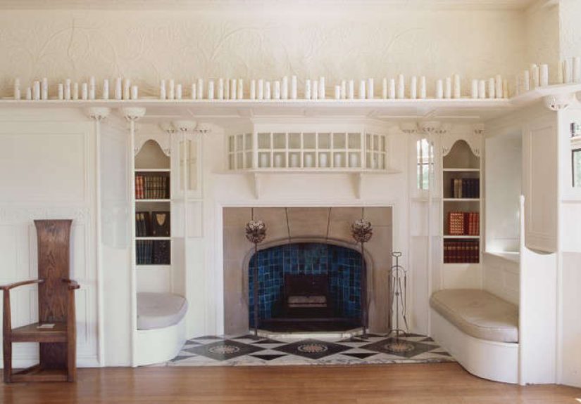
3) Frame the Collection: A Vitrine Turns Clutter into a Chorus
One of de Waal’s signature ideas is the vitrine: a glass case that doesn’t just protect objectsit edits them. A case creates a
boundary, and boundaries are what make a collection readable.
Think of a vitrine (or any “frame,” like a shelf niche or tray) as a stage. Once objects are “on the stage,” they stop being random stuff and start
becoming a set.
- Try this: Use one container to define a micro-collection: a tray, a glass cloche, a shadow box, a bookshelf bay.
- Display rule: keep the number small (3–9 items) and leave visible gaps.
- Vitrine styling trick: vary heightsone taller piece, a few mid pieces, and one low “anchor” object.
If you can’t buy a glass cabinet, don’t. A simple shelf with deliberate spacing can do the same job. The key is that your display should look
composed, not merely stored.
4) Mix Materials and Eras (Matching Is Optional; Coherence Is Not)
De Waal frequently puts porcelain in conversation with other materialsmetal, stone, wood, even shards. The contrast makes the porcelain feel more
fragile, more luminous, more alive. It also keeps minimalism from turning into monotony.
Here’s the trick: “mixing” doesn’t mean “anything goes.” It means you choose a few materials on purpose and repeat them so the mix feels designed.
- Try this: Pair one “soft” material with one “hard” material (porcelain + iron, glass + stone, paper + brass).
- Use an accent: add a small hit of gold, graphite, or deep wood tone to keep the eye moving.
- Make it modern: combine handmade items with one clean industrial element (a steel bookend, a concrete tray, a minimal frame).
Interior styling tip: In a minimalist display, contrast is the spice. You don’t need a lot of itbut you do need some, or everything tastes
like air.
5) Embrace Multiples: Repetition Creates Rhythm (and Calm)
De Waal is famous for repetitionrows, clusters, sequences of similar vessels with tiny variations. It’s soothing because your brain loves patterns.
And it’s interesting because handmade objects never repeat perfectly, so the pattern has human texture.
This lesson is gold for anyone who collects: mugs, bowls, small vases, vintage bottles, framed postcards, even rocks you swear are “special.”
Multiples are how you turn a lot of similar items into a single visual idea.
- Try this: Choose one object type and display it as a set (5, 7, 9, or 12 works well).
- Spacing rule: align edges or centers, then leave consistent gaps.
- Variation rule: let one thing be different (one darker piece, one taller piece, one imperfect piece).
Minimalist display secret: repetition reduces the “noise” of a collection because the eye reads it as one system.
6) Tell a Story with Placement (Think Outside the Shelf)
De Waal is both an artist and a writer, and his displays often feel narrativeobjects placed like sentences, pauses, and chapters. Sometimes the
story is material history (porcelain traveling across countries and centuries). Sometimes it’s memory and exile. Sometimes it’s simply the emotional
charge of putting a fragile thing inside a strong frame.
At home, “story-driven display” means your objects should relate to something: a place you visited, a person you love, a craft you practice, a book
that rearranged your brain chemistry. When placement reflects meaning, minimalism stops being an aesthetic and becomes a language.
- Try this: weave objects into bookshelvesplace a small vessel between books, or a sculpture beside a favorite spine.
- Create chapters: group by theme (travel, family, craft, color) instead of by “where it fits.”
- Use negative space as punctuation: leave one shelf bay mostly empty to make the next bay feel intentional.
Fun test: If someone asks “Why is that there?” and you can answer without saying “because I ran out of room,” you’re doing it right.
A Quick Checklist for Artful Minimalism (So You Don’t Spiral)
Minimalist display shouldn’t feel like a moral failing when you own more than three things. Use this quick set of rules to keep your shelves curated
and your nervous system intact:
- Edit first: remove one-third of what’s on the shelf before you start “styling.”
- Choose a palette: 2–3 main colors + 1 accent is plenty.
- Use frames: a tray, case, niche, or shelf bay turns objects into a collection.
- Repeat something: shape, material, color, or spacinggive the eye a pattern.
- Respect air: negative space is not “wasted”; it’s what makes objects legible.
- Light it: even the best display looks sad in bad lighting.
FAQ: Minimalist Display, Vitrines, and “How Do I Make This Look Intentional?”
Do I need a glass vitrine to get the Edmund de Waal look?
No. A vitrine is a tool, not a requirement. What you need is the effect: a boundary that says, “These items belong together.”
That can be a shelf bay, a tray, a shadow box, or even a consistent spacing system.
How do I display ceramics without it looking like a kitchen cabinet?
Use fewer pieces, space them out, and add contrast. Ceramics look elevated when paired with one “hard” element (metal, stone, wood) and when the
arrangement has a rhythm (repetition + variation).
What if my collection is colorful and de Waal’s work is… not?
Artful minimalism isn’t the absence of colorit’s the presence of intention. If your objects are bright, tighten the palette per shelf (or per tray)
and repeat one color across the arrangement so the display reads as a system, not a party supply aisle.
How many objects should be on a shelf?
The honest answer: fewer than you think. Start with 30–50% empty space. If that feels dramatic, remember: “dramatic” is often just “clear.”
Experience Section (): Real-World Ways to Practice Artful Minimalism
Here’s the part where the ideas leave the museum and walk into your living room like they pay rent. Below are four “practice runs” you can do in one
afternoon. Think of them as low-stakes experimentsno special tools, no sacred vows of minimalism, and absolutely no requirement to own artisanal
porcelain made under the light of a full moon.
Experiment 1: The “One Shelf Gallery” Reset
Pick one shelfjust one. Remove everything. Yes, everything. Take a breath and notice how the empty shelf already looks more expensive.
Now return only five to nine items. Choose one anchor piece (a vase, a framed photo, a small sculpture), then build around it with repetition:
two smaller pieces in the same material, one contrasting object (metal bookend, stone paperweight), and one “story” item (a travel souvenir,
a meaningful book, a found object). Leave gaps like you mean it.
The “de Waal” moment happens when you stop filling space and start composing it. When you’re done, step back and look for one thing:
does your eye have a path to travel? If your gaze gets stuck in one crowded clump, remove one object and redistribute the spacing.
Experiment 2: Vertical Display Without the Ladder Anxiety
Vertical display sounds scary until you realize it can be as simple as moving one framed piece up six inches. Try placing a narrow ledge shelf higher
than eye level and lining up a seriessmall vases, jars, or even identical candles. The goal is to create a quiet band of repetition that pulls
attention upward. This immediately changes the room’s “visual posture.” It sits taller.
If you rent (or hate drilling), do a vertical move with what you already have: stack books to create height, then place one object on top.
Repeat that move once more on the other side. Suddenly you have rhythm, not clutter.
Experiment 3: The “Frame Makes It a Collection” Test
Gather small objects you love but don’t know how to displaycoins, tiny figurines, shells, mini ceramics, matchbooks, whatever your heart hoards.
Put them in a tray or shallow box. Now remove half. (I know. I’m sorry. But trust the process.)
Arrange what remains with consistent spacing. If items are different sizes, group the smallest together and let one larger piece be the anchor.
The magic isn’t the tray; it’s the boundary. Your brain reads that edge and thinks, “Ah yes. A curated set.” Without the frame, the same objects
often read as “loose items awaiting purpose.”
Experiment 4: A Story Shelf (Because Meaning Is the Ultimate Minimalism)
Choose a theme you can explain in one sentence: “things from my grandparents,” “objects from one trip,” “materials I’m obsessed with,” or “books
that changed my mind.” Build a small display around that theme: one book, one object, one image, one texture. Leave space around it so the story
stays readable. This is the most de Waal-adjacent move of all: objects as carriers of memory, arranged so the viewer can feel the narrative without
needing a wall label.
If you do these experiments and your shelf still looks “off,” it’s usually one of three problems: too many colors, not enough negative space, or no
repetition. Fix those, and your display will start to feel less like storage and more like a quiet, confident installation.
Conclusion: Minimalism That Doesn’t Erase the Story
Edmund de Waal’s genius isn’t that he makes beautiful porcelain (he does). It’s that he makes placement meaningful.
He treats display as an act of care: framing objects, giving them room, letting light and shadow do part of the talking, and building rhythm through
repetition. That’s why his brand of artful minimalism translates so well into everyday interiors.
If you remember nothing else, remember this: minimalism isn’t fewer objectsit’s clearer relationships between objects.
Create boundaries, use height, mix materials with intention, repeat what matters, and leave enough silence for the collection to speak.