Table of Contents >> Show >> Hide
Some tiles quietly do their job in the background. Commune Abstrakt Tile 4 is not one of them. This is the kind of tile that walks into a room, rearranges the mood, and somehow makes your coffee taste more sophisticated. Designed through a collaboration between Los Angeles-based Commune and Exquisite Surfaces, Abstrakt Tile 4 brings together art, craft, color, and geometry in a way that feels both collected and surprisingly alive.
If you have been hunting for a patterned cement tile that feels less “cookie-cutter showroom” and more “gallery-minded design move,” this one deserves a serious look. It draws from abstract expressionism, traditional Scandinavian pattern language, and the handmade character of cement tile production. The result is bold without being chaotic, graphic without feeling cold, and playful without turning your home into a theme park.
In this guide, we will break down what Commune Abstrakt Tile 4 actually is, why designers love it, where it works best, what to know before installation, and what real everyday living with a statement tile like this can feel like.
What Is Commune Abstrakt Tile 4?
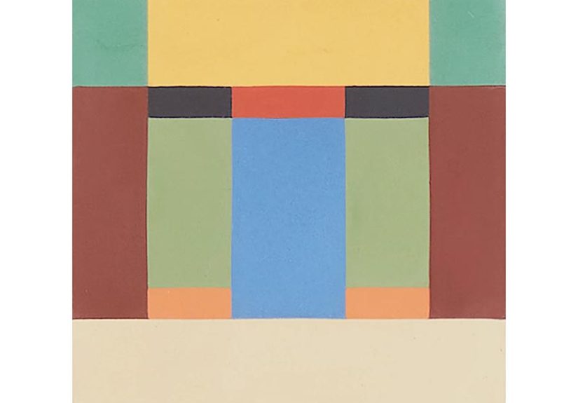
Commune Abstrakt Tile 4 is a handmade decorative cement tile developed in collaboration with Commune Design. The pattern comes from original artwork by Steven Johanknecht, one of Commune’s co-founders, and the larger Abstrakt collection was inspired by abstract expressionist painting and bright geometric traditions associated with Scandinavian and Swedish design. That artistic origin matters, because this tile does not feel like a random pattern stamped out for trend-chasing purposes. It feels composed.
Visually, Tile 4 is defined by a linear abstract arrangement of rectangular shapes in varied sizes. It has rhythm, but not rigid repetition. It looks intentional, yet still carries the energy of hand-made material. That balance is part of its appeal. From a distance, it reads as a strong graphic moment. Up close, it reveals softness in tone, subtle variation, and the kind of irregularity that gives handcrafted cement tile its soul.
The tile is made in Vietnam using a traditional, labor-intensive process. Pigment, cement, and stone powder are hand-poured into molds, pressed hydraulically, and cured before finishing. In plain English: this is not fast-fashion tile. It is the slow-cooked stew of the tile world. More effort, more character, better story.
Why Designers Notice It So Fast
It has art-world DNA
A lot of patterned tile borrows from historical motifs, but Abstrakt Tile 4 feels different because its origin is explicitly tied to painting. Steven Johanknecht’s small-scale artworks were translated into repeatable patterns, which gives the tile a sense of movement that feels less formulaic than many factory-perfect graphics. It can sit comfortably in a design-forward home because it already carries an artistic point of view.
It makes color feel intelligent
Bold tile can sometimes tip into visual shouting. Abstrakt Tile 4 avoids that trap by using color in a structured way. The geometry keeps the palette disciplined, so the composition feels curated rather than noisy. This is especially useful in kitchens, bathrooms, and entryways where a homeowner wants energy, but not a room that feels like it drank three espressos before sunrise.
It embraces variation instead of hiding it
Handmade cement tile is prized partly because it develops patina and reveals tonal shifts from piece to piece. Commune Abstrakt Tile 4 leans into that natural variation. Instead of chasing the hyper-uniform look of some machine-made tile, it celebrates the fact that handmade materials have personality. That quality helps the tile look richer over time, especially in homes that mix wood, plaster, stone, linen, and other materials with visible texture.
Where Commune Abstrakt Tile 4 Works Best
Kitchen backsplashes
This tile is a natural fit for a backsplash when the rest of the kitchen is relatively restrained. Think warm wood cabinetry, off-white walls, unlacquered brass, honed stone, or even simple painted cabinets. A graphic tile like this can become the kitchen’s focal point without requiring the island, lighting, countertops, and bar stools to all start competing for attention like reality show contestants.
It is especially effective behind a range or in a full-height backsplash installation. If you want a kitchen that feels collected and creative, rather than merely expensive, this tile can do a lot of heavy lifting.
Bathroom floors and feature walls
Patterned tile often shines in smaller spaces, and bathrooms are ideal for that move. On a powder room floor, Abstrakt Tile 4 can create an immediate sense of personality. In a larger bathroom, it works well as a feature wall behind a vanity, within a shower zone, or as a statement floor paired with simpler wall tile. Because the pattern is structured and graphic, it can help anchor floating vanities, rounded mirrors, and softer fixtures.
Entryways, mudrooms, and corridors
These transitional zones are perfect for a tile that makes a memorable first impression. A strong patterned floor in an entryway can instantly define the home’s tone. In a corridor, the linear energy of Tile 4 can encourage visual movement and make a long space feel intentional rather than forgotten.
Commercial or hospitality-style applications
Because the collection was imagined with energy and surprise in mind, Abstrakt Tile 4 also feels at home in boutique hospitality-inspired spaces: breakfast nooks, bar corners, covered patios, creative studios, or restaurants with a residential warmth. It has enough design presence to hold its own in a public-facing space, but enough craft to stay inviting.
Furniture and custom surfaces
One of the charming ideas behind the collection is that it can go beyond standard walls and floors. Tile-topped tables, custom vanities, outdoor shower details, and bench surfaces can all benefit from a pattern like this. In those applications, the tile reads almost like functional artwork.
How to Style It Without Overdoing It
The smartest way to use Commune Abstrakt Tile 4 is to let it be the star, then cast a very capable supporting ensemble. Pair it with materials that feel natural and grounded: oak, walnut, limewash, creamy paint, linen, matte metals, and simple stone. Repeating one or two colors from the tile elsewhere in the room can create cohesion, but there is no need to turn the whole space into a matching set. Your house is not applying for a synchronized swimming competition.
In modern spaces, the tile brings warmth and human irregularity. In traditional or Mediterranean-inspired interiors, it adds edge and freshness. In eclectic homes, it can act as a bridge between vintage pieces and more contemporary forms. That versatility is one reason the tile feels more lasting than trendy.
What to Know Before You Buy or Install
Handmade means variation is part of the deal
With handmade cement tile, slight shifts in shade, texture, and finish are not defects. They are part of the material’s identity. That means samples are essential, mockups are smart, and expectations should be calibrated toward character rather than machine precision. If you want every tile to be identical, this may not be your material. If you want depth, movement, and authenticity, you are in the right aisle.
Dry layout matters
Because patterned tile has a directional visual effect, dry-laying the tile before installation is one of the most important steps. This lets you confirm orientation, spacing, repeat rhythm, and the overall feel of the pattern in the room. Even a beautiful tile can look off if the layout is rushed.
Use an experienced tile installer
Statement cement tile deserves thoughtful installation. A qualified tile pro can help with substrate preparation, pattern planning, grout selection, edge decisions, and transitions to adjacent surfaces. That matters even more if the tile is being used in wet areas or on a floor that will see steady traffic. Great tile with sloppy installation is like a designer suit with one flip-flop. The math does not work.
Think about grout early
Grout color changes the whole look. A closely matched grout will quiet the pattern slightly and let the tile read as a broader field. A contrasting grout will sharpen every line and make the geometry more pronounced. Test boards help. So does resisting the urge to choose grout in a panic after staring at 84 tiny swatches under fluorescent lighting.
Maintenance is real, but manageable
Cement tile is durable, but it is not carefree in the same way some porcelain products are. Regular gentle cleaning, avoiding harsh chemicals, and following sealing and maintenance guidance are important. Mild soap, warm water, and pH-neutral cleaners are the usual safer lane. If the tile is installed in a high-splash or high-traffic area, staying on top of care will help preserve its look while allowing the natural patina to develop gracefully.
Is Commune Abstrakt Tile 4 Worth It?
If your goal is a forgettable surface that simply fills a wall, probably not. If your goal is to give a room identity, depth, and a conversation-starting visual anchor, yes, it makes a compelling case. This tile is worth considering for homeowners, designers, and renovators who want something with artistic roots and handcrafted integrity, not just a pattern that happens to be trending on social media this week.
Its value is not only in its appearance. It is also in what it allows a space to become. A kitchen becomes more expressive. A powder room becomes memorable. A hallway becomes intentional. A custom table becomes a design object. Commune Abstrakt Tile 4 is not filler. It is a decision.
Living With Commune Abstrakt Tile 4: The Experience Side
Here is what many people love most about a tile like Commune Abstrakt Tile 4: it keeps revealing itself. On installation day, the first reaction is usually visual. It is bold, graphic, and exciting. But the deeper appeal shows up later, when the room settles into everyday life. Morning light hits the surface differently than evening light. The tones look warmer on cloudy days, sharper on bright days, and richer when paired with wood, brass, or natural textiles. The tile begins to feel less like a finish material and more like part of the room’s personality.
In a kitchen, the experience can be surprisingly emotional. You walk in half-awake, looking for coffee and maybe a little hope, and the backsplash gives you a tiny hit of delight. That sounds dramatic for tile, but good design often works that way. It quietly improves the rituals you repeat every day. Chopping vegetables, washing dishes, packing lunches, opening a bottle of wine after a long Tuesday that somehow felt like three Thursdays in a trench coat; all of it happens against a background that feels intentional and alive.
In a bathroom, the experience is different. Abstrakt Tile 4 can make a small room feel curated instead of purely functional. A powder room becomes memorable to guests. A primary bathroom picks up a boutique-hotel energy without becoming stiff or over-styled. Because the pattern has movement, it prevents a space from feeling flat. Because it is handmade, it prevents the room from feeling sterile. Those two qualities together are rare.
There is also a tactile experience with handcrafted cement tile that people often underestimate. Even when you are not touching it directly, you register its material honesty. The slight variation from tile to tile reads as warmth. The surface does not feel overly polished or synthetic. In a world full of finishes trying very hard to look perfect, that human irregularity can be oddly calming.
Another lived-in benefit is that the tile tends to support layered interiors very well. Vintage stools, open shelving, old wood tables, plaster walls, framed art, and collected ceramics all seem to make more sense around it. It gives eclectic interiors structure and gives minimalist interiors a pulse. That is a neat trick.
Of course, living with a statement tile also means living with a statement. You are not choosing invisibility. Some homeowners find that energizing. Others realize they prefer quieter surfaces. That is why samples, mockups, and honest reflection matter. Ask yourself whether you want a room that whispers, or a room that tells a story. Commune Abstrakt Tile 4 is for the second camp.
And that is really the experience in a nutshell: you do not just install this tile and forget about it. You install it and keep noticing it. Not in an exhausting way. In a rewarding way. It continues to frame your routines, sharpen your space, and make ordinary corners feel a little more artful. For many design lovers, that is exactly the point.
Final Thoughts
Commune Abstrakt Tile 4 sits at a sweet spot between art piece and building material. It is rooted in original painting, shaped by handmade craft, and flexible enough to work across kitchens, bathrooms, entryways, and custom furniture applications. It rewards bold choices, but it also rewards thoughtful restraint around it.
If you want a tile that brings personality, pattern, and depth into a room without feeling gimmicky, this one deserves attention. It is lively, smart, handcrafted, and just a little rebellious. In other words, a very good roommate for your walls and floors.