Table of Contents >> Show >> Hide
- Quick cheat sheet: 2025 Colors of the Year at a glance
- What 2025 colors have in common (and why your lighting matters)
- Pantone: Mocha Mousse (PANTONE 17-1230)
- Benjamin Moore: Cinnamon Slate (2113-40)
- Behr: Rumors (MQ1-15)
- Sherwin-Williams: 2025 Color Capsule of the Year (9 shades)
- Valspar: Encore (8002-45G)
- PPG: Purple Basil (PPG1046-7)
- Glidden: Purple Basil (PPG1046-7)
- Dunn-Edwards: Caramelized (DET687)
- Dutch Boy: Mapped Blue (429-5DB)
- HGTV Home by Sherwin-Williams: Quietude (HGSW6212)
- Rust-Oleum: Warm Caramel
- Minwax: Violet (wood stain)
- Bonus: Glidden’s 2025 Spray Paint Color of the Year (Brick Red)
- How to choose your “right” 2025 Color of the Year
- of experiences: what living with 2025’s Colors of the Year feels like
- Conclusion: the big takeaway from 2025’s Colors of the Year
Every year, the “Color of the Year” announcements arrive like clockwork: right when you’re thinking, “I’m totally fine with my beige walls,” a dozen brands pop up and politely (but firmly) suggest you repaint everything. For 2025, the vibe is clear: comforting, grounded shades are having a momentalongside a few confident pops that basically dare you to paint a door red.
This roundup collects the major 2025 Color of the Year picks we knowfrom paint giants to trend forecasters to wood-stain expertsplus practical ideas for using each shade without accidentally turning your living room into a moody cave (unless that’s the dream, in which case: carry on).
Quick cheat sheet: 2025 Colors of the Year at a glance
Use this table to find your “that one!” shade fast. Then scroll for deeper notes on undertones, pairings, and where each color actually behaves in real homes.
| Brand / Forecaster | 2025 Color of the Year | Color family | Best for |
|---|---|---|---|
| Pantone | Mocha Mousse (PANTONE 17-1230) | Warm brown | Cozy neutrals, kitchens, soft modern |
| Benjamin Moore | Cinnamon Slate (2113-40) | Plum-brown | Bedrooms, libraries, “quiet luxury” spaces |
| Behr | Rumors (MQ1-15) | Ruby red | Front doors, dining rooms, statement walls |
| Sherwin-Williams | 2025 Color Capsule of the Year (9 shades) | Neutrals + accents | Whole-home palettes, mix-and-match rooms |
| Valspar | Encore (8002-45G) | Deep blue | Cabinetry, offices, bold traditional |
| PPG | Purple Basil (PPG1046-7) | Dusty violet | Accent walls, creative spaces, modern drama |
| Glidden | Purple Basil (PPG1046-7) | Dusty violet | Affordable bold color, “color drenching” |
| Dunn-Edwards | Caramelized (DET687) | Terracotta brown | Southwest warmth, exteriors, earthy interiors |
| Dutch Boy | Mapped Blue (429-5DB) | Medium blue | Living rooms, trim, versatile “new neutral” |
| HGTV Home by Sherwin-Williams | Quietude (HGSW6212) | Soft sage | Bathrooms, nurseries, calm whole-home backdrops |
| Rust-Oleum | Warm Caramel | Warm caramel | DIY projects, cabinetry, stains & finishes |
| Minwax | Violet | Purple stain | Furniture flips, wood accents, creative makeovers |
What 2025 colors have in common (and why your lighting matters)
Step back and you’ll notice two “teams” forming for 2025: (1) grounded, edible neutrals (mocha, caramel, terracotta) that make rooms feel warm and lived-in, and (2) moody, expressive hues (violet, plum-brown, ruby red) that bring personality without screaming neon.
Before you fall in love with any swatch, do yourself a favor and test it in your real light. Undertones are sneaky. A “warm brown” can lean rosy at sunset, and a “sage” can look minty in a bathroom with cool LEDs. Sample on multiple walls, check morning vs. evening, and look at it next to your fixed items (flooring, counters, tile). Color of the Year is funsurprise green undertones are not.
Pro tip: if you want the 2025 trend without committing to full walls, use these colors on built-ins, a powder-room vanity, interior doors, or a single accent zone (like the wall behind the bed). You’ll get the vibe without repainting your entire life.
Pantone: Mocha Mousse (PANTONE 17-1230)
Why it works
Mocha Mousse is a warming brown that leans comforting rather than heavythink coffee-with-cream, cocoa powder, or a leather journal you swear you’ll start using “any day now.” It’s part neutral, part mood, and it pairs beautifully with creams, soft whites, and natural textures.
Where to use it
Try it in kitchens (especially with brass or matte black hardware), dining rooms, or living rooms where you want cozy without going full-dark. It’s also a strong pick for layered “tone-on-tone” spaces: mocha walls, oatmeal textiles, walnut wood, and a few black accents.
Pairing ideas
- Warm whites, ivory, and greige for a calm palette
- Deep greens (olive/forest) for an earthy, upscale look
- Dusty pinks or muted mauves for softer contrast
Benjamin Moore: Cinnamon Slate (2113-40)
Why it works
Cinnamon Slate is a quietly complex mix of heathered plum and velvety brownbasically the color equivalent of an expensive knit sweater. It reads sophisticated, a little moody, and very “I have opinions about lighting temperature.”
Where to use it
Bedrooms and libraries love this shade. It’s also gorgeous on cabinetry if you want something deeper than taupe but not as stark as charcoal. In smaller rooms, it can feel envelopingin a good wayespecially with warm lamps.
Pairing ideas
- Soft creams and warm whites to keep it airy
- Bronze, antique brass, and walnut wood for richness
- Muted blues or smoky greens for a layered palette
Behr: Rumors (MQ1-15)
Why it works
Rumors is a ruby red that’s bold, warm, and surprisingly usablemore luxurious hotel lounge than cartoon fire engine. If 2025 is about confidence, Rumors is the shade that walks into the room first and somehow makes it look better.
Where to use it
If you’re new to red, start with a front door, a mudroom bench, or lower cabinetry. If you’re feeling fearless, try a dining room: reds can make spaces feel intimate and energized (hello, dinner parties that don’t end at 8:17 p.m.).
Pairing ideas
- Warm whites and creamy neutrals for balance
- Deep greens for a classic, tailored contrast
- Chocolate browns and brass for dramatic glam
Sherwin-Williams: 2025 Color Capsule of the Year (9 shades)
Instead of picking one shade, Sherwin-Williams spotlighted a nine-color “capsule”which is honestly relatable, because why choose one favorite when you can have a curated group chat of colors?
The 9 capsule shades (and the role each plays)
- White Snow – crisp, clean anchor for ceilings/trim
- Sunbleached – airy neutral that sits between beige and gray
- Malabar – sandy beige that reads soft and welcoming
- Grounded – rich brown that adds stability and warmth
- Clove – deep, near-black brown for modern depth
- Rain Cloud – stormy gray-blue that feels classic and calm
- Mauve Finery – subdued mauve for a dreamy, botanical note
- Bosc Pear – golden hue that brings “luxe organic” warmth
- Chartreuse – energetic accent for the brave (and the playful)
How to use the capsule without repainting every room twice
Pick one “base neutral” (Sunbleached or Malabar), one “depth color” (Grounded or Clove), and one “personality color” (Rain Cloud, Mauve Finery, Bosc Pear, or Chartreuse). Then repeat them in small wayspillows, art, rugs, or a single doorso your home feels intentional instead of like a paint store exploded.
Valspar: Encore (8002-45G)
Why it works
Encore is a deep, anchoring blue that reads confident and classic, with enough richness to feel modern. It’s the kind of blue that behaves like a neutral in a well-styled roomespecially when paired with warm woods and soft whites.
Where to use it
This shade shines on cabinetry, built-ins, and home offices (where you want “focus” not “fluorescent chaos”). It also looks sharp on exteriorsfront doors, shutters, or even porch ceilings if you want drama.
Pairing ideas
- Bright whites and creamy off-whites for crisp contrast
- Tan leather, brass, and walnut for a timeless look
- Muted terracotta or caramel accents for warmth
PPG: Purple Basil (PPG1046-7)
Why it works
Purple Basil is a dusty violet with mauve undertonesa bold shade that still feels grounded. It’s the 2025 answer to “I want color, but I also want to sleep at night knowing I can style this.”
Where to use it
Try it as an accent wall behind a bed, in a creative studio, or on built-in shelving. It’s also a strong “color drenching” candidate (walls + trim in the same shade) for a high-impact, editorial lookespecially in smaller rooms like a powder room.
Pairing ideas
- Warm neutrals (cream, camel, mocha) for softness
- Smoky blues for a moody, modern palette
- Gold/bronze accents to highlight the warmth
Glidden: Purple Basil (PPG1046-7)
Glidden’s 2025 pick lines up with Purple Basil too, which is a nice reminder that trends aren’t isolated to one brandthey show up across paint lines, fashion, and home decor at once. If you want the bold 2025 direction without boutique pricing, this is a strong route.
Styling note: Purple Basil looks especially polished when you keep surrounding materials naturalthink oak, cane, linen, and stone. Add contrast with warm whites, and you’ll get drama that still feels livable.
Dunn-Edwards: Caramelized (DET687)
Why it works
Caramelized is a warm terracotta brown reminiscent of sunbaked clayearthy, comforting, and surprisingly flexible. It hits that sweet spot between “neutral” and “statement,” which is exactly where a lot of 2025 color lives.
Where to use it
It’s a natural fit for Southwestern-inspired interiors, but it also looks great in modern spaces that need warmth: plaster walls, arched mirrors, creamy textiles, and natural woods. On exteriors, it can feel timeless when paired with off-white trim and dark bronze hardware.
Pairing ideas
- Warm whites and sandy beiges for an adobe feel
- Olive and sage greens for earthy harmony
- Charcoal accents for modern contrast
Dutch Boy: Mapped Blue (429-5DB)
Why it works
Mapped Blue is a medium-tone blue with a slight yellow undertonemeaning it can feel calm without turning icy. It’s one of those rare shades that plays well with both warm and cool palettes, so it can evolve as your style changes.
Where to use it
Living rooms, bedrooms, and hallways are easy wins. If you’re nervous, try it on trim or interior doors for a tailored look. On the outside, it can feel classic and “collected,” especially with stone, brick, or warm wood.
Pairing ideas
- Creamy whites and warm grays for softness
- Natural wood tones for a grounded look
- Rust, copper, or caramel accents for trend-forward warmth
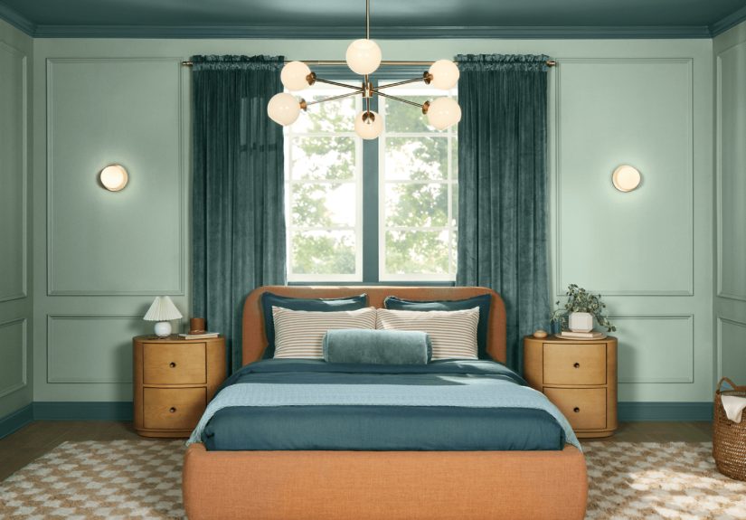
HGTV Home by Sherwin-Williams: Quietude (HGSW6212)
Why it works
Quietude is a soft sage green with a whisper of bluecalm, not cutesy. It fits right into the 2025 “slow living” mood: gentle color that feels restorative, like your home just told you to drink water and unclench your jaw.
Where to use it
Bathrooms, nurseries, and bedrooms love this shade, but it also works in open-plan spaces where you want a subtle, consistent backdrop. It pairs especially well with warm wood vanities, natural stone, and matte black fixtures.
Pairing ideas
- Warm whites and light oak for spa energy
- Soft clay and sand tones for organic warmth
- Deep navy accents for crisp structure
Rust-Oleum: Warm Caramel
Why it works
Warm Caramel leans into the “edible neutral” trendrich, golden-brown warmth that layers easily with other earth tones. It’s built for DIY: the kind of shade that can update a cabinet, a thrifted side table, or a shelf without requiring a complete identity change for your home.
Where to use it
Consider cabinetry, accent furniture, planters, picture frames, or even a statement stair rail. It also pairs beautifully with greens and bluesso you can keep your existing palette and still tap into 2025’s warmth.
Pairing ideas
- Earthy greens for a nature-forward palette
- Deep ocean blues for contrast
- Warm whites and greige for an easy, lived-in look
Minwax: Violet (wood stain)
Why it works
Minwax’s Violet is a bold wood-stain pick that still feels groundedmore “creative studio” than “kids’ toy aisle.” It’s a smart way to bring 2025’s purple direction into your home without painting a whole room: stain a dresser, side table, or wood panel, and let the grain add natural texture.
Where to use it
Furniture flips, built-in accents, floating shelves, and even wood ceilings (for the brave and the beautifully dramatic). Violet shines when you treat it as an accent that repeats elsewhere in small doseslike art, textiles, or ceramics.
Pairing ideas
- Warm neutrals (cream, tan) to keep it approachable
- Black metal for modern edge
- Brass or bronze for a vintage-meets-modern finish
Bonus: Glidden’s 2025 Spray Paint Color of the Year (Brick Red)
If you live for quick upgrades, Glidden also highlighted a 2025 spray paint Color of the Year in Brick Redan inviting, earthy red that pairs nicely with deeper, saturated tones. It’s perfect for outdoor planters, patio furniture, and small decor pieces that need a refresh without a full weekend project.
How to choose your “right” 2025 Color of the Year
1) Match the color to the job
Want calm? Look to Quietude or Mapped Blue. Want cozy? Mocha Mousse, Warm Caramel, or Caramelized. Want drama? Purple Basil, Cinnamon Slate, Rumors, or the darker capsule shades like Clove.
2) Decide if you’re painting walls or “supporting cast” surfaces
Walls are the lead actorhigh commitment. If you’re not sure, start smaller: trim, doors, a vanity, cabinetry, a bookcase, or a single accent zone. You’ll still get that 2025 update, but your entire home won’t depend on one swatch’s mood swings.
3) Respect undertones (seriously)
Browns can lean rosy or yellow; blues can shift gray or green; sages can read minty; purples can turn muddy if the lighting is harsh. Sample first, and look at the color next to the fixed finishes you can’t swap (tile, counters, floors).
of experiences: what living with 2025’s Colors of the Year feels like
Color trend lists are useful, but the real question is: what does it feel like to live with these shades day after day? Here are a few lived-in scenarioslittle “snapshots” of how 2025’s Colors of the Year show up in real routines, real messes, and real lighting that changes its mind every hour.
Mocha Mousse mornings: You walk into the kitchen half-awake, and the warm brown on the walls makes the space feel like it already brewed coffee for you. Stainless steel looks less cold. White cabinets look softer. Even the cereal box seems calmer. It’s cozy without being darklike the room is wearing a cashmere hoodie.
Cinnamon Slate evenings: A bedroom painted in that plum-brown mix doesn’t scream “purple.” Instead, it reads intimate and restful. At night, with warm lamps on, it turns velvety and luxe. In the morning, it becomes more complexmore “smoky” than “sweet”and suddenly your basic linen duvet looks expensive.
Rumors at dinner time: You thought red would be “too much,” so you tried it on just one wall. Now it’s the wall everyone faces when they sit down, and the room feels warmerlike the lights got upgraded. You notice conversations linger a little longer. The space feels designed, not accidental.
The Sherwin-Williams capsule effect: You use White Snow on trim, Sunbleached in the hallway, and Rain Cloud in the office. Nothing feels chaotic because the palette repeats. It’s the design equivalent of having matching socks: small, quiet confidence. Even your thrifted frames look curated because they’re not competing with five random wall colors.
Encore in a work zone: A deep blue office (or cabinet wall) has a strange magic: it makes clutter look more intentional. Papers aren’t “a mess,” they’re “a work-in-progress.” The color feels steady and focused, especially paired with warm wood. You sit down to work and your brain goes, “Okay, yes, we’re doing the thing.”
Purple Basil creativity: In a studio corner or a powder room, that dusty violet is bold but not loud. It feels expressivelike you’re allowed to have taste and personality in your home, not just “resale-friendly neutrals.” With brass accents and a warm mirror light, it becomes dramatic in the best way.
Caramelized on a sunny wall: Terracotta brown catches afternoon light and turns almost glowingsunbaked and soft. You add a cream rug, a woven basket, and suddenly the whole room feels like a boutique hotel in the desert (minus the minibar prices). It’s warm, earthy, and welcoming without trying too hard.
Mapped Blue as a “new neutral”: You paint a living room in Mapped Blue and realize it doesn’t dominate the spaceit supports it. Art pops more. Wood tones look richer. The color sits quietly in the background, and yet the room feels finished. It’s the rare shade that looks equally good on cloudy days and bright afternoons.
Quietude in the everyday: A bathroom in soft sage makes mornings feel less frantic. The mirror selfie lighting is kinder. White towels look crisp. The space feels clean but not sterilemore spa than hospital. Even if the counter is a little cluttered, the color keeps the vibe calm.
Warm Caramel DIY satisfaction: You paint a small cabinet (or stain a shelf) in Warm Caramel and suddenly the whole corner looks intentional. It’s the kind of warm tone that plays well with almost anythinggreens, blues, creamsso it doesn’t force you to redecorate. It just upgrades what you already have.
Minwax Violet “one brave piece”: You stain a thrifted side table violet, and it becomes the conversation starter. Not loudinteresting. The wood grain shows through, so it feels artisanal rather than plasticky. It’s proof you can do “trend color” in a way that still looks grown-up and personal.
Conclusion: the big takeaway from 2025’s Colors of the Year
If 2024 was about easing into comfort, 2025 takes the same idea and gives it more depthricher browns, warmer neutrals, and confident accents that feel expressive but still livable. Whether you go all-in on a moody room, try a calm sage, or just paint one door a brave red, the best “Color of the Year” is the one that works with your light, your space, and your actual daily life (including the laundry basket that never leaves the hallway).