Table of Contents >> Show >> Hide
- What “Monochromatic” Means (and What It Doesn’t)
- Why Monochromatic Schemes Work So Well
- Where Monochromatic Color Schemes Shine
- A Practical 7-Step Method to Build a Monochromatic Palette
- 1) Pick a base hue with a job to do
- 2) Build a “value ladder” (light, mid, dark)
- 3) Add tints, shades, and tones (not just “more of the same”)
- 4) Decide proportions (yes, the classic rule still helps)
- 5) Create contrast using texture, pattern, and finish
- 6) Choose a “grounding” neutral inside the family
- 7) Test in real conditions (because lighting and screens are sneaky)
- How to Keep Monochromatic Designs From Looking Flat
- Monochromatic Color Schemes in Digital Design (UI, Web, Product)
- Monochromatic Color Schemes in Interior Design
- Common Monochromatic Mistakes (and Fast Fixes)
- Monochromatic Quick-Start Cheat Sheet
- Conclusion
- Experience Notes: What Monochromatic Design Feels Like in the Real World (and Why It Gets Easier)
A monochromatic color scheme is the design equivalent of showing up to a party in “all blue” and still getting complimented on your outfit.
Done right, it’s sleek, confident, and oddly calminglike your layout is whispering, “Relax. I’ve got this.”
Done wrong, it’s… a little “office waiting room, circa 1997.”
This guide breaks down what monochromatic really means, why it works, and exactly how to build a one-color palette that still has depth,
hierarchy, and personalitywhether you’re styling a living room, designing a brand, or shipping a UI.
What “Monochromatic” Means (and What It Doesn’t)
A monochromatic scheme starts with one hue (say: blue) and expands it into a family using tints, shades, and tones.
You’re not using multiple different hues (that would be analogous, complementary, triadic, etc.). You’re exploring the full range of one hue’s
“moods”from airy and whisper-soft to deep and dramatic.
The three levers: tint, shade, tone
- Tints: your base hue mixed with white (lighter, softer, more “daylight”).
- Shades: your base hue mixed with black (darker, bolder, more “midnight”).
- Tones: your base hue mixed with gray (muted, sophisticated, less shouty).
In practice, you’re also adjusting value (light vs. dark) and saturation (vivid vs. muted).
The secret is: monochromatic success depends less on “picking a pretty color” and more on building a smart value ladder.
Monochromatic vs. “monochrome”
People often use “monochrome” to mean black-and-white. In design conversations, that’s usually an achromatic palette
(no hue), while monochromatic typically means one hue (like green) explored across light/dark and vivid/muted versions.
Both can be stunning. Both can also be accidentally depressing if you forget texture.
Why Monochromatic Schemes Work So Well
Monochromatic palettes show up everywherefrom magazines to appsbecause they solve several design problems at once:
- Cohesion without effort: One hue creates instant harmony across elements.
- Fewer decisions, better decisions: Limiting the palette reduces “color chaos” and speeds up iteration.
- More focus on form: With fewer color relationships competing for attention, typography, spacing, texture, and shape do the heavy lifting.
- A strong mood: One hue can feel calm (blue), grounded (green), energetic (orange), romantic (pink), or sophisticated (charcoal/ink).
The trade-off is that monochromatic design demands you get serious about contrast, materials,
and hierarchy. You can’t rely on “the red button pops” if you’ve decided you’re living in Blue Land now.
Where Monochromatic Color Schemes Shine
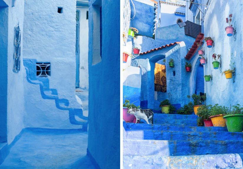
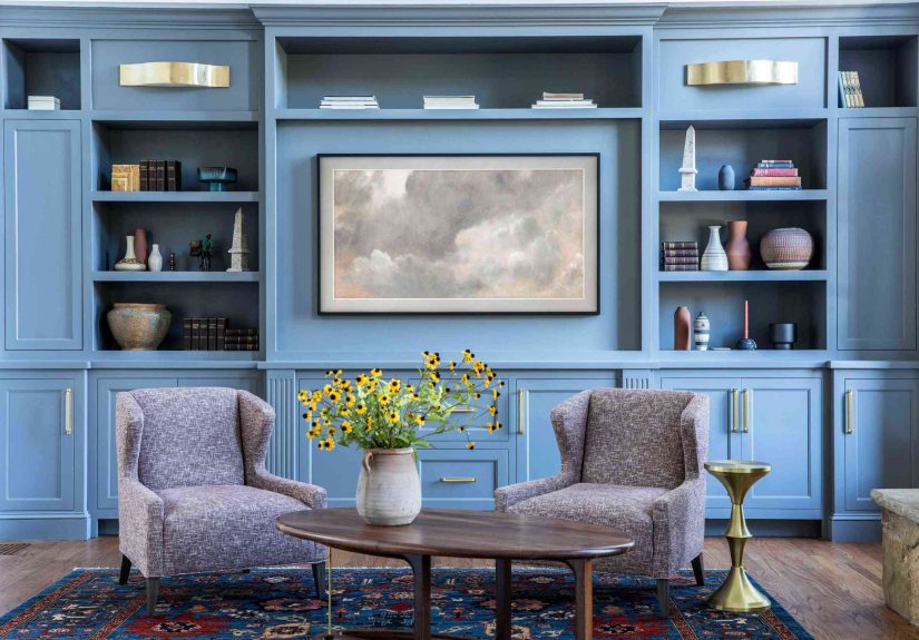
Interior design
Monochromatic rooms feel intentional and high-end, especially when you layer finishes: matte walls, satin trim, velvet pillows,
nubby linen, glossy ceramics. Same hue, different tactile experience.
Branding and graphic design
Monochromatic branding reads as clean and confident. It also makes systems easiersocial posts, slide decks, packaging
because you’re working inside one color family with predictable rules.
UI and product design
Monochromatic UI can look modern and calm, but you must design states (hover, active, disabled) carefully and test contrast for accessibility.
In digital design, monochrome isn’t a shortcut; it’s a commitment.
A Practical 7-Step Method to Build a Monochromatic Palette
1) Pick a base hue with a job to do
Start with intent. Ask: what should this design feel like?
A meditation app and a streetwear poster can both use “blue,” but they won’t use the same blue.
Choose a hue that supports your goal, audience, and context (screen vs. print, daylight vs. warm bulbs, etc.).
2) Build a “value ladder” (light, mid, dark)
Your palette needs at least three anchor values:
light (backgrounds), mid (surfaces/blocks), and dark (text/focal points).
Without this, monochromatic work often looks flat because everything lives in the same “brightness neighborhood.”
A simple rule: if you squint and everything becomes the same gray-ish blur, you don’t have enough value separation.
3) Add tints, shades, and tones (not just “more of the same”)
Don’t just slide up and down “brightness.” Create variety by mixing:
airy tints, muted tones, and dramatic shades.
That variety keeps the scheme cohesive while still giving it range.
4) Decide proportions (yes, the classic rule still helps)
The 60–30–10 concept translates well to monochromatic design:
use your lightest value as the dominant field (often backgrounds),
your mid-value as the supporting structure (cards, upholstery, cabinetry),
and your darkest value as accents (type, frames, hardware, buttons).
Even though it’s “one color,” the proportions keep it readable and balanced.
5) Create contrast using texture, pattern, and finish
This is the part people skipand then wonder why their room looks like a paint sample exploded.
In monochromatic work, texture becomes your secondary color.
Think: boucle vs. linen, glossy tile vs. matte paint, brushed metal vs. polished chrome, heavy serif vs. crisp sans.
6) Choose a “grounding” neutral inside the family
Many successful monochromatic designs include a near-neutral anchor:
white (to brighten), near-black (to ground), or a soft gray tone (to calm).
This doesn’t “break” monochromaticit stabilizes it. In interiors, a touch of black in hardware, frames, or lighting often adds structure.
7) Test in real conditions (because lighting and screens are sneaky)
Paint changes with daylight vs. warm bulbs. Screens shift color by device, brightness, and ambient light.
Print changes with paper stock and ink.
Before you commit, test your palette in context: a quick mockup, a sample board, a phone screenshot outdoors, a small paint swatch on the wall.
Monochromatic design is subtlesubtle things deserve real-world testing.
How to Keep Monochromatic Designs From Looking Flat
Monochromatic doesn’t mean “same-everything.” It means “same hue, smart variation.”
If your design feels bland, run through this checklist:
- Increase value contrast: add a darker shade for focal points or text.
- Reduce saturation in big areas: keep large fields quieter; let small elements be richer.
- Add texture or pattern: ribbed glass, woven fabric, subtle stripes, grain, or micro-contrast.
- Vary finish: matte + satin + gloss creates depth even when the hue is constant.
- Use negative space: monochromatic design loves breathing room.
Monochromatic Color Schemes in Digital Design (UI, Web, Product)
Monochromatic UI can look premium and calm, but it has one non-negotiable: accessibility.
In a monochromatic interface, you must rely on contrast (value), typography, spacing, and componentsnot just colorto communicate hierarchy and state.
Accessibility basics you should treat like gravity
Text needs enough contrast against its background to be readable, and interactive components need visible boundaries.
Use a contrast checker early, not after launch when someone politely explains they cannot read your app without squinting.
A simple monochromatic UI example (blue family)
Imagine a dashboard:
- Background: very light blue tint (quiet, spacious)
- Cards/Surfaces: slightly deeper tint/soft tone (structure)
- Primary button: darker shade (action emphasis)
- Text: deep navy shade (legibility)
- Dividers/borders: muted tone (subtle separation)
Notice what’s doing the work: value contrast and component design, not “let’s add a random orange button.”
You can still add an accent color later, but monochromatic can absolutely shipif the system is coherent.
Design states without leaving your hue
- Hover: slightly darker or more saturated than default (but consistent across components)
- Active/Pressed: darker shade or reduced brightness
- Disabled: lower contrast + additional cues (icons, labels, patterns) so it’s not mistaken for “broken”
- Errors: if you refuse to use red, add shape + iconography + messaging; don’t rely on color alone
Monochromatic Color Schemes in Interior Design
Interiors are where monochromatic schemes can look the most “designer,” because you have extra tools:
material, sheen, scale, and light. A monochromatic room should feel layered, not painted into a single-color flatland.
Use paint strips like a pro
Paint brands often organize colors into vertical “strips” that already move from light to dark within one hue family.
That’s basically a monochromatic starter kit.
Choose one strip, then assign roles: light for walls, mid for built-ins or upholstery, dark for doors, shelving, or accents.
Texture: the hero of monochromatic rooms
In a monochromatic space, texture keeps your eye moving:
woven rugs, plaster walls, velvet pillows, natural wood grain, stone, ceramics, and metal finishes.
If everything is the same texture and the same value, your room can feel like a giant sticky note.
Don’t forget sheen
A small change in paint finish creates a surprisingly big change in depth:
matte walls with a satin trim, or a higher-gloss ceiling with softer walls.
It’s the “quiet flex” of monochromatic design.
Common Monochromatic Mistakes (and Fast Fixes)
Mistake: The values are too close
If your background, surfaces, and text all live in the same mid-tone zone, nothing stands out.
Fix: widen the value range. Add a darker shade for type and focal points, and a lighter tint for breathing room.
Mistake: Everything is equally saturated
A fully saturated single-hue room or screen can feel intenselike the color is yelling at you from across the room.
Fix: keep big areas muted (tones), then use saturation strategically in smaller moments.
Mistake: Relying on color alone to communicate meaning
In UI, color-only signals break for accessibility and for anyone on a sunny patio with their brightness turned down.
Fix: pair color with icons, labels, patterns, and clear component shapes.
Mistake: Ignoring undertones
Two “grays” can fight like they’re auditioning for a reality show if one is warm and the other is cool.
Fix: compare swatches side by side in the same light, then sample in the actual space or screen context.
Monochromatic Quick-Start Cheat Sheet
- Pick one hue that matches the mood and context.
- Choose 3 anchor values: light / mid / dark.
- Add tones to calm down big areas.
- Use texture and finish as your “second color.”
- Assign roles: background, surfaces, accents, text.
- Test contrast early (especially for digital).
- Keep it breathable: spacing is the secret ingredient.
Conclusion
Monochromatic color schemes are simple, not simplistic.
When you work within one hue, you’re forced to design with intention: value contrast, texture, hierarchy, and proportion.
The reward is a look that’s cohesive, modern, and surprisingly versatilewhether you’re designing a brand system, a product UI, or a room that feels like a boutique hotel.
Start with one hue. Build a value ladder. Layer tints, shades, and tones. Then let texture, finish, and typography do the flirting.
Your palette can be one color and still have a whole personality.
Experience Notes: What Monochromatic Design Feels Like in the Real World (and Why It Gets Easier)
If you’ve never built a monochromatic scheme before, the first attempt usually follows a predictable emotional arc:
excitement, confidence, mild confusion, and then a sudden moment of “Wait… why does everything look the same?”
That moment is normal. Monochromatic design asks you to notice details most people ignorevalue shifts, undertones, texture, and the way light changes everything.
One common “aha” is realizing that monochromatic palettes are less about picking five pretty swatches and more about assigning jobs.
In practice, designers often stop thinking in terms of “colors” and start thinking in terms of roles: background, surface, accent, text, and divider.
The palette becomes a system. Once you have roles, the scheme stops feeling limiting and starts feeling freeingbecause decisions become consistent.
Another real-world lesson: your first palette is rarely your final palette. You might pick a base green that looks perfect on a color wheel,
only to discover it turns swampy under warm interior lighting, or too neon on a phone screen at full brightness.
The fix isn’t to abandon monochromatic; it’s to refine. Designers often keep the same hue family but shift saturation down, add a cooler tone,
or introduce a near-neutral anchor (like warm white or near-black) to stabilize the look.
In interiors, the most reliable shortcut is building a small “material stack” early: paint chip, fabric sample, wood tone, metal finish, and one textured wildcard
(woven basket, bouclé, ribbed glass). If those play nicely together, the room will almost design itself.
Without that stack, monochromatic rooms can feel oddly unfinishedlike you committed to a color but forgot to commit to depth.
Changing sheen (matte vs. satin) is another surprisingly powerful move; it adds dimension without adding new hues.
In digital design, the experience lesson is usually about contrast and states. A monochromatic UI can look gorgeous in a static mock,
then fall apart the moment you add hover, active, disabled, and error states. That’s why teams often prototype a few key components early:
buttons, inputs, alerts, and text on all backgrounds. Once those components work, the rest of the interface becomes easier to scale.
The “grown-up” version of monochromatic design is not a single pretty screenit’s a coherent system that survives real interaction.
Finally, monochromatic design teaches patience. When you limit hue, you start noticing how much variety lives inside one color family.
A blue can be airy, dusty, stormy, inky, playful, or corporatesometimes all within the same project.
After a few builds, you’ll probably find monochromatic schemes becoming a go-to tool: fast to assemble, hard to mess up (with the right value ladder),
and capable of looking expensive even on a very normal budget. One hue, many wins.