Table of Contents >> Show >> Hide
- What You’ll Learn
- Columns vs. Table Columns: Don’t Mix These Up
- How to Insert Page Columns on Desktop (Windows & Mac)
- How to Put Columns in Only Part of a Document
- Column Breaks: Control Where Text Jumps
- How to Insert Columns in a Table (Desktop & Mobile)
- Mobile Tips (iPhone, iPad, Android): What Works & What to Do When It Doesn’t
- Troubleshooting: Fix Weird Column Behavior
- Problem: “It applies columns to my whole document!”
- Problem: “My headline is stuck in one column, but I want it across the page.”
- Problem: “There’s a huge blank space at the bottom of a column.”
- Problem: “My columns look uneven and lopsided.”
- Problem: “I need columns inside a box (sidebar, callout, flyer panel).”
- Best Practices for Clean, Professional Columns
- Real-World Experiences (Extra )
- SEO Tags
Columns in Microsoft Word are the secret sauce behind anything that looks “newsletter-y,” “brochure-y,”
or “I definitely didn’t format this at 1:58 a.m.” They’re also one of Word’s most misunderstood featuresmostly
because the word column can mean two totally different things in Word:
page-layout columns (newspaper style) and table columns (spreadsheet-ish).
This guide covers both, with step-by-step instructions for desktop and mobileplus the little tricks that
stop your text from doing the formatting equivalent of tripping down the stairs.
Columns vs. Table Columns: Don’t Mix These Up
1) Page-layout columns (newsletter/newspaper style)
These columns make your text flow down the first column, then continue at the top of the next
columnlike a magazine. Great for newsletters, flyers, and multi-column reports.
2) Table columns (rows & columns inside a grid)
These are the columns inside a table. Text doesn’t “flow” between them; each cell is its own little box.
Great for comparisons, schedules, pricing lists, and anything that should stay lined up.
If you only remember one thing: Page columns are layout. Table columns are structure.
Use the right one and Word stops acting like it has free will.
How to Insert Page Columns on Desktop (Windows & Mac)
On desktop Word (Microsoft 365, Word 2021/2024, and many older versions), adding columns is usually the same idea:
you’ll use the Layout tab (sometimes called Page Layout in older Word).
Make the entire document into columns
- Open your Word document.
- Click the Layout tab on the ribbon.
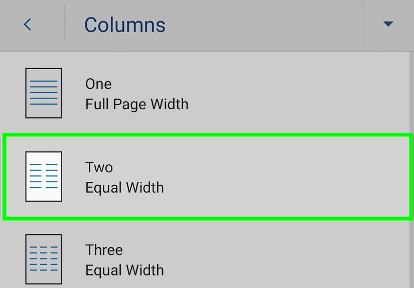
- Select Columns.
- Choose One, Two, Three, Left, or Right.
That’s it. Your text will automatically flow from one column to the next. If it looks too tight, don’t panic
spacing and width can be adjusted (we’ll get there).
Customize column width, spacing, and add a line between columns
- Go to Layout > Columns.
- Choose More Columns.
- Set the number of columns.
- Adjust Width and Spacing (and optionally check Line between).
- Pick Apply to: Whole document, This point forward, or Selected text.
- Click OK.
If you’re formatting something like a newsletter, this dialog is where the magic happensbecause “Two columns”
can mean “pleasant and readable” or “tiny print that requires binoculars.”
Remove columns (go back to normal)
- Click inside the columned section.
- Go to Layout > Columns > One.
How to Put Columns in Only Part of a Document
This is the most common “Why is Word doing this to me?” moment: you want columns for a single sectionlike a
newsletter block in the middle of a reportbut Word keeps applying columns to everything.
The fix is almost always the same: use section breaks to isolate formatting.
Option A: Columns for a specific block of text (fast method)
- Select the paragraphs you want in columns.
- Go to Layout > Columns.
- Pick Two or Three (or More Columns).
-
If Word asks how to apply it, choose Selected text.
(Word typically inserts section breaks automatically to contain that formatting.)
Option B: Full control (recommended for newsletters and mixed layouts)
Use this when you want a clean “single column → two columns → single column” flowespecially if you
want a headline that spans the full page width.
- Place your cursor before the part you want in columns.
- Go to Layout > Breaks > Section Breaks > Continuous.
- Place your cursor inside that new section (your “columns zone”).
- Go to Layout > Columns and choose your column setup.
- Place your cursor after the columned content.
- Insert another Continuous section break.
- In the new section after the columns, set Layout > Columns > One.
If you ever need one big headline above two columns, insert a continuous section break,
set that headline section to One column, then set the next section to Two columns.
Word is basically a well-meaning robot: it behaves best when you give it fences.
Column Breaks: Control Where Text Jumps
By default, Word decides where one column ends and the next begins based on the page height and your content.
That’s fineuntil you want a new article to start at the top of the next column (like a real newsletter).
Insert a column break (desktop)
- Click where you want the next column to start.
- Go to Layout > Breaks.
- Select Column.
Tip: If you’re trying to confirm that your break actually exists (because Word can be sneaky),
turn on formatting marks: Home > Show/Hide ¶.
Balance columns (so one isn’t comically longer)
If one column is much longer than the other and you want them to look even, try inserting a
Continuous section break at the end of the columned section. Word often rebalances the text
when the section ends cleanly.
How to Insert Columns in a Table (Desktop & Mobile)
Now let’s talk about the other kind of columns: table columns. This is what you want for
side-by-side comparisons (Pros vs. Cons, Features vs. Price, Cats vs. Dogsno judgment).
Add a column to a table on desktop
- Click inside your table.
- Look for Table Tools (or a Table Layout tab) on the ribbon.
- Choose Insert Left or Insert Right to add a column next to your cursor.
Quick table tip: insert multiple columns at once
If you select multiple existing columns first, Word can insert the same number of new columns in one shot.
(This is the difference between “efficient” and “why is my coffee empty?”)
Add a column to a table on mobile (Word app)
- Tap inside the table.
- Open the table controls/menu (often labeled Table or Layout when a table is selected).
- Use Insert options to add a column left or right.
Mobile Word has been steadily improving table creation and editing, so tables are often the most reliable
way to get a “columns-like” layout on phones and tablets.
Mobile Tips (iPhone, iPad, Android): What Works & What to Do When It Doesn’t
Here’s the honest truth: Word on mobile is great for editing text, but some page layout tools can be limited,
especially advanced column controls. Depending on your device and app version, you might be able to apply basic page columns,
or you might only be able to view existing columns created on desktop.
If you see a Columns option in the Word mobile app
- Tap the Edit (pencil) icon if you’re in viewing mode.
- Open the ribbon/menu (often via A icon, Home, or a three-dot menu).
- Look for Layout (or Page Layout).
- Tap Columns and choose One, Two, or Three.
If you don’t see Columns on mobile (common)
Don’t waste an hour hunting for a button that isn’t there. Use one of these workarounds:
Workaround 1: Create columns on desktop, then edit on mobile
Make your multi-column layout in Word on Windows/Mac (or Word for the web if available to you), save it,
then open the same document on your phone/tablet to edit the text. Word typically preserves the column layout
even when mobile can’t fully customize it.
Workaround 2: Use a borderless table for “columns”
- Tap where you want side-by-side content.
- Go to Insert > Table.
- Create a 2-column table (or 3 if you’re feeling ambitious).
- Type content into each cell.
- Optional: remove table borders (so it looks like clean columns, not a spreadsheet cage match).
On mobile, tables are often the best substitute for page-layout columnsespecially for resumes, comparisons,
and layouts that shouldn’t “flow” from left to right.
Workaround 3: Accept the limitation on custom columns (especially on iPad)
Some advanced column settings (like fully custom widths via “More Columns”) may not be available on certain mobile builds.
If you need precise spacing, set it on desktop first.
Troubleshooting: Fix Weird Column Behavior
Problem: “It applies columns to my whole document!”
You need section breaks. Use Continuous section breaks before and after the content, then apply columns
only within that section. Also check the Apply to setting in More Columns.
Problem: “My headline is stuck in one column, but I want it across the page.”
Put the headline in its own one-column section:
insert a continuous section break before the headline, set that section to One column,
then insert another continuous section break after and set the next section to Two columns.
Problem: “There’s a huge blank space at the bottom of a column.”
This can happen when Word is trying to keep a paragraph together, or when images/objects are anchored in a way that blocks text flow.
Try:
- Shortening the paragraph (split it into two).
- Adjusting picture wrapping (e.g., try Square or Top and Bottom).
- Using a column break only where you truly need it.
Problem: “My columns look uneven and lopsided.”
Insert a Continuous section break at the end of the columned section to encourage Word to balance the text.
If you’re building a newsletter, you may also need to manually insert column breaks for cleaner article starts.
Problem: “I need columns inside a box (sidebar, callout, flyer panel).”
Instead of page columns, use a text box (or shape) and set columns inside it. This is a great way to build
sidebars that don’t disturb your main document layout.
Best Practices for Clean, Professional Columns
Use columns for reading flownot for forced alignment
If content must stay side-by-side (like “Feature” next to “Details”), use a table. If content should read like a magazine,
use page columns.
Keep line length readable
Two narrow columns can improve readability, but only if the text isn’t cramped. Adjust spacing and consider increasing font size
slightly for newsletter layouts.
Be careful with images
Images can push text around in columns in surprising ways. If your layout starts acting haunted, simplify picture wrapping,
resize images, or place images between sections.
Use formatting marks when debugging
Show/Hide formatting marks is the flashlight in Word’s dark basement. If something looks wrong, turn it on and look for section breaks,
column breaks, and extra paragraph marks.
Real-World Experiences (Extra )
In real projects, “adding columns” is rarely the actual challengethe challenge is getting columns to behave while everything else
in the document is trying to live its best life. One of the most common scenarios is a simple newsletter: a big title at the top,
maybe a short intro paragraph, then two columns for the main stories. People often apply two columns to the whole page and immediately
regret it when the title gets squeezed into half the width. The smooth approach is to treat the title like a VIP: give it its own
one-column section, then start the two-column section right after. Once that clicks, Word suddenly feels less like a puzzle box.
Another frequent “columns moment” happens with resumes. Someone wants contact info on the left and skills on the right, or dates on the
left with job details on the right. Page-layout columns seem tempting, but they’re usually the wrong tool because resume content typically
needs to stay aligned side-by-side instead of flowing like a newspaper. In practice, a borderless table is often the cleanest solution:
it locks content into place, survives edits, and doesn’t unexpectedly push a job title into the next column because one bullet point got long.
The funny part is that many people avoid tables because they think tables look “spreadsheet-y,” but once borders are removed, tables become
the quiet hero of document layout.
Flyers and brochures add their own twist. A tri-fold brochure layout looks like “three columns,” but on a printed page it’s really three
panels that must stay independent. If text is allowed to flow from panel one into panel two automatically, the layout can become confusing
fastespecially when images and headings get involved. For brochure-style work, a table or text boxes often provide more predictable control
than page columns. Page columns shine when the reading order is continuous. When each column is a separate “container,” tables and text boxes
usually win the reliability award.
Mobile editing brings a practical lesson: build the layout where the tools are strongest, then edit where it’s convenient. Many people draft
a multi-column newsletter on a laptop, then do last-minute typo fixes on a phone. That’s a good workflow because Word commonly preserves the
column structure even if the mobile app can’t fully customize it. The pro move is to do the heavy formatting first (section breaks, column widths,
and any column breaks), then treat mobile as a “text-only maintenance mode.” This avoids the frustration of searching for layout controls that
may be limited on certain devices or app versions.
Finally, there’s a universal experience: when columns look wrong, the issue is almost always invisible formatting. A single extra section break,
a column break placed one line too early, or an image anchored awkwardly can produce giant blank areas and weird jumps. Turning on formatting marks
and scanning for breaks feels a bit like finding the loose Lego on the floor before it attacks your footannoying, but extremely satisfying once found.
Once people get comfortable using section breaks intentionally, columns stop being scary and start being one of Word’s most useful layout tools.