Table of Contents >> Show >> Hide
- What Is a Bar Chart in Word, Exactly?
- Before You Start: What You Need
- How to Make a Bar Chart in Word: 7 Steps
- Example: A Simple Bar Chart for a School Report
- Common Mistakes to Avoid
- Pro Tips for Better Bar Charts in Word
- Final Thoughts
- Extra Experience and Practical Lessons from Making Bar Charts in Word
- SEO Tags
If you have ever stared at a Microsoft Word document and thought, “This page needs less wall of text and more glorious bars,” you are in the right place. Learning how to make a bar chart in Word is one of those surprisingly useful skills that makes reports, homework, proposals, and business documents look smarter in about five minutes. It also makes you look like the kind of person who has their life together, even if your desktop is covered in screenshots named Final_Final_ReallyFinal.
The good news is that Word makes chart creation fairly painless. You do not need a separate design degree, a calculator watch, or a deep emotional bond with Excel. Word uses an embedded spreadsheet window to power charts, so once you understand the basic workflow, you can build a clean, readable bar chart fast. In this guide, you will learn exactly how to create one in seven simple steps, how to avoid common mistakes, and how to make the finished chart look polished instead of painfully default.
What Is a Bar Chart in Word, Exactly?
A bar chart is a graph that uses rectangular bars to compare values across categories. In Word, a true bar chart usually displays horizontal bars. That matters because many people use “bar chart” to mean any chart with bars, while Microsoft separates Bar and Column charts. A column chart uses vertical bars, while a bar chart uses horizontal ones. If your category names are long, a horizontal bar chart is often easier to read because the labels have more room and do not end up looking like they lost a wrestling match with the axis.
Bar charts work best when you want to compare categories clearly, such as sales by product, survey responses by option, or student scores by subject. They are especially useful when your goal is comparison rather than showing a timeline. If you are trying to show change over time, a column or line chart may be the better fit. But if your goal is “Which category is bigger, smaller, stronger, faster?” a bar chart is an excellent choice.
Before You Start: What You Need
Before making your chart, gather two things: category names and their numerical values. For example, if you are creating a chart about favorite school clubs, your data might look like this:
- Drama Club 28
- Science Club 35
- Chess Club 19
- Art Club 31
That is it. If you can make a short list, you can make a bar chart in Word.
How to Make a Bar Chart in Word: 7 Steps
Step 1: Place Your Cursor Where You Want the Chart
Open your Word document and click the exact spot where you want the bar chart to appear. This matters more than people think. If you skip this step and just start clicking buttons like a caffeine-fueled raccoon, Word will place the chart wherever the cursor last happened to be. That can mean your chart lands in the middle of a paragraph, which is not ideal unless your goal is chaos.
If the chart needs its own space, press Enter a couple of times first so it has room to breathe. Charts, like houseplants and introverts, appreciate breathing room.
Step 2: Go to Insert and Choose Chart
Next, go to the Insert tab on the Ribbon and click Chart. This opens the Insert Chart dialog box, where Word shows a menu of chart types. On the left side, select Bar. Then choose the bar chart style you want. For most documents, Clustered Bar is the best place to start because it is simple, clear, and does not look like it is trying too hard.
Once you click OK, Word inserts the chart into your document and opens an Excel-style data sheet. This sheet is where the real magic happens. Or, if we are being honest, where the real typing happens.
Step 3: Replace the Sample Data with Your Own
When the spreadsheet appears, you will see placeholder text like Category 1, Category 2, and Series 1. Replace those with your actual data. The left column usually holds your category names, and the next column holds the values.
For example, you might change the sheet to this:
- Drama Club 28
- Science Club 35
- Chess Club 19
- Art Club 31
As you type, the chart in Word updates automatically. This is one of the best parts of the process because it gives instant feedback. If a bar looks wrong, there is a good chance the number in the sheet is wrong. If the labels look strange, the category names probably need cleanup. In other words, the chart is honest. Brutally honest.
Step 4: Adjust the Data Range if Needed
Word does not always know how much data you want to include. The embedded sheet may show extra sample rows or columns, which can clutter the chart with blank categories or meaningless series. Drag the blue outline in the spreadsheet so it includes only the cells you actually want to plot.
This is a small step, but it solves a lot of ugly-chart problems. If your chart has mystery bars, extra legend entries, or category labels you never typed, the data range is usually the culprit.
At this point, close the spreadsheet window or click back into Word. Your chart remains editable, so do not worry. You are not locking it in stone like a dramatic ancient decree.
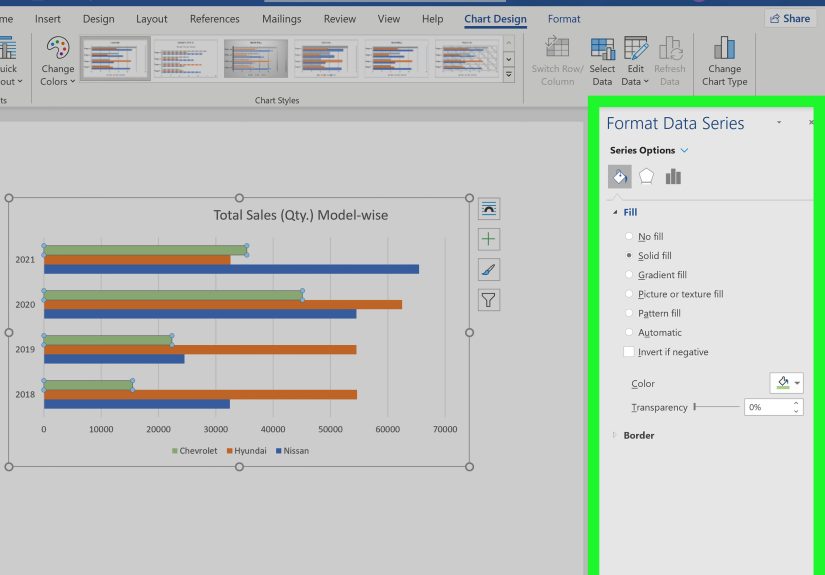
Step 5: Customize the Chart Design
Now that the chart exists, it is time to make it look intentional. Click the chart to reveal the Chart Design and Format tabs. These tools let you change colors, styles, layouts, and the overall appearance.
Start with the basics:
- Choose a clean chart style that matches your document.
- Use colors that are easy to distinguish.
- Avoid wild gradients, heavy outlines, or 3D effects that make the chart harder to read.
- Keep the design simple so the data does the talking.
If all your bars represent the same type of information, using one consistent bar color often looks more professional than turning the chart into a rainbow parade. Simpler charts are usually easier to read, easier to print, and easier to trust.
Step 6: Add Titles, Labels, and a Legend
A chart without labels is basically a decorative mystery. To make your bar chart useful, add a chart title and, if needed, axis titles, data labels, and a legend. With the chart selected, go to Chart Design > Add Chart Element. From there, you can add:
- Chart Title tells readers what the chart shows
- Axis Titles useful if the values or categories need explanation
- Data Labels places the actual numbers on or near the bars
- Legend helpful when you have more than one data series
If you are making a basic one-series bar chart, the legend is often unnecessary. In fact, removing it can make the chart cleaner. Data labels are often more useful because they let readers see the exact numbers without guessing from the axis. A strong title also does a lot of heavy lifting. “Club Participation by Group” is better than “Chart 1,” which sounds like you gave up halfway through naming things.
Step 7: Resize, Review, and Fine-Tune
Finally, resize the chart so it fits well on the page and is easy to read. Click and drag the corner handles to make it larger or smaller without distorting the shape. Then review the finished chart with fresh eyes.
Ask yourself:
- Are the category names easy to read?
- Are the numbers correct?
- Is the title specific and helpful?
- Is the chart too crowded?
- Would someone understand it in five seconds?
If the answer to that last question is no, simplify. Reduce clutter, shorten labels, or remove unnecessary extras. A good bar chart should feel obvious. Readers should not need detective music playing in the background.
Example: A Simple Bar Chart for a School Report
Imagine you are writing a report on student participation in after-school clubs. A bar chart works beautifully because the goal is to compare categories. Your final chart might include four horizontal bars, one for each club, with data labels showing membership counts. The title could read Student Participation in After-School Clubs. The category axis would list club names, and the value axis would show the number of students.
That one visual can communicate the core message faster than a paragraph of text. Instead of writing, “Science Club had the highest participation, followed by Art Club, then Drama Club, and finally Chess Club,” the reader can see it instantly. That is the whole point of using charts in the first place.
Common Mistakes to Avoid
Using the Wrong Chart Type
Do not choose a bar chart just because bars look friendly. Use it when you are comparing categories. If you are showing a long time trend, a line chart or column chart may be clearer.
Keeping Default Placeholder Text
Nothing says “I finished this at 11:59 PM” like a chart still labeled Series 1 and Category 3. Replace every placeholder with real text.
Overdesigning the Chart
Too many colors, effects, shadows, or giant labels can make the chart harder to read. Fancy is not the same as effective.
Forgetting Accessibility and Readability
Use clear titles, readable labels, and enough contrast between text and background. Do not rely on color alone to communicate meaning if you have multiple series. If the chart will be shared widely, simple design is your friend.
Pro Tips for Better Bar Charts in Word
- Use short, clean category names whenever possible.
- Choose horizontal bars when labels are long.
- Add data labels if exact values matter.
- Skip the legend for a single-series chart unless it truly helps.
- Keep spacing comfortable so titles and labels are not crammed together.
- Double-check numbers in the spreadsheet before blaming the chart.
Final Thoughts
Making a bar chart in Word is not difficult once you know the workflow. You place your cursor, go to Insert, choose Chart, select a bar chart, enter your data, and then polish the result with labels and formatting. That is the core process. The difference between a forgettable chart and a strong one comes down to readability: use the right chart type, keep labels clear, and avoid unnecessary clutter.
If you follow these seven steps, your bar chart will do what every good chart should do: make information faster to understand. And that is a pretty nice trick for a feature hiding quietly inside Word.
Extra Experience and Practical Lessons from Making Bar Charts in Word
One of the most common experiences people have with Word charts is realizing that the program is more capable than they expected, but also a little quirky in ways that can surprise beginners. The first surprise is usually the embedded spreadsheet window. Many users think they are creating a chart directly in Word, then suddenly an Excel-style grid appears and they wonder whether they accidentally opened another application, crossed into a parallel universe, or clicked the wrong thing. In reality, this is normal. Word relies on that data sheet because charts need structured values and labels, and the spreadsheet is the easiest way to manage them.
Another common experience is discovering that the chart looks fine at first, then weird as soon as you start typing real labels. This usually happens when category names are too long, the data range includes extra blank rows, or the chart type is not the best fit. For example, a horizontal bar chart often feels much easier to manage than a vertical column chart when your labels are phrases instead of single words. That is why many people end up switching from a column chart to a bar chart after a few minutes of wrestling with tilted labels that look like they are sliding off the page.
There is also the universal experience of formatting temptation. Word offers chart styles, colors, fills, and effects, and it can be very tempting to click every shiny option just to see what happens. Usually what happens is that the chart becomes harder to read. A design that seemed “dynamic” in the moment ends up looking busy, heavy, or slightly chaotic. Most experienced users learn the same lesson: a cleaner chart almost always wins. A simple title, consistent colors, readable numbers, and enough white space will beat a dramatic 3D monster every time.
People also learn quickly that charts are not just decorative extras. A good bar chart can rescue a document that feels too text-heavy. In reports, school assignments, marketing summaries, and proposals, a bar chart can turn a dull block of explanation into something readers understand in seconds. That is a big reason this skill is worth learning. Once you make one solid chart in Word, you start seeing places where visuals can do the job faster than paragraphs.
Finally, experience teaches that the best chart-making habit is reviewing the finished visual like a first-time reader. Check the title. Check the labels. Check the numbers. Ask whether the message is obvious. If the answer is yes, you are done. If not, simplify. In the end, the best Word bar chart is not the fanciest one. It is the one that makes people instantly understand the data without needing a translator, a magnifying glass, or a pep talk.