Table of Contents >> Show >> Hide
- Why custom wallpapers hit different (and why your friends secretly love them)
- Before you design: the “boring” stuff that keeps your wallpaper from looking cursed
- The fun part: building a wallpaper that actually feels like your friend
- Tools that make you look like you know what you’re doing
- Images and textures: how to avoid the “uh-oh, is this copyrighted?” moment
- 10 wallpaper formulas I keep reusing (because they work)
- How I deliver wallpapers (without becoming tech support)
- Troubleshooting (aka why your masterpiece looks wrong on their phone)
- What making wallpapers taught me (besides patience)
- Bonus: 500-ish words of wallpaper-making experiences (because I can’t shut up about it)
It started as a harmless flex: I made one phone wallpaper for a friend as a joke. Then another. Then a “quick one” that somehow involved three font tests, a color palette argument with myself, and the sudden realization that I might be… a Wallpaper Person now.
And honestly? I’m not mad about it. Custom phone wallpapers are the perfect tiny gift: they’re personal, useful, and they pop up every day like a little “hey, I know you” notewithout the pressure of buying something expensive or pretending you know their shoe size.
Why custom wallpapers hit different (and why your friends secretly love them)
A good wallpaper is like a theme song you don’t have to play out loud. It’s mood, identity, inside joke, and comfort all rolled into a rectangle you stare at 100 times a day. When you make one for a friend, you’re basically saying: “I pay attention. Also, I have layers.”
Plus, wallpapers are low-risk fun. If they love it, you’re a genius. If they don’t, they can quietly change it and no one gets hurt. The gift equivalent of bringing chips to a party: always appreciated, rarely criticized, and if someone does complain, that’s on them.
Before you design: the “boring” stuff that keeps your wallpaper from looking cursed
1) Resolution & aspect ratio: design big, export smart
Phones come in a parade of sizes, and they all crop a little differently. The safest strategy is to design larger than you think you need, then keep important elements away from the edges. If you want a “works on most phones” file, many designers create a tall canvas in a modern phone-ish ratio (like 9:16 or around 19.5:9) at a high resolution so details stay crisp when the phone scales it.
A practical rule: make the canvas big enough that even if the phone zooms or crops slightly, it still looks sharp. If you’ve ever set a wallpaper and watched your beautiful composition get zoomed into a forehead… you already understand why this matters.
2) Safe zones: where not to put the punchline
Your friend’s phone is going to add stuff on top of your art: the time, date, widgets, icons, and sometimes that little flashlight/camera area on the Lock Screen. Translation: the top and bottom portions are “danger zones” for text, faces, and any detail you’d be sad to lose.
The easiest workaround is to design with a “quiet center.” Put your hero subject or quote in the middle third of the canvas, then let the edges be atmospheric: gradients, texture, bokeh, clouds, abstract shapes, etc. It’s not just saferit also looks more intentional.
3) File format: PNG vs JPG (aka crisp vs compact)
If your wallpaper uses text, line art, or flat colors, PNG is usually your best friend because it preserves crisp edges. If it’s mostly a photograph, JPG can be smaller and still look greatjust export at high quality so you don’t accidentally gift your friend a beautiful sunset rendered in “mushy cereal.”
The fun part: building a wallpaper that actually feels like your friend
Start with a “friend brief” (yes, like you’re a tiny creative agency)
I ask myself three questions:
- What do they love (colors, hobbies, fandoms, places, pets)?
- What do they need (calm, energy, motivation, a laugh, a visual reset)?
- What’s the vibe (minimal, cozy, chaotic-good, elegant, meme-adjacent)?
Example: One friend is a chronic overthinker with a packed calendar. For them, I made a soft gradient wallpaper with one tiny line of text: “Breathe. Then pick one thing.” It wasn’t loud. It was a daily nudge.
Color palettes: mood first, aesthetics second
Color is emotional shorthand. Muted blues and warm neutrals feel calm. High-contrast neon feels energetic. Deep greens feel grounded. And black backgrounds can be sleekuntil your friend’s icons disappear into the void like they’re auditioning for a magic show.
If you include text, remember readability matters. High contrast between text and background isn’t just “design snob stuff”it’s the reason your friend can read the quote outdoors without squinting like they’re solving a crime.
Typography: the difference between “premium” and “middle-school poster”
Here’s the cheat code: pick one strong font for the main message, and one simple font (or none) for everything else. Limit yourself to two fonts max. Also, avoid super-thin type unless your background is extremely cleanphones love turning thin type into blurry whisper-lines.
Want your text to look intentional instantly? Add gentle spacing (a little extra letter spacing), give it breathing room, and don’t center everything just because the alignment button is right there begging you.
Personal details that don’t feel cheesy
The best wallpapers feel “custom” without screaming “CUSTOM.” A few ideas that land well:
- Coordinates of a meaningful place (first apartment, favorite hike, where you met).
- A tiny symbol they’d recognize (a lemon slice for the friend who lives on citrus drinks, a book spine silhouette, a doodled cat).
- Weather-coded palettes (foggy gray for the Pacific Northwest friend, sun-washed peach for the Florida friend).
- Low-key inside jokes (keep it subtle enough that strangers won’t ask questions in elevators).
Tools that make you look like you know what you’re doing
You do not need a design degree. You need a workflow you can repeat without spiraling.
- Canva: fast layouts, easy resizing, great for text-forward wallpapers and clean graphics.
- Photoshop / Adobe Express: ideal for photo-based wallpapers, color grading, and texture work.
- Illustrator: perfect for crisp vector shapes, icons, and minimal line art that stays sharp.
- Procreate: unbeatable for hand-drawn wallpapers, doodles, and painterly textures.
- Figma: surprisingly great for minimalist wallpapers and consistent spacing/type systems.
Pick one tool and get good at it. Your friend does not care if you used ten appsthey care if it looks good and fits their screen.
Images and textures: how to avoid the “uh-oh, is this copyrighted?” moment
If you use your own photos, you’re golden. If you use someone else’s work, you need to respect licenses and permissions. “It was on Google” is not a license (it’s a panic sentence).
Safer routes:
- Use stock images from sources with clear licensing terms.
- Use Creative Commons content and follow the exact license requirements (especially attribution and “no derivatives” rules).
- Make it yourself: photos you shoot, textures you scan, shapes you draw, gradients you buildthese are wallpaper gold.
Quick reality check: “Fair use” can exist, but it’s not a magic sticker you slap on anything you want. If you’re making wallpapers for friends, keep it respectful, avoid ripping artists’ work, and choose sources that explicitly allow reuse.
10 wallpaper formulas I keep reusing (because they work)
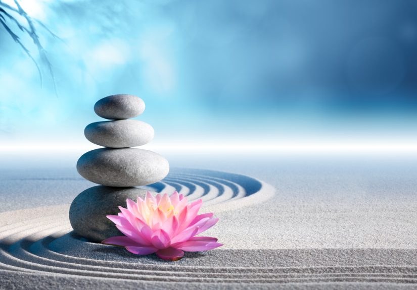
- The Calm Gradient: two or three soft colors, subtle texture, no text. Looks expensive. Takes 5 minutes.
- The Quote + Negative Space: one short line, centered in the safe zone, with generous breathing room.
- The Photo “Frame”: a photo placed inside a soft-edged shape with a blurred version of the same photo behind it.
- The Map Moment: a simple map outline + coordinates + date (minimal typography).
- The Monogram Remix: a big initial with a pattern inside (stars, florals, checkerboard, doodles).
- The Tiny Icon: one small symbol near the bottom thirdsubtle, classy, personal.
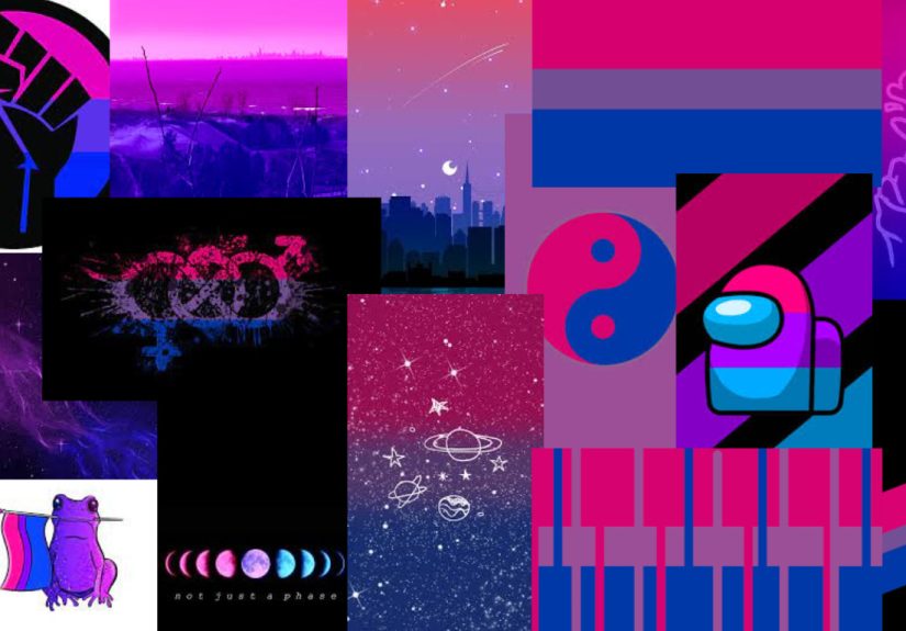
- The Collage Strip: 3–5 tiny photos in a vertical strip; background stays clean so icons don’t fight it.
- The “Reminder” Wallpaper: one useful phrase (“Drink water,” “One thing at a time,” “Text your mom”).
- The Seasonal Reset: same layout, new colors every seasonyour friend gets a refresh without losing familiarity.
- The Soft Noise Overlay: add a light grain texture so gradients don’t band and everything feels more tactile.
How I deliver wallpapers (without becoming tech support)
The easiest method: send the final image as a normal photo, plus one sentence: “Save it, then set it as your Lock Screen/Home Screen wallpaper. If it zooms weird, try repositioning or turning off zoom effects.”
If you want to be extra (I support this), send two versions:
- Lock Screen version: composition slightly lower so the time doesn’t bulldoze the main subject.
- Home Screen version: a calmer version so app icons stay readable.
Troubleshooting (aka why your masterpiece looks wrong on their phone)
- It looks blurry: the canvas was too small, or the image was compressed in messaging. Export bigger and send as a file if needed.
- It’s zoomed in: the phone is cropping to fit. Keep the subject in the center and leave edge “buffer space.”
- Icons disappear: background is too busy or too close in color. Add contrast, blur behind icon zones, or simplify.
- Text is hard to read: increase contrast, add a soft shadow, or put text on a translucent shape.
- Gradient banding: add a tiny bit of noise/grain; it smooths transitions like magic.
What making wallpapers taught me (besides patience)
I thought I was “just making backgrounds.” Turns out I was practicing design fundamentals: hierarchy, contrast, spacing, and restraint. Restraint is the hardest one. Restraint is me closing the app before I add “just one more sparkle.”
Also? Making wallpapers is sneakily intimate. You have to notice what your friends actually likewhat calms them, what makes them laugh, what they’re working through. That’s why a good wallpaper feels like a warm little ping of connection.
Bonus: 500-ish words of wallpaper-making experiences (because I can’t shut up about it)
The first wallpaper I made was aggressively simple: a pastel gradient and a tiny phrase that only my friend would understand. I sent it with the energy of someone tossing a paper airplane and hoping it doesn’t hit a ceiling fan. They set it immediately. Then they sent a screenshot of their Lock Screen like it was a proud pet adoption photo. That was it. I was hooked.
After that, I learned the real secret: people don’t want “perfect.” They want “personal.” One friend didn’t care that the kerning was a little off. They cared that I remembered their favorite color. Another friend loved a wallpaper that was literally just a doodled coffee cup and a tiny “you’ve got this,” because their mornings were chaos and that tiny image felt like a calm anchor.
I also learnedthrough painthat phones are not polite about cropping. I once designed a gorgeous wallpaper with a quote at the top, sent it with confidence, and got back: “Why does it only say ‘…ieve’?” The time display ate half the sentence like it was hungry. From then on, I started building “safe zones” into everything. Now I treat the top of the wallpaper like a no-fly zone for important words. (Unless the word is “BREATHE,” because honestly, that still works if it becomes “EATHE.”)
My favorite ones are the wallpapers that feel like a tiny private museum exhibit. For a friend who loves hiking, I used a photo from their trip, softened it, added a faint contour-line texture, and placed the coordinates in small type near the bottom. For a friend who loves cooking, I made a warm-toned background with a hand-drawn whisk and the phrase “mise en place, not misery.” For a friend going through a tough season, I made something that didn’t try to be motivationaljust calm: a quiet sky gradient with one line, “Today counts too.”
The unexpected win is that wallpaper-making sharpened my eye. I started noticing when backgrounds were too busy, when contrast was too low, when type looked “almost” right but not quite. And every time I got better, my friends benefittedbecause suddenly they were getting wallpapers that looked less like “I tried” and more like “I do this on purpose.”
Now I run a mini wallpaper tradition: birthdays get a new wallpaper, big life events get a commemorative one, and sometimes I’ll surprise a friend with a seasonal refresh just because I found the perfect color palette. Is it over-the-top? Yes. Is it also kind of adorable? Also yes. And I’m pretty proudbecause it’s a small, daily piece of joy that fits in your pocket.