Table of Contents >> Show >> Hide
- What Is Mouse’s Back No. 40?
- Why Mouse’s Back Can Look Different Room to Room
- Where Mouse’s Back No. 40 Looks Amazing
- How to Style Mouse’s Back: Winning Pairings
- Choosing the Right Finish for Mouse’s Back No. 40
- How to Test Mouse’s Back the Smart Way (So You Don’t Repaint Twice)
- Mouse’s Back No. 40 in Real Design Scenarios
- Color Matching and “Dupes”: What to Know
- Common Mistakes (and How to Avoid Them)
- Is Mouse’s Back No. 40 Right for You?
- of Real-World “Experiences” With Mouse’s Back No. 40
If you’ve ever wished your home could whisper “quietly confident” instead of shouting “I picked this color in a parking lot,”
Mouse’s Back No. 40 paint might be your new best friend. It’s the kind of shade that looks simple at first glance
a warm, earthy neutralthen casually reveals a little extra personality once it’s on the wall. Think: a soft gray-brown with a
subtle green-ish backbone that can feel cozy, classic, and surprisingly modern, depending on what you pair it with.
In this guide, we’ll break down what Mouse’s Back No. 40 really looks like, why it changes in different lighting, where it shines
(and where it can get a little moody), and how to style it so your room looks intentionalnot “I tried to paint greige and accidentally
invented mushroom soup.”
What Is Mouse’s Back No. 40?
Mouse’s Back No. 40 is best described as a quiet gray-brown neutral inspired by the warm, tawny tones you’d find
in naturespecifically, the soft fur color that gave it its name. But here’s the twist: it’s not just brown + gray. It carries a
gentle green base that can become more noticeable in certain conditions, especially lower-light rooms. That green grounding is what keeps
Mouse’s Back from feeling flat or overly beige.
Quick personality profile
- Color family: warm neutral (gray-brown / taupe-adjacent)
- Undertone: subtle green influence that can show up more in dim or cool light
- Vibe: calm, classic, slightly organiclike a tailored blazer made out of linen
- Best for: living spaces, hallways, studies, cabinetry, furniture, and anywhere you want depth without drama
Why Mouse’s Back Can Look Different Room to Room
Paint color is basically a magician: it never looks exactly the same twice, and it loves an audience. Mouse’s Back No. 40 is especially
sensitive to light direction, brightness, and sheen. That’s not a flawit’s part of why designers love complex neutrals.
But it does mean you’ll want to understand how it behaves before committing.
1) Natural light direction changes the “read”
- North-facing rooms: cooler, softer light can pull out the green/gray side and make Mouse’s Back feel more muted and earthy.
- South-facing rooms: warmer, brighter light typically brings out the brown warmth, making it feel sunnier and more “taupe.”
- East-facing rooms: brighter in the morning; you may see a warmer, friendlier tone early, then a more subdued neutral later.
- West-facing rooms: can turn extra cozy (and sometimes deeper) as afternoon light warms up.
2) LRV: the secret “how dark will this feel?” number
If you’ve seen people casually drop “LRV” like it’s a celebrity nickname, here’s what it means: Light Reflectance Value is
a 0–100 scale describing how much light a color reflects. Lower numbers generally read darker; higher numbers read lighter. Mouse’s Back No. 40
sits in a mid-to-deeper neutral range (often reported around the mid-20s), which means it can feel warmly envelopingespecially in rooms without
much natural light.
Translation: if your room is already dim, Mouse’s Back may look richer and slightly greener. If your room is bright, it often looks more like a
balanced warm gray-brown.
3) Sheen matters more than people expect
Higher sheen finishes reflect more light, which can make colors look brighter and more intensewhile also highlighting wall imperfections.
Lower sheen finishes can look softer and more velvety, but may show scuffs in busy zones depending on the product line. For Mouse’s Back, sheen
choice can subtly shift how noticeable the undertone feels.
Where Mouse’s Back No. 40 Looks Amazing
Living rooms and family rooms
Mouse’s Back is a strong candidate for living spaces because it’s neutral enough to support lots of decor stylestraditional, transitional,
modern organic, even lightly rusticwithout feeling like a “default builder beige.” It pairs beautifully with warm woods, leather, linen, and
natural fibers. If you love layered neutrals (cream + tan + walnut + a little black metal), it behaves like a team player with great taste.
Hallways, stairwells, and entryways
These areas often need a color that can handle changing light and still look polished. Mouse’s Back brings depth, hides minor scuffs better than
stark white, and makes framed art pop. Bonus: it can make a hallway feel intentional rather than “the place where shoes go to retire.”
Home offices and studies
Want focus without going full “dark academia”? Mouse’s Back is a great compromise. It reads grounded and calm, and it pairs well with wood desks,
brass accents, and off-white trim. Add a warm lamp and suddenly your Zoom background looks like you have your life together.
Cabinets, built-ins, and furniture
One of the smartest uses for Mouse’s Back No. 40 is on cabinetry or furniture, where its undertone adds richness without overpowering the room.
It works especially well for built-in bookshelves, bathroom vanities, and kitchen islands. If you’re nervous about painting all four walls, this is
a great “dip your toe in the mouse pond” option.
How to Style Mouse’s Back: Winning Pairings
Mouse’s Back No. 40 shines when you treat it like a warm neutral with a hidden green card up its sleeve. Your goal is to either (1) harmonize with
that subtle earthy base, or (2) deliberately contrast it with crisp elements for a tailored look.
1) The classic, traditional palette
- Soft off-whites: creamy whites and gentle off-whites keep it traditional and calm.
- Warm wood tones: oak, walnut, and reclaimed woods enhance the natural warmth.
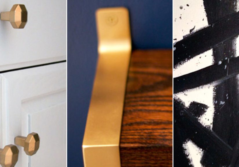
- Brass + aged metals: antique brass and bronze look especially elegant next to Mouse’s Back.
2) The modern organic palette
- Textured neutrals: boucle, linen, jute, clay ceramics
- Earthy greens: olive, moss, or eucalyptus accents echo the undertone without matching too literally
- Matte black: adds structure and contrast (think hardware, frames, or lighting)
3) A surprisingly pretty “warm-meets-soft” palette
Mouse’s Back can look fantastic with muted blush or dusty pink accents (pillows, art, rugs) because the warmth balances the softness. If you love
a gentle, elevated lookthis pairing is quietly powerful.
Choosing the Right Finish for Mouse’s Back No. 40
The finish you choose affects both appearance and durability. Here’s a practical way to decide:
Walls
- Low-sheen / matte / flat: best for a soft, upscale look and hiding imperfections (great for adult-only living rooms)
- Eggshell: a sweet spot for most homesstill soft, but easier to clean
- Satin: more wipeable, more reflectivegreat for busy hallways, but prep matters because it can highlight bumps
Trim and doors
If you’re painting trim in Mouse’s Back (or pairing it with a white trim), semi-gloss or satin trim finishes can look crispbut remember: higher
sheen reflects more light and can exaggerate texture, so good prep pays off.
Cabinetry and furniture
A durable finish matters here. Many people prefer a slightly higher sheen on cabinets for easier cleaning, while still staying in the “not too shiny”
zone for a sophisticated look.
How to Test Mouse’s Back the Smart Way (So You Don’t Repaint Twice)
Testing is not optional. It’s the difference between “this is perfect” and “why does my wall look like a wet cardboard box at 6 p.m.?”
Step-by-step testing routine
- Use a sample on a board: paint a foam board or poster board so you can move it around the room.
- Check morning, noon, and night: undertones show up at different times.
- Compare to a known neutral: place it near a true warm white and a true grayundertones become easier to spot.
- Test near fixed finishes: flooring, countertops, cabinets, and tile will influence what you see.
- Don’t judge it next to bright white only: bright white can make many colors look darker or muddier than they really are.
Mouse’s Back No. 40 in Real Design Scenarios
Scenario A: A cozy, low-light living room
If you have a living room that doesn’t get tons of daylight, Mouse’s Back can lean deeper and more earthysometimes revealing more of its green base.
To keep it cozy instead of heavy, pair it with warmer off-whites, layered lighting (floor lamp + table lamps), and warm wood accents.
A big cream rug helps bounce light back into the space.
Scenario B: A bright kitchen with warm oak floors
In a sunlit kitchen, Mouse’s Back often reads like a sophisticated warm neutralamazing on an island or lower cabinets. Pair it with creamy uppers,
brass hardware, and a simple white backsplash for a timeless look. If you want more modern contrast, add matte black pendants or faucet hardware.
Scenario C: A hallway that needs to look “finished”
Hallways can feel like design afterthoughts, but Mouse’s Back is a shortcut to polished. Use it on the walls with lighter trim, and it instantly
looks intentional. Add a gallery wall with black frames and suddenly the hallway becomes a destination instead of a corridor.
Color Matching and “Dupes”: What to Know
Yes, you can find close matches to Mouse’s Back No. 40 paint in other brands. But here’s the truth nobody wants to hear:
“close” can still look noticeably different once it’s on your wall, because paint formulas, bases, and sheens vary by manufacturer.
If you’re trying to match it in another line (say, for budget or availability), treat it like a separate color selection process:
test samples, compare under your home’s lighting, and don’t assume a digital swatch will behave the same in real life.
A practical shortcut
- Start with a known reference: use Mouse’s Back as your “anchor” and compare candidates next to it.
- Match undertone first, depth second: a slightly lighter match with the right undertone will usually look better than a perfect depth with the wrong undertone.
- Choose the finish intentionally: a satin match can look brighter than a matte original, even if the color code is close.
Common Mistakes (and How to Avoid Them)
Mistake 1: Pairing it with an icy white
Cool, stark whites can make Mouse’s Back look duller or bring out the green/gray side more than you wanted. If you want a clean contrast, choose a
warmer white that still feels fresh.
Mistake 2: Forgetting your fixed finishes
Floors, countertops, tile, and big furniture pieces are the boss of the room. Mouse’s Back looks best when it’s chosen in conversation with those
finishesnot in isolation.
Mistake 3: Skipping lighting
If you rely on one ceiling light that makes everyone look tired, don’t blame the paint when the walls feel off. Add warm, layered lighting and you’ll
often “fix” the room without repainting.
Is Mouse’s Back No. 40 Right for You?
Choose Mouse’s Back No. 40 paint if you want a neutral that feels lived-in, elegant, and groundedsomething warmer than a standard gray,
but not as golden as many beiges. It’s an excellent choice for people who love natural textures, warm wood, layered neutrals, and spaces that feel calm
rather than trendy.
If you want a neutral that is always crisp and never shifts undertone, you may prefer a simpler greige. But if you like a color that behaves like a
good character actorsubtle, versatile, and quietly stealing the sceneMouse’s Back is worth a serious look.
of Real-World “Experiences” With Mouse’s Back No. 40
People’s experiences with Mouse’s Back No. 40 tend to follow a familiar (and mildly comedic) storyline: they fall for it online,
they paint a test patch, they panic for about 12 hours, and then they realize it’s doing exactly what a complex neutral is supposed to do.
Here are a few common “yep, that happened” moments that show up again and again when homeowners and DIYers live with this shade.
The Sample-Board Tour
One of the most useful experiences is moving a sample board around the house like it’s a VIP guest. In a bright room, Mouse’s Back often looks
like a balanced warm taupe-graycalm, sophisticated, easy to style. Then the same board goes into a darker hallway and suddenly the color deepens,
looking more earthy and a bit more green-leaning. This is where people learn an important lesson: the paint isn’t “changing” to mess with you;
the light is revealing what was already there. That discovery is usually followed by a second lesson: adding a warmer bulb or a lamp can make the
color feel instantly more welcoming.
The Underlit Room Surprise
In underlit spaces, the most common reaction is, “Wait… is this greener than I thought?” That subtle green base can step forward when natural light
is limited. The good news is that it often reads as natural and groundedmore “stone and bark” than “mint and mischief.” People who embrace it tend
to love pairing it with creamy trim, warm wood, and brass hardware. People who fight it by adding icy whites or very cool grays nearby may find the room
feels slightly off, like a playlist where every song is good but somehow none of them are friends.
The Cabinet Glow-Up
A surprisingly popular “experience” is using Mouse’s Back on cabinets or built-ins first. It’s less commitment than four walls, but you still get the
character. Homeowners often describe the result as “custom” and “designer,” especially when paired with warm metals and simple, clean tile. On an island,
it can anchor a kitchen without going dark. On a vanity, it can make a bathroom feel calmer and more spa-likewithout turning everything into a sea of white.
The Trim Pairing Debate
Another common storyline: choosing the white. People often test a crisp white and a warmer off-white next to Mouse’s Back. In many homes, the warmer option
looks more harmonious and makes Mouse’s Back feel richer. The crisp white can look great too, but it tends to sharpen contrast and can make Mouse’s Back read
deeper. This is the moment when DIYers start saying things like, “I didn’t know whites had opinions,” and they’re not wrongwhites are extremely opinionated.
The “I’m Glad I Waited” Moment
The final experience is patience paying off. People who live with the sample for a few daysseeing it in morning light, afternoon warmth, and nighttime
lamplightoften end up more confident and happier with the result. Mouse’s Back rewards that slow decision-making. It’s not a paint color for impulsive
midnight purchases (unless you enjoy repainting as cardio). It’s a paint color for thoughtful layeringand once it’s in place, it tends to make a room feel
finished, calm, and quietly expensive.