Table of Contents >> Show >> Hide
- What Makes a Farmhouse Paint Color Feel “Cozy” (Not Cold or Flat)
- The Best Farmhouse Paint Colors (By “Cozy Personality”)
- 1) Warm Whites & Soft Off-Whites (The Cozy Farmhouse Foundation)
- 2) Greige & Taupe (The “Candlelit Neutral” Family)
- 3) Gentle Greens & Blue-Greens (Farmhouse Color That Still Behaves Like a Neutral)
- 4) Cozy Blues & Blue-Grays (For “Crisp” That Still Feels Warm)
- 5) Moody Accents: Black, Charcoal, and Navy (The Farmhouse “Eyebrow Pencil”)
- 6) Earthy Warm Colors (The “Modern Farmhouse Is Getting Cozier” Shift)
- Room-by-Room Farmhouse Color Cheat Sheet
- How to Choose the Right Shade in Your House (So You Don’t End Up With “Surprise Undertones”)
- Common Farmhouse Color Mistakes (And Quick Fixes)
- Real-World Experiences: What People Learn After Painting Farmhouse Colors (500+ Words)
- Wrap-Up: The Coziest Farmhouse Palette Is the One That Fits Your Light
Farmhouse style gets a bad rap for being “just white walls and a shiplap addiction.” But the best farmhouse homes don’t feel like a paint aisle they feel like a warm mug of something that would absolutely stain your favorite sweater. Cozy farmhouse color is all about soft warmth, livable neutrals, and nature-inspired accents that make every room feel welcoming instead of museum-quiet.
This guide breaks down the most reliable farmhouse paint color families (warm whites, greige, gentle greens, moody accents, and earthy warms), then gives you a room-by-room cheat sheet so you can stop squinting at 47 paint chips like they’re a “spot the difference” puzzle.
What Makes a Farmhouse Paint Color Feel “Cozy” (Not Cold or Flat)
“Cozy” isn’t a single colorit’s the effect you get when the paint works with your home’s light, finishes, and textures. Farmhouse spaces usually lean on natural materials (wood, linen, stone, black metal), so the coziest paint colors tend to have:
- Warm or balanced undertones (creamy, beige, gentle taupe) instead of icy blue-gray.
- Enough depth to feel soft (not blinding bright, not dungeon dark).
- Compatibility with fixed elements like flooring, countertops, tile, and cabinet finishes.
One more helpful concept: LRV (Light Reflectance Value). It’s a number that roughly describes how much light a paint color reflects. Higher LRV = brighter; lower LRV = moodier. You don’t need to memorize numbers, but it helps to know that a dim hallway often prefers a lighter, warmer paint, while a bright dining room can handle deeper color without feeling heavy.
The Best Farmhouse Paint Colors (By “Cozy Personality”)
Below are dependable, widely used farmhouse-friendly shades across major U.S. paint brands. Think of these as “anchor colors”the kind you can build an entire home palette around without waking up in a panic six months later.
1) Warm Whites & Soft Off-Whites (The Cozy Farmhouse Foundation)
Farmhouse white is not “printer paper.” Cozy farmhouse white is soft, creamy, and forgiving with natural wood and warm metals.
- Sherwin-Williams Alabaster (SW 7008): A balanced warm white that reads calm and cozy on walls, trim, or even kitchen spaces. It’s a go-to if you want bright without “sterile.”
- Benjamin Moore White Dove (OC-17): A classic warm white with gentle softnessgreat for open layouts where you want one color to flow from room to room.
- Benjamin Moore Simply White (OC-117): A brighter warm-leaning white that still feels welcoming. Excellent for rooms that need a lift (especially when paired with wood tones).
- Behr Cotton Knit: A soft, neutral white that plays nicely with farmhouse textures like linen curtains, woven shades, and white oak floors.
Where these shine: living rooms, kitchens, hallways, ceilings, trim, and anywhere you want “fresh but not chilly.”
2) Greige & Taupe (The “Candlelit Neutral” Family)
If warm whites are the bread, greige is the butter. It blends gray and beige so your walls feel calm, modern, and still cozyespecially with black hardware and rustic wood.
- Benjamin Moore Revere Pewter (HC-172): A famous greige for a reasonwarm, flexible, and easy to decorate around.
- Sherwin-Williams Agreeable Gray (SW 7029): A light warm greige that works in a wide range of homesgreat for open-concept areas that need a neutral “glue.”
- Sherwin-Williams Accessible Beige (SW 7036): A warm neutral that leans more beige than grayexcellent for cozy rooms with warm floors or creamy trim.
- Benjamin Moore Edgecomb Gray (HC-173): A soft greige/taupe hybrid that feels warm and relaxed, especially in bedrooms and dining rooms.
Where these shine: living rooms, dining rooms, bedrooms, home offices, and any space where you want warmth without going full tan.
3) Gentle Greens & Blue-Greens (Farmhouse Color That Still Behaves Like a Neutral)
Muted greens are farmhouse magic: they feel organic, calming, and “collected,” especially against white trim, wood furniture, and vintage-inspired brass or black fixtures.
- Sherwin-Williams Sea Salt (SW 6204): A soft blue-green that reads airy and spa-likegreat for bathrooms, bedrooms, and laundry rooms.
- Sage-leaning greens (various brands): Look for muted, herbal shades (not neon, not too minty). These work beautifully with warm whites and greige.
- Behr Dark Everglade (as an accent): A deeper green that can create a cozy feature wall, built-in color, or cabinet moment without feeling trendy in a fragile way.
Where these shine: bathrooms, bedrooms, mudrooms, kitchens (especially cabinets), and cozy reading corners.
4) Cozy Blues & Blue-Grays (For “Crisp” That Still Feels Warm)
Blue can absolutely be farmhouse-cozyif it’s softened. Think dusty denim, stormy sky, or a muted blue-gray that pairs with creamy white trim.
- Muted blue-grays: These work well in bedrooms and offices because they feel calm without being cold.
- Soft robin’s-egg or dusty blue accents: Perfect for a guest room, powder room vanity, or a pantry door if you want a little “farmhouse charm” without committing your entire living room to blue.
Where these shine: bedrooms, offices, nurseries, guest rooms, and calm living spaces with good natural light.
5) Moody Accents: Black, Charcoal, and Navy (The Farmhouse “Eyebrow Pencil”)
Every cozy farmhouse palette needs contrast. The trick is using dark shades strategicallylike eyeliner, not like you fell into a bucket of ink.
- Sherwin-Williams Tricorn Black (SW 6258): A true black that makes trim, doors, stair rails, and accents look crisp and timeless.
- Benjamin Moore Black Satin (2131-10): A rich black that works beautifully for modern farmhouse exteriors and statement interior accents.
- Navy accents: Great for kitchen islands, built-ins, or a dining room focal wallespecially with warm white walls and brass lighting.
Where these shine: interior doors, window trim, fireplaces, kitchen islands, built-ins, stair rails, and exterior accents.
6) Earthy Warm Colors (The “Modern Farmhouse Is Getting Cozier” Shift)
Farmhouse palettes have been drifting warmer and more nature-driventhink mushroomy neutrals, sandstone beiges, terracotta accents, and olive greens. These colors feel especially cozy in dining rooms, entryways, and rooms where you want an “embrace” instead of a “hello from across the room.”
- Sandstone / warm beige: Softer than tan, warmer than gray, and very friendly to wood tones.
- Terracotta (as an accent): Great for a powder room, a breakfast nook, or a warm entry moment.
- Olive green: A grown-up earthy green that feels classic with white trim and natural textures.
Room-by-Room Farmhouse Color Cheat Sheet
Entryway & Hallways
These spaces often have less natural light. Go for warm whites or a light greige so the area feels inviting instead of tunnel-ish. Consider Alabaster or a gentle greige like Agreeable Gray for continuity.
Living Room
For maximum coziness, try greige or soft taupe on walls with warm white trim. Add contrast with a black fireplace surround or black window mullions. If you want color, choose a muted green or dusty blue that still reads calm.
Kitchen
Classic farmhouse kitchens love a creamy white on walls and trim, then a cabinet color that adds warmth:
- Walls: warm white (Alabaster / White Dove / Simply White)
- Cabinets: warm greige, soft sage, or a deep green accent
- Island: navy, charcoal, or black for contrast
Tip: kitchens benefit from washable finishesthink eggshell/satin on walls and a more durable sheen on cabinets.
Dining Room
Dining rooms can handle a little more mood. Consider a deeper greige/taupe or an olive-leaning green. These tones look especially cozy at night with warm bulbs and candlelight (aka “the best lighting filter you can buy”).
Bedroom
Bedrooms do best with calm, soft color. Try:
- Warm greige for a soothing neutral envelope
- Muted blue-gray for a restful feel (especially in bright rooms)
- Soft sage for a nature-inspired farmhouse calm
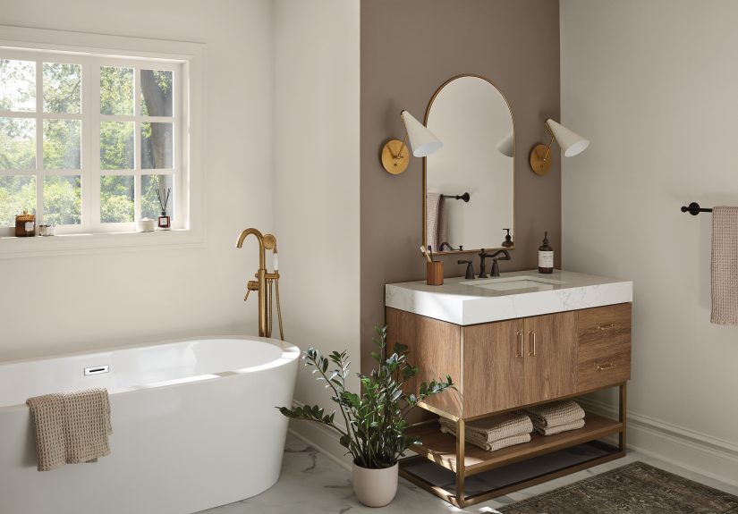
Bathroom
Bathrooms are perfect for spa-like blue-greens and soft whites. Sea Salt-style tones can feel fresh and cozy, especially with warm white trim, natural wood vanities, and matte black fixtures.
Laundry Room & Mudroom
These hardworking spaces can be fun without getting loud. A muted green, dusty blue, or warm greige helps them feel intentional. If you have hooks, cubbies, or built-ins, consider painting them a deeper accent (charcoal, deep green) while keeping walls lighter.
Home Office
A warm neutral keeps things focused and flattering on video calls. Greige and taupe reduce glare, while muted greens can feel calming during long work sessions. Add contrast with black shelving brackets or a black desk lamp for that farmhouse edge.
Kids’ Rooms
Farmhouse doesn’t mean boringjust choose softened tones. Dusty blues and gentle greens work well because they’re calm but still “kid-friendly.” Keep trim a warm white so the room stays bright and flexible as tastes change.
Trim, Doors, and Accents
Want instant farmhouse character? Paint interior doors black or charcoal, or do a black stair rail. Use a warm white on trim for a clean but cozy frame around your rooms.
How to Choose the Right Shade in Your House (So You Don’t End Up With “Surprise Undertones”)
Step 1: Identify Your “Fixed Stuff”
Floors, countertops, tile, and large furniture aren’t changing quickly (or cheaply). If your floors are warm (honey oak, warm brown), choose warm whites and greige/taupe. If your floors are cool (gray tile, cooler oak), choose balanced neutrals that won’t fight the undertone.
Step 2: Sample Like a Calm Person (Not a Paint-Roller Maniac)
Try peel-and-stick samples or paint swatches on a poster board. Move them around the room and check morning, afternoon, and night. Many “perfect” farmhouse colors look different once your lighting has a say in the matter.
Step 3: Use the Right Finish
- Walls: matte/eggshell for cozy softness; satin for easier cleaning in busy rooms
- Trim & doors: satin or semi-gloss for durability and crisp definition
- Ceilings: flat is common, but choose a tone that matches your wall undertones
Common Farmhouse Color Mistakes (And Quick Fixes)
Mistake: Choosing a “Bright White” Everywhere
Fix: Switch to a warm white for walls, then use a brighter white only on trim if you want contrast. Cozy farmhouse is usually more “soft cream” than “glossy printer paper.”
Mistake: Going Too Gray and Accidentally Building a Cold Cave
Fix: Choose greige or taupe, and add warm elements: wood tones, woven textures, warm metals, and warm lighting.
Mistake: Using Black Like It’s a Personality Test
Fix: Keep black to accents (doors, railings, fixtures, fireplace) so it adds definition without stealing the whole room’s oxygen.
Mistake: Ignoring Undertones in a Room With Tricky Light
Fix: Sample and observe. North-facing rooms often make colors look cooler; warm whites and warm neutrals help counteract that.
Real-World Experiences: What People Learn After Painting Farmhouse Colors (500+ Words)
Here’s the part nobody tells you when you’re standing in the paint aisle feeling brave: farmhouse neutrals are “neutral” only in theory. In real life, they have moods. People who paint their homes in cozy farmhouse palettes often report the same set of lessonsusually after the first wall goes up and someone says, “Wait… why does this look kind of green?”
Warm whites feel safer than you think. A lot of DIYers start out convinced they need a bright, crisp white to look modern. Then they paint one room and realize the space feels a little starklike it’s waiting for a dental appointment. Warm whites (the creamy, balanced kind) tend to feel more lived-in right away, especially when paired with wood floors and warm lighting. People love that they can still decorate with black accents and get that farmhouse contrast, but the room doesn’t feel chilly when the sun goes down.
Greige is the “peace treaty” color. In many homes, one person wants beige warmth and another wants modern gray. Greige often becomes the compromise everyone can live withespecially in open layouts where the living room, dining area, and hallway all connect. Homeowners frequently say greige makes decorating easier because it doesn’t shout over furniture, rugs, or wall art. It’s also forgiving with kids, pets, and everyday life (because yes, a pure white wall will absolutely become a handprint museum).
Lighting is the boss, not you. A consistent experience is that the same paint looks different from room to room. People notice that north-facing rooms can make neutrals look cooler or slightly flat, while south-facing rooms can warm up the same color and make it feel creamier. That’s why sampling is so popular nowfolks test swatches on different walls and check them at different times of day. It’s not overthinking; it’s avoiding repainting an entire room because your “soft beige” turned into “mysterious mushroom” by sunset.
Muted greens are surprisingly flexible. Many farmhouse fans are nervous about greens because they don’t want their house to look themed or trendy. But soft sage and blue-green shades often behave like neutrals: they pair well with warm whites, natural wood, and black fixtures, and they add a quiet personality that plain beige can’t. People who try a muted green in a bathroom or laundry room often end up bringing a related green into another spacemaybe cabinetry, a pantry door, or a built-inbecause it feels calm and “homey” instead of loud.
Moody accents change everything. Homeowners and designers frequently mention that adding a true black (or near-black) as an accent is what makes a farmhouse palette look intentional. A black front door, a black interior door set, a black island, or a black fireplace surround can turn “nice neutral house” into “wow, this feels curated.” The key is restraintmost people are happiest when black is the punctuation, not the entire paragraph.
The most common “success story” is a whole-house plan. People who feel happiest with their results usually chose a simple structure: one warm white (for trim or many walls), one main neutral (greige/taupe), and one soft color (sage/blue-green), plus a dark accent (black/charcoal/navy). That approach makes the home feel cohesive, cozy, and farmhouse-classicwithout every room looking like it came from a different design era (or a different personality).
Wrap-Up: The Coziest Farmhouse Palette Is the One That Fits Your Light
The best farmhouse paint colors for coziness aren’t about chasing the “one perfect shade.” They’re about picking warm, flexible anchorssoft whites, greige, muted greensand then using moody accents to add contrast. Start with your home’s light and fixed finishes, sample thoughtfully, and build a simple whole-house palette. Your walls (and your sanity) will thank you.