Table of Contents >> Show >> Hide
- How to Choose the Right Orange Combo (Before You Paint, Buy, or Post)
- 1) Cobalt Blue
- 2) Teal
- 3) Turquoise
- 4) Navy
- 5) Emerald Green
- 6) Lime Green (Chartreuse)
- 7) Fuchsia (Hot Pink)
- 8) Magenta
- 9) Purple (Amethyst)
- 10) Sunshine Yellow
- 11) Crimson Red
- 12) Gold (Brass)
- Common Mistakes (and How to Fix Them)
- 500+ Words of Real-World “Experience” with Orange Pairings
Orange is the extrovert of the color world. It walks into a room, tells a story, and somehow ends up hosting the after-party.
Whether you’re working with tangerine, pumpkin, persimmon, or a deep burnt orange, this color brings instant energyand
it looks best when it has a few equally confident friends.
The good news: orange is surprisingly flexible. With the right pairings, it can feel modern, retro, luxe, sporty, playful,
or quietly sophisticated. The trick is choosing bold companions that either balance orange (cool colors), amplify
it (warm colors), or sharpen it (high-contrast accents). Below are 12 bright, bold colors that go with orangeplus
specific examples and practical tips for using them in interior design, fashion, and graphic design.
How to Choose the Right Orange Combo (Before You Paint, Buy, or Post)
1) Know your orange’s “personality”
Orange isn’t one shadeit’s a whole family. Burnt orange leans earthy and mature, while bright tangerine
feels sporty and upbeat. Coral-orange can read softer and friendlier, and pumpkin feels cozy and autumnal.
Your best pairings depend on that undertone.
2) Use the “60–30–10” rule for bold colors
If you’re nervous about strong color, this classic ratio helps: 60% a main base (wall color, large rug, big clothing piece),
30% a secondary color (sofa, jacket, curtains), and 10% an accent (pillows, accessories, trim, shoes). Orange can be any of
those rolesbut it tends to shine as the 10% “pop” or the 30% supporting player.
3) Pick a finish that matches the mood
Glossy finishes feel lively and modern; matte can feel calmer and more “designer.” Textureslinen, velvet, leather, brushed
metalalso change how bold a color feels next to orange.
1) Cobalt Blue
If orange is the sun, cobalt blue is the deep sky. This pairing is bold, crisp, and unmistakably high-energy because
blue and orange sit opposite each other on the color wheel (classic complementary contrast).
Where it works
- Living room: burnt orange sofa + cobalt art print + warm wood coffee table
- Kitchen: orange accessories (canisters, towels) + cobalt backsplash tile accents
- Style: orange sneakers + cobalt jacket = “I planned this outfit” confidence
Pro tip: Add a neutral buffer (cream, tan, warm gray) so the combo feels intentionalnot like a sports logo (unless
you want that, in which case: full send).
2) Teal
Teal gives orange a more sophisticated edge than bright blue. Because it mixes blue and green, teal can feel modern,
coastal, or even moody depending on the shade.
Where it works
- Bedroom: terracotta throw pillows + teal duvet cover + brass lamp
- Graphic design: teal background + orange call-to-action button = high visibility
- Outdoor spaces: orange planters + teal cushions look vibrant against greenery
Pro tip: Teal loves metallicsespecially gold and brassso you can build a palette that feels layered and luxe.
3) Turquoise
Turquoise is the fun cousin of tealbrighter, lighter, and a little more playful. With orange, it creates a fresh, punchy look
that feels cheerful and modern.
Where it works
- Accent wall: turquoise wall + orange artwork + white trim
- Fashion: orange dress + turquoise earrings = instant vacation energy
- Kids’ spaces: orange and turquoise together feel upbeat without being “babyish”
Pro tip: Keep patterns simple (stripes, solids, small geometrics) so the colors stay the star of the show.
4) Navy
Navy is bold without being loud. It makes orange look richer and more groundedespecially if your orange is bright.
If orange feels like a shout, navy is the calm friend who says, “Great point, but let’s use indoor voices.”
Where it works
- Dining room: navy walls + burnt orange velvet chairs + warm wood table
- Workwear: navy blazer + orange tie/scarf = polished but interesting
- Brand palettes: navy adds trustworthiness; orange adds energy
Pro tip: Add white or cream for a crisp, classic finish that doesn’t feel heavy.
5) Emerald Green
Emerald is jewel-toned drama in the best way. With orange, it can feel artful, vintage-inspired, or lux depending on your materials.
Think velvet, dark wood, and a little sparkle.
Where it works
- Statement corner: emerald accent chair + orange throw blanket + brass side table
- Holiday decor: orange/copper ornaments + emerald greenery = unexpected, elegant contrast
- Accessories: emerald handbag + orange scarf looks deliberate and stylish
Pro tip: If both colors are very saturated, use one as the hero and one as the supporting accent.
6) Lime Green (Chartreuse)
Lime green is for the braveor for anyone tired of “safe choices.” Next to orange, it creates a high-voltage, modern look
that feels youthful and energetic.
Where it works
- Modern interiors: orange artwork + chartreuse vase + neutral furniture
- Streetwear: orange hoodie + lime beanie = loud, fun, and trending
- Events: orange + lime signage grabs attention fast
Pro tip: Keep the background calm (white, warm gray, light wood) or you risk creating a “neon fruit salad” situation.
7) Fuchsia (Hot Pink)
Orange and fuchsia are a fearless duowarm-on-warm, bold-on-bold. This combo reads playful, creative, and fashion-forward.
It’s especially popular for maximalist decor, summer styling, and punchy social graphics.
Where it works
- Gallery wall: orange and pink prints mixed with black frames
- Outfits: orange top + fuchsia skirt + neutral shoes
- Parties: orange florals + fuchsia linens = instant celebration
Pro tip: Add a grounding color (navy, chocolate brown, or crisp white) to keep it chic instead of chaotic.
8) Magenta
Magenta is a slightly deeper, more “grown-up” version of hot pink. With orange, it feels artsy and editoriallike a
design magazine cover you can’t stop staring at.
Where it works
- Textiles: magenta rug + orange accent pillows + neutral sofa
- Beauty/fashion branding: orange + magenta feels energetic and modern
- Small spaces: use magenta in a single bold piece (ottoman, lamp) with orange accents
Pro tip: If you’re using both in large areas, choose one to be slightly muted (burnt orange or deep magenta) for balance.
9) Purple (Amethyst)
Purple and orange can feel surprisingly harmonious. It’s a classic “Halloween” combo when you go super-saturated,
but with the right shades (amethyst, orchid, deep violet), it becomes elegant and contemporary.
Where it works
- Creative studios: orange desk accessories + purple wall art = energized workspace
- Bedrooms: deep purple bedding + burnt orange throw = cozy, rich layers
- Florals: orange tulips + purple irises look striking together
Pro tip: Keep the purple on the cooler side (blue-leaning violet) to prevent the palette from feeling overly warm.
10) Sunshine Yellow
Orange and yellow are neighbors on the color wheel, so they naturally blend into a warm, glowing palette. The key is contrast:
pick a bright, clear yellow (not too mustardy) so the colors don’t blur together.
Where it works
- Entryway: orange runner + yellow art + white walls
- Summer styling: orange shorts + yellow top + denim jacket
- Kids’ rooms: warm, happy, and full of “let’s build a fort” energy
Pro tip: Add a cool counterbalance (a touch of blue or teal) if you want the palette to feel more modern and less “all warm all day.”
11) Crimson Red
Orange + red is a bold warm pairing that can read spicy, confident, and luxurious. Think sunset gradients, fiery florals,
and statement rooms. Crimson adds depth and seriousness so orange doesn’t feel too “playground.”
Where it works
- Dining spaces: orange candles + crimson napkins + dark wood
- Outerwear: orange beanie + crimson scarf looks intentional in colder months
- Art and prints: red-orange palettes look dynamic with strong shapes and negative space
Pro tip: Separate them with texture or pattern (striped textiles, woven materials) so they don’t visually “fight” for attention.
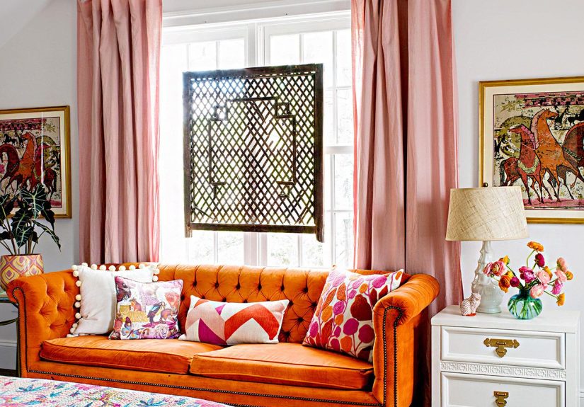
12) Gold (Brass)
Gold isn’t just an accentit’s a color strategy. Orange already reads warm, and gold turns that warmth into glow.
This pairing can feel glam, vintage, modern, or boho depending on your finishes.
Where it works
- Lighting: orange lampshade + brass base = instant statement piece
- Kitchen hardware: brass pulls + orange accessories warm up cool spaces
- Wardrobe: orange sweater + gold jewelry looks intentional and polished
Pro tip: Choose brushed or antique brass for a softer look, or high-shine gold for maximum drama.
Common Mistakes (and How to Fix Them)
“It looks too loud.”
Fix it by adding a buffer: cream, warm gray, beige, or natural wood. Neutrals give bold colors breathing room so the palette feels designed,
not accidental.
“It feels messy, not bold.”
Limit the palette. Choose one main bold partner for orange (like navy or teal), then add one smaller accent (like gold). Too many bright colors
at equal volume can look unplanned.
“The orange looks… off.”
Lighting and undertones matter. Bright cool lighting can make orange look harsh; warm lighting can make it look richer. If your orange is
leaning brown (burnt/terracotta), try deeper blues and greens. If it’s leaning bright (tangerine), try navy, cobalt, or crisp white accents.
500+ Words of Real-World “Experience” with Orange Pairings
When people actually live with orangenot just admire it in a perfectly styled photosomething funny happens: orange becomes a mood-setter.
It changes how a space feels when you walk in, and it changes how confident a look feels when you wear it. That’s why the best orange pairings
aren’t just “technically correct” on the color wheelthey’re combinations that behave well in real life.
One common experience is the “orange surprise”: you pick an orange pillow, vase, or jacket because it looks cheerful in the store, then you get
it home and realize it’s louder than you expected. This is where navy, teal, and emerald earn their keep. People tend to report that
cool, deep colors make orange feel more intentional, almost like the orange is highlighted rather than amplified. A burnt orange
throw looks richer against navy; a tangerine sneaker looks sharper next to a dark denim. The orange doesn’t disappearit just stops shouting
and starts “speaking with authority.”
Another real-world pattern: orange works better as a repeat than as a one-off. In interior design, a single orange object can
look random, but repeating orange two or three times (a pillow, a small art detail, and a candle) makes it feel planned. People often find that
orange becomes easier to love when it has a rhythm. The same idea applies in outfits: orange shoes plus one small orange detail (earrings, a bag,
a stripe) reads styled. Orange shoes alone can read accidentallike you lost a bet with your closet.
Warm pairingslike orange with sunshine yellow, crimson, or fuchsiacreate a different experience: they feel like instant energy. These combos
tend to shine in social settings (living rooms, entertaining spaces, summer outfits, parties) because they look joyful and expressive. The
“gotcha” is that warm-on-warm can become visually tiring if it’s everywhere. In practice, people often prefer these combos in smaller doses:
a fuchsia throw on a neutral sofa with orange pillows, or a yellow vase on a shelf with orange book spines. Big areas of both colors can be
incredible, but they usually need a calm anchorwhite walls, wood tones, or black framingto feel grown-up.
Then there’s the experience of texture. Orange next to flat, shiny color can look very modern and graphic (which is great if that’s the goal).
But many people fall in love with orange when it shows up in tactile materials: velvet, leather, clay, woven textiles, natural
fibers. That’s also why gold and brass are so reliable with orange. Metallic warmth behaves like a “glow” rather than a competing color, and in
real rooms, it often makes orange feel more elevated. A brass lamp near an orange accent pillow can make the whole corner feel styled, even if
the rest of the room is simple.
Finally, real-life orange is all about context. In a bright, sunlit room, orange can feel cheerful and airyespecially with turquoise or cobalt.
In a dimmer space, it can feel cozy and dramaticespecially with emerald, navy, or purple. People who love orange long-term usually figure out
their personal sweet spot: either orange as a bold accent with cool partners, or orange as a warm foundation with lively companions and lots of
neutral breathing room. Once you find that balance, orange stops being “a risky color” and starts being the best kind of design decision:
the one that makes you smile every time you see it.