Table of Contents >> Show >> Hide
- 1) Treating the Entryway Like a “Temporary” Storage Zone (That Becomes Permanent)
- 2) Skipping a Real “Drop Zone” System (So Everything Ends Up Everywhere)
- 3) Using Flat, Harsh, or Too-Dim Lighting (a.k.a. “Welcome to the Cave”)
- 4) Choosing the Wrong Rug (Too Small, Too Slippery, Too Precious, or All Three)
- 5) Decorating with “Random” Scale (Too Much Furniture, Tiny Art, or Decor That Doesn’t Match the Home)
- A Quick Entryway Glow-Up Checklist (No Renovation Required)
- Conclusion
- Real-World Experiences and “Yep, That’s My Entryway” Moments (500+ Words)
Your entryway has the hardest job in the house. It’s the first impression, the last stop before you sprint out the door,
and the place where umbrellas go to retire (forever) after one slightly drizzly afternoon.
Designers love entryways because a few smart tweaks can make the whole home feel more polishedfast.
They also notice the same handful of “please don’t do this” mistakes over and over.
The good news: none of these problems require a full renovation or a dramatic “demo day” montage.
Most are fixable with better placement, a little editing, and the kind of lighting that doesn’t make your guests look like
they’re auditioning for a spooky documentary.
Here are five common entryway mistakes designers say are quietly sabotaging your home’s vibeplus what to do instead.
1) Treating the Entryway Like a “Temporary” Storage Zone (That Becomes Permanent)
The #1 entryway killer is simple: too much stuff out in the open. Shoes multiply. Bags spawn new bags.
Mail piles up like it’s training for the Paper Olympics. Even a beautiful foyer starts to look messy when the floor and
every surface become a landing pad for “just for now” items.
Why it makes your entryway look bad
Clutter creates visual noise. In a small spaceespecially a narrow hallway entryvisual noise reads as chaos.
And because the entryway is often seen in one quick glance, the brain doesn’t separate “decor” from “life admin.”
It just registers: “busy, crowded, stressful.”
Do this instead: the 60-second “first impression edit”
- Clear the floor. Aim for a clean walking path and minimal shoe sprawl.
- Limit what lives there. Keep only what’s used daily (and in the current season).
- Create a “contained drop.” Use one tray, one bowl, or one basketoneso essentials look intentional.
- Give mail a rule. If it can be recycled or shredded, it shouldn’t spend the night by the front door.
Designer logic: the entry should feel like a transition space, not a storage unit with a doormat.
If you want your entryway to look better immediately, remove more than you add. That’s not minimalismit’s strategy.
2) Skipping a Real “Drop Zone” System (So Everything Ends Up Everywhere)
Some entryways look cluttered even when they aren’t “dirty” because there’s no plan for the stuff that truly belongs there:
keys, sunglasses, dog leash, coats, bags, packages, and the shoes you actually wear.
When the space doesn’t provide obvious homes for these items, people improvise… and the entryway loses.
Why designers notice it immediately
An entryway without functional storage forces you to decorate around real life instead of designing for it.
That’s when you see piles on chairs, backpacks on the floor, and coats hanging off a doorknob like it’s their job.
(It is not their job. Doorknobs deserve better.)
Do this instead: build a drop zone that matches your space
If you have a small entryway:
- Go vertical. Add hooks, a wall rail, or a peg rack for coats and bags.
- Use a slim shelf. A narrow ledge works for keys and wallets without eating walkway space.
- Hide shoes smartly. Choose a closed shoe cabinet, a lidded bench, or a basket system that keeps the floor calm.
If you have a bigger foyer:
- Try a console with storage. Drawers or cabinet doors are your best friends.
- Add a bench with purpose. Seating helps guests (and you) take shoes on/off without the one-foot hop routine.
- Create zones. One area for shoes, one for keys/mail, one for coatsso the whole space doesn’t become one giant pile.
A designer’s trick: pick the “problem items” you always see firstusually shoes and bagsthen solve those specifically.
When your entryway handles the repeat offenders, the rest of the house feels tidier, too.
3) Using Flat, Harsh, or Too-Dim Lighting (a.k.a. “Welcome to the Cave”)
Lighting is the fastest way to make an entryway feel elevatedor forgotten. Designers often point out that relying on one
overhead source (especially recessed lights only) can make the space feel flat, cold, and a little “office hallway at 7 p.m.”
On the flip side, an entryway that’s too dim feels unwelcoming and highlights clutter.
Why it makes your entryway look worse than it is
Bad lighting exaggerates everything you don’t want to notice: scuffs, piles, cramped corners, and that one wall that feels
weirdly beige no matter what paint sample you choose. Great lighting softens and defines the spacemaking it look intentional
even when real life is happening.
Do this instead: layer your light like you mean it
- Start with a statement overhead. A pendant or semi-flush fixture adds personality and better ambient light.
- Add a second source. A table lamp on a console (or a plug-in sconce) creates warmth and dimension.
- Choose a welcoming bulb tone. Warm lighting typically feels more inviting than stark, icy white.
- Use a dimmer if you can. Entryways need “bright morning” and “soft evening” modes.
If your entry has no natural light, don’t fight it with one blinding ceiling light. Add glow at eye level.
Your guests will look better. Your home will feel better. Everyone wins.
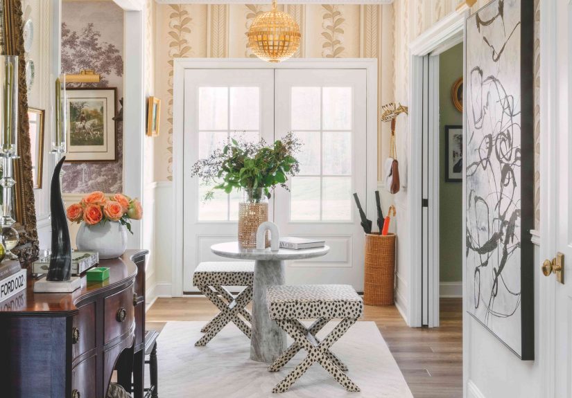
4) Choosing the Wrong Rug (Too Small, Too Slippery, Too Precious, or All Three)
A tiny rug in an entryway is like a postage stamp on a billboard: it technically exists, but it’s not doing the job.
Designers frequently see entry rugs that are undersized, constantly crooked, or made from delicate materials that can’t
handle real shoes, real weather, and real humans.
Why it throws off the whole space
The rug is often the visual “base” of the entryway. When it’s too small, the furniture looks like it’s floating.
When it slides around, the space feels messy (and becomes a safety hazard).
When it’s too fluffy or too thick, doors snag and the entry instantly feels awkward.
Do this instead: pick a rug that works as hard as the entryway does
- Size up. Choose a rug that visually anchors the area and makes sense with your door swing.
- Think durable and cleanable. Low-pile, washable, or indoor-outdoor styles are popular for a reason.
- Use a rug pad. It keeps the rug in place and helps it wear better.
- Layer smartly if needed. A tough doormat outside + a larger indoor rug inside keeps dirt from traveling.
Pro detail: if your entryway is also a hallway, consider a runner that visually guides you inward.
It makes the space feel longer, calmer, and more “designed” without adding more stuff.
5) Decorating with “Random” Scale (Too Much Furniture, Tiny Art, or Decor That Doesn’t Match the Home)
Designers can spot a confused entryway instantly: an oversized chair squeezed into a corner, a tiny mirror floating way too high,
five small frames scattered like they were tossed by a gentle breeze, and a console table that’s either massive or barely a shelf.
This is where good intentions go to get weird.
Why it reads as messy (even when it’s clean)
Scale creates order. When furniture is too bulky for the footprint, the entry feels cramped and hard to move through.
When wall decor is too small, it looks unfinished. When styles clash with the rest of the home, the entry feels like a different
house entirelylike you walked in and the foyer is wearing a costume.
Do this instead: pick one focal point, then support it
- Choose a “hero” moment. A mirror, bold artwork, or statement light fixturejust one main star.
- Keep furniture proportional. In narrow entries, use slim consoles, floating shelves, or a streamlined bench.
- Go bigger on wall decor than you think. One substantial piece often looks cleaner than many tiny pieces.
- Connect to the rest of the home. Repeat a color, metal finish, or style cue so the entry feels cohesive.
A designer’s favorite “polish move”: hang a mirror where it reflects light (or a pretty view),
pair it with a simple console, and add one grounded object (a lamp or vase) plus one practical object (a tray).
That’s it. Your entryway just got promoted.
A Quick Entryway Glow-Up Checklist (No Renovation Required)
- Delete clutter: remove anything that doesn’t belong to “leaving” or “arriving.”
- Contain essentials: tray for keys, hooks for bags, a real shoe solution.
- Upgrade lighting: add warmth and a second light source.
- Fix the rug situation: bigger, grippier, easier to clean.
- Choose one focal point: mirror/art/light, then keep the rest simple.
Conclusion
When designers talk about entryway mistakes, they’re not judging your real lifethey’re solving for it.
The best entryway design is the one that makes your day smoother: shoes contained, coats corralled,
lighting flattering, and the whole space feeling like a confident “hello” instead of a stressed-out apology.
Fix the five mistakes above and you’ll notice something surprising: the rest of your home feels cleaner and more pulled together,
even if you didn’t touch another room. That’s the power of a strong first impressionand a front door area that finally has a plan.
Real-World Experiences and “Yep, That’s My Entryway” Moments (500+ Words)
The funniest thing about entryways is that almost everyone thinks their situation is uniquely chaoticuntil you describe it out loud
and three other people say, “Wait… do we live in the same house?” Below are a few common, true-to-life scenarios that designers and
organizers hear all the time. Think of these as composite stories based on everyday patterns, not one specific home.
If any of them feel familiar, congratulations: you’re normal. Also, you’re about to get your entry back.
The “We’re Only Setting It Here for a Second” Family Pile
A family of four comes home. Backpacks hit the floor. Shoes fly off mid-stride. A sports bag leans against the wall like it’s
waiting for a ride. The entryway isn’t huge, but it’s not tiny eitheryet it feels permanently crowded. The parents swear they tidy
it constantly. The kids swear they have never owned shoes in their lives.
The fix isn’t “be tidier.” The fix is making the “right” behavior easier than the “wrong” behavior. Hooks at kid height.
A basket per person for hats/gloves. A bench that doubles as a shoe zone. A single tray for keys so they stop migrating to the kitchen
counter. Once the landing spots exist, the entryway starts to run like a system instead of a daily argument.
And the best part? When guests walk in, they see the housenot the family’s entire schedule spilling onto the floor.
The Small Apartment Entry That Feels Like a Hallway Trap
In a rental, the entry might be a three-foot strip between the door and the living room. There’s no closet.
Adding furniture feels impossible, so the space stays blankuntil real life fills it anyway.
That’s when shoes line the wall, bags hang from the doorknob, and mail stacks on the nearest available surface
(which is sometimes the top of the shoe pile, for reasons no one can explain).
The breakthrough usually comes from going vertical and keeping things slim: a row of hooks, a narrow wall shelf,
and a closed container for shoes (even if it’s a lidded bench or a tall basket). Add a plug-in sconce or a small lamp
if there’s any kind of ledge or table, and suddenly the space looks “styled” instead of “temporary.”
One mirror finishes the job by bouncing light and making the entry feel biggerlike the apartment just got an upgrade
without anyone asking the landlord for permission.
The Pet-and-Weather Combo That Destroys Every Cute Idea
Some homes don’t have “entryway decor” problems. They have “it’s raining sideways and the dog just ran in” problems.
In these houses, a delicate rug doesn’t last a week, and white anything is basically a dare.
The entry starts to look worn because it’s doing real workmud, snow, wet umbrellas, and paw prints.
Designers typically solve this with materials, not willpower: a durable rug that can take abuse, a boot tray to contain
the mess, and storage that can hide the reality of winter (or a muddy spring) without pretending it doesn’t exist.
Lighting matters here, toowarm light makes the space feel welcoming even when the weather is not.
And once the “mess zone” is contained, the rest of the entry can look calm and intentional again.
The Holiday Hosting Panic (“People Are Coming In Through THIS Door?!”)
Right before guests arrive, the entryway becomes the house’s official stress headquarters. Everyone suddenly notices the
pile of shoes, the random stack of mail, the dim overhead light, and the fact that there’s nowhere for anyone to put a coat.
This is when people consider dramatic solutions like hiding everything in a bedroom and never opening that door again.
The calmer approach is a quick, designer-approved reset: clear the floor, bring out a basket for shoes, add extra hooks
temporarily (even removable ones), and turn on a lamp so the space feels warm. Put a simple tray out for keys.
If you have a mirror, make sure it’s cleanbecause it quietly signals “we have our life together,” even if the kitchen says otherwise.
Guests don’t need a museum. They need a welcoming, functional landing spot. When the entry is handled, the whole home feels more ready.
The pattern across all these experiences is the same: entryways look best when they’re designed for arriving and leaving,
not for storing everything you own. When you give everyday items a real homeand upgrade lighting and scaleyour entry stops
looking “bad” and starts looking like it belongs in the house you actually want to live in.