Table of Contents >> Show >> Hide
- What Is a House Portrait (and Why Are They So Popular)?
- Choose Your Style and Medium First (Before You Buy 47 Brushes)
- Gather Materials (Keep It Simple, Upgrade Later)
- Start With a Great Reference Photo (Your Painting Is Only as Calm as Your Reference)
- Plan the Composition (Make the House the Star, Not the Trash Bin)
- Get the Drawing Right (Yes, Even If You “Hate Drawing”)
- Map Values Before Color (Your Secret Weapon)
- Color Strategy That Actually Works
- Step-by-Step: How to Paint a Watercolor House Portrait
- Step-by-Step: How to Paint an Acrylic House Portrait
- Details That Make a House Portrait Feel “Real”
- Common Mistakes (and How to Fix Them Without Panic)
- If You’re Painting House Portraits for Clients
- Real-World Experiences Artists Commonly Share (About Painting House Portraits)
- Final Thoughts
A house portrait is basically a love letter to a buildingminus the awkward “Dear Sir/Madam” at the top.
Whether it’s your childhood home, Grandma’s bungalow, or the first place you ever paid rent for (and cried about it),
painting a house portrait turns bricks and siding into something sentimental, giftable, and surprisingly addictive.
In this guide, you’ll learn how to paint a house portrait step by stepfrom choosing a medium (watercolor, acrylic, or gouache),
to nailing perspective, to adding the small details that make a house feel like that house.
I’ll keep it practical, beginner-friendly, and detailed enough that you won’t have to “just vibe it out” at the hardest part.
What Is a House Portrait (and Why Are They So Popular)?
A house portrait is an illustrated or painted depiction of a specific home or building.
People commission them as wedding gifts, housewarming gifts, memorial keepsakes, real estate closing gifts, or simply because they love their home.
The goal isn’t photorealism (unless you want it to be). The goal is recognition, warmth, and characterlike a good movie adaptation of a book.
Choose Your Style and Medium First (Before You Buy 47 Brushes)
Before you paint, decide how you want the final piece to feel. Your medium affects the mood, the process, and your sanity.
Watercolor House Portrait
- Best for: airy, luminous, charming portraits with soft edges and gentle color.
- Watch-outs: watercolor is transparent, so planning values and highlights matters.
- Typical vibe: storybook, elegant, “this belongs on a stationery set.”
Acrylic House Portrait
- Best for: bold color, crisp edges, easy corrections, and layered detail.
- Watch-outs: acrylic dries fast; you’ll want a plan for blending and smooth gradients.
- Typical vibe: vibrant, modern, slightly more graphic (in a good way).
Gouache (Optional but Fantastic)
- Best for: matte, illustrative looks and strong shapes (great for simplified portraits).
- Watch-outs: reactivates with water; layering takes practice.
Gather Materials (Keep It Simple, Upgrade Later)
Core supplies for watercolor
- Watercolor paper (cold press is forgiving; 140 lb is a great baseline)
- Watercolor paints (a basic set is fine)
- Brushes: 1 round (medium), 1 small round, 1 flat (optional)
- Pencil, eraser (kneaded eraser is ideal), waterproof fineliner (optional)
- Masking tape, two jars of water, paper towel
Core supplies for acrylic
- Canvas panel or gessoed paper/board
- Acrylic paints (limited palette works beautifully)
- Brushes: 1 flat, 1 filbert or bright, 1 small round/liner
- Palette, water jar, paper towel
- Optional but helpful: glazing medium, slow-dry medium, matte varnish
Start With a Great Reference Photo (Your Painting Is Only as Calm as Your Reference)
You can paint from life, but most house portraits start from a photo. Pick one with:
- Good lighting: overcast is your friend (less harsh shadow drama).
- Clear structure: you can see rooflines and window shapes.
- Minimal distortion: phone wide-angle shots can warp vertical lines.
If the photo is a little wonky, you can still win. Crop the image to simplify the composition,
straighten it digitally if needed, and consider printing a black-and-white version to study values.
Plan the Composition (Make the House the Star, Not the Trash Bin)
House portraits look best when the viewer’s eye goes straight to the building. Do a quick thumbnail sketch (30–60 seconds)
to decide what to include and what to politely “forget.”
- Crop out distracting cars, random utility poles, or the world’s saddest recycling bin.
- Decide whether to include landscaping. Trees can frame the houseor swallow it whole.
- Choose a background: sky wash, light gradient, or no background for a clean illustrated look.
Get the Drawing Right (Yes, Even If You “Hate Drawing”)
A strong drawing makes painting easier. A shaky drawing makes painting… an emotional journey.
You don’t need to be an architect, but you do need basic structure: angles, proportions, and perspective.
Perspective basics for houses
- One-point perspective: straight-on view, lines recede toward one vanishing point.
- Two-point perspective: corner view, lines recede to two vanishing points on the horizon line.
Keep vertical lines mostly vertical (unless your house is actively sliding off a hill).
If the reference photo shows tilted walls, that’s likely lens distortioncorrect it in your drawing.
Three easy ways to transfer your drawing (no shame allowed)
-
Grid method: draw a light grid on your reference and your paper, then copy square by square.
Great for accuracy without fancy tech. -
Graphite transfer: shade the back of your printed reference with soft graphite, then trace.
Fast and effective. -
Transfer paper: place transfer paper between reference and painting surface, trace lines.
Clean and convenient.
Once transferred, simplify: you don’t need to draw every brick. Sketch major shapes (roof, walls, windows, doors),
then lightly indicate key value changes (shadow side vs light side).
Map Values Before Color (Your Secret Weapon)
Values are how light or dark something is. If your values work, your house will read as a house even in grayscale.
If your values don’t work, the colors can’t rescue youkind of like putting glitter on a flat tire.
Quick value plan
- Light: sunlit walls, highlights on window frames
- Midtones: most siding/brick areas
- Darks: window interiors, deep shadows under eaves, porch recesses
Tip: Squint at your reference photo. It’s not glamorous, but it instantly simplifies details into value shapes.
Color Strategy That Actually Works
Houses are full of neutralsbeige siding, gray shingles, white trimwhich can look flat if you paint them as “just gray.”
Instead, build neutrals from warmer and cooler mixes, and let lighting influence color.
Smart palette ideas
- Watercolor: ultramarine, burnt sienna, yellow ochre, a cool red, a cool green, plus a dark (or mix your own)
- Acrylic: titanium white, ultramarine, burnt sienna, yellow ochre, alizarin (or quinacridone), phthalo green (optional)
For brick: vary reds with tiny shiftssome bricks lean orange, some purple-brown, some dull.
For siding: add subtle temperature changes (cooler shadows, warmer lights).
Step-by-Step: How to Paint a Watercolor House Portrait
1) Tape and pre-wet (optional)
Tape down watercolor paper to reduce warping and create crisp borders.
If you want a smooth sky wash, lightly pre-wet the sky area with clean water.
2) Paint the sky/background first
Sky is usually lighter than the house. Lay in a soft wash and let it dry.
Keep it simple so the house stays the focus.
3) Block in the biggest light shapes
Paint the lightest main colors on walls and roof with diluted paint.
Preserve highlights (like bright trim or sunlit edges) by painting around them.
4) Build depth with glazing
Glazing means layering transparent washes after the previous layer dries.
This is how watercolor gets that luminous, “how did you do that?” glow.
Use glazing to deepen shadows under eaves, define roof planes, and separate foreground trees from the house.
5) Add mid-level details
- Window shapes and shadows
- Door panels
- Major brick divisions or siding lines (suggest, don’t count)
6) Finish with crisp accents
Save the darkest darks for last: window interiors, porch recesses, and shadow gaps.
Add the final lines (optional) with a waterproof fineliner if you like an illustrated look.
Step-by-Step: How to Paint an Acrylic House Portrait
1) Tone the surface (optional but helpful)
A thin neutral undercoat (like a warm gray) helps you judge values more easily than starting on stark white.
2) Block in large shapes
Paint the house, roof, sky, and major landscape shapes with midtone colors first.
Don’t chase details yetthis is the “big shapes only” phase.
3) Establish a value underpainting (fast mode)
Many acrylic painters use a simplified value plan first (a quick monochrome stage),
then layer color on top. This keeps the structure solid and prevents the “color soup” problem.
4) Layer and glaze for richness
Acrylic glazing uses transparent layers (usually paint + glazing medium) over dry paint.
It’s excellent for warming sunlit walls, cooling shadow planes, and creating depth without repainting everything.
5) Tighten edges and add details
- Edges: crisp edges for architecture, softer edges for trees and clouds
- Windows: paint window glass as a value shape first, then add muntins (grid lines)
- Brick: suggest texture with broken strokes; avoid outlining every brick
6) Final highlights and finishing
Add highlights sparingly: trim edges, sun-catching rooflines, subtle reflections on windows.
After the painting cures, protect it with a varnish (matte or satin usually looks classy).
Details That Make a House Portrait Feel “Real”
Windows: the face of the house
Windows are usually darker than the surrounding walls. Even on a sunny day, interiors read as dark shapes.
Add a hint of sky reflection, then keep the rest simple.
Roof planes: don’t paint it as one flat slab
Separate roof planes by value and temperature. One side is often darker/cooler.
Add subtle texture with directional strokes that follow the roof angle.
Greenery: suggest, don’t illustrate every leaf
Trees and shrubs look best when you paint them as grouped shapes with value variation.
Save leaf-level detail for the final layer (and only in a few focal areas).
Common Mistakes (and How to Fix Them Without Panic)
- Everything is the same value: push shadows darker and keep highlights cleaner.
- Perspective feels “off”: re-check rooflines and window alignment; keep verticals vertical.
- Over-detailing: step back; simplify texture; let brushwork do the talking.
- Colors look chalky (acrylic): use thin layers/glazes instead of heavy opaque mixes.
- Muddy watercolor: let layers dry fully; don’t overwork the same area.
If You’re Painting House Portraits for Clients
House portraits are a popular commission category because the subject is meaningful and the “pose” never complains.
A simple workflow helps you stay professional:
Commission checklist
- Ask for 3–5 reference photos (different lighting and angles helps).
- Confirm crop/composition (what stays, what goes).
- Agree on size, medium, timeframe, and price.
- Collect a deposit.
- Share a sketch or value plan for approval (avoid endless revisions later).
- Deliver with protective packaging and a care note.
Tip: Offer seasonal optionssummer greenery, fall color, winter snowbecause people love seeing “their” house in a favorite season.
Real-World Experiences Artists Commonly Share (About Painting House Portraits)
House portraits sound straightforward until you actually start painting one and realize you’re dealing with
perspective, landscaping, multiple materials, and the emotional weight of someone’s memoriesall in one project.
Here are experiences and scenarios artists often describe, plus what tends to help.
When the reference photo is… not great
A very common scenario: the only photo available is a slightly blurry phone shot taken at dusk, from the driveway,
with a car blocking half the front door. Artists often solve this by asking for multiple photosideally in daylight
or by combining references. If that’s not possible, a practical workaround is to simplify the portrait:
reduce small details, keep edges clean, and focus on the recognizable silhouette (roofline, porch shape, window pattern).
Ironically, a simplified, illustrated approach can look more polished than a strained attempt at realism from weak reference material.
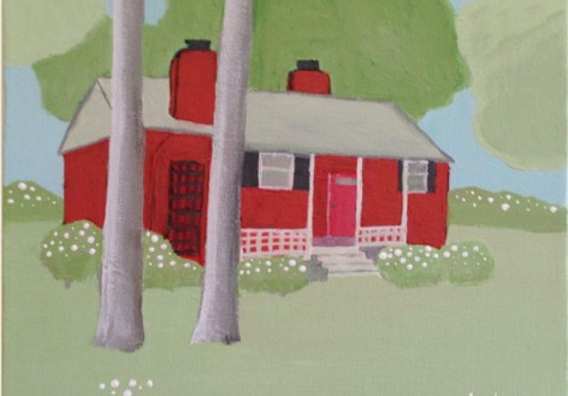
The “trees ate my house” problem
Landscaping can be beautiful, but it can also overwhelm the structure. Many artists mention that early house portraits
get lost in a jungle of leaves. A reliable fix is to treat greenery as framing:
keep foliage darker or softer around the edges, and lighten or simplify the area directly surrounding the house.
This value control creates a natural spotlight effect, making the building stand out without looking artificial.
Another helpful trick is to paint the house first, then add trees afterward so you don’t accidentally “design”
the portrait around the shrubbery.
Learning to love “not painting every brick”
Beginners often feel pressure to paint every brick, shingle, and clapboard line.
Artists commonly report that the portrait looks stiff when everything is equally detailed.
The breakthrough is realizing that detail works best in a few focal zones:
the front door area, a window cluster, or a distinctive architectural feature.
Elsewhere, texture can be suggested with broken strokes or subtle value shifts.
The house still reads correctlyjust with better visual rhythm (and less hand cramping).
Watercolor patience is real (and so is the hair dryer)
Many watercolor painters describe a learning curve around drying time.
Glazing is powerful, but only when layers are fully dry; otherwise colors bloom and mix unpredictably.
Artists often keep a hair dryer nearby (used carefully) to speed up drying between glazes,
especially when building shadows under eaves or deepening window interiors.
The more the painter trusts light-to-dark layering, the more luminous the final portrait becomes.
Client expectations: “Can you add the dog?”
If you take commissions, artists frequently note that clients request personal touches:
a specific flower color, a swing on the porch, a seasonal version of the yard, or sometimes a pet in the scene.
The key experience-based lesson is to set boundaries kindly and early.
Adding one meaningful detail can increase emotional impact, but too many additions can clutter the composition.
A practical approach is offering a “standard portrait” and optional add-ons (extra elements, background changes, or additional revision rounds).
The most satisfying moment
Artists often describe the best part as the final passwhen dark accents, window contrast, and a few crisp edges
suddenly make the painting “click.” It’s a reminder that house portraits are built in layers:
the early stages can look awkward and unfinished, but the structure is forming underneath.
Sticking with the processbig shapes, clear values, then selected detailtends to create portraits that feel both accurate and heartfelt.
Final Thoughts
Painting a house portrait is part observation, part design, and part storytelling.
When you keep perspective clean, values intentional, and details selective, your painting will feel both recognizable and artistic.
Start with one home, follow the steps, and don’t worry if your first attempt looks like it belongs in a sitcom flashback.
That’s normal. The second one will be better. The third one might actually make you say, “Wait… did I just do that?”