Table of Contents >> Show >> Hide
- What “Blue Patina” Really Looks Like (So You Don’t Accidentally Paint a Smurf)
- The Secret Sauce: Layers + Transparency + Controlled Mess
- Materials and Tools
- Step-by-Step: How to Create a Blue Patina With Paint
- Step 1: Prep like you mean it
- Step 2: Prime for adhesion and even color
- Step 3: Lay down your shadow base
- Step 4: Add your metallic “copper” layer (the believable under-story)
- Step 5: Mix a patina wash (thin beats thick)
- Step 6: Dab, blot, and build in layers
- Step 7: Add highlights (the “bloom” of oxidation)
- Step 8: Knock it back (so it doesn’t look like candy)
- Step 9: Reintroduce metallic warmth (sparingly)
- Step 10: Seal it (especially if it’s handled or outdoors)
- Three Easy Blue Patina Color Recipes (Pick Your Vibe)
- Project Examples: Where Blue Patina Paint Looks Amazing
- Common Mistakes (and How to Fix Them Fast)
- Advanced Techniques for Next-Level Faux Patina
- Finishing and Durability Tips
- Conclusion: Patina Is a Look, Not a Single Color
- Field Notes: What You’ll Learn After Your First Blue Patina Project (The 500-Word Reality Check)
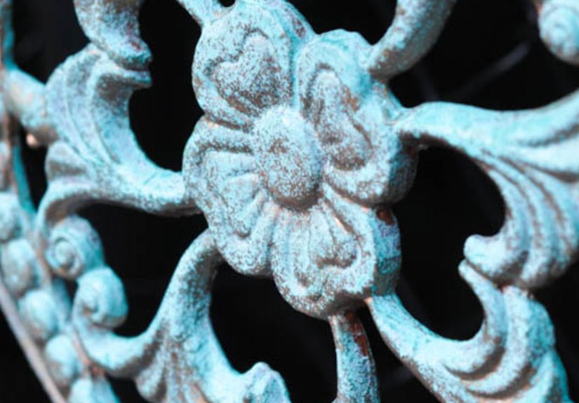
Blue patina is that dreamy blue-green “I’ve been outside since the 1800s” look you see on old copper roofs, vintage lanterns,
weathered garden statues, and anything that has had a long, dramatic relationship with air and moisture. The fancy word for it is
verdigris. The fun word for it is instant character.
The best part? You don’t need actual copper, harsh chemicals, or three months of waiting for Mother Nature to do her thing.
With the right paint layers, a little glaze, and some controlled chaos (the good kind), you can create a believable
blue patina paint finish on almost any surfacewood, metal, resin, plastic, ceramic, even thrift-store mystery material.
What “Blue Patina” Really Looks Like (So You Don’t Accidentally Paint a Smurf)
Real patina is not one flat teal color. It’s a stack of colors that build up in irregular patches:
deep shadows in crevices, dusty turquoise blooms on high points, cloudy pale blue haze in between, and little flashes of warm metal
peeking through. If you remember one rule, make it this:
Patina is layered, transparent, and uneven on purpose. If your finish looks “perfect,” it won’t look real.
(Yes, this is permission to stop overthinking and start dabbing.)
The Secret Sauce: Layers + Transparency + Controlled Mess
Most realistic faux patina painting comes down to three things:
- A believable base (dark shadow + metallic warmth)
- Translucent color (thin washes of blue-green, not thick coats)
- Organic texture (sponging, stippling, dry brushing, blotting)
You’re basically painting the story of oxidation: it forms in pockets, clings to edges, and fades where hands, weather, and time
would naturally rub it away.
Materials and Tools
You can do this with craft acrylics, wall paint samples, or furniture paint. Choose what matches your project and budget.
Core supplies
- Cleaner/degreaser (dish soap + water works; for greasy metal, use a degreaser)
- Sandpaper (180–220 grit for scuffing; 320 grit for smoothing between coats if needed)
- Primer (bonding primer for glossy surfaces; metal primer for bare metal)
- Base shadow paint (charcoal, deep brown, or black)
- Metallic base (copper, bronze, or antique gold)
- Patina colors (turquoise, teal, blue-green, mossy green, pale blue, and a touch of white)
- Glazing medium (or clear mixing glaze; optional but highly recommended)
- Sealer (water-based clear coat, matte/satin; or wax for indoor decor)
Tools that make life easier
- Natural sea sponge (or cosmetic wedges/makeup sponges)
- Chip brush (the cheap “I won’t cry if it dies” brush)
- Small detail brush for corners and edges
- Lint-free rags or paper towels for blotting
- Optional: spray bottle with water for soft blending
Step-by-Step: How to Create a Blue Patina With Paint
Step 1: Prep like you mean it
Clean first. Patina finishes hate grease because grease repels paint, and then your “artfully aged copper” becomes
“random bald spots.” Wash, rinse, dry completely. Lightly scuff glossy surfaces so primer can grab on.
If you’re painting metal that’s outdoors or has any rust, remove loose rust and consider a rust-inhibiting primer.
For slick plastic, use a bonding primer designed for glossy surfaces.
Step 2: Prime for adhesion and even color
Primer isn’t glamorous, but it prevents peeling and keeps your layers consistent. Apply a thin, even coat and let it dry fully.
If your surface is especially slick or you’re planning an outdoor piece, two light coats are better than one thick coat.
Step 3: Lay down your shadow base
Patina looks real when there’s depth. Start with a dark basecharcoal, deep espresso, or blackespecially if you want a dramatic,
antique copper effect. This becomes the “shadow metal” in crevices and under layers.
Step 4: Add your metallic “copper” layer (the believable under-story)
Once the dark base is dry, apply a metallic copper or bronze layer. Don’t worry about total perfection, but do aim for good coverage.
Metallic paint creates the illusion that there’s real metal under the oxidation.
Pro move: After the metallic coat dries, lightly dry brush a little extra metallic on raised edges and high points.
Real objects get rubbed there, so showing “fresh metal” makes your patina finish convincing.
Step 5: Mix a patina wash (thin beats thick)
Here’s where most beginners accidentally make “painted teal.” The goal is transparency.
Mix your turquoise/teal paint with glazing medium so it becomes a semi-transparent wash.
A solid starting ratio is 1 part paint to 2–3 parts glaze.
If you don’t have glaze, you can thin with a little waterjust don’t overdo it or you can weaken coverage.
Step 6: Dab, blot, and build in layers
Use a damp sea sponge or makeup wedge. Load it with your patina wash, then offload on a plate or paper towel first.
Lightly dab patches onto the surface, focusing on:
- Crevices and corners (where oxidation “collects”)
- Around decorative details, seams, and edges
- Random mid-surface areas (keep it irregular)
Immediately after dabbing, blot gently with a rag or paper towel to soften harsh edges and create that cloudy,
mineral-like texture.
Let the layer dry for a few minutes, then repeat with a slightly different mix (more blue, more green, lighter, darker).
Patina looks best when you apply multiple thin passes instead of one heavy coat.
Step 7: Add highlights (the “bloom” of oxidation)
Mix a lighter patina tone (turquoise + a touch of white, or pale blue-green). With a mostly dry sponge, tap lightly over
the previous layersespecially on raised texture and edges. This creates that chalky bloom that makes the finish read as “patina,”
not “paint job.”
Step 8: Knock it back (so it doesn’t look like candy)
If your patina is too bright, glaze is your best friend. Mix a tiny amount of deep brown, charcoal, or even muted green into glaze
(think “dirty water,” not “mud”), then wipe a whisper of it over parts of the surface. Immediately wipe back with a clean rag.
This step unifies everything and makes the colors feel aged.
Step 9: Reintroduce metallic warmth (sparingly)
Real patina rarely covers everything evenly. Use a dry brush with metallic copper/bronze and skim the highest points.
Keep it subtlelike the object is quietly reminding everyone it used to be shiny.
Step 10: Seal it (especially if it’s handled or outdoors)
For indoor decor, wax can work if the piece won’t be exposed to water or heavy wear. For durability, use a clear water-based topcoat
in matte or satin. Two thin coats beat one thick coat.
Important: Sealers can slightly deepen or darken colors. If your finish is perfect right now, consider stopping
one shade lighter than “perfect” before sealing.
Three Easy Blue Patina Color Recipes (Pick Your Vibe)
1) Classic Verdigris (architectural copper look)
- Turquoise (main)
- Mossy green (small amount)
- White (tiny highlight)
- Optional: a drop of black or deep brown in glaze to age it
Result: Blue-green, slightly dusty, like an old copper lantern that’s seen a few storms and one very judgmental squirrel.
2) Coastal Patina (lighter, breezy, “beach house”)
- Aqua or pale turquoise
- Light blue
- White (more generous)
- Less green overall
Result: Softer, airier, great for frames, mirrors, planters, and decor that needs “charm,” not “crypt artifact.”
3) Stormy Oxidation (darker, moodier, more antique)
- Deep teal
- Muted green
- Charcoal glaze wash (very light)
- Metallic highlights kept minimal
Result: Old-world depth with dramatic shadowsexcellent for hardware, lamps, and statement pieces.
Project Examples: Where Blue Patina Paint Looks Amazing
Example A: Thrift-store metal lamp base
Clean thoroughly (lamps collect fingerprints like it’s their job). Prime with a metal primer, then do a dark base + metallic copper.
Concentrate patina dabs near seams, around knobs, and under decorative ridges. Seal with a durable clear coat so it survives dusting.
Example B: Plastic planter that wants to look expensive
Scuff sand, use bonding primer, then go for the classic recipe. Keep the patina heavier near the bottom rim and around any molded detail.
Finish with an outdoor-rated clear coat. Suddenly your planter has “European courtyard” energy instead of “clearance aisle.”
Example C: Wooden picture frame turned “antique copper”
Wood is perfect for faux patina because it accepts layers well. Add a little texture first (optional): a thin skim of spackle or texture paste,
sanded lightly, gives patina something to cling to visually. Then paint as usual. The result is shockingly convincing from normal viewing distance.
Common Mistakes (and How to Fix Them Fast)
“It looks like I painted it teal.”
Add transparency and variety. Switch to thinner washes with glaze, introduce a second and third patina shade, and blot edges.
Then add a light dusty highlight and a tiny aging glaze to pull it together.
“My sponge marks look like… sponge marks.”
Rotate the sponge constantly and tear off a rough edge if it’s too uniform. Blot with a rag after each pass.
You can also soften patterns with a mist of water and a quick dab.
“It’s too bright or too clean.”
Glaze it down. A whisper-thin dirty glaze (charcoal or brown tinted glaze) wiped back immediately adds age.
Then re-highlight metallic edges lightly so it looks worn, not muddy.
“It got blotchy in a bad way.”
Blotchy can be goodunless it’s random bald patches. That’s usually prep or adhesion.
If paint is beading up, stop, clean again, scuff sand, and re-prime. Patina magic needs a surface that cooperates.
Advanced Techniques for Next-Level Faux Patina
Add texture before paint (for mineral realism)
Real oxidation has thickness. For a more tactile look, add subtle texture with a stipple brush in primer, or a very light layer
of texture paste/spackle that you sand back. Then paint your layers. The patina will catch on peaks and look naturally crusty.
Use “wipe-back” glazing for depth
Apply a tinted glaze over a section and wipe it back with a rag so it stays in crevices. This creates instant age and makes details pop.
It’s also a fantastic way to make a brand-new piece look like it has a past.
Create patina streaks (gravity is your art director)
On outdoor-looking pieces, add a few faint vertical streaks: dilute a blue-green wash, load a small brush, and draw a short line,
then immediately soften downward with a damp sponge. Keep it subtle. The goal is “weather,” not “wallpaper.”
Finishing and Durability Tips
For indoor furniture and decor, a matte or satin water-based topcoat keeps the finish looking natural.
For outdoor items, choose products rated for exterior use and allow full cure time before exposure.
Wax can be beautiful, but it’s not a raincoatsave it for indoor pieces that won’t be handled daily.
Conclusion: Patina Is a Look, Not a Single Color
Creating a blue patina with paint is less about “the right teal” and more about building a believable surface through layers:
shadow, metallic warmth, translucent blue-green blooms, and gentle wear. Once you embrace the imperfect, irregular nature of patina,
the technique becomes ridiculously forgivingand wildly addictive.
Start with a small project, practice your dabbing and blotting, and remember: if it looks too perfect, you’re not done yet.
Patina is basically permission to be messywith style.
Field Notes: What You’ll Learn After Your First Blue Patina Project (The 500-Word Reality Check)
The first time you try a faux verdigris finish, you’ll probably have a moment where you stare at your piece and think,
“This looks like a craft store exploded.” Congratulationsthis is normal. Blue patina is a finish that looks wrong
right before it looks right. The shift happens when you stop trying to “paint patina” and start letting the layers
do their slow reveal.
One common early lesson: your hand naturally wants to make patterns. Real patina does not. If you notice your sponge dabs forming
a polite, evenly spaced constellation, you’ll learn to rotate your sponge every few taps, change pressure constantly,
and purposely leave areas alone. The best patina has “quiet zones” where the metallic base shows through like a memory.
You’ll also discover that the blotting step is basically the difference between “painted blue-green”
and “mineral oxidation.” Dabbing puts the color down, but blotting makes it look like it belongs there.
It softens edges, breaks up sponge texture, and creates that cloudy, chalky haze you see on aged copper.
Many people skip blotting because it feels like removing progressthen they realize it’s actually creating realism.
Another experience most DIYers share: the finish looks wildly different under different lighting.
In bright daylight, your turquoise might read “fresh and coastal.” Under warm indoor bulbs, it might turn greener and deeper.
That’s why testing on a scrap board (or the back of the piece) saves frustration. You’re not just choosing colorsyou’re choosing
how those colors behave in the room where the object will live.
Then there’s the “too much patina” moment. It happens fast: you get excited, you add another layer, and suddenly your copper looks like it’s been
dipped in mint frosting. The fix is reassuringly simple: a thin dirty glaze wash (brown/charcoal tinted glaze) wiped back immediately.
That one step can calm everything down, push bright colors into the background, and bring the piece back to “aged” instead of “newly painted.”
Finally, you’ll learn that patina is a finish you can’t rush, even though it’s fast.
Not because it takes days, but because your eyes need time to read the layers.
Taking a few steps back between passesliterally backing awayhelps you see whether you need more color, more contrast,
or simply a break before your enthusiasm turns into over-coverage.
If you stick with it, the technique becomes one of those satisfying DIY skills you can pull out anytime you want instant charm:
thrifted decor, outdated fixtures, bland planters, even props and signage. And the best part is that the “mistakes” usually look like
natural variationbecause patina itself is basically nature freelancing.