Table of Contents >> Show >> Hide
- Why Create a Chart from a Pivot Table?
- Before You Start
- How to Create a Chart from a Pivot Table: 10 Steps
- Step 1: Build or confirm your PivotTable
- Step 2: Click inside the PivotTable
- Step 3: Insert the chart
- Step 4: Choose the right chart type
- Step 5: Check the field layout in the chart
- Step 6: Filter the data to tell one clear story
- Step 7: Add chart elements that improve clarity
- Step 8: Clean up formatting and remove distractions
- Step 9: Test how the chart reacts to changes
- Step 10: Refresh and maintain the PivotChart
- Best Chart Types for Pivot Tables
- Common Mistakes to Avoid
- Quick Example
- Final Thoughts
- Experience-Based Tips: What Usually Happens in Real Life
- SEO Tags
Note: Ribbon labels and button locations can vary a little between Excel 365, Excel 2021, Mac, and Excel for the web, but the overall workflow is almost the same. In most versions, once you click inside a PivotTable, Excel lets you insert a chart that stays connected to that summary. That connection is the magic trick. The chart updates when your PivotTable changes, which is a lot more useful than building a static chart and hoping it behaves.
If you have ever stared at a PivotTable and thought, “This is helpful, but it looks like a robot’s grocery list,” you are not alone. PivotTables are brilliant for summarizing data, but charts are what make the story jump off the screen. A PivotChart turns rows of totals, categories, and filters into something people can understand in about three seconds instead of thirty. That matters whether you are reporting sales, tracking inventory, measuring campaign performance, or just trying to survive Monday morning with your spreadsheet dignity intact.
In this guide, you will learn exactly how to create a chart from a PivotTable in Excel in 10 simple steps. Along the way, you will also pick up smart tips for choosing the right chart type, cleaning up the layout, filtering data with less drama, and avoiding the classic mistakes that make otherwise good charts look confusing. We will keep it practical, clear, and a little fun, because Excel is powerful enough already. It does not need to be boring too.
Why Create a Chart from a Pivot Table?
A regular Excel chart works fine when your data is simple and fixed. A chart from a PivotTable is better when your data needs to move, filter, regroup, or answer different questions. Because the chart is linked to the PivotTable, it changes as the PivotTable changes. Filter one region, the chart follows. Switch from sum to average, the chart follows. Add a slicer, the chart follows like a loyal golden retriever made of formulas.
This is why PivotCharts are so useful for dashboards, monthly reports, KPI summaries, and exploratory analysis. Instead of rebuilding the visual every time the data shifts, you update the PivotTable and let the chart do its job.
Before You Start
Before jumping into the 10 steps, make sure your source data is in decent shape. Excel loves clean data and becomes dramatically less charming when the data is messy. Ideally, your data should follow these rules:
- Each column has a clear header.
- Each row represents one record.
- There are no completely blank rows or columns in the middle of the dataset.
- Dates are stored as real dates, not text pretending to be dates.
- Amounts are numeric, not numbers wearing little text costumes.
If you already have a PivotTable, great. You are halfway there. If not, create one first from your dataset, because the chart needs that summarized structure to work properly.
How to Create a Chart from a Pivot Table: 10 Steps
Step 1: Build or confirm your PivotTable
Start by making sure your PivotTable is set up correctly. Click anywhere inside your dataset, go to the Insert tab, and create a PivotTable if you have not done that yet. Then drag the fields you want into Rows, Columns, Values, and Filters. For example, if you are analyzing sales, you might place Region in Rows, Month in Columns, and Revenue in Values. The better your PivotTable structure, the better your chart will be. If the summary looks confusing in table form, the chart will not magically become a genius. Fix the summary first, then visualize it.
Step 2: Click inside the PivotTable
This step sounds almost too basic, but it matters. Click any cell inside the PivotTable before inserting the chart. Excel uses that active selection to understand what you want to visualize. If you click outside the PivotTable, Excel may try to build a regular chart instead, which is not the same thing. A regular chart is more static. A PivotChart stays connected to the PivotTable and understands filters, field rearrangements, and slicers. So yes, this tiny click is the difference between “smart chart” and “why is Excel doing this to me?”
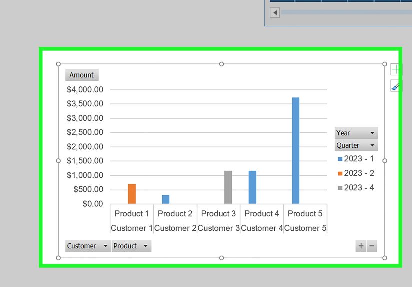
Step 3: Insert the chart
With a cell inside the PivotTable selected, go to Insert and choose PivotChart or use the Insert Chart option shown for the active PivotTable, depending on your version of Excel. A dialog box will appear with chart options. At this stage, do not overthink the perfect design. Just choose a chart type that roughly matches your data, then click OK. Excel will generate a chart linked to your PivotTable. Congratulations: you now have a working PivotChart. It may not be beautiful yet, but it is alive, responsive, and ready for improvement.
Step 4: Choose the right chart type
This is where many charts either become heroes or public nuisances. For comparisons across categories, a clustered column chart or bar chart is often the safest choice. For trends over time, a line chart usually works best. For part-to-whole views, a pie chart can work, but only when the dataset is small and the categories are limited. If your pie chart has eight slices and three of them are tiny enough to need a microscope, choose something else. PivotTables often summarize a lot of categories, so column, bar, and line charts are usually the most readable and professional.
Step 5: Check the field layout in the chart
Once the chart appears, examine how Excel mapped your PivotTable fields into the chart. The categories typically become the axis labels, while the values become the plotted series. If the result looks backward or hard to read, do not panic. You can adjust the PivotTable field placement or the chart field buttons to reorganize the visual. Sometimes the issue is as simple as having too many category labels or placing the wrong field in Columns instead of Rows. A quick rearrangement in the PivotTable often fixes what looks like a chart problem. In Excel, many “chart problems” are really “summary design problems wearing sunglasses.”
Step 6: Filter the data to tell one clear story
A chart should answer a question quickly. If it tries to answer twelve questions at once, it answers none of them well. Use PivotTable filters, chart field buttons, or slicers to narrow the data. Maybe show only one year, one product line, or one geographic region. This is one of the biggest advantages of creating a chart from a PivotTable instead of from a flat range. You can interact with the summary and let the chart respond in real time. If your audience needs to compare categories, remove clutter. If they need a trend, simplify the view so the pattern is obvious.
Step 7: Add chart elements that improve clarity
Now that the chart is doing its job, make it easier to read. Add a clear chart title that says what the chart shows, not something vague like “Chart 1,” which tells the reader exactly nothing. If helpful, add data labels, axis titles, or a legend. Keep only the elements that improve clarity. Too many labels can make a clean visual look like a crowded airport departures board. A good title might be Monthly Revenue by Region or Top 5 Product Categories by Units Sold. That gives immediate context and makes your report feel intentional rather than accidentally exported.
Step 8: Clean up formatting and remove distractions
Formatting is not just decoration. It affects comprehension. Use readable fonts, moderate colors, and a simple layout. If the PivotChart field buttons crowd the chart, you can hide them to create a cleaner look. Resize the chart so labels are not cramped. Reduce unnecessary gridlines if they add noise. Avoid chart effects that scream “I discovered 3D bevels and now no one is safe.” A professional PivotChart is clean, balanced, and easy to scan. Readers should focus on the data story, not on shiny formatting choices that look like they escaped from 2007.
Step 9: Test how the chart reacts to changes
This is a step people skip, and then later wonder why their dashboard behaves like a haunted house. Change a filter, move a field, or switch the summarized value from Sum to Average. Watch how the chart responds. This helps you confirm that the chart is linked correctly and still makes sense when the PivotTable changes. If a small tweak makes the chart unreadable, that is useful information. It means the design may be too fragile. A strong PivotChart should still communicate clearly even after common adjustments like filtering a month, sorting values, or switching between categories.
Step 10: Refresh and maintain the PivotChart
Your chart is only as current as the data feeding it. If the underlying source data changes, refresh the PivotTable so the chart updates too. You can usually do this by right-clicking the PivotTable and choosing Refresh, or by using the Data tools in the ribbon. If new rows are added regularly, consider converting the source range into an Excel Table first so the PivotTable can be easier to maintain. A great chart that shows last month’s numbers after this month’s update is not insightful; it is just confidently wrong. Refreshing is the final habit that turns a one-time chart into a dependable reporting tool.
Best Chart Types for Pivot Tables
Not every chart deserves a PivotTable, and not every PivotTable deserves every chart. Here are the safest matches:
- Column chart: Great for comparing categories such as regions, departments, or products.
- Bar chart: Excellent when category names are long and need more room.
- Line chart: Best for showing trends over time, especially months, quarters, or years.
- Pie or doughnut chart: Only useful when you have a small number of categories and a part-to-whole message.
- Combo chart: Helpful in special cases, but keep it simple unless your audience really needs it.
If you are unsure, start with a clustered column chart. It is the jeans and white T-shirt of Excel visuals: versatile, reliable, and rarely embarrassing.
Common Mistakes to Avoid
- Using too many categories, which turns labels into unreadable confetti.
- Choosing a pie chart for complex data just because it looks friendly.
- Leaving generic titles that do not explain what the reader is seeing.
- Forgetting to refresh the PivotTable after the source data changes.
- Adding every possible chart element until the chart becomes harder to read than the original table.
- Ignoring the PivotTable structure and trying to fix everything with chart formatting alone.
Quick Example
Imagine you have a sales dataset with columns for Date, Region, Product Category, and Revenue. You build a PivotTable that shows total revenue by region. Then you insert a PivotChart using a clustered column chart. Suddenly, instead of reading a stack of totals, you can see that the West region is leading, the South is consistent, and the Northeast needs a pep talk. Add a slicer for Product Category, and your chart becomes interactive. One click, and you are comparing only furniture, or only electronics, without rebuilding anything. That is the real power here: speed, flexibility, and clarity working together.
Final Thoughts
Learning how to create a chart from a PivotTable is one of those Excel skills that pays off immediately. It makes your reports more visual, your analysis more flexible, and your meetings shorter because fewer people ask, “Wait, what am I looking at?” The workflow is simple once you understand the rhythm: build a smart PivotTable, insert a connected chart, pick the right chart type, filter with purpose, clean up the layout, and refresh when the data changes.
In other words, the secret is not just clicking Insert Chart. The real skill is designing a summary that deserves to be visualized. Do that well, and Excel becomes less like a spreadsheet and more like a storytelling tool with very strong opinions about commas.
Experience-Based Tips: What Usually Happens in Real Life
In real-world spreadsheet work, creating a chart from a PivotTable sounds simple until actual humans get involved. The most common scenario goes like this: someone has a giant worksheet full of raw sales, marketing, or operations data, and they need a chart “for a quick meeting.” That phrase, by the way, often means the meeting starts in 14 minutes and the coffee has already failed. The PivotTable saves the day because it can summarize huge amounts of data fast, and the PivotChart turns that summary into something the room can understand before anyone starts speaking in vague corporate poetry.
One lesson that comes up again and again is that the first chart is rarely the final chart. People often begin with whatever Excel suggests, which is fine for a draft, but not always ideal. A default chart may technically work while still being visually confusing. For example, a pie chart may look cheerful, but once there are too many categories, it becomes a colorful puzzle nobody asked for. In practice, column and bar charts usually win because they handle category comparisons cleanly. Line charts also do a great job when the PivotTable is summarizing dates and the real goal is spotting direction over time.
Another common experience is discovering that the PivotTable structure matters more than the chart format. Many users spend too long changing colors, fonts, and chart styles when the real problem is that the wrong field is sitting in Rows or Columns. Once the fields are rearranged correctly, the chart suddenly starts making sense. It is one of those quiet Excel truths: if the summary is messy, the visual will be messy in a better outfit.
Filtering also changes everything. In many reporting situations, one chart tries to show all regions, all products, all months, and all customer segments at the same time. The result is not insight. It is visual traffic. A better experience comes from narrowing the question. Show one year. Compare top five categories. Focus on one business unit. When slicers are added, the chart becomes far more useful because viewers can interact with the data without touching the structure underneath.
Refreshing is another real-life pain point. A PivotChart may look perfect on Tuesday and become misleading on Friday if the source data changes and nobody refreshes the PivotTable. Teams that use PivotCharts regularly learn this habit quickly. Refresh first, then trust the visual. It is simple, but it prevents the kind of awkward meeting where someone says, “These numbers do not match the latest file,” and the room suddenly gets very interested in the ceiling.
The best experience usually happens when the chart is treated as a communication tool, not just an Excel feature. The strongest PivotCharts are not overloaded. They have a clear title, a readable layout, a sensible chart type, and a single obvious takeaway. When that happens, the chart does more than decorate a report. It helps people decide, compare, explain, and act. And that is the moment Excel stops feeling like a spreadsheet and starts feeling like a useful ally.