Table of Contents >> Show >> Hide
- Why Red, White, and Black Show Up So Often
- Country Flags That Use Red, White, and Black Brilliantly
- City and Regional Flags That Use the Palette in Smart Ways
- More Than Geography: Flags for Movements, Memory, and Identity
- What Makes Red, White, and Black Flags So Effective?
- Experiences With Red, White, and Black Flags in Real Life
- Conclusion
Some flags whisper. Others practically kick the door open. Red, white, and black flags belong to the second group. They look bold from a distance, photograph well, and carry a strange mix of elegance, danger, history, and drama. In other words, they are the visual equivalent of showing up overdressed and somehow pulling it off.
Across countries, cities, states, and social movements, these colors keep appearing for a reason. They are high-contrast, memorable, and flexible enough to mean very different things depending on where you are. In one place, red can stand for sacrifice. In another, it signals warmth or courage. White may suggest peace, equality, hope, or purity. Black might point to heritage, endurance, mourning, rebellion, or simply a powerful design choice that says, “Yes, this flag knows exactly what it’s doing.”
That variety is the real story. There is no single universal meaning for red, white, and black together. Instead, these colors travel through different flag traditions: Pan-Arab national flags, heraldic banners, modern city symbols, labor and protest flags, and memorial designs. The result is a fascinating gallery of flags that may share a palette but not a personality.
Why Red, White, and Black Show Up So Often
Good flag design is never just about decoration. A strong flag needs to be visible, recognizable, and meaningful. Red, white, and black check all three boxes. They create sharp contrast, stay readable from far away, and work well in both simple and complex compositions. That matters whether a flag is flying over a government building, printed in a history book, or slapped onto a souvenir mug that probably costs too much.
More importantly, flags tend to inherit their colors from older stories. National flags often grow out of history, religion, heraldry, or political movements. That is why the same color combination can tell completely different stories in different places. Red, white, and black may point to medieval symbols in one region and 20th-century revolution in another. The palette repeats, but the message changes.
That is what makes this group of flags so interesting for readers, travelers, and design nerds alike. You are not just looking at colors. You are looking at memory, identity, and a whole lot of “we have been through things.”
Country Flags That Use Red, White, and Black Brilliantly
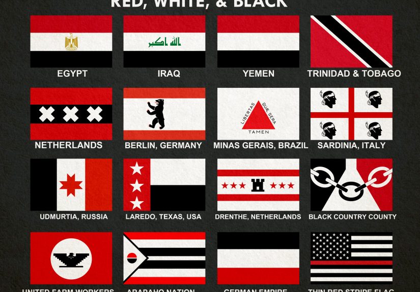
Egypt: A Flag With Revolutionary DNA
Egypt’s flag is one of the most recognizable red, white, and black national flags in the world. Its horizontal stripes are clean and direct, and the golden Eagle of Saladin in the center gives it instant authority. It looks official because, well, it very much is.
What makes Egypt especially important in this conversation is its connection to the Arab Liberation Flag. After the 1952 revolution, red, white, and black stripes became linked with a wider political and cultural current in the Arab world. Egypt helped popularize that look, and the design influenced other national flags in the region. So when people notice similar red-white-black combinations elsewhere in the Middle East and North Africa, they are not imagining things. They are seeing a real historical flag family at work.
Design-wise, Egypt’s flag shows why tricolors endure. It is simple enough for instant recognition, but the central eagle prevents it from feeling generic. Think of it as a plain black suit with one very expensive gold accessory.
Yemen: Minimalism With Meaning
Yemen’s flag strips the concept down to its essentials: three horizontal bands of red, white, and black, with no emblem in the middle. That minimalism gives it a stark, serious elegance.
According to standard historical explanations, the black recalls dark days of the past, white points toward a brighter future, and red honors the struggle for independence and unity. Whether you approach flags through politics, symbolism, or design, Yemen is a good reminder that a simple layout does not have to mean shallow meaning. Sometimes the plainest flags carry the heaviest history.
And yes, it also proves that a flag does not need an animal, a sword, or fourteen tiny stars to make an impression. Clean lines can absolutely do the job.
Sudan: Shared Colors, Distinct Story
Sudan’s flag also uses red, white, and black horizontal stripes, but it adds a green triangle at the hoist. At first glance, it looks related to other Pan-Arab designs, and historically it is. But Sudan’s symbolism has also been explained in its own terms, including associations with peace, optimism, and the country’s name itself.
This is where readers often make a common mistake: assuming flags with similar colors always mean the same thing. They do not. Sudan belongs to a broader visual tradition, yet it also carries a specifically Sudanese story. Flags are like relatives at a family reunion. You can tell they are connected, but each one still has its own personality.
Trinidad and Tobago: Proof That Diagonal Stripes Can Be Cool
Not every standout red, white, and black flag is a horizontal tricolor. Trinidad and Tobago takes the same palette and turns it into something much more kinetic: a red field cut by a diagonal black stripe edged in white.
The symbolism attached to the colors is especially rich. Black has been associated with unity, strength, and purpose. White recalls the sea and the equality and aspirations of the people. Red suggests energy, warmth, vitality, courage, and friendliness. The result is one of the sharpest national flag designs anywhere: modern, balanced, and unmistakable.
It also has that rare design quality of looking fast even when there is no wind. That should count for something.
Albania: Red Background, Legendary Black Eagle
Albania’s flag does not include white, but it belongs in any broader discussion of red-and-black flag power. The red field with the black double-headed eagle is one of the most dramatic national flags on earth. It is rooted in the banner associated with Skanderbeg, the Albanian hero who resisted Ottoman rule in the 15th century.
In terms of visual identity, Albania proves how strong black can be when placed against red. The contrast is sharp, historic, and unforgettable. If many flags aim for polite symbolism, Albania’s flag walks in like it already knows the soundtrack should be epic.
City and Regional Flags That Use the Palette in Smart Ways
Amsterdam: The Famous Red, Black, and White City Flag
When people think of city flags that use red, white, and black well, Amsterdam is usually near the top of the list. Its design features three white St. Andrew’s crosses on a black vertical band over a red field. It is simple, graphic, and wildly recognizable.
One reason it works so well is that it feels both historic and modern. The symbol is old, tied to the city’s coat of arms and maritime identity, yet the overall design looks contemporary enough to appear on street banners, jerseys, posters, tote bags, and the kind of coffee cup that insists it is artisanal.
Amsterdam also shows how city flags can thrive when their symbols move beyond government use and into everyday culture. Once people start wearing a city symbol, drawing it, and turning it into shorthand for local pride, the flag has already won.
Knoxville: A City Flag With More Range Than People Expect
Knoxville’s official city flag deserves more attention than it usually gets. Adopted in 1896, it predates Tennessee’s state flag by almost a decade. Its official colors include white, red, black, blue, and gold, making it broader than a strict three-color palette, but red, white, and black remain part of the identity.
That matters because it shows how municipal flags often mix local symbolism with visual ambition. Cities want something memorable, but they also want a flag that can represent civic pride over time. Knoxville’s design comes from a moment when cities were eager to express identity through official colors, coats of arms, and public symbols. It is an example of local branding long before “branding” became every meeting’s favorite buzzword.
Maryland: A State Flag That Refuses To Be Ignored
Maryland’s state flag is not a city flag, but it absolutely belongs in this discussion. It combines black-and-gold Calvert arms with red-and-white Crossland arms in a quartered design that is impossible to confuse with anything else. If many U.S. state flags blur together at a distance, Maryland’s does the opposite. It practically shouts its own ZIP code.
The black and gold do not come with a tidy modern slogan attached; historically, they stem from heraldic design. The red and white quartering has its own family roots as well. That makes Maryland a perfect example of how older coats of arms shaped later flags. It is not a modern color-theory experiment. It is inherited identity, stitched into cloth.
Detroit: A Flag That Layers History Instead of Hiding It
Detroit’s flag is more complex than the average city banner, but it deserves mention because it uses color to narrate control, survival, and civic memory. The design recalls France, Great Britain, and the United States, with the city seal in the middle representing the Great Fire of 1805 and Detroit’s rise afterward.
It is not a minimalist flag, and that is exactly why it is interesting. Detroit’s flag does not try to erase complication. It embraces it. That makes it a strong reminder that city flags do not always need to be stripped down to one shape and two colors. Sometimes complexity is the point because the city itself has earned it.
More Than Geography: Flags for Movements, Memory, and Identity
The United Farm Workers and the Black Eagle
Red, white, and black also appear beyond national and municipal identity. One powerful example comes from the farm workers’ movement associated with César Chávez and Dolores Huerta. The black eagle, set against red and white, became an unforgettable labor symbol. It was bold, easy to reproduce, and emotionally direct.
That combination mattered. A protest flag has to work in motion, in crowds, on handmade signs, and in photographs. The UFW imagery succeeded because it was simple enough for mass use while still feeling fierce and specific. It was not decorative. It was a visual rallying cry.
The POW/MIA Flag: Black, White, and Remembrance
The POW/MIA flag is another major example of how black-and-white design can carry serious emotional weight. With its dark field, white silhouette, watchtower, and stark text, it was created to keep missing and captured service members visible in the public conscience. It is not designed to feel festive or abstract. It is designed to be solemn, direct, and impossible to miss.
That is one reason it remains so powerful. The flag does not hide behind decoration. Every visual choice pushes toward memory, concern, and national obligation. In a world full of loud graphics, its restraint is exactly what gives it force.
What Makes Red, White, and Black Flags So Effective?
There are at least four reasons this palette keeps winning.
- Contrast: Red, white, and black are easy to distinguish from far away.
- Flexibility: They work in stripes, diagonals, emblems, heraldic quarters, and minimalist layouts.
- Emotional range: The same colors can suggest sacrifice, dignity, grief, power, unity, courage, or rebellion.
- Historical depth: These colors often arrive with inherited meaning instead of being chosen at random.
The best flags using this palette are not just attractive. They are legible. They tell a story quickly, and they stay in your head after you stop looking at them. That is the real test. If a five-year-old can sketch the idea and an adult can explain why it matters, the design is doing its job.
Experiences With Red, White, and Black Flags in Real Life
One of the most interesting things about red, white, and black flags is how different they feel in person compared with how they look in a list or on a screen. On a webpage, they can seem like design objects. In real life, they feel more like signals. They mark a building, a city square, a parade route, a protest line, a museum wall, or a memorial day ceremony. Suddenly the colors are not just colors anymore. They are part of the atmosphere.
A traveler noticing Amsterdam’s crosses for the first time may start by thinking, “That’s a cool design,” and end the day realizing the symbol is everywhere: on flags, poles, signage, transit details, and souvenirs. A visitor in Maryland might see the state flag on shirts, bumper stickers, crab mallets, sports gear, and home décor and realize that this is not just a government emblem. It is a lifestyle. A person attending a remembrance event might see the black-and-white POW/MIA flag and feel the room go more serious without anyone saying a word. That is the power of flag experience: the meaning arrives before the explanation does.
These flags also create very different moods. Red and white by themselves can feel festive or patriotic. Add black, and the emotional temperature changes. The design becomes heavier, sharper, sometimes more formal, sometimes more defiant. A red-white-black national flag can look disciplined and historic. A red-white-black labor flag can feel urgent. A black-and-white memorial flag can feel quiet but intense. Same visual toolbox, very different emotional outcome.
There is also something memorable about spotting these flags in motion. A tricolor hanging still on a wall is one thing. A flag snapping in the wind is another. The contrast becomes more dramatic, and the design reveals whether it was truly built to be seen from a distance. Strong flags pass this test. Weak flags turn into visual soup. Red, white, and black usually pass with flying colors, literally and figuratively.
Even for people who are not obsessed with vexillology, these flags tend to stick in memory because they are easy to describe later. You may forget the exact shade of blue on some flag you saw once, but you probably remember “the one with the black eagle on red,” or “the one with the white crosses on black,” or “the one with the diagonal black stripe edged in white.” That descriptive power matters. It means the flag is doing what symbols are supposed to do: turning identity into something portable.
And then there is the social side. Once you start noticing these flags, you begin noticing how people use them. Some are displayed formally by governments. Others are worn casually by residents. Others appear during marches, commemorations, or cultural celebrations. In each setting, the flag is doing slightly different work. It may be representing sovereignty, grief, heritage, resistance, pride, or local belonging. Watching that shift happen in real time is one of the best ways to understand flags as living symbols rather than museum pieces.
That may be the biggest experience of all: realizing that flags are not just about cloth on poles. They are about how communities see themselves, how history is remembered, and how identity gets turned into a design simple enough to wave. Red, white, and black flags do this especially well because they look dramatic, carry deep symbolism, and refuse to blend into the background. They were not made to be ignored, and honestly, they are very good at their job.
Conclusion
Red, white, and black flags are not one category with one message. They are a broad visual family that appears across countries, cities, states, labor movements, and memorial traditions. Egypt, Yemen, and Sudan show how the palette can operate within a major political and historical tradition. Trinidad and Tobago proves the same colors can look sleek and modern. Albania demonstrates the sheer force of red and black symbolism. Amsterdam, Knoxville, Maryland, and Detroit reveal how local and regional identities use these tones to preserve history and stand out. Meanwhile, the UFW and POW/MIA flags show that the palette also thrives outside geography, where memory and activism matter just as much as territory.
So the next time you spot a red, white, and black flag, do not stop at “that looks cool.” It probably does look cool. But it is also likely carrying a story about revolution, heritage, labor, resilience, mourning, city pride, or all of the above. And for a rectangle on a pole, that is a pretty impressive résumé.
Note: HTML body only, written in standard American English, with SEO tags included in JSON format for web publishing.