Table of Contents >> Show >> Hide
- What Is the Colour Carpet, Exactly?
- Why Scholten & Baijings’s Design Approach Works So Well
- How Colour Carpet Changes a Room
- How to Style a Scholten & Baijings Colour Carpet
- Why the Colour Carpet Still Feels Current
- The Bigger Design Story Behind the Rug
- Living With a Scholten & Baijings-designed Colour Carpet: The Experience
- Conclusion
Some rugs are content to sit quietly on the floor and mind their own business. The Scholten & Baijings-designed Colour Carpet is not one of them. This rug does not merely “tie the room together.” It walks into the room, clears its throat politely, and then proceeds to become the most interesting surface in the house.
Designed by the Amsterdam-based duo Scholten & Baijings for HAY, the Colour Carpet has become one of those rare modern pieces that feels both artful and livable. It is graphic without being cold, colorful without becoming chaotic, and playful without looking like it escaped from a kindergarten with excellent taste. In a design world full of beige rugs trying very hard to be “timeless,” this one dares to have a pulse.
That balance is exactly why the Colour Carpet still matters. It captures the duo’s signature design language: layered color, geometric order, subtle experimentation, and a fascination with how materials behave in real life. More than a decorative accessory, it acts like a visual anchor. It gives a room rhythm, personality, and just enough tension to keep modern interiors from slipping into nap-inducing minimalism.
What Is the Colour Carpet, Exactly?
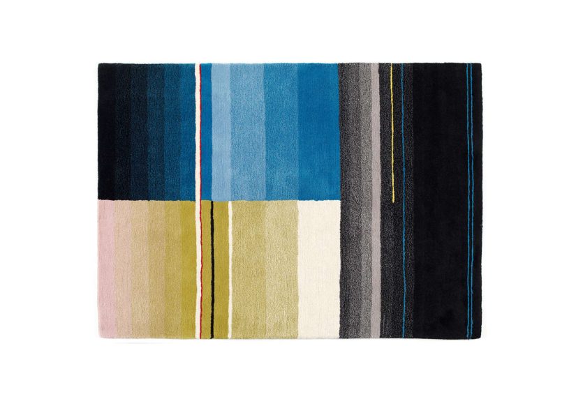
The Colour Carpet is a designer wool rug created for HAY by Scholten & Baijings, a studio known for bringing a highly disciplined yet surprisingly emotional use of color to furniture, textiles, and home accessories. The collection is best recognized for its distinct blocks, gradients, and tonal shifts, which make the rug feel less like a flat object and more like a carefully composed landscape.
Unlike traditional patterned rugs that rely on repeated motifs, floral medallions, or heavily ornamental borders, this carpet speaks in a different accent. Its visual language is modern and architectural. Planes of color overlap, edges create rhythm, and the design feels intentional from every angle. There is structure, but there is also softness. It looks thought through, not overthought. That is a very important difference, especially in interiors where one bad rug can make the whole room look like it is apologizing for itself.
Material matters here too. A 100% wool rug already carries a natural advantage in the world of interiors because wool offers warmth, softness, and visual depth. With Colour Carpet, that tactile comfort is paired with a palette that feels smart rather than loud. The result is a piece that can live in a bedroom, living room, reading nook, creative studio, or even a child’s room without losing its sophistication.
Why Scholten & Baijings’s Design Approach Works So Well
They treat color as structure, not decoration
One of the reasons the Colour Carpet feels so distinctive is that Scholten & Baijings do not use color like frosting. For many designers, color arrives at the end of the process, once shape and function have already taken center stage. For this duo, color is part of the architecture of the object itself. That approach changes everything.
In the Colour Carpet, shades do not simply fill in predefined areas. They shape the identity of the rug. They control balance, create movement, and alter how the eye reads scale. This is why the carpet can feel dynamic without being visually exhausting. It is built on discipline. Each color transition is doing a job.
That is also why the rug works so well in contemporary interiors. Modern rooms often depend on restraint: clean lines, edited furniture, open space, and a limited palette. A careless burst of color can wreck the mood in seconds. The Colour Carpet avoids that trap by making color feel organized, almost architectural. It is a statement piece with manners.
They understand optical softness
Another strength of the design is its use of gradients and layered fields. This gives the rug what might be called optical softness. Even when the geometry is crisp, the overall impression is not harsh. The eye moves across the surface gently. Colors seem to dissolve into one another, overlap, or shift in intensity, creating a sense of depth that flat graphics often lack.
This is where the rug becomes more than a product and starts behaving like design theater for the floor. The composition changes depending on the surrounding light, nearby furniture, and even the angle from which it is viewed. Morning light can make it feel airy and quiet. Evening shadows can pull out richer contrasts. In other words, the rug is doing overtime.
They mix precision with humanity
Some highly graphic rugs can feel a little too perfect, like they were designed by a ruler with trust issues. Colour Carpet avoids that problem because it balances controlled composition with the warmth of textile craft. Wool has natural body, softness, and irregularity. That texture keeps the piece from feeling sterile.
This human quality is central to the appeal of the carpet. You are not just looking at a geometric design. You are experiencing a textile object with weight, tactility, and presence. It has the sharpness of a modern composition, but it still feels domestic in the best sense of the word: welcoming, grounded, and made for real rooms where people actually sit, walk, read, and occasionally drop snacks they swear they will clean up immediately.
How Colour Carpet Changes a Room
It grounds a space without making it heavy
A great rug should do more than cover the floor. It should define a zone, create visual gravity, and help everything above it make more sense. Colour Carpet excels at this. Because the design is built from measured color relationships rather than busy all-over pattern, it anchors furniture without overwhelming it.
In a living room, it can frame a sofa and coffee table arrangement beautifully. In a bedroom, it adds softness while still feeling tailored. In a play area or family room, it introduces energy without tipping into cartoon territory. That is a difficult line to walk, and this rug walks it with suspicious confidence.
It adds warmth to minimalist interiors
One of the biggest risks in modern decorating is ending up with a space that looks elegant but feels emotionally unavailable. Minimal interiors can be beautiful, but they can also drift into “gallery waiting room” territory if every surface is pale, flat, and serious. A colourful modern rug solves that problem quickly.
Colour Carpet is especially effective because it brings in warmth on two levels. First, there is literal warmth from the wool material. Second, there is emotional warmth from the layered palette. The geometry gives it clarity; the color gives it life. Together, those elements help a room feel curated rather than clinically edited.
It creates conversation without begging for attention
There are statement rugs, and then there are rugs that practically jump on the coffee table and shout, “Look at me!” Colour Carpet belongs firmly in the first category. It is eye-catching, but not needy. Guests notice it. Designers appreciate it. Even people who claim not to care about rugs suddenly have opinions, which is honestly one of the funniest side effects of good interior design.
Because the palette is thoughtful rather than random, the rug starts conversations about color, composition, and style. Yet it still leaves room for art, furniture, lighting, and architecture to breathe. It does not hijack the room. It elevates it.
How to Style a Scholten & Baijings Colour Carpet
Pair it with calm furniture
If the rug is doing the visual heavy lifting, let the furniture stay relatively composed. Clean-lined sofas, simple oak or ash tables, matte finishes, and understated upholstery work especially well. This creates the ideal tension: quiet forms, lively floor.
That does not mean the room must be boring. It simply means the rug needs space to breathe. Think of it as the lead singer in a very stylish band. The rest of the instruments still matter, but nobody wants the tambourine trying to steal the solo.
Repeat one or two colors elsewhere in the room
To make the composition feel intentional, echo one or two tones from the rug in small doses. A cushion, throw, ceramic object, artwork detail, or lamp base can be enough. This helps the carpet feel integrated rather than isolated.
The key is restraint. You are creating a visual conversation, not opening a color-themed amusement park. Small repetitions usually feel more sophisticated than big matching gestures.
Use it to soften hard architecture
Colour Carpet is especially effective in rooms with polished concrete, pale timber, white walls, black metal details, or large window expanses. These architectural settings can sometimes feel a little stark. The rug adds softness and complexity without undermining the modern mood.
In other words, it is perfect for spaces that look great in photos but need a little help feeling good on a Tuesday afternoon.
Why the Colour Carpet Still Feels Current
Many designer rugs are trapped in their era. You can spot the decade from the doorway, and not always in a flattering way. Colour Carpet has aged far more gracefully because its design is based on proportion, layering, and subtle tension rather than trend gimmicks.
It fits beautifully with Scandinavian interiors, contemporary apartments, creative family homes, and even more eclectic spaces that mix vintage and new. It can sit beneath mid-century furniture, contemporary lighting, artisanal ceramics, or minimalist shelving and still make sense. That versatility is a major part of its staying power.
It also aligns with how many people want to live now. Homeowners increasingly look for pieces that offer comfort, craft, individuality, and visual clarity all at once. They want rooms that feel warm but not messy, expressive but not exhausting, modern but not robotic. Colour Carpet answers that brief with surprising elegance.
The Bigger Design Story Behind the Rug
Looking at Colour Carpet only as a product would actually undersell it. This rug is part of a larger design philosophy that has defined Scholten & Baijings for years. Their work often explores how color can create transparency, layering, rhythm, and quiet surprise. They are drawn to grids, shifts, overlaps, and tonal relationships that feel measured but never dead.
That broader context matters because it explains why the rug feels so resolved. It was not invented as a one-off attempt to make flooring “more fun.” It emerged from an ongoing studio language shaped through textiles, furniture, objects, and experiments in color. The carpet carries that DNA clearly. You can feel that it belongs to a larger body of thought.
And honestly, that is what separates good designer rugs from expensive rectangles with marketing teams. The best pieces are not just decorative. They embody a way of seeing.
Living With a Scholten & Baijings-designed Colour Carpet: The Experience
Now for the part people really care about after the mood boards and design theory: what does it actually feel like to live with a rug like this?
The first thing is visual calm. That may sound odd for a colorful carpet, but it is true. Because the palette is composed so carefully, the rug does not create noise. It creates order. When you enter a room with a Colour Carpet, your eye lands somewhere meaningful almost immediately. The floor becomes part of the architecture instead of a blank leftover surface. That alone can make a room feel more complete, more grown-up, and a little less like it is still waiting for the “final touch” that never arrives.
The second thing is physical comfort. Wool changes the emotional temperature of a room in a way that is hard to overstate. Bare feet notice it before your brain does. A room with a quality wool rug tends to feel quieter, softer, and more settled. It is the difference between a room that looks finished and a room that feels inhabited. In daily life, that matters much more than people admit.
Then there is the experience of changing light. This is where the Colour Carpet becomes especially rewarding over time. In bright daylight, the gradients and blocks feel airy and graphic. Under softer evening light, the tones deepen and the rug feels more intimate. It never behaves like a static decoration. It has moods. Not dramatic opera moods, thankfully, but enough personality to keep the room interesting.
There is also a psychological effect that good patterned rugs often create: they help everyday clutter look less tragic. A book on the floor feels intentional. A child’s toys seem less visually jarring. A low coffee table suddenly has context. Even a slightly awkward furniture layout can look more convincing once the rug establishes a strong visual field underneath it. That is one of interior design’s best magic tricks, and this carpet knows it well.
In family spaces, the experience is even better because the rug carries sophistication without feeling precious. It can support real life. You can imagine reading on it, stretching on it, playing on it, or simply standing there half-awake with a cup of coffee, appreciating the fact that the floor is doing more for the room than some entire furniture collections manage to do.
Emotionally, the biggest pleasure comes from the balance it creates. A Colour Carpet can make a room feel designed without feeling staged. That is rare. So many beautiful interiors collapse the moment real people enter them. This type of rug resists that problem because it has both intelligence and warmth. It is refined, but it is not fragile. It is modern, but it is not cold. It is colorful, but it does not scream. In a world full of interiors trying too hard to be perfect, that balance feels refreshingly human.
And perhaps that is the best argument for the Scholten & Baijings-designed Colour Carpet: it does not just decorate a room. It improves the experience of being in it.
Conclusion
The Scholten & Baijings-designed Colour Carpet succeeds because it brings together the things modern interiors often struggle to combine: clarity and comfort, geometry and softness, color and restraint. It is not merely a rug for people who love design magazines. It is a rug for people who want their homes to feel alive, thoughtful, and just a little smarter than average.
Its enduring appeal comes from the fact that it does not chase novelty. Instead, it relies on enduring design values: material quality, disciplined composition, and a deep understanding of how color changes a room. The result is a modern wool rug that still feels fresh, still feels useful, and still feels capable of transforming a space without turning it into a showroom.
In short, Colour Carpet is proof that the floor does not have to be the quietest part of the room. Sometimes it can be the most eloquent.