Table of Contents >> Show >> Hide
- Why in-app video tutorials are a SaaS onboarding cheat code
- Where in-app video tutorials belong in the onboarding flow
- How to design high-performing in-app video tutorials
- Implementation playbook: how to roll out in-app video tutorials
- Common mistakes to avoid with in-app video tutorials
- Experience-based lessons: what really works in practice
- Conclusion: build an onboarding experience users actually want to finish
If you work on a SaaS product, you already know the harsh truth: users don’t read long onboarding guides, but they also get confused if you skip onboarding entirely. It’s a fun little paradox… until you check your churn rate and it stops being fun at all.
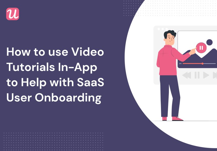
That’s where in-app video tutorials come in. Short, contextual videos embedded directly into your product can show users exactly what to do, when they need it, without forcing them to dig through help docs or watch a 45-minute webinar. Done right, in-app videos become your 24/7 onboarding assistant: friendly, scalable, and mercifully low drama.
In this article, we’ll break down why in-app video tutorials work so well for SaaS user onboarding, where to place them in your product, how to design them for maximum impact, and what to avoid. Then we’ll wrap up with some hands-on, experience-based tips from the field so you can steal what works and skip what doesn’t.
Why in-app video tutorials are a SaaS onboarding cheat code
User onboarding is all about getting people from “What does this do?” to “Wow, this solves my problem” as quickly as possible. The faster users hit that first “aha moment,” the more likely they are to activate, stick around, and eventually upgrade.
Video is uniquely good at doing this because it compresses time and cognitive effort. Instead of reading dense text, users can watch a 20–60 second clip that visually demonstrates the exact steps they need to take inside the UI. That reduces friction, anxiety, and “I’ll set this up later” procrastination.
Video onboarding boosts understanding and retention
People retain visual information better than text alone, especially when they’re learning a new workflow. Short, focused tutorials:
- Show users what to click and why it matters, step by step.
- Reduce misinterpretation of instructions (“Wait, which menu was that?”).
- Support different learning styles (visual, auditory, step-by-step).
- Make complex workflows feel less intimidating and more doable.
Many SaaS teams that adopt video onboarding also report higher productivity and better knowledge retention compared to text-only training, especially for more complex products with multiple roles and use cases.
Video tutorials help fight early churn
Early churn is often a symptom of one thing: users never reach value. They sign up, poke around, get overwhelmed, and ghost your app. Strong onboarding can dramatically reduce that, and in-app videos are a powerful part of that toolkit.
Embedded videos can:
- Walk users through their first key setup steps (import data, invite teammates, connect integrations).
- Highlight core features that correlate with long-term retention.
- Set realistic expectations for what the product does and doesn’t do.
- Create an emotional connection with a human face or voice instead of just a wall of UI.
Instead of users bouncing at the “this is confusing” moment, video tutorials give them a lifelineright inside the product.
They fit perfectly into product-led onboarding
Product-led onboarding aims to let the product do the teaching. Rather than giving users external PDFs or long webinars, you guide them to value through in-app prompts, tooltips, checklists, and contextual nudges. In-app video tutorials plug directly into this approach.
Instead of one giant, linear product tour, you can sprinkle micro-videos at the exact moment a user:
- Clicks a complex feature for the first time.
- Lands on an empty state (no data yet, no dashboards created).
- Triggers a milestone (first project created, first campaign launched, first automation published).
The result is a progressive, self-serve learning experience that feels natural instead of like homework.
Where in-app video tutorials belong in the onboarding flow
Not all video content belongs on your marketing site or YouTube channel. Some videos are much more powerful when they are embedded inside your app, exactly where the user needs guidance. Let’s look at prime locations.
1. Welcome screen & first-session experience
A short welcome video on the first screen can do three important jobs in under a minute:
- Reaffirm the core value proposition (“Here’s what this product will do for you.”)
- Show a quick overview of what the user will accomplish in the next few minutes.
- Set expectations and invite them to follow a simple onboarding path (“We’ll do three quick steps together.”)
Think of this as the trailer, not the whole movie. It should be aspirational and outcome-focused, not a full feature dump.
2. Empty states and “blank canvas” moments
Empty dashboards and blank projects are intimidating. Embedding a short in-app video in these moments can change the vibe from “I have no idea what to do” to “Oh, I just follow along with this quick demo.”
For example, in a project management tool, the empty state video might walk through:
- Creating the first project board.
- Adding columns and tasks.
- Inviting teammates and assigning owners.
Bonus points if the video shows real examples and matches the actual UI, so users can mirror the steps directly.
3. Feature hotspots, tooltips, and modals
Modern onboarding platforms let you embed videos inside:
- Modals (for high-impact announcements or major features).
- Slideouts and side panels (for secondary or optional guidance).
- Tooltips and hotspots (for micro-explanations near specific UI elements).
Instead of a paragraph of text in a tooltip, you might show a 10-second looped video of how to use a filter, configure a rule, or drag-and-drop an element. This is especially helpful for visually complex interactions like builders, canvases, and timelines.
4. In-app resource centers and help hubs
Many SaaS apps now include an in-app help center or “?” widget that opens a resource panel. This is a perfect home for a video library:
- “Getting started” playlists for new users.
- Role-based playlists (admin, manager, contributor, analyst).
- Feature-specific tutorials for power users.
Users who want more depth can browse and binge, while others can rely on contextual videos only. This reduces support tickets and makes self-serve education much more appealing.
5. Post-onboarding and expansion journeys
Onboarding isn’t just about Day 1. As users grow more advanced, you can trigger expansion-focused videos that introduce higher-tier features:
- Advanced automation or reporting.
- Security and compliance features.
- Integrations and ecosystem tools.
These can be triggered by usage milestones (like hitting a certain volume or using a feature repeatedly) so the content always feels timely and relevant.
How to design high-performing in-app video tutorials
Great placement won’t save a bad video. To actually help users, your in-app tutorials need to be intentional, short, and focused on outcomes. Here’s how to design them.
Start from the “aha moment,” not the feature list
Every video should answer a simple question: “What outcome is this helping the user achieve?” Start with that outcome, then reverse-engineer the steps:
- Define the job-to-be-done (e.g., “publish a campaign,” “generate a report,” “invite a teammate”).
- Map the minimal steps necessary inside the product.
- Cut everything that’s “nice to have” but not required for success.
If a video tries to do too much, users will either zone out or abandon it halfway through.
Keep it short, specific, and contextual
For in-app tutorials, brevity is your friend. Aim for:
- 5–15 seconds for micro-tooltips or UI interactions.
- 20–60 seconds for simple flows (like connecting an integration).
- Up to 2 minutes for more advanced multi-step workflowsonly when truly necessary.
The more contextual the video is (triggered by a specific click or location in the UI), the shorter it can be because you don’t have to re-explain the entire universe every time.
Design for silent autoplay and accessibility
Many users will encounter your videos in environments where sound is off. Design accordingly:
- Use clear on-screen captions and labels.
- Rely on UI highlights, cursors, and simple callouts.
- Keep motion smooth and avoid distracting zooms or spins.
Always offer:
- Full closed captions.
- Keyboard-accessible player controls.
- A text or step-by-step fallback for users who prefer reading.
Match the real product experience
Nothing breaks trust faster than a video that doesn’t match the UI users see on screen. When designs change, your videos should be updated or replaced. That means:
- Recording with realistic demo data, not empty placeholders.
- Using a staging account that mirrors real-world setups.
- Versioning your content and tracking where each video is embedded.
Short, modular videos are much easier to update than long, narrative walkthroughs. That is another reason to go small and focused.
Human tone, not stiff corporate voiceover
Users can tell when a video script was written by someone who never talked to an actual customer. Keep your tone conversational and outcome-driven:
- “Here’s how to set up your first report in under a minute.”
- “Let’s connect your CRM so you don’t have to import CSVs ever again.”
- “Want to see which campaigns actually make money? Start here.”
It’s onboarding, not a courtroom transcript. A little personality goes a long wayjust keep it clear and respectful of users’ time.
Implementation playbook: how to roll out in-app video tutorials
Let’s turn all of this into a practical implementation plan you can use with your product, design, and customer success teams.
1. Define onboarding goals and key activation events
Start by agreeing on what “onboarded” actually means in your product. Common activation milestones include:
- Creating the first project, campaign, or workspace.
- Importing or connecting key data.
- Inviting at least one teammate.
- Completing a core workflow end-to-end (e.g., scheduling a post, publishing a page, sending a message).
These events should guide which videos you create first and where you embed them.
2. Audit your current onboarding experience
Walk through your product as if you were a new user and ask:
- Where do users typically get stuck or open support tickets?
- Which screens feel confusing or “empty” without guidance?
- Where are we currently using long tooltips or heavy text that could be replaced with a short video?
Prioritize 3–5 high-impact moments for your first round of in-app videos.
3. Choose your tech stack for in-app delivery
You’ll typically need:
- A video hosting platform that supports fast loading, captions, and responsive playback.
- An onboarding or digital adoption platform (or in-house tooling) to trigger videos in modals, tooltips, slideouts, or resource centers.
- Analytics to track views, completion rates, and downstream impact on activation and retention.
Many onboarding tools allow you to embed videos directly in UI patterns like checklists, hotspots, and side panels, making it easy to test different placements without manual engineering for every experiment.
4. Script, storyboard, and batch-record
To save time and keep quality consistent:
- Create short scripts that focus on one outcome per video.
- Storyboard the key screens and cursor movements before recording.
- Batch record multiple videos in one session using the same visual style (fonts, colors, annotation style).
Use simple templates like: “Context → Goal → Steps → Success state → Next suggested action.”
5. A/B test placements and measure impact
Once the videos are live, don’t just celebratemeasure:
- View and completion rates for each video.
- Changes in activation metrics for users who see or complete videos vs. those who don’t.
- Impact on support tickets related to the flows covered by tutorials.
Use these insights to iterate on video length, script clarity, and placement triggers. Often, a small tweaklike moving a video from a hidden resource center into an empty statecan significantly increase engagement.
Common mistakes to avoid with in-app video tutorials
Even good ideas can go wrong in implementation. Here are pitfalls to sidestep.
Making one giant “onboarding movie”
Long, linear, 10-minute tours feel impressive to the team that made them, but users rarely finish them. Instead:
- Break content into focused clips triggered contextually.
- Let users opt into deeper videos from a resource center or “learn more” link.
- Use checklists to guide sequence, not one mega-video.
Auto-playing videos with loud sound
Few things are more jarring than a video suddenly blasting audio in a quiet office or meeting. Use:
- Muted autoplay with captions by default.
- Clear player controls so users can enable sound if they want.
- Respect for user preferencesif someone closes a video, don’t nag them with the same one every 10 seconds.
Forgetting to maintain and update content
Products evolve. If your UI has changed three times but your onboarding videos are still showing Version 1, you’re training users to distrust your content. Assign ownership for:
- Reviewing videos when major UI changes ship.
- Retiring outdated tutorials.
- Tagging videos by feature or version so they’re easy to track.
Ignoring data and feedback
Users will tell youdirectly or indirectlywhat’s working. Pay attention to:
- Support tickets that start with “I watched the video, but…”
- Very low completion rates (the video is probably too long or poorly placed).
- Qualitative feedback from customer success and sales demos.
Treat in-app video tutorials as living assets, not one-off projects.
Experience-based lessons: what really works in practice
Theory is nice, but real-world onboarding never goes exactly by the book. Here are experience-based insights and patterns many SaaS teams discover the hard way.
Micro-videos beat big-budget productions
One of the biggest misconceptions is that onboarding videos need to look like Super Bowl ads to be effective. In practice, 20–40 second screen recordings with crisp captions and clear cursor movement often outperform glossy, fully animated explainers.
Users care far more about clarity and relevance than motion graphics. A straightforward screen capture that says “Click here, then here, and you’re done” will outperform a cinematic brand story when someone just wants to launch their first campaign before their next meeting.
Onboarding videos work best as “boosts,” not crutches
Teams sometimes try to use video tutorials to fix a fundamentally confusing UX. That almost never works. If the product is hard to use, videos will only partially mask the problemand you’ll be constantly reshooting them as you redesign the flow.
The most successful SaaS teams treat in-app videos as power-ups, not crutches:
- They start by simplifying flows and reducing unnecessary steps.
- Then they layer on videos to increase confidence, show best practices, and accelerate learning.
In other words, video should amplify a good product experience, not bandage a broken one.
Role-based playlists reduce overwhelm
In multi-tenant or multi-role SaaS tools, users often have very different goals. An admin setting up SSO has different needs compared to a marketer scheduling posts or an analyst building dashboards.
Experience shows that splitting onboarding content by role:
- Increases completion rates because users only see what’s relevant.
- Reduces confusion (“Why is this video talking about features I never use?”).
- Helps customer success teams share curated playlists for each stakeholder.
Consider simple labels like “For admins,” “For managers,” and “For contributors” in your in-app resource center, plus tailored triggers in the UI based on role or permissions.
Contextual triggers beat generic video libraries
Many teams start by building a central video library, then wonder why usage is low. The missing piece is context. Users rarely think, “I should open the help center and browse all tutorials just for fun.”
The biggest wins usually come from:
- Triggering a video the first time a user lands on a key feature page.
- Showing a micro-video when someone hovers over or clicks a complex control.
- Offering “Watch how it works” links directly inside empty states and error states.
When videos are tied to user actions and moments of need, they feel helpful rather than like another content library to manage.
Small teams can move fast with templates and reuse
You don’t need a dedicated video department to build an effective in-app tutorial system. Smaller SaaS teams often succeed by:
- Creating a simple script template and visual style guide.
- Recording multiple videos in a single session using the same environment.
- Reusing assets (like intro/outro frames, cursors, and overlays) to keep production lightweight.
This makes it realistic to keep content fresh as the product evolves, instead of letting onboarding videos drift out of date.
The real success metric: time-to-value
At the end of the day, the most important metric for in-app video tutorials is how much they reduce time-to-value. If new users can accomplish meaningful outcomes fasterand do so with fewer support interactionsyour onboarding is working.
Track how video-exposed cohorts perform compared to those who don’t see tutorials:
- Do they reach activation milestones faster?
- Do they submit fewer “how do I…?” tickets?
- Are they more likely to convert from trial to paid or expand usage?
These are the signals that your in-app video strategy is paying offnot just views or likes.
Conclusion: build an onboarding experience users actually want to finish
In-app video tutorials are not magic, but they’re about as close to a cheat code as you can get for SaaS onboarding. They help users understand your product faster, reduce the friction of learning complex workflows, and support a truly product-led experience.
Start small: identify a handful of high-impact moments in your onboarding flow, create short, outcome-focused videos, and embed them right where users need help. Measure activation, listen to feedback, and iterate. Over time, you’ll build a video-powered onboarding system that feels natural, efficient, and surprisingly delightfulboth for your users and your internal teams.