Table of Contents >> Show >> Hide
Note: Because Vilmie Figur is an older IKEA product with limited archival coverage, this article is written as a careful, research-based retrospective using catalog details and period design commentary.
Some home items are loud in the best possible way. They do not shout with glitter, neon, or a suspicious amount of tassels. Instead, they walk into a room wearing black and beige, say something clever, and quietly become the reason the sofa looks finished. That is the charm of Vilmie Figur, an older IKEA cushion cover that still sparks interest because it managed to do something budget décor often fails to do: look stylish without trying too hard.
In plain English, Vilmie Figur was the kind of accent pillow cover people bought because it was affordable, practical, and visually sharp. In slightly more dramatic English, it was a small rectangle of design confidence. With its graphic pattern, yarn-dyed cotton construction, zippered cover, and easy-to-style neutral palette, it fit right into the era when IKEA was proving that mass-market design did not have to look boring.
This article takes a deeper look at what made Vilmie Figur memorable, why the design still feels relevant, how it fits into the wider IKEA decorating story, and what kind of experience it brings to a room. If you are curious about the cushion itself, interested in vintage IKEA textiles, or simply trying to figure out why certain discontinued home accessories linger in people’s minds, Vilmie Figur deserves a closer look.
What Is Vilmie Figur?
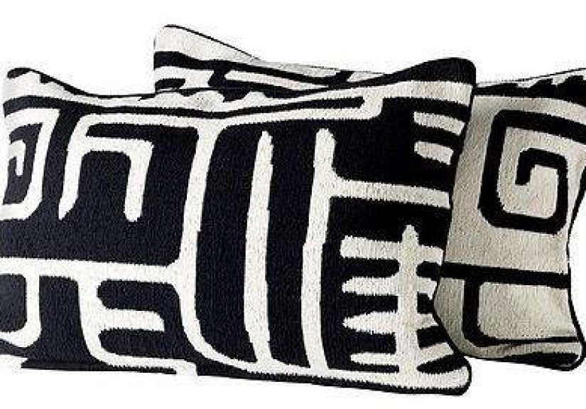
Vilmie Figur is best understood as a decorative IKEA cushion cover from the VILMIE line, a collection associated with designer Emma Jones. The product was presented as a rectangular cover in a black-and-beige colorway, made from 100% cotton and designed to fit a 16-by-24-inch inner cushion. That shape matters more than it sounds. Square throw pillows are everywhere, but a longer rectangular cushion has a different job: it stretches across a bed more elegantly, anchors the center of a sofa, and adds structure when a room has too many fluffy shapes floating around.
The name itself sounds almost mysterious, like a Scandinavian detective who solves crimes using textiles and very calm eye contact. In reality, the appeal was refreshingly practical. The cover was designed for everyday use, with a zipper for easy removal and washing, plus yarn-dyed fabric intended to help the colors stay strong over time. That combination of design and utility is classic IKEA: give people something attractive, then make sure it survives actual life.
What sets Vilmie Figur apart from a generic decorative pillow is that it was never just filler. It had a graphic, high-contrast look that gave it visual presence. It was the sort of piece that could sit on a bed, bench, or couch and instantly make the surrounding furniture look more intentional. No renovation required. No design degree required. No need to dramatically whisper, “This room needs tension.” The pillow handled that on its own.
Why Vilmie Figur Stood Out
A Graphic Pattern That Felt Modern Without Feeling Cold
Black-and-beige or black-and-cream textiles have a special superpower in home décor: they can work with almost everything while still getting noticed. Vilmie Figur leaned into that strength. Its pattern had a blocky, graphic quality that felt bold enough to create contrast, but not so busy that it dominated the room.
That balance is harder to achieve than it looks. A lot of budget accent pillows fall into one of two traps. They are either too plain and disappear into the furniture, or too trendy and start looking dated the minute a new season rolls around. Vilmie Figur sat in the sweet spot. It had personality, but it also had restraint. It could play nicely with wood tones, white bedding, leather, gray upholstery, natural fiber rugs, and even more expressive patterns.
Because the palette was grounded in neutrals, the cushion cover had broad styling flexibility. It could nod toward bohemian interiors, support a midcentury room, sharpen up a minimalist space, or add depth to a bedroom that needed one more layer of contrast. In other words, it did not demand a room revolve around it. It just made the room look more awake.
Practical Construction Helped It Feel Like a Smart Buy
Design only gets you halfway. If a product is annoying to live with, people stop loving it very quickly. One reason Vilmie Figur earned attention was that it checked the practical boxes that matter in everyday homes. The zippered construction made it easy to remove for washing. The yarn-dyed cotton suggested a level of color durability. And the rectangular format made it useful rather than purely decorative.
That practicality is part of why older IKEA textiles often develop a loyal following. They were not precious museum objects. They were affordable items made to be used, leaned on, tossed around, and occasionally rescued from an unfortunate coffee incident. Vilmie Figur fit that tradition well. It looked refined enough for design-minded shoppers, but approachable enough for normal people who own things like pets, children, or elbows.
The Shape Did More Than Decorate
The 16-by-24-inch size is one of the most underrated features of Vilmie Figur. Rectangular cushions can create rhythm on a bed or sofa in a way square pillows often cannot. On a bed, they sit beautifully in front of sleeping pillows and larger Euro shams. On a sofa, they break up a row of identical squares and add variety. On a bench or reading nook, they can act as both support and style.
That shape also makes the cover feel less random. Instead of reading as “I bought another decorative pillow because my couch looked emotionally unavailable,” it reads as an intentional styling decision. Long story short: proportions matter, and Vilmie Figur benefited from them.
How Vilmie Figur Fit the IKEA Design Mood
To understand why Vilmie Figur still gets attention, it helps to remember what IKEA was doing especially well in the early 2010s. The brand was delivering affordable products that brought graphic design, global influences, and clean Scandinavian practicality into mainstream homes. It was not just selling furniture; it was selling the idea that regular people could build a room with personality on a modest budget.
Vilmie Figur fits that moment beautifully. Its look suggested craft influence and pattern confidence, while its price and accessibility kept it democratic. This was not luxury pretending to be casual. It was affordable design honestly trying to be good.
That matters because some home products are memorable not because they are rare or expensive, but because they capture a specific design shift. Vilmie Figur arrived at a time when many shoppers wanted interiors that felt layered, eclectic, and more expressive than plain catalog minimalism. A cushion like this could bridge worlds: Scandinavian base, global flavor, graphic edge, practical use.
It also spoke to a larger truth about home styling: soft goods do a lot of heavy lifting. You can keep a simple sofa for years and make it feel fresh with new pillows, throws, and textiles. IKEA understood that, and Vilmie Figur was exactly the type of product that made a room feel updated without requiring a full spending spree.
Why the Design Still Feels Relevant Today
Plenty of old home accessories deserve to stay in the past. Some look like they belong in a themed waiting room. Others seem to have been designed during a brief national emergency involving fake florals. Vilmie Figur has aged better.
The biggest reason is that graphic neutrals tend to hold up well. Black, beige, cream, and similar tones remain useful across shifting trends. Whether your style leans modern organic, soft minimalist, eclectic vintage, or collected boho, a pillow with strong contrast and a natural base still earns its keep.
Another reason is the ongoing popularity of vintage and discontinued IKEA pieces. More people now appreciate older IKEA designs for their originality, quality, and distinct point of view. What once seemed like a simple budget find can later become a sought-after secondhand piece, especially when it reflects a specific era of the brand’s design language.
Vilmie Figur also benefits from not being overly fussy. There is no gimmick here. No novelty shape, no trendy slogan, no color that only works for six months. It is just a well-scaled, patterned textile with enough visual confidence to liven up a space. That kind of simplicity ages gracefully.
How to Style Vilmie Figur in a Home Today
On a Sofa With Mixed Textures
If you were styling a living room around Vilmie Figur today, one of the easiest wins would be pairing it with tactile materials. Think linen upholstery, boucle accents, leather, slubby cotton, or a chunky wool throw. Because the cushion cover has a graphic pattern, it works best when nearby textures provide softness rather than more visual noise.
It would look especially good on a neutral sofa in oatmeal, tan, gray, or off-white. Add one or two solid pillows in earthy tones, and suddenly the room looks composed rather than accidental. This is the decorating version of wearing a crisp jacket over a T-shirt. Still relaxed, just more pulled together.
At the Center of a Bed Arrangement
Rectangular cushions shine on beds. Vilmie Figur could easily sit in front of sleeping pillows and bring definition to soft bedding. Pair it with white sheets, warm beige blankets, and maybe one darker accent throw, and the whole setup feels sharper. The black-and-beige palette creates contrast without the harshness pure black-and-white sometimes brings.
In a Collected, Eclectic Room
Because the pattern has a crafted, almost globally inspired feel, Vilmie Figur also makes sense in eclectic interiors. It could work alongside woven baskets, wood furniture, ceramics, brass details, and art with strong lines. This is where it becomes more than a pillow. It becomes part of a layered visual conversation, which is a very fancy way of saying it helps the room stop looking flat.
What to Know If You Find One Secondhand
Since Vilmie Figur is mostly discussed through archival pages and resale listings now, anyone interested in owning one would likely be shopping secondhand. If that happens, condition matters. Check the zipper, seams, and corners first. Cotton pillow covers can wear beautifully, but they can also show fading, shrinkage, or stress around the closure after years of use.
Pattern clarity is another clue. Because this design relies on contrast, heavy fading can weaken its whole effect. A slightly softened look can be charming, but if the graphic punch is gone, the cover loses some of what made it interesting in the first place.
Also pay attention to insert size. A good rectangular insert with enough fullness will make the cover look crisp and substantial. A limp insert is the fastest way to turn a stylish textile into a sad pancake. No one wants a sad pancake on the couch.
The Experience of Living With Vilmie Figur
What does a pillow like Vilmie Figur actually feel like in real life, beyond catalog descriptions and design nostalgia? The answer is that it changes the mood of a room in small but noticeable ways. You might not walk in and announce, “Behold, my decorative transformation is complete.” But you will likely sense that the space feels more intentional.
Imagine a sofa that is perfectly decent but a little bland. The cushions are fine. The upholstery is fine. The whole thing is aggressively fine. Add a cover like Vilmie Figur, and suddenly the sofa has an anchor. Your eye lands somewhere. The room gains a focal point that is soft enough to feel casual but graphic enough to feel styled. That is the first part of the experience: visual structure.
Then there is the everyday usability. Because it is cotton and shaped like a lumbar cushion, it can work in ways that are more functional than a purely decorative square throw pillow. It can sit behind your back during reading, tuck under your arm during a movie, or rest across the bed without looking awkward. Some pillows are decorative celebrities: gorgeous, dramatic, and absolutely useless. Vilmie Figur seems more like the reliable character actor who quietly improves every scene.
Its color palette also changes how it behaves in a room across the day. In bright daylight, the contrast looks crisp and architectural. In softer evening light, the beige tones tend to warm up, which keeps the pattern from feeling too stark. That makes it easier to live with over time. High-contrast décor can sometimes feel severe, but this particular combination is gentler and more adaptable.
There is also a tactile experience to consider. A well-made cotton cushion cover does not need to be flashy to be satisfying. It just needs to feel sturdy, breathable, and comfortable enough that you do not treat it like a forbidden object. Vilmie Figur appears to have been designed for that kind of easy use. It belongs in homes where people actually sit down, not just in rooms that exist for holiday photos and polite panic.
Emotionally, the experience of owning a piece like this can be surprisingly specific. It gives a room a little confidence. It suggests that someone made a choice rather than simply accepting the default setting of a couch or bed. And because the design has a strong but not overbearing personality, it can make the rest of a room look more expensive than it really is. That might be one of IKEA’s greatest tricks: selling small items that help everything around them step up its game.
There is also the pleasure of contrast. A lot of comfortable rooms drift toward softness, sameness, and a sea of agreeable neutrals. That can be lovely, but it can also end up looking sleepy. A pattern like Vilmie Figur wakes things up. It adds edge without making the room feel hard. It introduces rhythm without demanding chaos. It is design caffeine, but the sensible kind.
For people who enjoy collecting discontinued home pieces, there is another layer of experience: the satisfaction of finding something that feels both familiar and distinctive. Older IKEA textiles often tap into memory. They remind people of first apartments, early decorating experiments, or that era when discovering a good pillow felt like an act of genius. Vilmie Figur carries some of that emotional texture. It is not just an object. It is a reminder that good design can come from accessible places, and that small details often create the strongest sense of home.
In the end, living with Vilmie Figur is not really about owning a famous product. It is about enjoying a smart, graphic textile that knows exactly what job it is there to do. It is there to sharpen the room, soften the furniture, add contrast, support your back, and make your home look a little more considered. That is a lot to ask from one cushion cover, but this one seems game.
Final Thoughts
Vilmie Figur may be a relatively small chapter in the story of IKEA design, but it is an interesting one. It represents the kind of product that earns lasting affection not by being flashy, but by being smart. Its graphic pattern, practical construction, flexible neutral palette, and rectangular shape all helped it punch above its price point.
More importantly, it reflects why certain home accessories linger in memory. They make life easier, make rooms better, and make ordinary spaces feel a bit more designed. Vilmie Figur did all three. Whether you remember it from older IKEA catalogs, spot it in archival design posts, or stumble across one secondhand, it still reads as a thoughtful piece of décor rather than a disposable trend.
And that is the real lesson here. Great home style is not always about giant furniture upgrades or dramatic room makeovers. Sometimes it is about one good pillow cover showing up, getting to work, and making the whole room look like it has its act together.