Table of Contents >> Show >> Hide
- What Exactly Is a “Cashmere Kitchen”?
- Why Designers Keep Choosing This Look (Even When Clients Come in Asking for “Just White”)
- The Cashmere Kitchen “Recipe” (Colors, Finishes, Materials)
- How to Get the Cashmere Kitchen Look Without a Full Renovation
- Common Cashmere Kitchen Mistakes (And How Designers Avoid Them)
- Cashmere Pairings Designers Reach For Again and Again
- Is the Cashmere Kitchen Trend Actually Timeless?
- Designer Field Notes: Real-Life Experiences With the Cashmere Kitchen Look (Extra )
- Conclusion
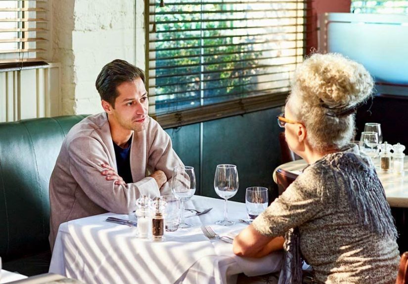
If kitchens had a wardrobe, the last decade was a rollercoaster: the all-white era (crisp, clinical, somehow always
out of coffee), the moody-black moment (gorgeous, but you can’t find the paprika), and the cool-gray phase that now
feels a little… dentist-office-adjacent. Enter the cashmere kitchen trend: the design equivalent of
slipping into your softest sweater and deciding you deserve peace.
“Cashmere” isn’t a literal material requirement (no one is asking you to upholster a backsplash in knitwearplease
don’t). It’s a vibe: warm neutrals, gentle contrast, tactile surfaces, and lighting that flatters your kitchen the
way golden hour flatters your face. Designers love it because it looks elevated and lives well. Homeowners
love it because it feels calm without being boring. Everyone winsespecially your countertops.
What Exactly Is a “Cashmere Kitchen”?
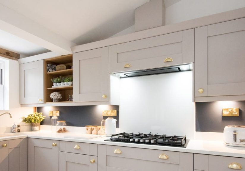
A cashmere kitchen leans into a warm, latte-like palettethink warm whites, creamy off-whites,
greige, taupe, and “mushroom” tonespaired with natural materials (wood, stone) and soft sheen finishes that bounce
light around instead of swallowing it. The result is a kitchen that feels quietly luxe, not flashy.
The key difference from “beige kitchens” of yesteryear: modern cashmere kitchens aren’t flat or yellowy. They’re
layered. They have undertones that play nicely together. They use contrast strategically (hello, aged brass and
veined stone) and rely on texture to keep the neutrals from turning into one big oatmeal mural.
Why Designers Keep Choosing This Look (Even When Clients Come in Asking for “Just White”)
1) It’s the Goldilocks zone between stark white and super moody
Designers often describe cashmere kitchens as the “middle ground” that gives you the airiness of light kitchens
without the harshness. Warm neutrals read softer under real-life lighting (morning sun, overhead cans, that one
pendant bulb you never replace). The space stays bright, but it’s not screaming “I AM A WHITE BOX.”
2) It’s the ultimate “quiet luxury” move
Quiet luxury in kitchens is all about restraint: fewer visual interruptions, better materials, and finishes that
age gracefully. Cashmere kitchens align perfectlysubtle cabinetry, integrated or low-contrast elements, and natural
surfaces that bring depth without chaos. It’s a “whisper, not shout” aesthetic, which is exactly what many clients
want after years of trend whiplash.
3) It makes a kitchen feel more human
Kitchens are high-traffic emotional zones: coffee rituals, family chaos, late-night “why am I eating pickles”
moments. Designers have noticed homeowners craving spaces that feel comforting and grounded. Warm neutrals and soft
textures do that. The room feels like it’s on your side.
4) It’s incredibly forgiving (read: it won’t punish you for living)
All-white kitchens can be beautiful, but they highlight every smudge like a spotlight at an interrogation. Cashmere
palettes are more forgiving: fingerprints blend, crumbs aren’t performance art, and the overall tone stays warm even
if the day gets messy.
5) It’s flexibleso the kitchen can evolve without a demolition permit
Designers love trends that don’t trap you. A cashmere kitchen can swing modern, traditional, coastal, or even
slightly rustic just by swapping the accents: hardware, barstools, lighting, art, textiles. It’s a strong base layer
(like, yes, a good sweater) that can handle a lot of styling moods.
The Cashmere Kitchen “Recipe” (Colors, Finishes, Materials)
Step 1: Choose warm neutrals with intention
Cashmere kitchens are all about undertones. The difference between “soft and elevated” and “sad conference room” is
usually a battle between warm and cool. Designers often start by picking one anchor neutral and building outward.
Popular options include warm whites and greige neutrals. For example, some designers like using warm white wall
shades such as Sherwin-Williams Alabaster, while cabinetry often lands in the warm greige/taupe lane
(shades like Accessible Beige are frequently recommended for that balanced beige-with-gray
undertone). If you want a paler cabinet or wall option that still feels gentle, some turn to soft whites like
Aesthetic Whitebut always test it, because undertones can shift based on lighting and surrounding
finishes.
- Pro tip: Sample paint in at least two spots: near a window and in the darkest corner. Cashmere is all about how the room “glows.”
- Reality check: The same color can look creamy at 9 a.m. and oddly gray at 9 p.m. Your bulbs and your countertop matter.
Step 2: Cabinetry that feels tailored, not trendy
Cashmere kitchens tend to favor cabinetry styles that sit comfortably in the “timeless” zonethink shaker, slim
shaker, or simple panel doors. The shape is quiet; the materials do the talking.
And yes, wood is having a major moment again. Designers increasingly mix warm wood tones (like white oak) with warm
painted cabinets, which adds depth without relying on bold color. This is also why “transitional” kitchensthose
balancing classic and modernpair so well with the cashmere approach.
Step 3: Stone and backsplashes that add texture (without yelling)
Natural stone is basically the cashmere kitchen’s best friend. Designers love surfaces that have movement and
warmth: subtle veining, creamy backgrounds, and organic variation. Quartzite in particular gets a lot of attention
because it can deliver marble-like beauty with more durability in many real kitchens.
One stone that comes up often in cashmere conversations is Taj Mahal quartzitea warm, creamy
quartzite with soft golden-beige veining that pairs beautifully with greige and taupe cabinetry. It reads luxe
without looking icy.
Another move designers keep making: the slab backsplash (a full-height piece of stone behind the
counter). It reduces visual seams (less grout, less clutter) and instantly makes the room feel more customvery on
brand for quiet luxury.
- If you want drama: choose a stone with veining, then keep everything else calm.
- If you want serenity: choose a “quiet” slab and let lighting + hardware do the sparkle.
Step 4: Metals that glow, not glare
Cashmere kitchens tend to avoid super-shiny finishes that feel flashy. Designers often reach for warm metalsaged
brass, satin brass, champagne bronzeor softer silvers like brushed nickel. These finishes complement warm neutrals
and develop character over time (patina is basically “aging gracefully,” but for hardware).
If you’re worried about committing: start with hardware. Swapping pulls and knobs is one of the fastest ways to
shift a kitchen’s vibe from “builder basic” to “someone with taste lives here.”
Step 5: Texture is non-negotiable
Here’s the secret: in a cashmere kitchen, texture is the accent color. Designers layer tactile elements so the
palette doesn’t feel flat:
- plaster or limewash-style walls (subtle movement)
- wood grains (especially oak and walnut)
- handmade-look tile (zellige-style or softly irregular ceramics)
- linen shades or café curtains
- woven stools, natural fiber runners, vintage rugs
That mix of smooth + matte + softly reflective is what makes the room feel “cashmere” instead of “unseasoned
oatmeal.”
Step 6: Lighting that makes the kitchen feel like a mood
Cashmere kitchens thrive on warm, layered lighting. Designers typically aim for a mix:
- Ambient: recessed or flush-mount lighting for overall brightness
- Task: under-cabinet lighting so you can actually chop an onion safely
- Accent: pendants or sconces that add glow and personality
Even a beautifully designed cashmere palette can fall flat under cool, blue-toned bulbs. Warm lighting helps those
creamy neutrals do their job: softening the room and making it feel welcoming.
How to Get the Cashmere Kitchen Look Without a Full Renovation
Designers love this trend partly because it’s scalable. You can do “full cashmere” or “cashmere-ish” depending on
your budget and patience level.
Easy upgrades that move the needle
- Swap hardware: satin brass or brushed nickel instantly warms the room.
- Upgrade your bulbs: choose warmer color temperature lighting for a softer glow.
- Add a runner: a vintage-style rug brings warmth, color depth, and texture.
- Style the counters: wood boards, ceramic canisters, and a linen towel = instant cashmere energy.
- Paint one element: the island or lower cabinets in a warm greige/taupe can transform the palette.
Mid-level moves (still not demolition)
- Paint cabinets: warm neutrals on cabinets are a hallmark of the look.
- Replace the faucet: a warm metal faucet reads high-end fast.
- Install under-cabinet lights: the glow makes everything look more expensive.
Common Cashmere Kitchen Mistakes (And How Designers Avoid Them)
Mistake: Picking a “warm neutral” that’s secretly yellow or secretly gray
Designers test samples obsessively because undertones can turn on you. A beige that looks cozy in one room can look
like melted butter in another. A greige can swing cold if the light is north-facing or if your counters are too
icy-white. Sample first, commit second.
Mistake: Going too low-contrast without adding texture
Low contrast is part of the cashmere charmbut if everything is the same flat finish, the kitchen can feel bland.
Designers fix this with layered textures (wood grain, stone movement, handmade-look tile) and controlled contrast
(hardware, lighting, a darker stool or two).
Mistake: Forgetting the “quiet” part of quiet luxury
Cashmere kitchens aren’t about stuffing every surface with decor. The best ones feel edited. If you love open
shelving, keep it curated: a few ceramics, a stack of plates, maybe one “I went to a coastal town and became a
different person” pitcher. Leave breathing room.
Cashmere Pairings Designers Reach For Again and Again
Warm greige cabinets + white oak accents
This combo nails the cozy-but-modern sweet spot. The oak adds organic warmth; the greige keeps it sophisticated.
Creamy walls + stone backsplash + aged brass
It’s timeless, it glows, and it looks expensive even when the kitchen is a perfectly normal size (because not
everyone lives inside a magazine spread).
Cashmere base + one “earthy” accent color
Designers often add a supporting shadesage, muted clay, soft olivethrough stools, art, or a pantry door. The
palette stays calm but gains personality.
Is the Cashmere Kitchen Trend Actually Timeless?
Designers don’t call something “timeless” lightly (they’ve seen things). Cashmere kitchens have a strong case
because they’re grounded in long-running design principles: warm neutrals, natural materials, simple cabinet
profiles, and layered lighting.
There’s also a practical reason designers feel confident about this direction: industry reports and homeowner
surveys show ongoing demand for warmth and texturewood cabinetry, nature-inspired finishes, and stone surfaces that
feel organic rather than ultra-sterile. In other words, the vibe shift away from stark white and cool gray isn’t
just a fleeting TikTok mood; it reflects how people want their kitchens to feel day-to-day.
Will every cashmere kitchen age perfectly? Only if it’s designed well. But that’s true of anything. The best
versions avoid extremes: not too beige, not too gray, not too shiny, not too flat. The goal is balancecozy,
tailored, and quietly confident.
Designer Field Notes: Real-Life Experiences With the Cashmere Kitchen Look (Extra )
Designers love to talk about cashmere kitchens like they’re inevitable (and sometimes they are), but the most
interesting part is what happens in real projectswhen a trend meets actual humans, actual lighting, and the actual
emotional journey of choosing between 42 nearly identical paint swatches.
The “I swear I don’t want beige” client who ends up loving beige
A common pattern: a homeowner starts with a firm stance“No beige. Beige is what my aunt did in 2003.” Then the
designer lays out a few modern warm neutrals: creamy whites, soft taupes, greiges with balanced undertones. Suddenly
the client realizes this isn’t “beige beige.” It’s cashmere. It’s latte foam. It’s calm. And it works with
the floors they already have.
The winning move is usually a side-by-side comparison: one crisp cool white next to one warm white, under the
kitchen’s real lighting at night. The cool white can look stark; the warm white looks inviting. The client’s face
says, “Oh. I get it now.” That moment is basically the cashmere kitchen origin story.
When the stone “chooses the palette,” not the other way around
Another real-world scenario: the homeowner falls in love with a slaboften a warm quartzite with creamy veining.
Once that stone is chosen, the rest becomes a supporting cast. Designers will pull paint samples that echo the
stone’s undertones (golden-beige, soft taupe, sometimes a hint of rosy warmth) so everything feels cohesive.
This is where cashmere kitchens shine: the palette is flexible enough to harmonize with stone, wood, and metal
finishes without looking overly “matched.” It’s coordinated, not coordinated-to-death.
The lighting plot twist
Designers will tell youpolitely, with the tired kindness of someone who has been betrayed by LEDs beforethat
lighting can make or break a cashmere kitchen. A paint color that looked dreamy in the showroom can turn flat if the
bulbs are too cool. One of the most common “after” upgrades isn’t even a design change; it’s swapping bulbs and
adding under-cabinet lighting.
The transformation can feel dramatic: suddenly the cabinets read creamy instead of gray, the stone looks warmer,
and the whole kitchen gets that “soft glow” effect that makes people say, “Did you renovate?” when you mostly just
fixed the lighting and got new pulls.
How designers keep it from feeling boring
The fear with neutrals is always the same: “Will it feel bland?” Designers counter that by adding texture and a
tiny bit of contrastlike aged brass, a darker island stool, a vintage runner, or a backsplash with a handmade look.
In practice, those details are what make a cashmere kitchen feel collected instead of generic.
And yes, designers also quietly love that cashmere kitchens photograph beautifully. Warm neutrals are forgiving on
camera, and the textures catch light in a way that reads “expensive” even when the budget was firmly in the
“responsible adult” category.
The biggest takeaway from real projects is this: cashmere kitchens aren’t about being trendy. They’re about being
livablecomfortable, calm, and easy to build on over time. That’s why designers keep choosing them, and why clients
keep saying, months later, “It still makes me happy when I walk in.”
Conclusion
The cashmere kitchen trend is designer-loved for one simple reason: it balances beauty and real
life. Warm neutrals create comfort. Natural materials create depth. Thoughtful lighting creates glow. And the whole
look is flexible enough to evolve as your taste changeswithout forcing you into another kitchen identity crisis in
five years.
If you want a kitchen that feels calm, looks high-end, and still forgives you for being a human who eats toast, the
cashmere approach might be your sweet spot.