Table of Contents >> Show >> Hide
- Why Entryway Paint Colors Are Different From Other Rooms
- 1. Stark White
- 2. Dark Gray
- 3. Bright Red
- 4. Neon Shades
- 5. Cool Pastels
- 6. Black
- What Color Experts Recommend for Entryways Instead
- How to Pick the Right Entryway Paint Color for Your Home
- Real-Life Experiences and Lessons From Entryway Color Regret
- Conclusion
Your entryway has one job, and it is not subtle: it has to make a first impression before your guests even finish saying, “Wow, your dog is enthusiastic.” This little stretch of wall sets the mood for the entire home. It hints at whether the rest of the house feels warm, stylish, relaxed, dramatic, or one Amazon return away from chaos.
That is why color experts tend to get especially opinionated about entryway paint. Unlike a bedroom or den, the entryway is a transition space. It often gets less natural light, more foot traffic, more scuffs, more umbrella drips, and more visual pressure to connect several rooms at once. In other words, it is not the place for every trendy shade your paint deck tries to seduce you with.
After reviewing expert-backed guidance from major U.S. home and design publications, one theme is clear: the best entryway colors feel welcoming, soft, and intentional. The worst ones tend to feel cold, harsh, cramped, dated, or weirdly stressful. Below are six colors experts say you should think twice about before painting your foyer, hallway, or front entranceplus what to use instead if you still want personality without the regret.
Why Entryway Paint Colors Are Different From Other Rooms
Before we get to the shades to avoid, here is the big design truth: entryways behave differently than most rooms. Many are small. Many are dim. Many connect directly to living rooms, stair halls, or kitchens, so the color has to play nicely with several spaces at once. And because this is a high-traffic zone, the paint also has to handle dirt, fingerprints, and everyday life without looking like it lost an argument with a soccer cleat.
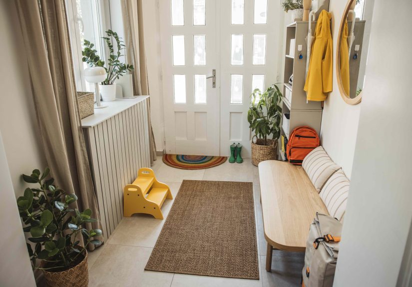
That is why warm neutrals, muted earth tones, soft greens, and complex colors with a little gray or brown mixed in tend to work so well. They are friendlier in shifting light, easier to decorate around, and far more forgiving when real life shows up wearing wet shoes.
1. Stark White
Why experts dislike it
On paper, stark white sounds foolproof. It feels fresh. It feels clean. It feels like the safe choice. But in a real entryway, bright, clinical white can feel more like a waiting room than a warm welcome. It often reads cold, especially in homes that do not get generous natural light at the front door.
There is also the practical problem: entryways are magnets for scuffs, muddy shoes, backpack bumps, and mystery smudges that appear out of nowhere and then refuse to explain themselves. Stark white highlights every single one of them. Instead of looking elegant, it can start looking tired surprisingly fast.
What to choose instead
If you love a light, airy look, go with a warm white, creamy ivory, soft almond, or off-white with beige undertones. These shades still brighten the space, but they feel softer and more inviting. They also pair beautifully with wood furniture, black hardware, woven baskets, and patterned runners.
Better choice: Think “fresh latte foam,” not “dentist office fluorescent wall.”
2. Dark Gray
Why experts dislike it
Dark gray has had a long, very public relationship with modern interiors. It can look dramatic and sophisticated in the right room. But in an entryway, especially a small one, it often absorbs precious light and makes the space feel heavier than it needs to. That is a problem when your goal is to make people feel welcomed, not gently lowered into a cave.
This is especially risky in foyers without windows or in narrow hall-style entrances. A charcoal or concrete gray can flatten the space and make walls feel closer. It may look polished in a magazine photo with perfect lighting, but real homes do not usually come with a lighting crew and a fog machine.
What to choose instead
Try a warmer greige, mushroom beige, taupe, or stone color. These tones give you the same grounded, grown-up vibe without sucking the life out of the room. They are also more flexible if the adjoining spaces lean warm rather than cool.
Better choice: A mid-tone greige that feels cozy instead of corporate.
3. Bright Red
Why experts dislike it
Red is energetic, bold, and memorable. It is also one of the easiest colors to overdo in an entryway. A bright, fire-engine red can feel aggressive the moment you walk inside. Rather than saying, “Come in and stay awhile,” it can say, “Act natural, but faster.”
Color experts often warn that saturated red can overstimulate a space that should feel grounding and transitional. It can also create decorating headaches. Red walls compete with artwork, rugs, wood tones, and nearby room colors. Unless the rest of the home is intentionally built around that intensity, bright red can feel like an overly dramatic opening scene for a movie that turns out to be a perfectly normal family home.
What to choose instead
If you want warmth and richness, go for terracotta, muted rust, clay, cinnamon, or rosy beige. These colors have the same warmth as red, but with more depth and less visual shouting. They can make an entryway feel earthy, layered, and sophisticated.
Better choice: A baked-clay tone that feels curated, not confrontational.
4. Neon Shades
Why experts dislike it
Neon green, electric blue, blazing orange, highlighter yellowthese shades can be fun in theory and exhausting in practice. In an entryway, neon colors often feel jarring and quickly dated. They also tend to clash with the materials most homes already have near the entrance: wood floors, metal hooks, console tables, family photos, natural fiber rugs, and neutral trim.
The problem is not just brightness. It is saturation. An entryway already has a lot going on visually: doors opening, shoes landing, bags dropping, mail piling up, people passing through. Add a neon wall and suddenly the whole space feels like it is trying to host a rave before breakfast.
What to choose instead
If you love color, choose a muted version of the same family. Dusty blue instead of electric blue. Olive instead of lime. Burnt orange instead of traffic-cone orange. Soft ochre instead of highlighter yellow. You still get personality, but the room stays livable.
Better choice: Saturation dialed down just enough that your eyeballs do not file a complaint.
5. Cool Pastels
Why experts dislike it
Pastels can sound charming. Powder blue, icy pink, pale lavender, and mint often feel safe because they are light and soft. But in entryways with limited or cool natural light, these shades can turn chilly, washed out, and vaguely theme-park-ish. Instead of feeling elegant, they may read flat and underpowered.
This is one of those paint mistakes that surprises people. They expect pastel blue to feel breezy or pastel pink to feel cheerful, but the wrong light can pull all the warmth out of them. What remains is a color that feels cold at best and accidental at worst.
Cool pastels can also make it harder to create a seamless transition into adjacent rooms unless your whole home leans in that direction. In many houses, they end up feeling disconnected from the rest of the palette.
What to choose instead
Choose softened, slightly muddier versions with warmer undertones: sage green, dusty blue, blush beige, muted mauve, or pale olive. These shades still bring color into the entryway, but they feel more grounded and grown-up.
Better choice: Think “softly weathered garden wall,” not “baby shower backdrop.”
6. Black
Why experts dislike it
Black walls can be stunning. They are dramatic, moody, and undeniably stylish in the right setting. But experts caution that black is a risky choice for most entryways because it absorbs light, emphasizes dust and imperfections, and can make a small front hall feel boxed in.
That does not mean black is always wrong. If your entryway is large, tall, well lit, and intentionally designed around contrast, black can absolutely work. But most entryways are not grand vestibules in a glossy design spread. They are functional spaces with keys, shoes, coats, and a basket you swear you will organize this weekend.
In an average-size entry, black can make the room feel closed off before guests even have time to admire your mirror.
What to choose instead
Try a deep navy, smoky olive, warm charcoal, espresso brown, or inky blue-gray. These darker colors still create mood and drama, but they usually feel softer and more dimensional than a flat black wall.
Better choice: A rich, complex dark that whispers “stylish” instead of shouting “void.”
What Color Experts Recommend for Entryways Instead
If all six of those “never paint” colors just ruined your original plan, do not panic. Experts are not anti-color. They are anti-regret. The goal is not to make your entryway boring; it is to make it inviting, practical, and connected to the rest of your home.
Here are the kinds of shades that tend to work beautifully:
- Warm whites and creamy ivories for brightness without the sterile look
- Greige and mushroom tones for easy elegance
- Terracotta and clay for earthy warmth
- Sage and olive greens for a natural, grounded feel
- Dusty blues and denim tones for subtle color with softness
- Blush beige and muted pinks for warmth without sweetness overload
The secret is undertone. In an entryway, complex colors usually outperform flat ones. A warm neutral with a bit of brown, a green with a hint of gray, or a pink with a dusty base will usually age better than a pure, one-note version of the same hue.
How to Pick the Right Entryway Paint Color for Your Home
Look at the light first
If your entryway faces north, gets little sunlight, or has no windows, cooler shades will likely feel even cooler. Warmer tones help offset that. If you have a bright, sun-filled foyer, you have more flexibility, but you still want the color to feel intentional rather than blinding.
Think about traffic
Your entryway is not a museum. It is the place where umbrellas drip, sneakers skid, dogs shake off rain, and children fling backpacks with Olympian confidence. Choose a color that can handle visible wear with a little dignity.
Create flow with nearby rooms
The entryway should introduce your home, not confuse it. If the adjacent rooms are warm and earthy, a cold pastel foyer may feel disconnected. If the rest of the house leans classic and neutral, a neon orange entrance may feel like it belongs to someone else entirely.
Sample before you commit
Paint swatches lie a little. They are tiny, flattering, and overly confident. Always test a large sample on more than one wall and check it in daylight, evening light, and lamplight before making a final call.
Real-Life Experiences and Lessons From Entryway Color Regret
I have seen more entryway paint regret than almost any other part of the home, and it usually starts with good intentions. Someone wants a clean look, so they choose bright white. Someone wants drama, so they choose black. Someone wants cheerful, so they go red or yellow. Then a few days later the same person is standing under a light fixture with a paint deck in one hand and a thousand-yard stare in the other.
One of the most common mistakes is assuming the entryway should be treated like a blank canvas. In real homes, blank often turns into bland or cold. A friend once painted her small apartment entry a sharp gallery white because she wanted it to feel “fresh and minimalist.” What she got instead was a space that looked sterile by day and oddly gray at night. Within a week, the walls had visible scuffs from shoes and bags. She repainted it a creamy beige, and the entire entrance immediately felt calmer, warmer, and more expensive.
Another experience that comes up a lot is the “moody but make it chic” idea. In theory, deep charcoal or black sounds sophisticated. In practice, many entryways are too narrow or dim to carry that much depth. I remember walking into a townhouse where the entry hall had been painted nearly black from floor to ceiling. The owner loved it in online inspiration photos. But in person, it felt like the walls were leaning inward. The runner disappeared. The artwork disappeared. Even the beautiful console table looked like it had given up. They eventually repainted in a warm olive-gray and kept the mood while getting the space back.
Bright red is another classic case of enthusiasm outrunning reality. It often starts with the idea that an entryway should feel bold and memorable. That part is true. The problem is that bright red does not just feel memorableit feels relentless. It reflects onto nearby white trim, bounces weirdly in evening light, and can make adjacent rooms feel like they are arguing with it. One homeowner told me her red foyer looked festive for exactly three days and then started feeling like she was being greeted by a stop sign every time she came home from work.
Cool pastels create a different kind of disappointment. They rarely look terrible on the paint chip, which is part of the danger. A pale blue or pink can seem sweet, airy, and harmless. But once it is on the wall in a low-light entry, it often turns flat and chilly. That is especially true in homes with gray flooring, cool daylight, or limited natural light. A color meant to feel soft suddenly feels sleepy or icy. Warmed-up versionsdusty sage, blush beige, muted blue-grayusually fix the problem without losing the gentle vibe people wanted in the first place.
The biggest lesson from all of these experiences is simple: entryways need personality, but they also need balance. The best ones feel intentional from the moment the door opens. They are warm without being muddy, stylish without being difficult, and practical without looking purely utilitarian. When in doubt, go for colors with softness, depth, and a little warmth. Your future self, your guests, and your walls will all be happier for it.
Conclusion
The wrong entryway paint color can make your home feel colder, darker, smaller, or more chaotic before guests even take off their shoes. According to color experts, stark white, dark gray, bright red, neon shades, cool pastels, and black are the most common shades to regret in this hardworking space. The better move is usually a warmer, more forgiving color with depthsomething that reflects light, hides everyday life a little better, and sets a welcoming tone for the rest of the house.
If your entryway currently feels off, the problem may not be your furniture or layout at all. It may just be the wall color. And that is good news, because paint is one of the easiest ways to change the entire mood of a space. Just maybe do not let a tiny paint chip talk you into neon lime at 8 p.m. on a Tuesday.