Table of Contents >> Show >> Hide
- Why Fill Color Matters in InDesign
- Before You Start: Know the Difference Between Fill and Stroke
- How to Fill Color on InDesign in 4 Simple Steps
- How to Fill Different Elements in InDesign
- Common InDesign Color Problems and How to Fix Them
- Best Practices for Using Fill Color in InDesign
- A Quick Real-World Example
- Experience and Lessons Learned from Filling Color in InDesign
- Conclusion
If Adobe InDesign has ever made you wonder why your box is still stubbornly blank, welcome to the club. Few things in design are more humbling than clicking a bright swatch and watching absolutely nothing happen. Usually, the problem is not your taste level. It is that InDesign is very particular about what you selected, which color target is active, and whether you are coloring the fill or the stroke.
The good news is that filling color in InDesign is actually easy once you understand the logic. You select the object or text, activate the Fill target, choose a color from the Swatches, Color, or Properties panel, and then refine it if needed. That is the short version. The better version, the one that saves you from five minutes of random clicking and one dramatic sigh, is below.
In this guide, you will learn how to fill color on InDesign in 4 simple steps, plus when to use swatches, how to fill text versus frames, and which mistakes trip up beginners the most. By the end, you will be able to add color with confidence instead of treating the Tools panel like a slot machine.
Why Fill Color Matters in InDesign
Color in InDesign is not just decoration. It helps organize layouts, establish hierarchy, highlight calls to action, create branded materials, and make pages feel intentional instead of accidental. Whether you are designing a brochure, social graphic, flyer, report, magazine spread, or business card, fill color helps shapes, text frames, and typography pull their weight.
InDesign also gives you more than one way to apply color. You can use saved swatches for consistency, create custom colors for a specific project, apply tints for softer variations, and even work with gradients when you want something less flat. That flexibility is wonderful, but it also explains why new users sometimes fill the wrong thing or wonder why their text turned white when they meant to color the frame blue.
Before You Start: Know the Difference Between Fill and Stroke
Before we jump into the four steps, here is the key concept: fill is the inside color of an object or text, while stroke is the outline. If Stroke is active and you click a swatch, you will color the border, not the inside. That is why people often think InDesign is ignoring them. It is not ignoring you. It is following instructions with the cold precision of a machine.
Also remember this:
- Shapes and frames can have both a fill and a stroke.
- Text can also have a fill color and a stroke color.
- A text frame and the text inside it are not the same thing.
That last point matters a lot. If you select a text frame with the Selection tool, you may color the frame. If you select the characters with the Type tool, you color the text itself. Same document, very different result.
How to Fill Color on InDesign in 4 Simple Steps
Step 1: Select the Object, Shape, Frame, or Text You Want to Color
The first step is simple, but it decides everything that follows. Click the object you want to edit.
If you are coloring a shape, rectangle, ellipse, polygon, or image frame, use the Selection tool. If you want to color actual text, switch to the Type tool and highlight the characters. If you want to color the background of a text box rather than the letters, select the frame itself instead of the text inside it.
Example: Let’s say you have a pull quote in a newsletter. If you drag over the words with the Type tool and choose orange, the letters become orange. If you click the text frame with the Selection tool and choose orange, the box behind the quote becomes orange. Same swatch, totally different mood.
Pro tip: if nothing is selected, color changes may apply to future objects instead of the one already on the page. In other words, do not trust your memory. Trust the selection edges.
Step 2: Make Sure Fill Is Active, Not Stroke
Once your object or text is selected, look at the Fill and Stroke controls in the Tools panel, Swatches panel, or Properties panel. Click the Fill box so it becomes the active target. This tells InDesign, “Color the inside, please, and let us all stay calm.”
If the Stroke box is active instead, your chosen color will affect only the outline. That can be useful for borders, outlined text, and decorative shapes, but it is not what you want when the goal is a solid fill.
A fast visual check helps here:
- If the front box is Fill, you are ready to add interior color.
- If the front box is Stroke, you are about to color the edge.
- If you see a red slash through the active target, that means no color is applied.
This step is the most common fix for the classic complaint: “Why is InDesign not filling my shape?” Nine times out of ten, the answer is that Stroke was active, not Fill.
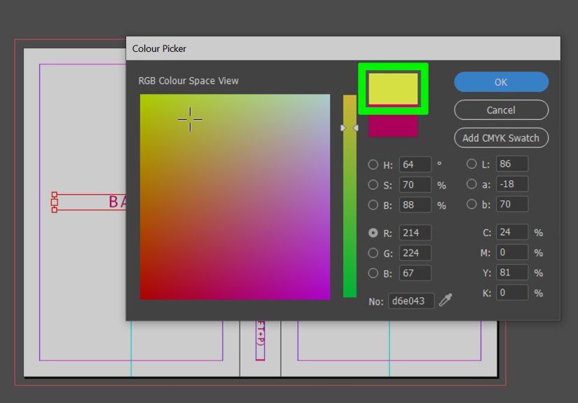
Step 3: Choose a Color from Swatches, the Color Panel, or the Properties Panel
Now for the fun part. With the right item selected and Fill active, choose your color. InDesign gives you a few reliable options:
- Swatches panel: Best for consistent, reusable colors across a document.
- Color panel: Best for mixing a custom color on the fly.
- Properties panel: Best for a quick, beginner-friendly workflow.
- Color Picker: Best when you want more precise control.
If you open Window > Color > Swatches, you can click an existing swatch and apply it instantly. This is ideal for brand colors, recurring accent colors, and any project where consistency matters. If you need something custom, use the Color panel or the Color Picker to adjust the values manually.
Example: You are designing a company flyer and want a navy header box. Rather than making up a slightly different navy every time, create or choose one swatch and reuse it across the whole file. Your future self will thank you when the client says, “Can we make the blue a little deeper?” and you only need to change one swatch instead of 27 separate objects.
For print projects, CMYK is often the practical choice. For screen-first graphics, RGB can make more sense. The important part is not being casual about color mode when your design has a final destination.
Step 4: Refine the Color, Save It as a Swatch, and Check the Result
Once the color is applied, take a second to refine it. Maybe the yellow is too loud. Maybe the red is perfect for a fire truck but slightly aggressive for a nonprofit brochure. This is where you adjust tints, change the color values, or save the result as a reusable swatch.
Saving colors as swatches is one of the smartest habits you can build in InDesign. It keeps your document organized, makes updates easy, and helps prevent the “Why do I have four different blacks?” problem that sneaks into messy files.
After applying the fill, zoom out and evaluate the layout:
- Does the color improve readability?
- Does it match the brand or tone of the piece?
- Does the text still have enough contrast?
- Did you color the frame, the text, or both by accident?
If something looks off, fix it now. Color mistakes are easier to catch before the whole page turns into a parade float.
How to Fill Different Elements in InDesign
How to Fill a Shape with Color
Select the shape using the Selection tool, activate Fill, and click a swatch. That is it. This works for rectangles, circles, polygons, and custom-drawn shapes. If the object also has a stroke, you can style the border separately.
How to Fill a Text Frame with Color
Select the frame itself, not the text cursor inside it. Then activate Fill and choose a color. This colors the box behind the text and is useful for banners, sidebars, captions, callout boxes, and labels.
How to Fill Text with Color
Use the Type tool to highlight the text. Make sure you are affecting the text, not the frame. Then activate Fill and choose your swatch or custom color. This is the correct method for changing headline color, emphasis words, pull quotes, or branded typography.
How to Use Gradient Fills
If a flat color feels too basic, gradients are an option. Create or choose a gradient swatch and apply it the same way you would a normal fill. Use this sparingly. Gradients can look polished when done well, but they can also make a layout feel like it is trying to relive the early 2000s.
Common InDesign Color Problems and How to Fix Them
You Click a Color and Nothing Happens
Check whether the object is actually selected. Then check whether Fill or Stroke is active. Also confirm that you are selecting the frame instead of the text, or the text instead of the frame, depending on your goal.
The Border Changes Color, Not the Inside
Stroke is active. Switch to Fill and try again.
The Text Changes, but the Box Does Not
You selected the characters with the Type tool. Select the frame with the Selection tool if you want to color the container.
The Box Changes, but the Text Does Not
You selected the frame, not the text. Highlight the words with the Type tool and apply the fill to the characters themselves.
The Color Looks Different in Print
This is usually a color mode or output issue, not a sign that the universe hates your brochure. Double-check whether your swatches are appropriate for print and whether your workflow matches the final use of the document.
Best Practices for Using Fill Color in InDesign
- Use saved swatches for consistency across pages.
- Keep contrast high enough for readability.
- Choose colors with purpose, not just because they are “kind of pretty.”
- Use tint variations instead of creating random near-duplicates.
- Test text color and background color together, not separately.
- Think about output: print, PDF, presentation, or digital publishing.
Good color choices help users scan content faster and understand hierarchy. Bad color choices make them squint, guess, and quietly judge your design decisions. Choose wisely.
A Quick Real-World Example
Imagine you are building a simple event flyer in InDesign. You create a large rectangle at the top for the event name, a smaller highlighted box for the date, and a few icons at the bottom. To color it efficiently, you would:
- Select the top rectangle and fill it with your main brand color.
- Select the date box and apply a lighter tint of the same color.
- Highlight the event title text and set it to white for contrast.
- Save each final color as a swatch so the whole flyer stays consistent.
That is how InDesign color starts working for you instead of against you.
Experience and Lessons Learned from Filling Color in InDesign
One of the most useful lessons people learn with InDesign is that color problems are usually selection problems in disguise. Early on, it is easy to assume the software is being complicated just to be dramatic. Then you realize InDesign is actually being logical. It separates text from frames, fill from stroke, and reusable swatches from one-off color decisions. Once that clicks, the whole interface feels less like a maze and more like a tool chest.
A lot of beginners also discover that the first successful color fill is strangely satisfying. You draw a box, make Fill active, click a swatch, and suddenly the page feels alive. Then you get ambitious. You color a headline, add a shaded sidebar, tweak a pull quote, and before long your once-boring page starts looking intentional. That little shift matters because it teaches an important design truth: color is not an afterthought. It is structure, emphasis, tone, and branding rolled into one.
There is also a practical lesson hidden in everyday work. When you create colors casually, your file gets messy fast. You think you used one blue, but now there are five blues that all look like cousins at a family reunion. The fix is simple: build swatches early and use them consistently. Experienced InDesign users rely on this habit because it saves serious time later. When a manager, client, or teammate asks for a palette update, you can edit a swatch instead of hunting through the document like a detective in a trench coat.
Another common experience is mixing up the text and the text frame. Nearly everyone does it. You want a colored caption box, but only the words change. Or you want the headline letters to turn gold, but the whole frame becomes gold instead. That confusion is not a failure. It is part of learning how InDesign thinks. Once you understand that the container and its content are separate targets, you stop fighting the app and start using it with much more precision.
People who design for both print and screen also learn that color choice is not just about aesthetics. A color that looks bold and beautiful on-screen may print more dull than expected if the workflow is not set up carefully. That does not mean InDesign is bad at color. It means professional design requires intention. The more you work with color fills, swatches, and document settings, the more you appreciate that good results come from repeatable systems, not random luck.
And finally, there is the confidence factor. Once you know how to fill color in InDesign in a controlled, repeatable way, other features become less intimidating too. Gradients make more sense. Object styles feel more useful. Brand systems become easier to manage. A tiny skill, like applying a fill color correctly, turns into a foundation for better page design overall. That is why mastering these four simple steps is worth it. It is not just about getting a blue box. It is about understanding how to make InDesign behave like a professional design tool instead of a mildly judgmental robot.
Conclusion
If you want to know how to fill color on InDesign in 4 simple steps, the workflow is refreshingly straightforward: select the correct object or text, activate Fill, choose a swatch or custom color, and refine or save it for reuse. That is the entire game. The tricky part is not the number of steps. It is knowing what you selected and where the color is being applied.
Once you understand that fill and stroke are separate, and that text is different from its frame, you can color just about anything in InDesign without confusion. Better yet, you can do it consistently, which is the difference between a file that feels polished and one that feels like it survived a minor storm.
So the next time InDesign refuses to cooperate, do not panic. Check your selection. Check Fill versus Stroke. Open the Swatches panel. Then proceed like the calm, color-savvy layout wizard you were clearly meant to be.